everweij / react-laag

Hooks to build things like tooltips, dropdown menu's and popovers in React
https://www.react-laag.com
MIT License
907 stars 47 forks source link

[BUG] tooltip created with react-laag not working when called from a modal created with react-modal #80

Closed JeFaisLeCafe closed 2 years ago

JeFaisLeCafe commented 2 years ago

Describe the bug Hello, I'm trying to use a tooltip I created with react-laag inside a modal created with react-modal. When I try to do that, with default behaviour, it's not working but instead throwing an Unhandled Runtime Error

Error: react-laag: Could not find a valid reference for the layer element. There might be 2 causes:
   - Make sure that the 'ref' is set correctly on the layer element when isOpen: true. Also make sure your component forwards the ref with "forwardRef()".
   - Make sure that you are actually rendering the layer when the isOpen prop is set to true

I'm using this tooltip in my web-app in other places, and it works perfectly in all other contexts. This is the first time I want to use it in a modal, and sadly it doesn't work.

To Reproduce Steps to reproduce the behavior:

my app.ts looks something like that

import React from 'react'
import ReactModal from 'react-modal'
import { ModalProvider } from 'react-modal-hook'

ReactModal.setAppElement('#__next') // we are using next

const App = () => {
  return (
      <ModalProvider rootComponent={TransitionGroup}>
         {children}
      </ModalProvider>)
}

I call my modal with a hook:

import { ReactNode, ReactPortal } from 'react'
import { LayerProps, useHover, useLayer, UseLayerOptions } from 'react-laag'

export interface TooltipProps extends LayerProps {
  isOpen: boolean
  renderLayer: (children: ReactNode) => ReactPortal | null
  className?: string
  children?: React.ReactNode
}

export const useTooltip = (options?: Partial<UseLayerOptions>) => {
  const [isOver, hoverProps] = useHover()

  const { triggerProps, layerProps, renderLayer } = useLayer({
    auto: true,
    placement: 'bottom-end',
    possiblePlacements: [
      'bottom-start',
      'bottom-end',
      'bottom-center',
      'top-start',
      'top-center',
      'top-end',
    ],
    triggerOffset: 8,
    ...options,
    isOpen: isOver,
  })

  return {
    registerTooltipTrigger: () => ({
      ...triggerProps,
      ...hoverProps,
    }),
    registerTooltip: (): TooltipProps => ({
      ...layerProps,
      isOpen: isOver,
      renderLayer,
    }),
    isOpen: isOver,
  }
}

and the Tooltip component is like this:

import clsx from 'clsx'
import { AnimatePresence, motion } from 'framer-motion'
import { TooltipProps } from 'modules/common/hooks/useTooltip'
import { forwardRef } from 'react'
import { useTheme } from './Tooltip.theme'

export type TooltipColor = 'blue' | 'red' | 'orange' | 'green'

interface Props extends TooltipProps {
  color: TooltipColor
}
export const Tooltip = forwardRef<HTMLDivElement, Props>(
  ({ children, style, isOpen, renderLayer, className, color }, ref) => {
    const { themeClass } = useTheme({
      color,
    })

    return renderLayer(
      <AnimatePresence>
        {isOpen && (
          <motion.div
            className={clsx(
              'rounded max-w-max filter drop-shadow-lg p-4',
              themeClass,
              className
            )}
            ref={ref}
            style={{ ...style, minWidth: 200 }}
            initial={{ opacity: 0, scale: 0.9 }}
            animate={{ opacity: 1, scale: 1 }}
            exit={{ opacity: 0, scale: 0.9 }}
            transition={{ duration: 0.1 }}
          >
            {children}
          </motion.div>
        )}
      </AnimatePresence>
    )
  }
)

My Modal is provided by a hook and react-modal

import { Modal, ModalProps } from 'modules/common/components/Modal/Modal'
import defaultI18n, { i18n } from 'i18next'
import { I18nextProvider, initReactI18next } from 'react-i18next'
import React, { DependencyList } from 'react'
import { useModal } from 'react-modal-hook'

export type ContentModalProps = Pick<
  ModalProps,
  | 'classNames'
  | 'headerButtonType'
  | 'headerIconButtonVariant'
  | 'headerTitle'
  | 'overlayTransitionType'
  | 'shouldCloseOnEsc'
  | 'shouldCloseOnOverlayClick'
  | 'content'
  | 'footer'
  | 'onBack'
> & {
  onCancel?: () => unknown | Promise<unknown>
  i18n?: i18n
}

// We need a i18n instance to make the <Trans> components work
defaultI18n
  .use(initReactI18next) // bind react-i18next to the instance
  .init()

interface ReactModalProps {
  in: boolean
  enter: any
  exit: any
  onExited: () => void
}

export const useContentModal = (
  {
    onCancel,
    onBack,
    footer,
    content,
    i18n = defaultI18n,
    ...props
  }: ContentModalProps,
  deps: DependencyList = []
) => {
  const [showModal, hideModal] = useModal(
    ({ in: open }: ReactModalProps) => {
      const onClose = async () => {
        if (onCancel) {
          await onCancel()
        }
        hideModal()
      }

      return (
        <Modal
          isOpen={open}
          onClose={onClose}
          onBack={onBack}
          footer={
            footer && <I18nextProvider i18n={i18n}>{footer}</I18nextProvider>
          }
          content={<I18nextProvider i18n={i18n}>{content}</I18nextProvider>}
          hideModal={hideModal}
          {...props}
        />
      )
    },
    [footer, content, ...deps]
  )

  return {
    showModal,
    hideModal,
  }
}

where Modal is

import clsx from 'clsx'
import React from 'react'
import { HideModalContextProvider } from '../../context/HideModalContext'
import { ModalBody } from './ModalBody'
import { ModalFooter } from './ModalFooter'
import { ModalHeaderButton, ModalHeaderButtonProps } from './ModalHeaderButton'
import { ModalRoot, TransitionType } from './ModalRoot'

export interface ModalProps {
  isOpen: boolean
  onClose: () => unknown
  onBack?: () => unknown
  classNames?: {
    modalRoot?: string
    modalBody?: string
    modalFooter?: string
  }
  headerTitle?: string
  headerButtonType?: ModalHeaderButtonProps['type']
  headerIconButtonVariant?: ModalHeaderButtonProps['iconVariant']
  overlayTransitionType?: TransitionType
  shouldCloseOnEsc?: boolean
  shouldCloseOnOverlayClick?: boolean
  content: React.ReactNode
  footer?: React.ReactNode
  hideModal: () => void
}

export const Modal = ({
  isOpen,
  onClose,
  onBack,
  classNames,
  headerTitle,
  headerButtonType,
  headerIconButtonVariant,
  overlayTransitionType,
  shouldCloseOnEsc,
  shouldCloseOnOverlayClick,
  content,
  footer,
  hideModal,
}: ModalProps) => {
  return (
    <HideModalContextProvider hideModal={hideModal}>
      <ModalRoot
        isOpen={isOpen}
        onRequestClose={onClose}
        className={classNames?.modalRoot}
        overlayTransitionType={overlayTransitionType}
        shouldCloseOnEsc={shouldCloseOnEsc}
        shouldCloseOnOverlayClick={shouldCloseOnOverlayClick}
      >
        <div
          className={clsx(
            'flex-row w-full',
            headerTitle && 'border-blue-cardstroke border-b'
          )}
        >
          <ModalHeaderButton
            onBack={onBack}
            onClose={onClose}
            type={headerButtonType}
            iconVariant={headerIconButtonVariant}
          />
          {headerTitle && (
            <span className="inline-block my-4 mx-10 font-headings text-sm text-gray-supergray font-bold">
              {headerTitle}
            </span>
          )}
        </div>
        <ModalBody className={classNames?.modalBody}>{content}</ModalBody>
        {!!footer && (
          <ModalFooter
            className={clsx(
              'flex-col md:flex-row space-y-4 md:space-x-4 md:space-y-0',
              classNames?.modalFooter
            )}
          >
            {footer}
          </ModalFooter>
        )}
      </ModalRoot>
    </HideModalContextProvider>
  )
}

Ultimately, I can call my tooltip with

export const Demo = () => {
  const { registerTooltip, registerTooltipTrigger } = useTooltip()
  return (
    <div className="flex">
      <span className="text-xl" {...registerTooltipTrigger()}>
        Hover me if you dare 😈
      </span>

      <Tooltip color={'blue'} {...registerTooltip()}>
        Well done! Get out now.
      </Tooltip>
    </div>
  )
}

The result is great when used in a regular screen: https://user-images.githubusercontent.com/33933332/142455947-bb7fb6a8-f6cc-4a42-b6cb-b858b627d247.mov

But sadly doesn't work when I use it in a modal, I get this screen Screenshot 2021-11-18 at 17 29 33

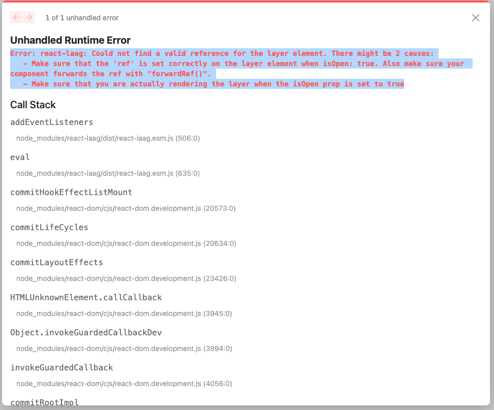
Expected behavior The tooltip is working without breaking when used inside a modal created with react-modal

Browser / OS (please complete the following information):