evidence-dev / evidence

Business intelligence as code: build fast, interactive data visualizations in pure SQL and markdown
https://evidence.dev
MIT License
3.38k stars 164 forks source link

Reference line and area components aren't reactive #1928

Closed HopeFan closed 6 days ago

HopeFan commented 2 weeks ago

Steps To Reproduce

1. create queries inside queries folder :

monthly_tech_overtime.sql

SELECT *
FROM insights.monthly_tech_ovt_tbl
WHERE PC = 'OT'

monthly_stat_count.sql

WITH monthly_summary_stats AS (
    SELECT 
        QUANTILE_DISC(total_count, 0.75) as percentile_75,
        QUANTILE_DISC(total_count, 0.25) as percentile_25,
        QUANTILE_DISC(total_hours, 0.25) as hpercentile_25,
        QUANTILE_DISC(total_hours, 0.75) as hpercentile_75,
        MAX(total_count) as max_total_count,
        MAX(total_hours) as max_total_hours,
        COUNT(DISTINCT employid) as employee,
    FROM ${monthly_tech_overtime}
)
SELECT 
    (percentile_75 + 1.5 * (percentile_75 - percentile_25)) as outlier,
    (hpercentile_75 + 1.5 * (hpercentile_75 - hpercentile_25)) as houtlier,
    max_total_count,
    max_total_hours,
    employee
FROM monthly_summary_stats

2. create a page called like overtime_tech.sql

inside the page add this:

queries:  
- monthly_tech_overtime: technician_overtime/monthly_tech_overtime.sql  
- monthly_stat_count: technician_overtime/monthly_stat_count.sql

<Grid cols=3 gapSize="sm">
  <Dropdown name=year_of_dropdown title="Select Year">
    <DropdownOption valueLabel="2024" value=2024 />
    <DropdownOption valueLabel="2023" value=2023 />
  </Dropdown>
  <Dropdown name=season_of_dropdown title="Select Seasonality">
    <DropdownOption valueLabel="Monthly" value="Monthly" />
    <DropdownOption valueLabel="Weekly" value="Weekly" />
  </Dropdown>  
  <Dropdown name=division_of_dropdown  title="Select Maintenance Division">
    <DropdownOption valueLabel="VIC" value="VIC" />
    <DropdownOption valueLabel="NSW" value="NSW" />
    <DropdownOption valueLabel="OLD" value="QLD" />
    <DropdownOption valueLabel="SA" value="SA" />
    <DropdownOption valueLabel="WA" value="WA" />
    <DropdownOption valueLabel="NT" value="NT" />
    <DropdownOption valueLabel="TAS" value="TAS" />
    <DropdownOption valueLabel="ACT" value="ACT" />
  </Dropdown>
</Grid>

  <Histogram
    data={monthly_tech_overtime}
    x=Total_count
    yAxisTitle="Number of Observed Technicians"
    xAxisTitle="Technician Overtime Instances"
    yGridlines=false
    colorPalette={['#01bcff','#010320']}
   title=""
   chartAreaHeight=250
  >
    <ReferenceLine x={monthly_stat_count[0].outlier} label="Threshold" color=black labelColor=black lineWidth=2/>
    <ReferenceArea xMin={monthly_stat_count[0].outlier}  xMax={monthly_stat_count[0].max_total_count+10} 
    label="Unusual Overtime" color='#eeeeee' labelPosition=center labelColor=black />
  </Histogram>

Environment

Expected Behavior

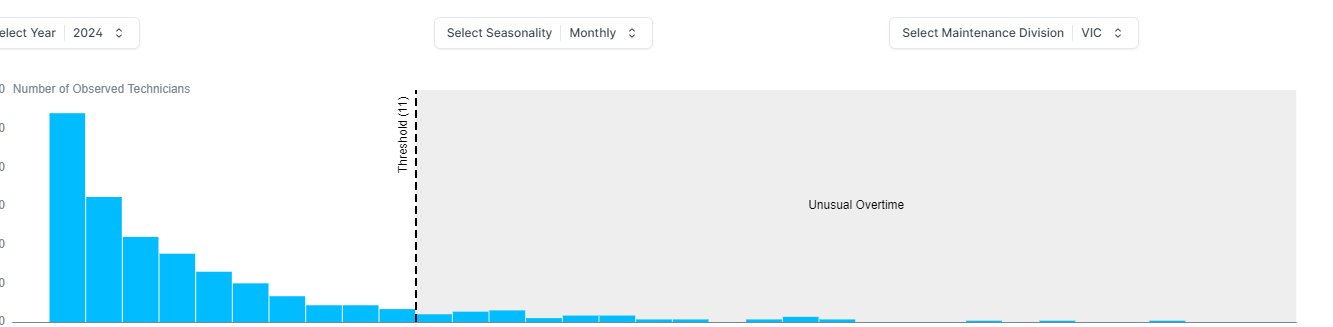
I think expected behavour is that when we change anything like year and the refrence line and annotation area values changed, we should see the last change in the chart not having same on top of each other. ( please refer to the screenshots I shared with you)

Actual Behaviour

in the dropdown list when I change for example a dropdown list from year 2024 to 2023 , I ended up having both in one chart :
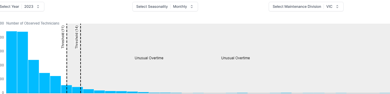
 image (1) image

Workarounds

Anything you can do in advance of this being fixed? not sure but let me know if you have any questions .

HopeFan commented 2 weeks ago

technician_monthly_tbl_sample_data.csv

hughess commented 6 days ago

@HopeFan how does the query get updated by the dropdown? I don't see the inputs showing up in any of your queries