 techninja
commented
9 years ago
techninja
commented
9 years ago Also, in light of redoing a bit of UI here, how do we feel about a update to the checkbox styling into something iOS9-like:

Closed techninja closed 8 years ago
techninja
commented
9 years ago Also, in light of redoing a bit of UI here, how do we feel about a update to the checkbox styling into something iOS9-like:
 oskay
commented
9 years ago
oskay
commented
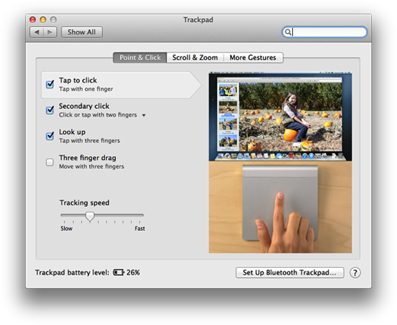
9 years ago +1 on updating UI to slider buttons.
If you look at the settings in (e.g.,) iOS 9, there is a neat consistency about them: Each item title is in plain text, left justified. Each setting is on the same line, right justified. There is no "explanation text." Net result: It's all very readable.
What if we make the explanation text only visible if you click an element to "unhide it", like so?

techninja
commented
9 years ago Been thinking about that. Usually the explanation text is so huge that it just doesn't fit in a tooltip. I've been musing on hiding them for quite some time now, especially considering just these three checkboxes take up SO MUCH ROOM with helper text!

Admittedly this could be partially solved by having an editor of some sort... But yes, people don't care about thus stuff unless they're deciding if they want to use it. Unfortunately, the label of the checkbox itself is part of the checkbox, and will activate the check/uncheck. It's unlikely that would ever do something bad, but it's not an intended reaction if someone is looking to get more details. Perhaps... some kind of question mark icon after the label (putting the switchery checkbox before the label), when clicked (or hovered) reveals the text in the current location as above. Only one would ever show, shrinking away when another one opens.
Eh?
oskay
commented
9 years ago That should work....
techninja
commented
9 years ago 
Eh?
oskay
commented
9 years ago Neat!
Some suggestions:
techninja
commented
9 years ago 
Once I get return feedback on this, I'll go ahead and make another mini screencast.
oskay
commented
9 years ago 1-5: Yes! 6: Yes-- also showing an untouched original SVG would be ideal. Perhaps label them: "original" and "preview"
techninja
commented
9 years ago Else: Awesome! Original SVG included now. Haven't put any text on it that says original, I suspect it will be somewhat obvious.
Iteration count: The new tracing paradigm for generating both live preview and machine paths at once works on an animation frame iterator. This most importantly makes it easy to process very complex art in the exact same way as non-complex art without slowing down the UI or blocking anything.
For every requested frame, a little loop runs based on the iterator count for fills and strokes to do more than one frames worth of work in the space for one frame. This is basically a tracing "speed" slider. And yes, this could easily be replaced with possibly 5 or so options in a drop down. Maybe..
I don't know how well "[N]x" translates to other languages, but it does make sense in English. Note that 20x may seem crazy, but for the One Line Tree drawing, with "Fine" trace precision, it takes ~6:40 at 1x to just trace it, at 20x it's about 19 seconds.
oskay
commented
9 years ago Can you use the multiplication symbol "×", rather than "x"?
techninja
commented
9 years ago Sure. You happy with it otherwise? I can also change out the "line width" from a range to a dropdown. The "line width" is the size of the motion paths shown. Really this should probably be taken from implement config and not shown here at all, but I figure it should be an option.
oskay
commented
9 years ago Yes, all looks good. I may have additional feedback after trying it out. :)
techninja
commented
9 years ago Will have a new build out tonight for testing.
techninja
commented
9 years ago Leaving for GitHub universe tomorrow morning(!), so have failed to build tonight, but I did finish all the intro work for the features and settings! All I really need to do is add the translation strings correctly (cheated and hard coded english for now).
Doing stuff for translation string heavy settings is easily the most tedious thing to do in RP, and I can't say I have a good solution to make it easier, apart from some kind of JSON definition and settings renderer.. which doesn't immediately allow for awesome stuff like the live preview.. so I'm leaving it. Here's latest screencast:

techninja
commented
9 years ago @oskay No rest for you I suppose! Close this if you think the new settings in the 2.0 beta are to your liking, otherwise add comments for any issues you see.
oskay
commented
9 years ago The "Dynamic line fill options" apply to the three "zig zag" fills, but it is not immediately obvious that "dynamic line fill" is the same thing as zig-zag. I suggest changing the text as follows:
(Type pop-up) Zig-Zag :arrow_right: Hatch (Zig-zag) (Type pop-up) Zig-Zag Straight :arrow_right: Hatch (Straight) (Type pop-up) Zig-Zag Smooth :arrow_right: Hatch (Smooth) Dynamic line fill options :arrow_right: Hatch fill options Line fills angle :arrow_right: Hatch angle Line Spacing :arrow_right: Hatch line spacing Randomize fill angle :arrow_right: Randomize hatch angle
techninja
commented
9 years ago Minimum threshold for grouping hatch line endings together into connected groups. Large value connects more groups with fewer tool lifts, 0 will ensure no groups are made.techninja
commented
9 years ago "Skip White Paint" is now fully implemented and tested, it relies on the translation key being known "white". Note that the algorithm always has a "perfect white" available to select to be ignored, so #FFFFFF is going to match far better than the color I've selected to approximately match the paint color given (which is a very, very light gray), so it must be closer to that otherwise it'll always be ignored.
oskay
commented
8 years ago Is there a (good) reason that the brush height controls migrated to the "Advanced" tab?
techninja
commented
8 years ago Fitting everything all over the place with everything else is difficult. I was left with the feeling that these controls are (as by design) less required for the average user. Their defaults are perfectly workable for most "default" situations. Knowing where to put stuff and make it reasonably easy for a user to find and use are very tricky, and settings has almost grown to be its own gigantic application. Also I never considered settings "done" as it was in quite a bit of flux trying to figure out how to incorporate everything.
This is why I worked for a couple weeks to see if I could encapsulate all of it into a set of configuration files, that way moving and weighting each piece would be incredibly easy. Unfortunately that step proved more difficult than simply cutting/pasting elements around in HTML (as that's basically all these are anyways).
If you've got a good idea of where you want em, I'll happily accept a PR with it moved where you think it works best :smile:.
techninja
commented
8 years ago I'm going to call this done as we seem to be living quite well with the majority of the big changes made here. Piecemeal improvement should continue to happen in other tickets.
I've been kicking around how to do settings windows forever, and the strange floaty shadow window we've got now came to be because we wanted to see that everything was still working below, and to emphasize the immediacy of its settings (you can change the color set and see it change the mode below).
As I build out the new settings for fills and strokes, all I can feel is... cramped. Default window size less the all around margin means all that useful text and stuff we want to help the user with is trying to do its magic in almost no space. Feels cramped and hard to parse. So I'm now proposing to pull from a very successful settings window model: Google Chrome!
Here's what I've got so far. Exactly WHAT the tabs are reflect a few other yet to be flushed out changes, but it's a start.
Notes: