Closed davemcg closed 4 years ago
Hello! I assume the picture you shared is geom_scattermost + the scale edited in by hand?
Anyway, geom_scattermost
unfortunately cannot influence the guides/legends directly because its main purpose is to avoid ggplot touching the data. You can either use geom_scattermore
if that's good enough (that will be slow though), or fake the data column as such:
xy <- cbind(rnorm(1000), rnorm(1000)) # data
val <- asinh(xy[,1]*xy[,2]) # color value (derived from data to look nicer)
ggsave("test.png", width=2, height=1.5, scale=2, #saves the plot
ggplot() + #no real data to plot
geom_scattermost(xy, #manually plot and color the points
col=viridisLite::inferno(100)[1+99*(val-min(val))/(max(val)-min(val))],
pointsize=4) +
geom_point(data=data.frame(x=double(0)), aes(x,x,color=x)) + # add a fake empty point-style aes
scale_color_gradientn( #add the manual guide for the empty aes
limits=c(min(val),max(val)),
colors=viridisLite::inferno(100),
name="Some value") +
ggtitle("Manual guide with geom_scattermost")
)
Results in this:
Would that work?
Oh that is perfect. I forgot you had to fake the data aes for ggplot to add a legend. I was trying to manually add the legend and was getting miffed.
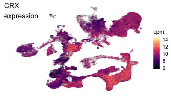
The example I gave is actually the scattermore
implementation, but as this is for a Shiny app speed is VERY important as the plot will get remade every time someone changes the gene.
Code for scattermost (with your improvement):
gene <- 'CRX'
# p is a data frame with UMAP_1 (x coord), UMAP_2 (y coord), and cpm (intensity value for color) that only contains values for points/cells with a cpm > 1
# meta_filter is just UMAP_1, UMAP_2 for ALL data points (plotted in gray)
color_range <- range(p$cpm)
plot <- ggplot() +
geom_scattermost(cbind(meta_filter$UMAP_1, meta_filter$UMAP_2), color = '#D3D3D333',
pointsize = 2) +
geom_scattermost(cbind(p$UMAP_1, p$UMAP_2),
color = viridis::magma(100, alpha=0.3)
[1+99*(p$cpm-color_range[1])/diff(color_range)],
pointsize=2.5,
pixels=c(1000,1000),
interpolate=FALSE) +
geom_point(data=data.frame(x=double(0)), aes(x,x,color=x)) +
scale_color_gradientn( #add the manual guide for the empty aes
limits=c(min(p$cpm),max(p$cpm)),
colors=viridis::magma(100),
name="log2(cpm+1)") +
cowplot::theme_cowplot() +
theme(axis.line = element_blank(),
axis.title = element_blank(),
axis.ticks = element_blank(),
axis.text = element_blank()) +
annotate("text", -Inf, Inf, label = paste0(gene, '\nexpression'), hjust = 0, vjust = 1, size = 6)
Scattermore version
p %>% ggplot() +
geom_scattermore(data = meta_filter,
aes(x = UMAP_1, y = UMAP_2),
pointsize = 2, color = 'gray', alpha = 0.1) +
geom_scattermore(aes(x = UMAP_1, y = UMAP_2, colour = cpm),
pointsize = 2.5,
alpha = 0.3) +
scale_color_viridis_c(option = 'magma') +
cowplot::theme_cowplot() +
theme(axis.line = element_blank(),
axis.title = element_blank(),
axis.ticks = element_blank(),
axis.text = element_blank()) +
annotate("text", -Inf, Inf, label = paste0(gene, '\nexpression'), hjust = 0, vjust = 1, size = 6)
This is plotting ~550,000 points and on a 12'' MacBook also running Zoom scattermore
is ~6 seconds and scattermost
is ~3 seconds.
Oh that is perfect.
OK, great. I'll pin the issue b/c there may be more people with the same problem.
but as this is for a Shiny app speed is VERY important
Well, Shiny is the original reason for scattermore... See https://gitlab.com/exaexa/ShinySOM :]
PS. This https://github.com/exaexa/shinyAccPoints was the first attempt for plotting the data really quick with Shiny, using WebGL. It seemed to be a pretty nice starting point for various animated web output, but the loading performance is actually killed by the insane (non-)speed of R JSONifier implementation.... :]
Is there any easy way to add a legend of the colors using scattermost? Not a gradient just like a regular legend like with geom_point
@jhagberg you mean for a discrete scale? yeah, basically the same way as at https://github.com/exaexa/scattermore/issues/2#issuecomment-616656555 except you likely need to supply an empty data preferably as integer(0)
and your precise description of the colors. I can work out an example when I get a bit of time.
Yes. We have a Very slow scatter plot using ggplot. with X,y and grouping by "method" name . So every point from the same method should have the same color
Anyway @jhagberg it was a bit harder to push ggplot into thinking that it really needs to print the guide but it can be glued together roughly like this:
xy <- cbind(rnorm(1000), rnorm(1000))
levs <- 1:4
labs <- c("a","B","c","violet")
clu <- sample(levs, 1000, replace=T)
pal <- function(n){print(n); RColorBrewer::brewer.pal(n, 'Set1');}
ggsave("test2.png", width=2, height=1.5, scale=2,
ggplot() +
geom_scattermost(xy,
col=pal(length(levs))[clu],
pointsize=4) +
geom_point(
data=data.frame(x=as.double(NA), y=factor(as.integer(NA), levels=levs)),
aes(x,x,color=y)) +
scale_color_manual(
breaks=levs,
values=pal(length(levs)),
labels=labs,
drop=F,
name="Some category") +
ggtitle("Manual guide with geom_scattermost")
)
I hope some ggplot specialists show up and fix the code a bit less hacky :D
(side note: interesting that ggplot is okay making the colorbar for empty continuous data, but completely removes the legend for empty discrete data...)
I'm trying to implement
scattermost
(seems to improved plotting time from ~2 seconds to ~1 second!), but I can't figure out how to add the scale color bar. Any tips?