 darisi
commented
6 years ago
darisi
commented
6 years ago Here are some variations of the Bazaar logo. Works nicely with the "Marketplace" functionality as well. I think that #6 is the best one here as it's clear and simple. Adding some fruit or a person makes it more like an illustration instead of an icon/symbol.
Also as a note the style here (lines + white opacity fill). Will be also used for other logos/symbols like Masquerade so we consistency between our things.

 clarkwinkelmann
 luceos
 Ralkage


 lblockken
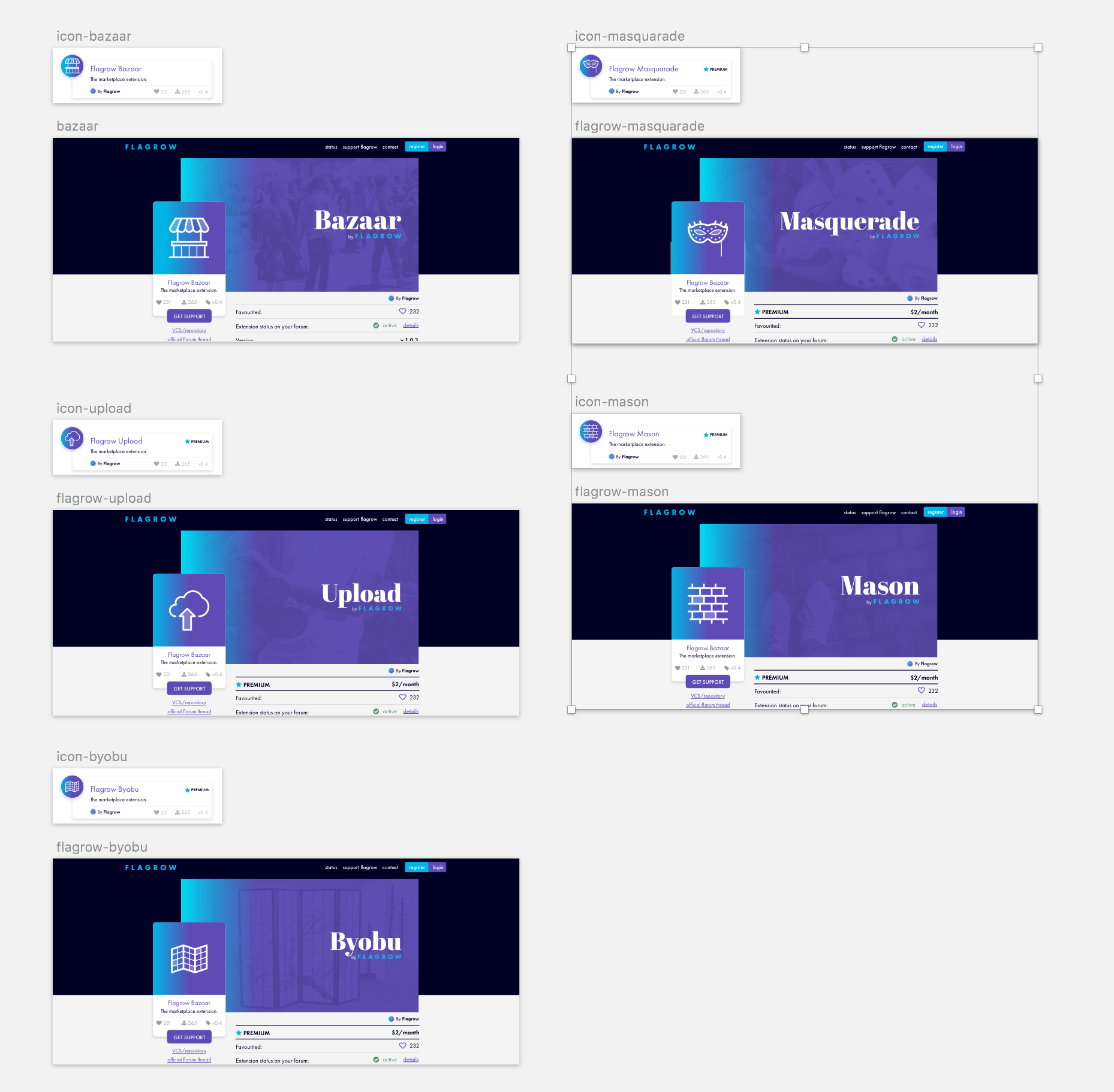
 jordanjay29
It's time we profesionalised this extension a bit more. For Bazaar we need;
Migrated from #84