Team's Response
We are rejecting this for the reasons below.
Regarding point 1, we believe listing the parameters before the commands makes for a better user experience. By introducing the parameters and allowing users to take a brief glance if they do not want to read the entire thing in detail, when users reach various commands, they will already have an idea of how the parameters should be formatted. To introduce parameters as and when the relevant command comes up would lead to two possible scenarios
1) Every parameter is explained for each command in which it is involved. This would lead to duplicated messages throughout the entire user guide
2) Every parameter is only explained once for the first command in which it is involved. This would make users confused as it would necessitate that they read every command so that they understand every parameter.
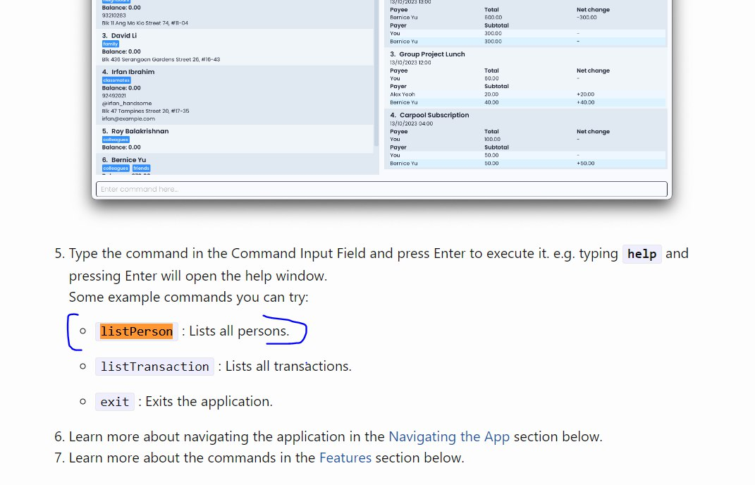
Regarding point 2, listPerson command is clearly defined near the start of the UG under the quick start guide, which would be one of the first sections that the user reads.

Items for the Tester to Verify
:question: Issue response
Team chose [response.Rejected]
- [x] I disagree
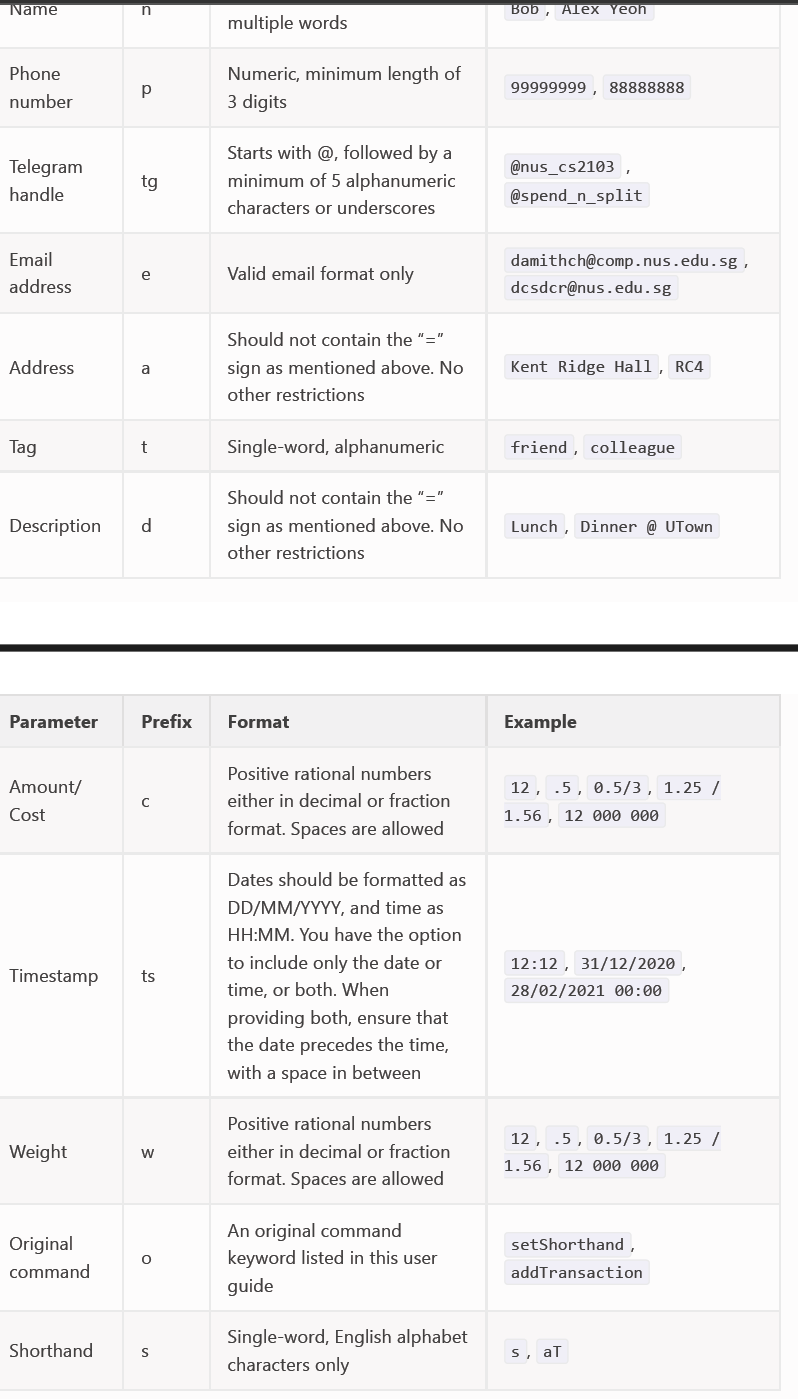
Reason for disagreement: I disagree with the team's response to point 1, and the major part of the severe documentation bug. In the starting section on Parameters, all the parameters for all commands are grouped together, and there's no indication of which parameter belongs to which command. Refer to the screenshot below. Here, all the parameters belong to different commands with no indication or mention. Also, there's absolutely no explanation given for some of the more complex parameters, such as Weight, Timestamp, Shorthand etc. Their point that the user will get a glance and overview is completely invalid because there's absolutely no context provided in the Parameters section, and the individual parameters are not mentioned or explained again in the commands itself. This leads to a very disconnected way of information discharge to the user. The user is left perplexed when he/she first comes to the Parameter section, then again confused when they want to try to use individual commands.

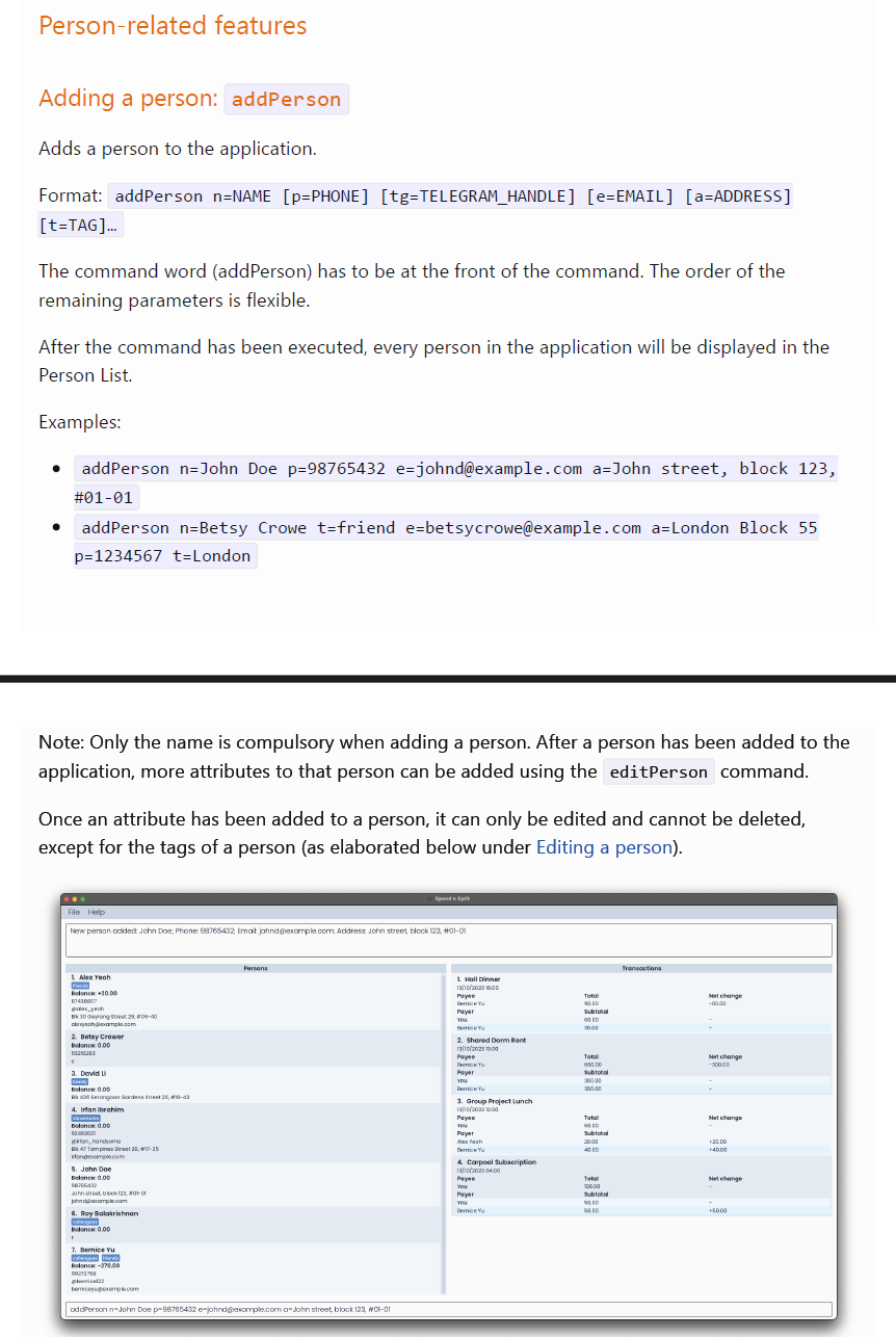
Refer below to the add command, which provides no information on all list of available commands. In such a case, it becomes hard to determine which parameter from the start belongs to which command.

In several places, information is presenting in the wrong order, such as using a command before introducing it, or placing crucial commands and features below parameter summaries. In the following cases specifically:
'Parameters' section includes all parameters for person, transaction, other commands too and appears at the start, before introducing any command at all. This can severely affect readability and confuse the user about which parameters are applicable to which entity/command. The main commands should come earlier, and parameters should be introduced as and when the relevant command comes up. To view the correct argument formats for the 'editPerson' or 'editTransaction' or 'addTransaction', I've to scroll all the way to the top, which is not ideal.
On Page 10, listPerson command is used within the section for deletePerson, but there's no indication or mention of what the listPerson command does before this point in the UG. This makes it extremely confusing and demotivating for the user as now he has to find another section in the UG (one he hasn't encountered yet) to be able to fully understand deletePerson