 violasong
commented
4 years ago
violasong
commented
4 years ago Here's the mockup of the warning bar: https://github.com/firefox-devtools/debugger/issues/6673#issuecomment-623780401
Closed digitarald closed 3 years ago
violasong
commented
4 years ago Here's the mockup of the warning bar: https://github.com/firefox-devtools/debugger/issues/6673#issuecomment-623780401
 fvsch
commented
4 years ago
fvsch
commented
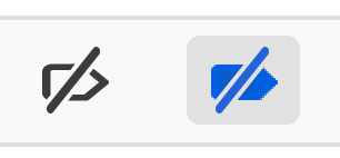
4 years ago Personally I don't find Chrome's icon a good solution. Pros: there's a clear distinction between the two states because the shape of the icon changes, not just its color. Cons: a blue breakpoint does not convey "Breakpoints are currently disabled" to me, at all.
Chrome, breakpoints enabled:

Chrome, breakpoints disabled:

IMO we should:
violasong
commented
4 years ago Some quick sketches


I think I actually like the blue one on top best because it's a simple on-off of this button. The red introduces an extra layer of confusion because it begins to illustrate the double negative of 'stopping the stops.'
 digitarald
commented
4 years ago
digitarald
commented
4 years ago I think I actually like the blue one on top best because it's a simple on-off of this button.
fwiw, request blocking goes also blue.
The struggle is real to have an enabled state for a disabling button. Apart from the strike and the color change, would an enabled button background add context?
violasong
commented
4 years ago Ah yes! That background would be good
 darkwing
commented
4 years ago
darkwing
commented
4 years ago I love those two!
digitarald
commented
4 years ago Filed https://bugzilla.mozilla.org/show_bug.cgi?id=1643130 and opened it up as good-first-bug 👋🏻
violasong
commented
3 years ago Closing since this graduated to bugzilla :)
We did some work, like fading out the breakpoint panels, to ensure disabled pausing is clearly communicated.
Seeing reports like https://twitter.com/__jakub_g/status/1260912327702073347 there is more work to do it seems.
Thoughts:
cc @violasong @darkwing @fvsch @janodvarko