 yashjohar
commented
5 years ago
yashjohar
commented
5 years ago The icon with negative spacing:
 Some others I've been experimenting with:
1)
Some others I've been experimenting with:
1)
 2)
2)
 Let me know what you think :)
Sorry about the delay. I'll start working on the frame button soon.
Let me know what you think :)
Sorry about the delay. I'll start working on the frame button soon.
 (Slightly leaning towards this one: goes well with the existing devtools icons)
 violasong
 fvsch
fvsch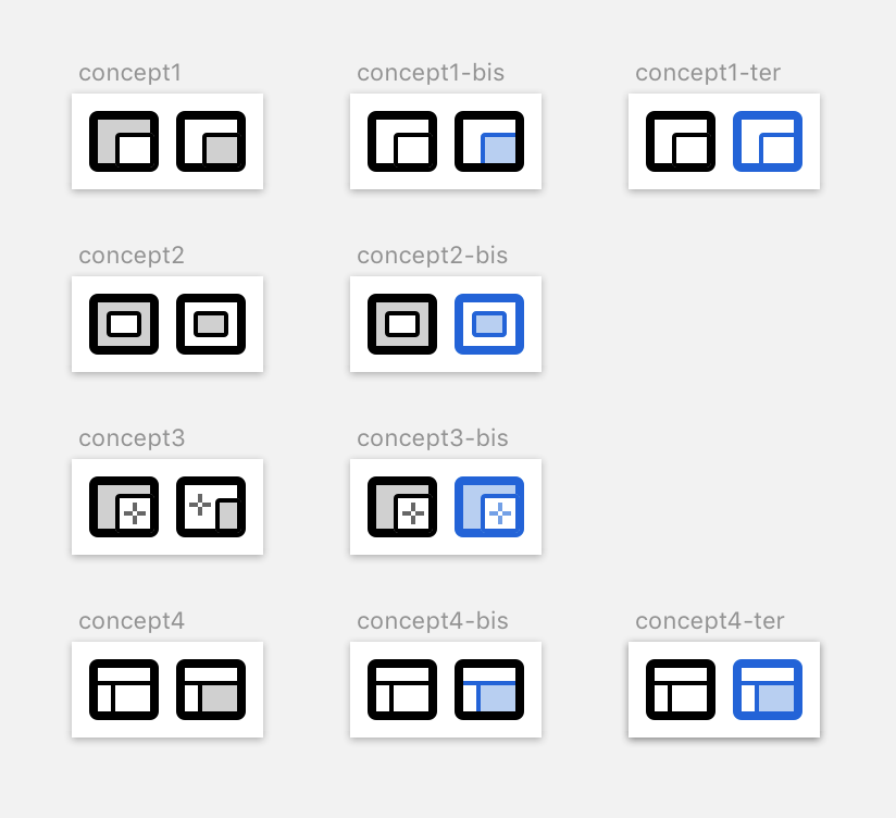

 martinbalfanz


(Assigned to @yashjohar)
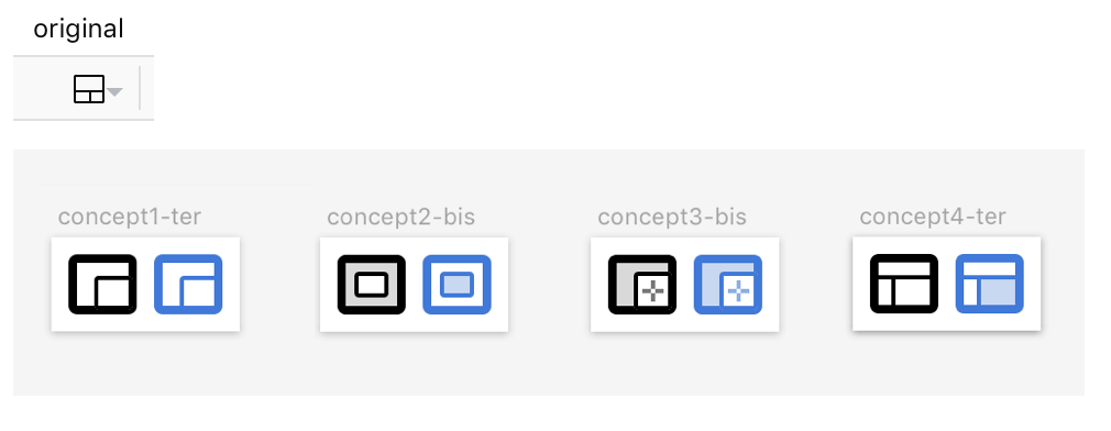
Yash submitted some great work for the RDM icon:
However, as @gabrielluong and I were looking at it some more, we realized that a bit more Photon-ness would be helpful to blend in better with the ••• and x icons. I worked on this quick-and-dirty variant that gives the tablet part a thicker line weight, with some negative space where the tablet meets the phone to provide a bit more separation:
Task 1: Would you mind making a new version of this icon with more polished negative spacing :D? My version of this is pretty rough: rdm2.svg.zip
This icon looks good in context, except the frame button (which is visible by default on any page that has frames) now looks pretty awful next to it.
Task 2: Could you come up with ideas for a frame button that looks better?