 violasong
commented
5 years ago
violasong
commented
5 years ago Open violasong opened 5 years ago
violasong
commented
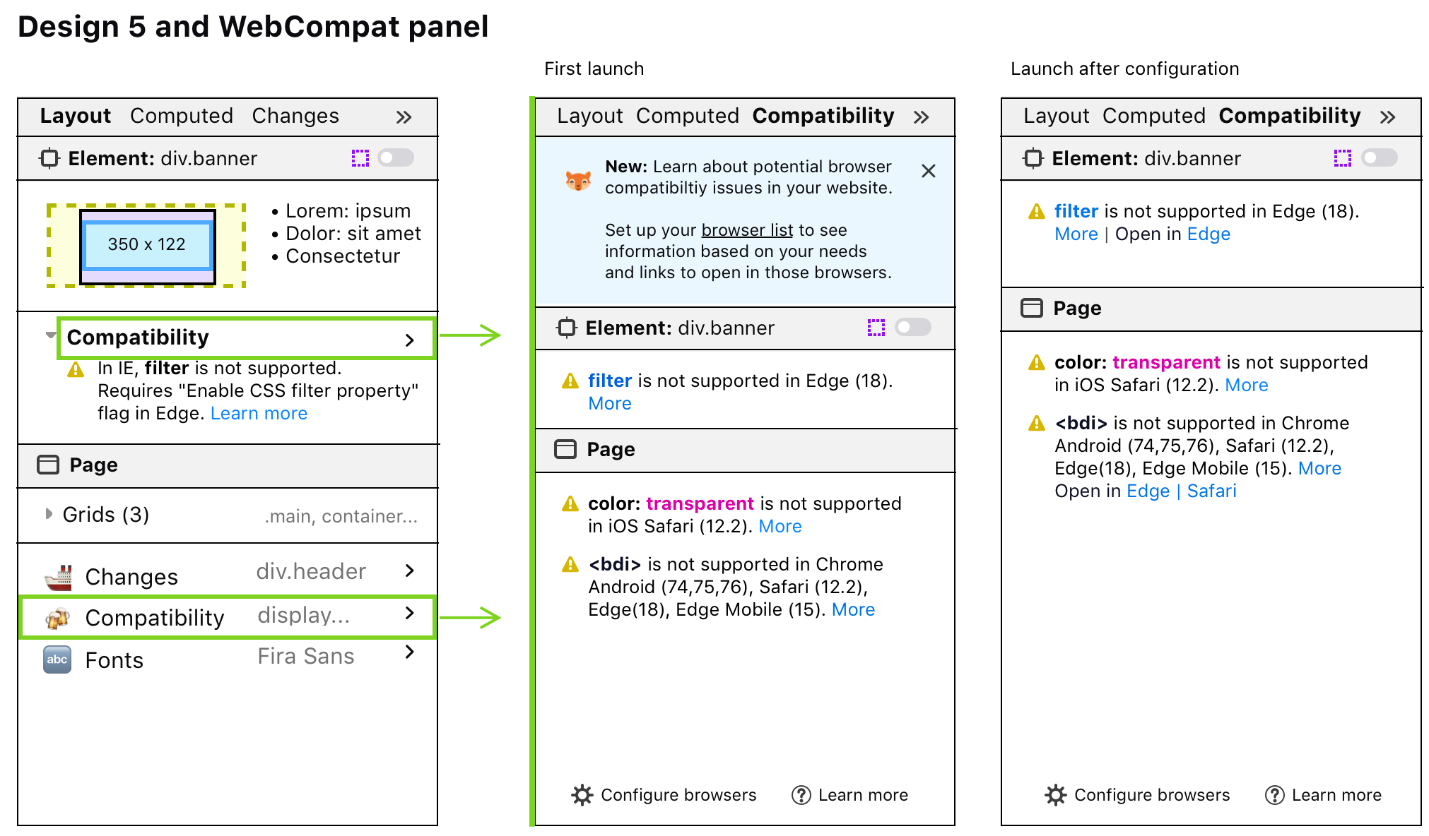
5 years ago I realized that with the plans for a dedicated WebCompat tab in the third pane, it would actually be displayed like this in the "shortcuts to other tabs" section. It would still bubble up to the "This Element" section when the error is on the selected element. Latest mockup:
 (edit: updated image)
violasong
commented
5 years ago If the current element has a compat issue, and there is also a compat issue elsewhere in the page, it could look like this:
 violasong
commented
5 years ago
violasong
commented
5 years ago Unified Layout + basic first wireframes for WebCompat sidebar (invision link)
 violasong
commented
5 years ago
violasong
commented
5 years ago Regarding the "box model properties" info that currently appears under the box model, and is next to the box model in these designs:
From @fvsch on Slack:
I wonder if we should always expand that section (maybe without the top "Box Model Properties" label), and only show each line when they have non-default values?
- only show
floatif notnone- only show
z-indexif notauto- only show
positionif notstatic- etc.
It's also questionable why we have stuff like float here but not flexbox/grid alignment properties? Why line-height but not font-size? Why not min|max-height|width? So I guess one reason I go to Computed instead is that the selection of box-model properties feels a bit incomplete or random and in Computed I'm sure to find what I need (at the cost of some filtering).
From me:
Yes!!! Thanks for the great feedback. Totally agree we should only show non-default values, and in general we need to rethink this. Maybe it should only be positioning info. Font stuff can be handled by the fonts panel.
Some things like float seem really redundant with the declaration in Rules. Is it actually a useful shortcut? I guess float, z-index, position can all be gotchas. Maybe that's what we want to highlight. But maybe we should highlight that in Rules instead, somehow.

Checklist
Inspector: 3rd pane problems
Proposed Solution
I want to turn the Layout tab into a little homepage of sorts, containing an overview of useful info and links into other parts of the 3rd pane. We should only surface info that is relevant to the currently selected element. Here are some of my current ideas:
The next tool will be a WebCompat tab, so many examples will be focused on WebCompat.
Latest design
Other mockups