 exaby73
commented
1 year ago
exaby73
commented
1 year ago Triage report
I can reproduce this issue with the code sample provided above on Master (3.5.0-12.0.pre.94).
Closed sabin26 closed 1 month ago
exaby73
commented
1 year ago I can reproduce this issue with the code sample provided above on Master (3.5.0-12.0.pre.94).
 FelixZY
commented
1 year ago
FelixZY
commented
1 year ago Some more screenshots. The AdaptiveScaffold seems visually broken at this time and is currently unusable for me.


 FelixZY
commented
1 year ago
FelixZY
commented
1 year ago
- Bottom navigation bar is completely off-m3 spec
Looks like this is caused by standardBottomNavigationBar using BottomNavigationBar instead of NavigationBar (see also https://api.flutter.dev/flutter/material/NavigationBar-class.html)
FelixZY
commented
1 year ago
- Long-press ripple reaches square bounds - I would expect rounded corners
I believe I expected large screens to use a NavigationDrawer rather than an expanded NavigationRail. Based on current documentation, an expanded NavigationRail is expected behavior, however.
 lewinpauli
commented
1 year ago
lewinpauli
commented
1 year ago Thank you @sabin26 ! I just changed backgroundColor, selectedIconTheme, unselectedIconTheme, selectedLabelTextStyle to required and removed the default value. ("required" is probably not the best way to go in the long term but it works for now)
For backgroundColor I still set a default value to make it transparent and not popping up when changing the theme.
Here my adaptive_scaffold.dart file and navigation_rail.dart file to save someone some time:
In your App you have to specify those values now, you can change the colors of course:
(If I did some formatting wrong please excuse me, this is one of my first github comments... )
 martijn00
commented
1 month ago
martijn00
commented
1 month ago Same here as: https://github.com/flutter/flutter/issues/120963
@stuartmorgan @gspencergoog I believe this is already fixed. See https://github.com/flutter/packages/blob/main/packages/flutter_adaptive_scaffold/lib/src/adaptive_scaffold.dart#L513
The theme is passed through and parameters have been made nullable.
 gspencergoog
commented
1 month ago
gspencergoog
commented
1 month ago Closing as fixed.
 github-actions[bot]
commented
1 month ago
github-actions[bot]
commented
1 month ago This thread has been automatically locked since there has not been any recent activity after it was closed. If you are still experiencing a similar issue, please open a new bug, including the output of flutter doctor -v and a minimal reproduction of the issue.
Steps to Reproduce
flutter runon the code sampleExpected results: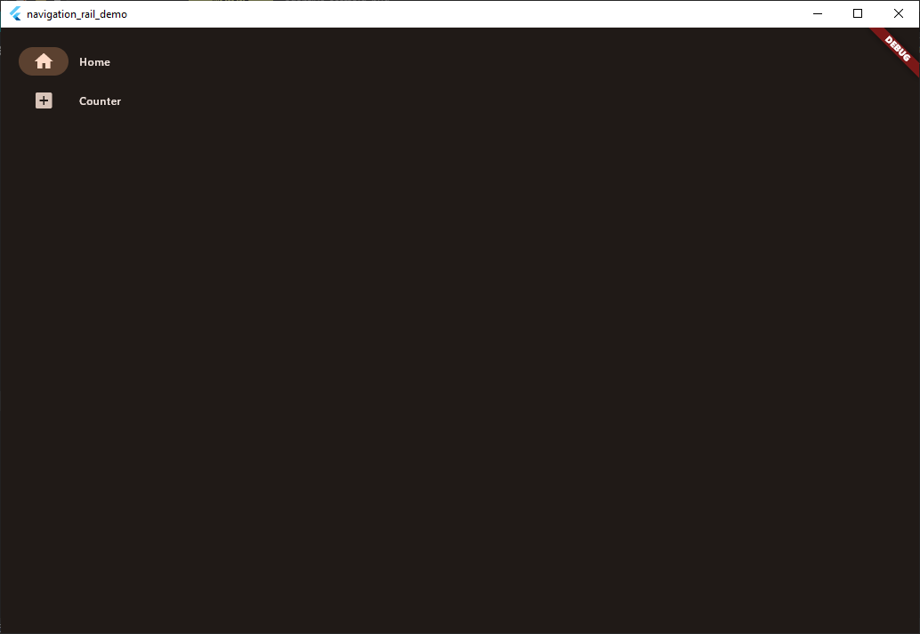
Actual results: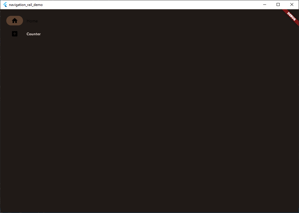
Code sample
```dart import 'package:flutter/material.dart'; import 'package:flutter_adaptive_scaffold/flutter_adaptive_scaffold.dart'; void main() { runApp(const MyApp()); } class MyApp extends StatelessWidget { const MyApp({super.key}); @override Widget build(BuildContext context) { return MaterialApp( title: 'Flutter Demo', theme: ThemeData( colorSchemeSeed: const Color(0xFFE4935D), useMaterial3: true, brightness: Brightness.light, ), darkTheme: ThemeData( colorSchemeSeed: const Color(0xFFE4935D), useMaterial3: true, brightness: Brightness.dark, ), home: const HomePage(), ); } } class HomePage extends StatelessWidget { const HomePage({super.key}); @override Widget build(BuildContext context) { return AdaptiveScaffold( appBar: AppBar( elevation: 4, title: const Text('Demo App'), ), useDrawer: false, destinations: constThe issue is from standardNavigationRail function in adaptive_scaffold.dart where default values for backgroundcolor, selectedIconTheme, unselectedIconTheme, selectedLabelTextStyle are provided. When removed, it works as expected.