 DanPristupov
commented
6 years ago
DanPristupov
commented
6 years ago Can you provide any info how developers should solve such kind of problems?
Closed Whirlwind closed 1 year ago
DanPristupov
commented
6 years ago Can you provide any info how developers should solve such kind of problems?
 Whirlwind
commented
6 years ago
Whirlwind
commented
6 years ago The SourceTree:

First, there is a + and -, this is very clear.
Then the color is not red and green, and sourcetree app allow user custom the color.
 nebhale
commented
6 years ago
nebhale
commented
6 years ago @DanPristupov I've not evaluated this directly, but the company I work for use Color Oracle during design work to simulate these scenarios. There are macOS native apps such as Sim Daltonism as well.
DanPristupov
commented
6 years ago @nebhale Sim Daltonism is a great application, thank you.
Here's how Fork looks. Seems to be confusing indeed.
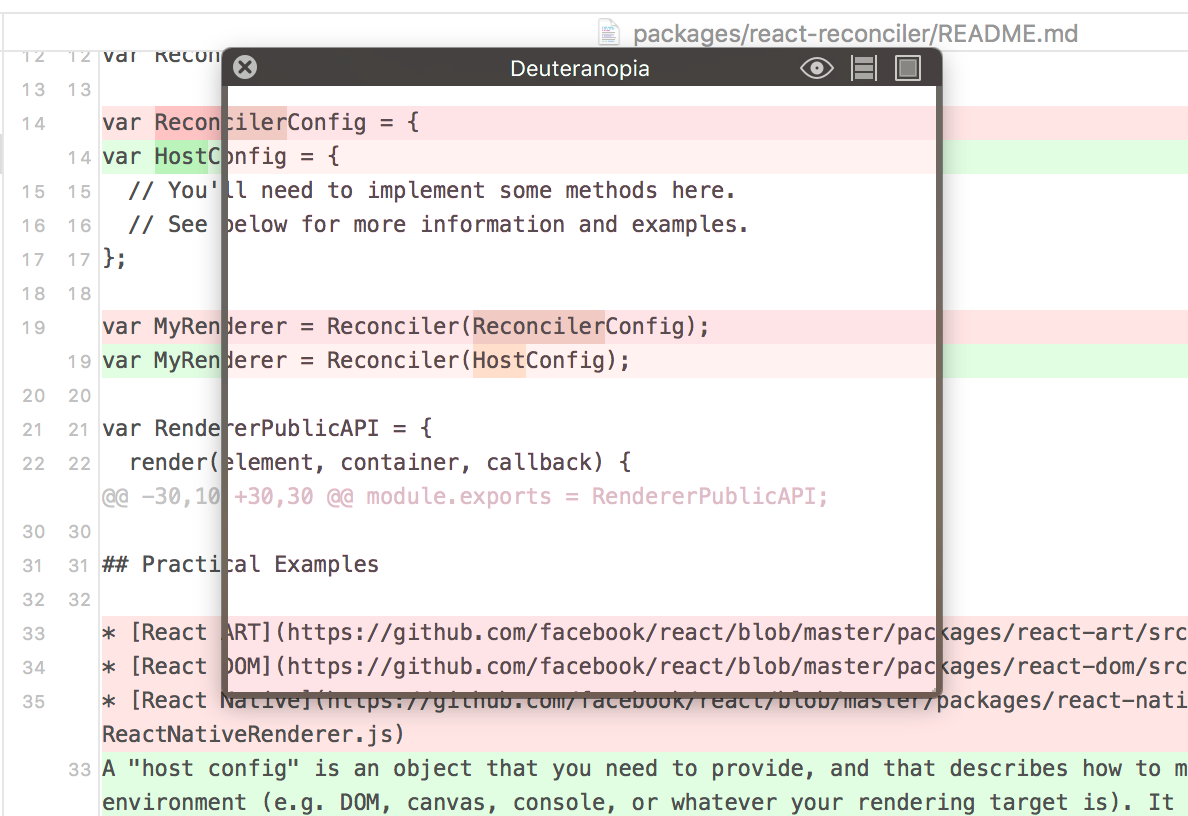
I'm not ready to change whole application palette, but I can introduce a color-blind mode with more distinctive highlighting colors and additional - + signs. Local/Remote branch colors could be improved too.
Few questions to @Whirlwind :
What about GitHub palette? It should be quite bad, right?
Do you use any special appearance settings in macOS?
Whirlwind
commented
6 years ago What about GitHub palette? It should be quite bad, right?
There are multi ways to make a difference in diff view in the Github:
+ and - is very clear.Do you use any special appearance settings in macOS?
No, I just use the dark style in the Fork.
Whirlwind
commented
6 years ago By the way, the color-blind have multi type, not just red and green.
 luong-komorebi
commented
6 years ago
luong-komorebi
commented
6 years ago  My experiece in dark mode and when two changes sit next to each other is even much more challeging. I suggest that we
DanPristupov
commented
5 years ago In 1.0.73 we used better colors in the dark theme.
 laurentvaills
commented
3 years ago
laurentvaills
commented
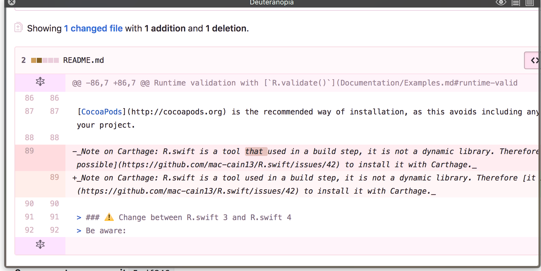
3 years ago I can see this issue is closed but still with 2.0.4 the difference of colors is not good for colorblind people in the diff view (only when it switches to dark theme):

 apff
commented
3 years ago
apff
commented
3 years ago Even in the dark theme it's still hard to distinguish the colors for some red-green colorblind users.
An option to define custom highlight colors, like other users have suggested, would be really helpful and definitely solve this issue, not just for red-green but also for other types of colorblindness.
DanPristupov
commented
3 years ago In Fork 2.10 we added the option to show -+ marks near the change lines.
 laurentvaills
commented
3 years ago
laurentvaills
commented
3 years ago Thanks for the -+ marks.

By the way, I just noticed that the background of the preview is not the same as the background of a real window.
In dark mode, the diff is red for delete lines and green for add lines, but I am a
red and green color blindness. :(