 maksimovic
commented
6 years ago
maksimovic
commented
6 years ago Indeed, it can be rather hard to figure out who branched from which point. Another example:

Closed jakob closed 6 years ago
maksimovic
commented
6 years ago Indeed, it can be rather hard to figure out who branched from which point. Another example:
 DanPristupov
commented
6 years ago
DanPristupov
commented
6 years ago First of all, I agree that what you've drawn looks nice. But making one example doesn't make much sense because we need a complete algorithm, which is fairly complicated. You can try to google for a 'graph visualization algorithm'.
Performance - is another problem, but we can avoid it for now :)
The rules are simple: each revision has sha/id and array of parent revisions (0 or more parents).
So, to proceed we need a pseudocode algorithm or at least an example of an application with a better implementation.
maksimovic
commented
6 years ago Just don't sacrifice the performance, it's one of the main Fork's selling points for me.
The flow can be figured out, just with paying a bit more attention.
DanPristupov
commented
6 years ago @maksimovic graph visualization used to be a bottleneck, but about 10 versions ago I made it lazy, so it calculates only the visible area. So, ideally the algorithm must be lazy.
Could you run git log --all --pretty="%h|%p|%d", past the output here http://bit-booster.com/graph.html and share the result? UPD: in my case I got a huge mess, but may be it was just a bad example.
Here are some other existing implementations:
 jakob
commented
6 years ago
jakob
commented
6 years ago @DanPristupov Thank you for your consideration. I know it's a hard problem (I've done some graph layout and drawing before).
I'm not suggesting to actually change the layout of the graph (the hard part). I think the layout is fine. I'm only suggesting a small change to the way that the actual bezier paths are drawn:
It should have very little performance impact, since it would only affect the drawing of a few bezier paths that are on screen.
I can try to build a small example app with the drawing code that I have in mind, I just wonder how to do it without having to write all the graph layout code...
DanPristupov
commented
6 years ago @jakob yes, it makes sense. I'll check the code and try to draw a different connection type for that case.
P.S. However different connection drawing won't help much in @maksimovic's case.
DanPristupov
commented
6 years ago @jakob do you use the date commit order? I think your commit graph can be improved if you use topo-order in Fork preferences.
maksimovic
commented
6 years ago I'm using topological sort, but I don't think that very complex/edge cases are worth the struggle.
The congestion screenshoted above in bit-booster's version:
 jakob
commented
6 years ago
jakob
commented
6 years ago @DanPristupov I just checked and topological order is selected. It indeed looks better than date order.
Just to repeat: I have no complaints about the layout itself. It's very clear most of the time, and I really like the graph view in fork. My only complaint is about the way that the bezier curves are drawn. I think the problem is that they are angled on one side, and smooth on the other side -- most of the examples you linked above are either angled on both sides, or smooth on both sides.
I'll try to write some example code and share it here later (I like writing drawing code!)
DanPristupov
commented
6 years ago It turned out to be not a trivial change. Drawing itself is not a problem, it's just a bezier curve.
In Fork each line consists of two types of lines:
This approach allows me to perform all calculations in just 1 loop O(children+parents) for a line. Determining if a top line is connected to a bottom one will require O(Children*parents) work, which will be super-slow on complex graph.
I need to think about this problem for a few days.
DanPristupov
commented
6 years ago What do you think guys?
Before:

After:
 DanPristupov
commented
6 years ago
DanPristupov
commented
6 years ago Case (2):
Before:
After:
 maksimovic
commented
6 years ago
maksimovic
commented
6 years ago Wow, that's nice!
Do you still think it's going to affect performance? If yes, then I'm willing take some pre-release for a spin to check how it's behaving here.
DanPristupov
commented
6 years ago No, actually it would be even a bit faster. When one returns to an algorithm he/she spent a lot of time on in the past, often new ideas come out of nowhere :).
I'm going to tweak the curves a bit more and then share the pre-release.
jakob
commented
6 years ago @DanPristupov Thanks for the explanations, I think I understand now. I see why it is not so trivial as I imagined.
Anyway, the new version definitely looks less confusing, but I think your old version looks prettier...
DanPristupov
commented
6 years ago @jakob yes, I agree. Here's an improved version. I think it's better.
1st case:
Before/improved/now:

2nd case:
Before/improved/now:

I'm quite happy with the latest result now.
You can try it yourselves: http://git-fork.com/update/files/Fork-1.0.68.5.dmg.
P.S. Since we are here, this version also contains the improved commit description field in the commit view. It resizes automatically relying on the context.
maksimovic
commented
6 years ago Way better. Unfortunately, I can't reproduce my original screenshot in the new fashion because the log is now quite different and I'm actually lacking horizontal space there (btw, are we going to be able to resize columns in the log view sometimes?)
However, here's another complex case which is now surprisingly good-looking:
 jakob
commented
6 years ago
jakob
commented
6 years ago @DanPristupov looks a lot better now! Here's a screenshot of the part that I initially complained about:

Looks beautiful!
DanPristupov
commented
6 years ago @jakob looks really great now. Thank you very much for starting this issue initially!
jakob
commented
6 years ago Perfect. Should I close the issue or do you want to leave it open?
DanPristupov
commented
6 years ago Leave it open please. I will review the issues after the public release of the new version and take care of it.
 rbukovansky
commented
6 years ago
rbukovansky
commented
6 years ago Hi there, as requested by Dan per my complaint about those branch/merge curves looking little bit weird (for me they look like first attempt of rounded corners of Photoshop beginner; I do believe you do remember websites with it), so I'm attaching screenshots from my favorite Git GUI client GitKraken and Sourcetree which is used in company I'm working for. GitKraken is using normally rounded corners and Sourcetree is using straight skewed (right word?) lines. I'm not saying they are perfect, but they look better to me... For now...
If you want me to try them on something more complicated, please give me URL of repo. Thanks.
GitKraken:

Sourcetree:

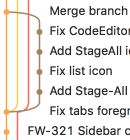
In some cases the branch view can be a bit confusing.
Instead of explaining, let me show an example:
I thought that the brown branch originates from master "Merge Pull Request 44" but in reality the branch starts somewhere further down.
I think it would be best to use different curves for "branching" and "lane changes". Lane changes shouldn't be angular, but smooth.
Here's what I mean:
What do you think?