freeCodeCamp / 2016-new-coder-survey

196 stars 61 forks source link

Add bar charts #48

Closed SamAI-Software closed 8 years ago

SamAI-Software commented 8 years ago

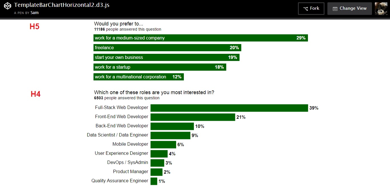
Website preview is here.

Bar charts are responsive (on page refresh), animated (on page refresh) and easy to embed.

Commit Message

HELP WANTED

sarony commented 8 years ago

@SamAI-Software Overall, this looks great! The only thing I'd like to change is to make the graph bars the lighter green (#7ED321) and on hover to make them 1) the dark green they are currently and 2) have white text on the bar that gives the raw number of respondents. I think that'll make the hover interaction more informative.

There are a few very minor styling things like spacing and margin that I'll fix after this is merged (I think it's easier than adding those details to this PR. Otherwise, looks good!

SamAI-Software commented 8 years ago

@sarony got you with colors, will do asap.

and to have white text on the bar that gives the raw number of respondents.

Yes, that was planned in the beginning and .csv file has this data and I've found cool library for tips, but then I've faced a few problems, because the bars are horizontal. I will try to add this feature later on. :+1: Btw, do you mean for H4 format only? https://files.gitter.im/SamAI-Software/UO6O/BarChartsHorizontal_H5H4.jpg

sarony commented 8 years ago

@SamAI-Software for consistency's sake, I think it would be best to stick with the H4 format for the bar graphs. How does that sound?

SamAI-Software commented 8 years ago

I think it would be best to stick with the H4 format for the bar graphs. How does that sound?

@sarony sounds not so good to me :) Because I do like H5 and most ppl also voted for H5. Also I've seen at stackoverflow that they use different styles of labels at the end of bars and it doesn't look bad.

Of course, if we put H4 and H5 on one line, then it will look weird. h4 h5

But anyway we will need to rearrange all bar charts to tell users a story. And when H4 & H5 are on the different lines, they look pretty good, aren't they? h4 h5_difflines

Also H5 are responsive on scale (it's important for web developers and ppl who open the website with landscape mode and then switched to portrait mode), but H4 are responsive only on refresh of the page, because the left and right space for the titles/texts are fixed with px.

However, the H5 have a problem with hover, it doesn't work when hover on titles/labels. I didn't find a solution yet. I've tried to add hover for classes .barLabel:hover, .barTitle:hover, play with z-index, even put an empty div with position: absolute; top: 0; left 0; width: 100%; height: 100%; z-index: 1000 and put hover on it, but it still didn't work out. Probably it's something to do with the way d3.js creates this elements. If you or somebody else can help to fix this problem, then it will be great, otherwise it make sense to disable hover for H5 or even get rid of H5 at all.


Anyway, I do like H5 and I'd like to keep it, but I'm emotionally attached to it, because I've spend a lot of time to make different formats, which is not good for decision-making. So in the end of the day it's up to you and @QuincyLarson to decide if we gonna use all formats H4, H4d & H5, or we gonna use only one of them.

And btw, I made it very easy to change formats, so you don't need my help for that, if you will suddenly decide to change it later on.

barCharts("HasHomeMortgage","H5", "5", "5");

Just change H5 to H4 and adjust left and right margin.

barCharts("HasHomeMortgage","H4", "35", "45");

SamAI-Software commented 8 years ago

@sarony, I've changed the colors, preview is here (don't forget to refresh) With CN color the whole website looks lighter, which is fine, but H5 looks pretty bad. I've used 02_CN_black_white for now, but I can change it, as you will choose the best one. Here are different variants to choose from: ##_barColor_H4labelColor_H5title&labelColor

01_CN_CN_white

h4 h5_ 7ed321_1


02_CN_black_white

h4 h5_ 7ed321_2


03_CN_black_black

h4 h5_ 7ed321_3


04_FCC_FCC_white

h4 h5_ 006400

sarony commented 8 years ago

@SamAI-Software I think it looks great in the preview, nice job! As far as the H5 vs H4, I don't have a strong opinion, just that we be consistent in our design whenever possible. For example, if we have a yes/no bar graph, I think we should pick one or the other, and not use both. I picked H4 is because it was more accommodating for the graphs that have very small numbers, where you can't fit the percentage in the bar, so we could use it everywhere. If we use both H4 and H5, I'd like there to be some logic on how we choose one or the other, as right now it looks like it's a random decision. Does that make sense?

Also for the responsiveness of the H4, I think you're right, that's really important to have. Is that something we can work on? I'm wondering what it would take to get that to work? You seem to know your stuff, so let me know if that's a big task! :)

SamAI-Software commented 8 years ago

I'd like there to be some logic on how we choose one or the other, as right now it looks like it's a random decision.

@sarony, it's not random. I used this logic.

if (H5 ==:cool:){format = H5;} else if (H4 ==:cool:){format = H4;} else {format = H4d}

Anyway, if we decide to stick with CN colors, then it will make sense to get rid of H5, because if (barColor == CN){return H5 !=:cool:}

SamAI-Software commented 8 years ago

Also for the responsiveness of the H4, I think you're right, that's really important to have.

@sarony

I'm wondering what it would take to get that to work?

:watch: :hourglass: :hourglass_flowing_sand:

QuincyLarson commented 8 years ago

Hi @SamAI-Software,

I think the most important thing is that these are consistent across all of the bar charts. You could potentially move the % to the left side of each bar - then it could always be inside the chart.

We want to make the most of your scarce time. If you can focus on making all of these charts look consistent (even if they are less aesthetically pleasing) we can ship this and maybe revisit it and improve the look later.

As the saying goes, "Done is better than perfect" :)

@sarony would you agree that we should err on the side of consistency and shipping as quickly as possible?

sarony commented 8 years ago

@QuincyLarson @SamAI-Software yes, I agree.

@SamAI-Software when I was talking about the logic, I didn't mean the code logic, I meant the visual logic that the user would see. For example, in this screenshot we have two bar graphs with yes/no options, and we use two different styles. While there might be coding logic that makes sense for using H4 and H5, from the user's perspective, there isn't a semantic reason why those two charts would be styled differently. Apologies for not being clearer in my earlier comment, but hopefully this explanation and the accompanying image is more helpful.

screen shot 2016-06-14 at 3 13 55 am

SamAI-Software commented 8 years ago

@sarony as I said, all bar charts should be reordered for better UX, so I didn't pay attention how they look like together right now.

if (H5 ==:cool:){format = H5;} else if (H4 ==:cool:){format = H4;} else {format = H4d}

Haha, I had a very playful mood a few hours ago, sorry, you didn't get it. My fault. With this fake line of code I mean that I used H5 as the default format, because it's cool/fancy and more responsive, and only if I cannot fit the bar title into H5, then I used H4.

Anyway, you are bosses @sarony @QuincyLarson, so I'll change H5 to H4 now.

As the saying goes, "Done is better than perfect" :)

True, true :+1:

SamAI-Software commented 8 years ago

@sarony @QuincyLarson

Done (refresh)


Extra small screens still look weak (320px) bars320

The simple solution is to make long titles shorter. I already did some "cutting", but I'm afraid to touch some topics, because I'm not a native speaker. If you can cut some of these titles by just 3-5 characters - that would be great! :+1:

Education

high school or equivalent professional (MBA, MD, JD) trade, technical, vocational

Family

married or partnership

Employment

stay-at-home parent, homemaker Not working, not looking

arts, media, sports architecture, physical eng office and admin support police, fire, rescue


Btw @sarony the navbar takes way too much space in landscape mode, it's hard to scroll, keep it in mind.

barslandscape

evaristoc commented 8 years ago

@SamAI-Software and everyone: I think that the effect that Sam is getting from the extra small screen is not that bad for long text... sometimes the bars are not needed... There is also the additional effect of the proportional length of bars changing after resizing: the "message" from the visualization will change if the proportion of bar length is not the same or similar after re-sizing, so at some point not showing them could be a better option...

The rest, I would say @SamAI-Software is doing a great job!

SamAI-Software commented 8 years ago

Preview is here (don't forget to refresh)

If you see any bugs -> screenshot with the px size of a screen plz

Log of changes:

#### Education
high school diploma or equivalent (GED) -> high school or equivalent
professional degree (MBA, MD, JD, etc.) -> professional (MBA, MD, JD)
trade, technical, or vocational training -> trade, technical, vocational

#### Family
married or domestic partnership  -> married or partnership

#### Employment
A stay-at-home parent or homemaker -> Stay-at-home parent, homemaker
Not working and not looking for work -> Not working, not looking

arts, entertainment, sports, or media -> arts, media, sports
architecture or physical engineering -> architecture, physical eng
office and administrative support -> office and admin support
law enforcement and fire and rescue -> police, fire, rescue
evaristoc commented 8 years ago

@sarony:

Sorry for discussing this here:

There were few of us who also tried other type of presentations. One is kris (the map) and the other one is mine. I understand that kris contacted you already. What chance do I have for mine to be also included as an additional viz in the project? See my project below: http://evaristoc.github.io/viz_exer/chartandpie/index.html