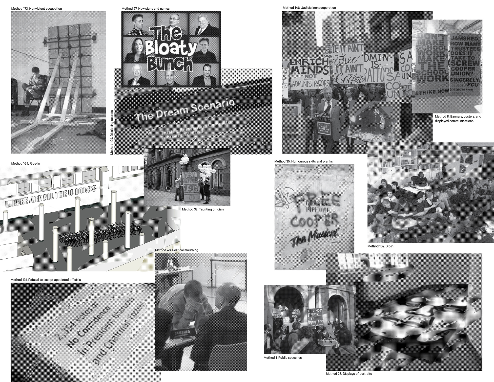
just throwing this out as another option. for sure we should do it on the cover, but it's open to any other image as well. would probably also be smart to recomposite this for smaller screens

Open caseyg opened 10 years ago
just throwing this out as another option. for sure we should do it on the cover, but it's open to any other image as well. would probably also be smart to recomposite this for smaller screens

Great point, I am willing to make a new image or arrangement but i think it would be total okay for smaller screens, keep the same size but just crop it. I trust you to pick an interesting cropping, I can make a specific cropping but, the texture is really nice on screen so even if its small it should be "Same size" just cropped or at least made slightly smaller... does that make sense?
Right now we are loading the same 2000px images for everything on every browser but we can:
if we think about the best instantiation of each image at different sizes/ratios
http://usecases.responsiveimages.org/#art-direction
@troykreiner let me know if you have direction about this. In particular the front page cover image could, I think, stand to be re-composited for large and small screens in vertical and/or horizontal orientations
e.g.
beautiful detail/composition/texture as seen on 30" display:
is totally lost when shrunk without being recomposited for a smaller aspect ratio: