 gabyang
commented
1 year ago
gabyang
commented
1 year ago 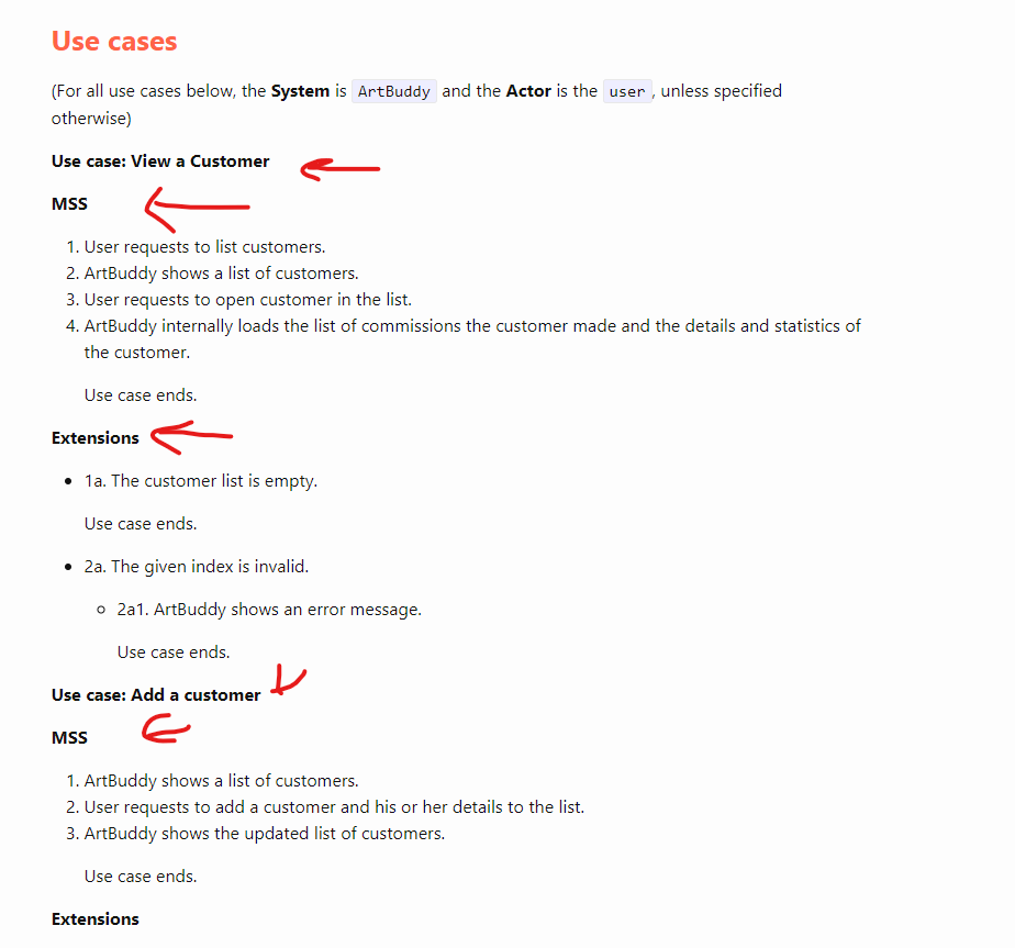
Open gabyang opened 1 year ago
gabyang
commented
1 year ago
 nus-se-script
commented
1 year ago
nus-se-script
commented
1 year ago Hi,
As no description was provided in the bug report, we unfortunately have to mark this issue as unclear. We can only try to guess what issue this bug report is trying to raise:
1. Title sizes in bold (Use case, MSS, Extensions) should be bigger?
We're not sure why your screenshot looks like that- could you perhaps provide us more details on how you are viewing our DG?
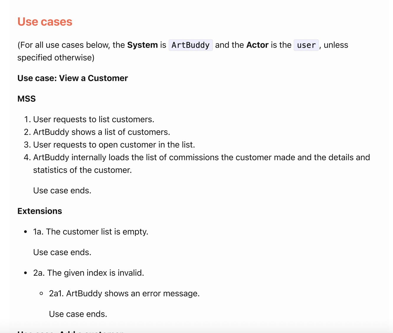
When the PDF version of the DG is viewed using a PDF reader, the title sizes appear bigger and more easily discernible. A screenshot is attached below for your reference.
If you are viewing the web version of our DG (I noticed the text-wrapping of the line "ArtBuddy internally loads the list of commissions the customer made and the details and statistics of the customer." is different from the PDF version of the DG and more consistent with how the web DG renders when viewed in split screen), the text styles might appear differently.
PE instructions specify that the PDF version of the DG should be used, and the fonts appear fine in the PDF format of the DG.
2. Font size of 'Use case' should be different from 'MSS' and 'Extensions?'
No requirements that say different font size or styling must be used for 'Use case', 'MSS', and 'Extensions'. Using a PDF reader, it is still quite easy to read the use cases?
Would be great if we could get more clarification on this bug report, thanks!
Team chose [response.IssueUnclear]
Reason for disagreement: [replace this with your explanation]