gc-proto / design-refresh

Prototypes, research and ideas related to Canada.ca visual design update
2 stars 1 forks source link

There is evidence to support more white space in the overall typography #6

Closed patlaj closed 6 years ago

pcwsmith commented 6 years ago

pasting in an email from @jmealing :

The Effects of Font Type and Spacing of Text for Online Readability and Performance

"... (another font) has more readability as it is more clear, simple, with a high x-height, and with a width set of the right dimensions to support progress of the readability of the on-screen text ... "

This study here is also in favour of increasing spacing for aiding readability and I attached the handy chart.

effectsofleading

.."respondents strongly agreed that they read texts blocks number 4 (Verdana with double spacing) on screen easier than other text blocks ... confirmatory which they prefer double spacing rather than single spacing for onscreen reading purposes ... "

Source: https://files.eric.ed.gov/fulltext/EJ1105535.pdf

jmealing commented 6 years ago

"Negative space has been called “practically synonymous with” and “the backbone of” minimalist interfaces. Many minimalist designers use it as a tool to try to direct users’ attention and allow them to digest content more easily.

Considering these strong assertions of negative space as the defining characteristic of minimalism, it’s surprising that only 84% of the sample sites used substantial amounts of negative space in their designs."

https://www.nngroup.com/articles/characteristics-minimalism/


"The team discovered that for glanceable reading, bigger text is better, irrespective of the dimension being increased:"
https://www.nngroup.com/articles/glanceable-fonts/

jmealing commented 6 years ago

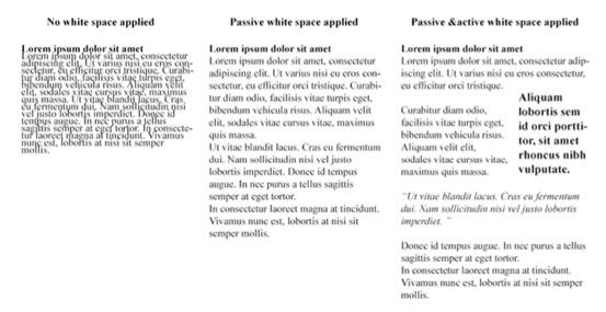
The power of white space:

"In the central example, we’ve added some passive (and micro) white space. Do you notice how much easier you can read it than the first?"

https://www.interaction-design.org/literature/article/the-power-of-white-space

jmealing commented 6 years ago

Boag, P. (2011, February 15) Why White Space Matters.Boag World. Retrieved from: http://boagworld.com/design/why-whitespace-matters/. [2014, June 20]

Boulton, M. (2007).Whitespace. A List Apart. Retrieved from: http://alistapart.com/article/whitespace. [2015, April]

Kollin, Z. UX Myths.Myth #28:White Space Is Wasted Space. Retrieved from: http://uxmyths.com/post/2059998441/myth-28-white-space-is-wasted-space. [2014, June 20]

Kyrnin, J. The Importance of White Space in Web Designs. Web Design Basics. Retrieved from: http://webdesign.about.com/od/webdesignbasics/a/whitespace.htm. [2014, June 20]

Turnbull, C. Using White Space (or Negative Space) in Your Designs. Web Design Tuts Plus. Retrieved from: http://webdesign.tutsplus.com/articles/using-white-space-or-negative-space-in-your-designs--webdesign-3401. [2014, June 20]

DK-TBS commented 6 years ago

Yes! I LOVE it