georgd / EB-Garamond

Digitization of the Garamond shown on the Egenolff-Berner specimen
http://www.georgduffner.at/ebgaramond
SIL Open Font License 1.1
876 stars 68 forks source link

German ß as upper case character #37

Closed LisaLaus closed 1 year ago

LisaLaus commented 11 years ago

Hello, please bear in mind that the German "ß" exists only and exclusively as a lower case character. Therefore, in the SC fonts there should appear "SS" instead of a pseudo-capitalized "ß". I do know, of course, that there exist some persons campaigning for a capital "ß" but this is in no way an official tendency and in all probability never will be. To the contrary, one should better consider this leftover from the old German Fraktur (Garamond is Latin) as obsolete, as practised in Switzerland – but this may be a separate discussion. For the time being and in the official future, a capital "ß" simply does not exist and not implementing it would save the labour of correcting this letter manually whereever the SC font is used. Besides that: great, great work. Thank you for it. Lisa

twardoch commented 11 years ago

In 2010, the Federal German Office for Cartography (Bundesamt für Kartographie und Geodäsie) issued an official recommendation that the capital ß rather than "SS" should be used in all-caps spelling of geographical names which contain ß: http://141.74.33.52/stagn/Portals/0/101125_TopR5.pdf

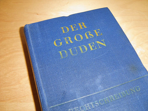
The 2006 spelling reform in Germany clarified the status of ß as a "single consonant letter", while previously it was a hybrid of a single and a double consonant letter. The new spelling rules changed ß to ss in all words where it followed a short vowel, while kept it when it follows a long vowel. So now ß is completely in sync with other letters, and the system is completely logical.

Except in the uppercase. Using the new rules, the spelling "GROSS" for "groß" changes the pronunciation of the word (forcing the O to be short), so keeping this bizarre capitalization rule is very confusing to people who only learn the new spelling rules, i.e. young speakers of German.

Linguistic intuition, common sense and the trends already showing all suggest that the uppercase ß will find wider adoption in future.

Best, Adam

Sent from my mobile phone.

On 08.05.2013, at 12:14, LisaLaus notifications@github.com wrote:

Hello, please bear in mind that the German "ß" exists only and exclusively as a lower case character. Therefore, in the SC fonts there should appear "SS" instead of a pseudo-capitalized "ß". I do know, of course, that there exist some persons campaigning for a capital "ß" but this is in no way an official tendency and in all probability never will be. To the contrary, one should better consider this leftover from the old German Fraktur (Garamond is Latin) as obsolete, as practised in Switzerland – but this may be a separate discussion. For the time being and in the official future, a capital "ß" simply does not exist and not implementing it would save the labour of correcting this letter manually whereever the SC font is used. Besides that: great, great work. Thank you for it. Lisa

— Reply to this email directly or view it on GitHub.

georgd commented 11 years ago

@LisaLaus I do not agree with you on the ß in general. Its new rules after the spelling reform are the only thing that committee got right and the swiss orthography always causes a hickup when reading: Massanzug looks for me like a combination with english “mass” (I read more english than swiss german). However, I do agree on your view to obey official rules. There was a similar quest already which I did follow but I forgot EBG12-sc. I’ll change it there too, but be assured that the day the Duden incorporates the ẞ EBG will reflect this change :)

LisaLaus commented 11 years ago
  @LisaLaus I do not agree with you on
    the ß in general. Its new rules after the spelling reform are
    the only thing that committee got right and the swiss
    orthography always causes a hickup when reading: Massanzug looks
    for me like a combination with english “mass” (I read more
    english than swiss german). However, I do agree on your view to
    obey official rules. There was a similar quest already which I
    did follow but I forgot EBG12-sc. I’ll change it there too, but
    be assured that the day the Duden incorporates the ẞ EBG will
    reflect this change :)
  —
    Reply to this email directly or view
      it on GitHub.

Thank you.  :-) One question: How do
    I get access to Contextual
      Ligatures (final
        s)? In Quarkxpress, even activating Contextual Ligatures does not show
          them.And just for
            my information: Do you plan to publish a new version of
            EBG12 in the nearer
                future?Best
                  regards,Lisa
georgd commented 11 years ago

I don’t know what you mean with contextual ligatures. What should they ligate?

I might do a minor release at the beginning of june.

LisaLaus commented 11 years ago
  I don’t know what you mean with contextual ligatures. What
    should they ligate?

as described and shown on p. 7 in specimen.pdf, see attachment.
  I might do a minor release at the beginning of june.

fine, thx
  —
    Reply to this email directly or view
      it on GitHub.
georgd commented 11 years ago

Ah, in the italic font. Well, I have no idea. Contrary to what I wrote in the specimen, it should be on by default. Which version of EBG are you using?

LisaLaus commented 11 years ago
0.015c

  Ah, in the italic font. Well, I have no idea. Contrary to what
    I wrote in the specimen, it should be on by default. Which
    version of EBG are you using?
  —
    Reply to this email directly or view
      it on GitHub.
georgd commented 11 years ago

Ok. Sadly I don’t have Quarkxpress, so this is a black box for me. It might be a bug in that application. All the tools I have at my disposition render correctly (xetex, luatex, fontforge, firefox and chromium). Do you know some Quarkxpress guru who could help here?

LisaLaus commented 11 years ago
  Ok. Sadly I don’t have Quarkxpress, so this is a black box for
    me. It might be a bug in that application. All the tools I have
    at my disposition render correctly (xetex, luatex, fontforge,
    firefox and chromium). Do you know some Quarkxpress guru who
    could help here?
  —
    Reply to this email directly or view
      it on GitHub.

I tried in Adobe Indesign. Although
      it is an old
        version (CS2) it shows these ligatures correctly. So you are
        right assuming a bug in Quarkxpress and I have to contact them directly. THX for for your help!Lisa
LisaLaus commented 11 years ago

I cannot find the ligature glyphs for final s after a, e, i and u in the EBG12 italic font. Can you give me the exact location? THX, Lisa

georgd commented 11 years ago

They don’t have a code point. Please send me an email (g.duffner@gmail.com)

frakturfreak commented 10 years ago

Please design the ẞ for EB-Garamond. The Duden isn’t the one and only authority in questions of German orthography. And here you have a Duden incorparating the ẞ: http://www.typografie.info/temp/GrosseDuden.jpg

So you can go ahead and include one, maybe as stylistic alternative.

georgd commented 10 years ago

The ẞ already exists in EBG12 and EBGSC12.

frakturfreak commented 10 years ago

Ok, maybe it’s luatex’s fault then, that I can’t get an ẞ when using luatex:

https://gist.github.com/anonymous/11430958

Using the latest version of EBG.

georgd commented 10 years ago

I can’t reproduce your problem. I’m getting ẞ both with XeLaTeX and LuaLaTeX with your mwe. There’s a difference in the engine versions but only in the build date, they’re both the latest from TL2013: XeTeX 3.1415926-2.5-0.9999.3-2013060708 (TeX Live 2013) and LuaTeX, Version beta-0.76.0-2013061708 (TeX Live 2013) (rev 4627) May I see a pdf from your lualatex run?

frakturfreak commented 10 years ago

https://dl.dropboxusercontent.com/u/34624431/luatex-test.pdf https://dl.dropboxusercontent.com/u/34624431/luatex-test.log https://dl.dropboxusercontent.com/u/34624431/xetex-test.pdf https://dl.dropboxusercontent.com/u/34624431/xetex-test.log

-- Edit

I think I found the issue. Somehow luatex uses EBG08 scaled up for the default font size of 11 pt for scrartcl whilst xetex scales EBG12 down.

georgd commented 10 years ago

in this case, luatex is using EBG08 where indeed I haven’t drawn the ẞ yet. Do you perhaps have an older version of the font somewhere else on your machine?

frakturfreak commented 10 years ago

Looks deleting luatex’s font name cache did the trick. All version of EB-Garamond that I have are symlinks to the latest downloads.

doncherry commented 10 years ago

@georgd Would you consider adding a capital ⟨ß⟩ to the lowercase small-caps font? Compare:

\documentclass[12pt]{article}
\usepackage{libertine}
\usepackage{ebgaramond}
\begin{document}
\textsc{Maße}

\libertine
\textsc{Maße}
\end{document}

Output

This would be helpful e.g. for bibliographies with names in small-caps, where it might be desirable retain the ⟨ß⟩.

georgd commented 9 years ago

@doncherry It’s already there. Try with \addfontfeature{RawFeature=+cv47} or \addfontfeature{CharacterVariant=47}.

It might be interesting to provide a package option for this (also for libertine which provides similar functionality but with the capital ß shape as default) but you’d have to request it from Bob Tennent.

doncherry commented 9 years ago

@georgd Indeed, thank you for that hint! I e-mailed Bob Tennent about this issue.