 kocsmy
commented
5 years ago
kocsmy
commented
5 years ago Here's the first draft of the extended left sidebar with parameters and code snippets.
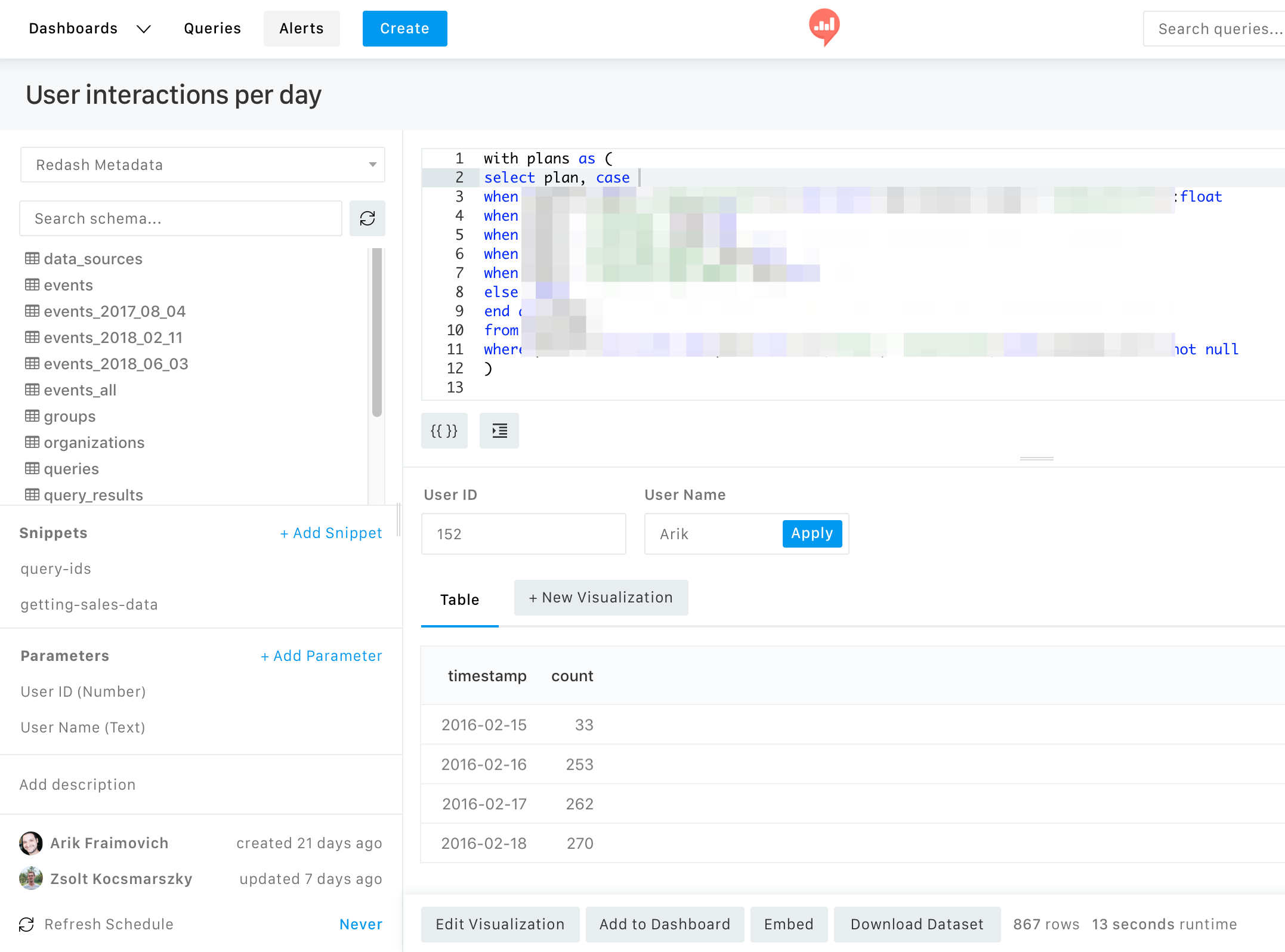
Thoughts:
- Similar to schema, you an insert icon appear while hovering the item.
- The parameter button could be removed from below the editor so we won't show it twice.
- Maybe we should make these sections expandable. So we could only show the header as "Snippets" and "Parameters" and click will expand.
- Query description does not fit there at all for me. We might need to look for a new place for that, maybe just merge it with the meta data right below?
 arikfr


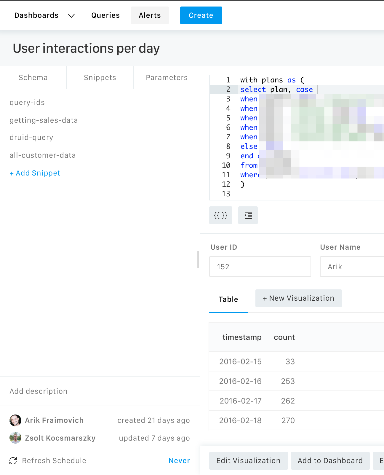
This is not only parameters related, but we can have two additional areas between the schema and the query metadata:
The areas should be collapsed by default (when collapsed they will only show the title of the area), so they don’t take much space.
(we should split this into two separate tasks when we get to actually work on this)