ggobi / ggally

R package that extends ggplot2
http://ggobi.github.io/ggally/
584 stars 119 forks source link

Curved edges in ggnetworkmap #205

Closed maikol-solis closed 7 years ago

maikol-solis commented 7 years ago

Hello. According to this tutorial

https://ggobi.github.io/ggally/ggnetworkmap.html

I see that the flights' example has curved edges.

What is the parameter in ggnetworkmap to achieved this? I have made several examples and I can't get the curved edges.

Best regards.

schloerke commented 7 years ago

Hello!

The argument you are looking for is great.circles = TRUE.

Existing example:

ggnetworkmap(usa, flights, size = 4, great.circles = TRUE,
             node.group = mygroup, segment.color = "steelblue",
             ring.group = degree, weight = degree)

screen shot 2016-10-16 at 4 32 52 pm

Setting great.circles to FALSE

ggnetworkmap(usa, flights, size = 4, great.circles = FALSE,
             node.group = mygroup, segment.color = "steelblue",
             ring.group = degree, weight = degree)

screen shot 2016-10-16 at 4 33 19 pm

Hope this helps!

maikol-solis commented 7 years ago

Thank you for your answer!

Is it possible to have more control on this parameter?

I have a relative small area (my example is Costa Rica), but even with great.circles = TRUE, the graph appears with straight edges. It would be nice if ggnetworkmap could make curved edges independently of the area size. I know that igraph can make this, but it uses the base machinery and not ggplot.

Best regards.

schloerke commented 7 years ago

Short answer: no

the arch of the network map comes from this function: https://www.rdocumentation.org/packages/geosphere/versions/1.3-13/topics/gcIntermediate

The doc's website says to look at http://williams.best.vwh.net/avform.htm#Intermediate . This site states nothing about the radius of the arch, only that it shows a "true" path of flight between to points.

Since you are looking at Costa Rica, there would be very minimal arch in the lines given the size below and the example above.

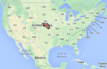
Size comparison to Costa Rica

maikol-solis commented 7 years ago

Ok I understand, gcIntermediate controls the curved edges and not ggnetworkmap nor ggplot directly. This parameter is more geographical than esthetic to my understanding.

Maybe you could consider make an extra parameter for curved edges without using gcIntermediate that make curved edges only to improve the clarity of the graph. I don't know if ggplot is capable of such thing.

Best regards.

maikol-solis commented 7 years ago

Hi!

I searched a little about curved edges with ggplot but I couldn't find something similar (and practical) as ggnetworkmap.
However, I see that ggplot2 has geom_curve (http://docs.ggplot2.org/current/geom_segment.html) which produces really nice curves with arrows.

Do you think that something like this is doable for a network graphic? I could try to implement this, but I don't know where start to start?

I appreciate any help.

Best.

curve

curve

curve

schloerke commented 7 years ago

Hi Maikol,

This question would be better asked on Stack Overflow (or another forum site) as it doesn't pertain to bugs or requests for GGally.

I believe I understand where you're going for, so here's a good start!

####################################
#### taken from ggnetworkmap example
####################################

invisible(lapply(c("ggplot2", "maps", "network", "sna"), base::library, character.only = TRUE))

## Example showing great circles on a simple map of the USA
## http://flowingdata.com/2011/05/11/how-to-map-connections-with-great-circles/
airports <- read.csv("http://datasets.flowingdata.com/tuts/maparcs/airports.csv", header = TRUE)
rownames(airports) <- airports$iata

# select some random flights
set.seed(1234)
flights <- data.frame(
  origin = sample(airports[200:400, ]$iata, 200, replace = TRUE),
  destination = sample(airports[200:400, ]$iata, 200, replace = TRUE)
)

# convert to network
flights <- network(flights, directed = TRUE)

# add geographic coordinates
flights %v% "lat" <- airports[ network.vertex.names(flights), "lat" ]
flights %v% "lon" <- airports[ network.vertex.names(flights), "long" ]

# drop isolated airports
delete.vertices(flights, which(degree(flights) < 2))

# compute degree centrality
flights %v% "degree" <- degree(flights, gmode = "digraph")

# add random groups
flights %v% "mygroup" <- sample(letters[1:4], network.size(flights), replace = TRUE)

# create a map of the USA
usa <- ggplot(map_data("usa"), aes(x = long, y = lat)) +
  geom_polygon(aes(group = group), color = "grey65",
               fill = "#f9f9f9", size = 0.2)

####################################################
##############        plot code      ###############
####################################################

# get points
plotcord = data.frame(
  lon = as.numeric(flights %v% "lon"),
  lat = as.numeric(flights %v% "lat")
)

# get edges
edges <- network::as.matrix.network.edgelist(flights)
edges_mat <- data.frame(
  x = plotcord$lon[edges[,1]],
  xend = plotcord$lon[edges[,2]],
  y = plotcord$lat[edges[,1]],
  yend = plotcord$lat[edges[,2]]
)

# make plot with usa in background
usa + 
  geom_point(data = plotcord, mapping = aes(x = lon, y = lat)) +
  geom_curve(
    data = edges_mat, 
    mapping = aes(x = x, xend = xend, y = y, yend = yend), 
    arrow = arrow(length = unit(0.03, "npc"))
  )

screen shot 2016-11-08 at 10 56 29 am