Open furshift opened 1 month ago
Ha, I created this because so many of the other options are hot garbage!
Are you thinking something like this?
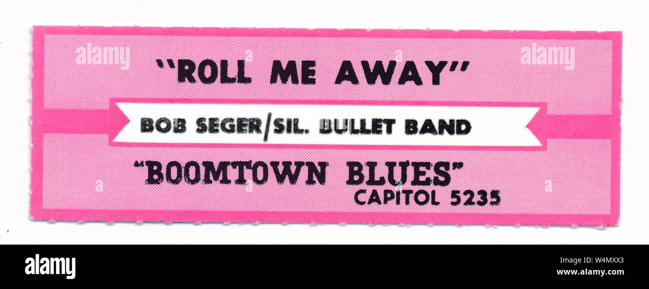
That's definitely possible. I haven't looked at the thicker borders before so I will have to try a few to get it right. Your Wurlizer will probably be very close to mine (2400) so if I can get it right on my boards, it should work great on yours.
I made this a Design option. Go to Design
at the top, and look for Thick Borders
:
The thick borders will be applied to all title strips. Please try and let me know if the borders are thick enough.
Ha, I created this because so many of the other options are hot garbage!
yeah ive got thru dozens of them at this point and are hot garbage in 1 way or another, as if half of the needs are afterthoughts
i litteraly found mom n dads 45s a few weeks ago and have cataloged all of them(well cared for and dont look played) artist, a/b sides, year, label, ID(i have label/id split for cleaner filing would splitting them be to much trouble?) and then i took the trouble to do, condition, and collection source with special being used for white label, dj copy, promos etc..just shy of 400 of em
heres my format Side A | Side B | Artist | Record Label | Year | Manufacturer ID | special | copys | collection | sleeve | damage | wear 1-10 |
ANYWAY....back on topic lol
so far in testing ive run across 2 things genre only holds on "arrows" and gets removed if you change it to any other style(i prefer diamond myself)..worse if you change it back its simply gone from the import not sure what else i can say on that is kinda weird lol, also noticed it auto adds "hit" to the other side for genre, any chance of having that a blank field? even the ability to put say "rock" on both sides would feel a little cleaner as listing genre doesnt always mean it was a hit LOL..but if it was a second blank field and useable in all styles anything "usefull" could be plugged in there from year to rating
any chance of adding "year"....bottom or top left would probably be ideal, ..i think in the early 80s i remember it being in the top left but memorys a bit fuzzy lol
the only other request id have aside from color variety..you got the pink tho so thanks for that.your really only missing yellow
i mean aside from some deep editing of adding a color pallet, ..so maybe just a "dark" and "light" versions..IE the red you have now would be light and a deeper truer red would be the dark...or maybe call it light/vivid?...its really more of a finding that sweet spot on the color tones so they "pop" like they should..my 3700s have a factory "tint and glare" film between the glass and the strips so it washes the colors out, but it keeps most of the light IN the box and not glaring on the ceiling LOL
btw this is by far the cleanest most intuitive and usefull labler out there, and i thank you for the effort youve put into it
on the thick boarder ill run a batch thru fedex and let ya know...i print on 80lb paper as it lets very little light thru but the cards feel neer perfect
Nice find on the 45s! Sadly I never inherited any, but I started my collection when I was a kid, so I have plenty these days.
The "genre" only applies to the "Arrows" style, because it doesn't really work with the other styles, and historically only came on the "Arrows" design. The Christmas themes don't have anywhere to put the text and the "Diamond" style doesn't really have enough usable space. I tried it just now, and this was the result: Even the four-letter "Rock" doesn't fit on the right. Perhaps this was why it wasn't ever used for this style.
The word "HIT" on the left was selected largely because that's what the original request was and nobody ever asked for anything else, but I can add a field in so you can select what it says - you could repeat the genre, or add in "Stereo", or whatever you like. I'll working on adding that for you.
I try to keep the title cards created by this true to the originals, so if you have examples of colors I'm missing that are true to the originals, I would be more than happy to add them! Just include images, or links to them and I'll get them included. The same applies for any styles or fonts that are missing that you would like to have added.
I'm glad you find it useful, if there's anything else that can be added, just let me know!
i see what you mean on the arrows, makes total sense, but having the "hit" changeable to stereo/mono or whatnot would be very usefull even if it doesnt work in diamond..a healthy mix n match makes a juke have more character anyway
honestly its been DECADES since i saw OE labels.. sitting at the bowling alley tossing quarters in the juke i do remember "year" being on the labels somewhere on the left side as it helped me find alot of the surfer stuff i was looking for..., and hell it may have even been on the arrow ones opposite the genre....and it may very well have been something that just that bowling alley did on the title strips?...i remember it being in similar "fine print" as the label/id and on the left in a corner
all said your font selection is spot on, and as mentioned the only thing i see with the colors is light/dark...but that could have just been "who printed them and how long they had been in service", i will say that in my 3700 they feel like they have been in service for a decade..not a complaint persay , but if i swap one out it doesnt stand out as "hey someone serviced this machine and slipped a couple new tunes in it" as that was always a dead give away of the brighter vivid fresh print labels back in the day
im going to dig up some examples of the light/dark colors tho...and i just happened to run across a shot of the "other" diamond, yellow, and the "line box? version where youve got stereo on one side and the record rpm on the other side https://i.ebayimg.com/images/g/LYcAAOSwxjVmvAU4/s-l1600.webp
id ask about the "stars" but i always thought that looked silly
here is what id call double diamond, which might give a way for genre and ? https://i.ebayimg.com/images/g/5LcAAOSwcfFl7Hzc/s-l1600.webp
heres a taste of what i was talking about of light vs dark faded vs vivid https://www.ebay.com/itm/365108729631?_skw=jukebox+labels&itmmeta=01JADV6VFVVNGWC3X9HQ8BX9V6&hash=item55022d171f:g:ax8AAOSwcE1mwAIW
VS a never used strip still with its 45 https://i.ebayimg.com/images/g/x18AAOSwNjFnEUZi/s-l1600.webp
ok so im working with a pair of Wurlitzer 3700's, and just finally got your program figured out, however, its missing a few color options, specifically the pink often found in alot of boxes when i was growing up that was the most common color in them
the second issue is the boarders are paper thin, is there any way to adjust the boarder size so that theirs still a nice thick boarder after print?..its so thin now there wont be a boarder once cut
jukebox create a label 3.0 is a good example of both the color and boarders im talking about...i tryed using it and its hot garbage, aside from having all the colors and options for templates