 0rAX0
commented
11 years ago
0rAX0
commented
11 years ago It would be interesting for me if the new curvy look could be adapted/merged with the current Adwaita style so Firefox could keep some of its "personality".
Closed garrett closed 10 years ago
0rAX0
commented
11 years ago It would be interesting for me if the new curvy look could be adapted/merged with the current Adwaita style so Firefox could keep some of its "personality".
 garrett
commented
11 years ago
garrett
commented
11 years ago Agreed. It would be nice to experiment with mockups. Thankfully, there's a bit of time still before this hits an official nightly, so we should have more than enough lead time for mockups and implementation.
garrett
commented
11 years ago Feature pages: https://wiki.mozilla.org/Firefox/Features/Theme_Refinement_and_Evolution_%28Australis%29 https://wiki.mozilla.org/Tab_Strip_Visual_Redesign https://wiki.mozilla.org/Features/Desktop/Panel_Menu https://wiki.mozilla.org/Arrow_Panel_Redesign
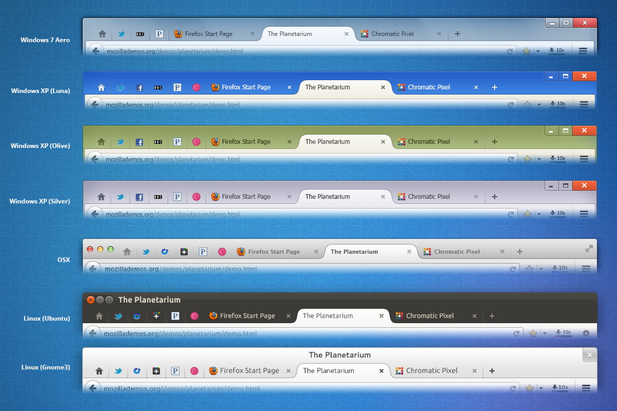
Tab mockups (including Linux): https://wiki.mozilla.org/images/0/0c/Australis-i02-Tabs.jpg http://people.mozilla.com/~shorlander/files/australis-designSpecs/australis-designSpecs-linux-mainWindow.html
Latest UX branch builds: https://ftp.mozilla.org/pub/mozilla.org/firefox/nightly/latest-ux/?C=M;O=D
garrett
commented
11 years ago Most of the mockups and documents are a year old at this point. (The tab comparison across OSes is from March 2012, for example.)
This means it may have been changed somewhat from the mockups. We should be aware of this and see what the latest UX builds are actually doing.
garrett
commented
11 years ago Firefox 22, 64-bit snapshot: https://ftp.mozilla.org/pub/mozilla.org/firefox/nightly/latest-ux/firefox-22.0a1.en-US.linux-x86_64.tar.bz2
Firefox 22, 32-bit snapshot: https://ftp.mozilla.org/pub/mozilla.org/firefox/nightly/latest-ux/firefox-22.0a1.en-US.linux-i686.tar.bz2
There are also Firefox 21 builds. I wonder when this will realistically land, however...
0rAX0
commented
11 years ago I have installed the UX build two days ago, FF looks like the mockups minus the toolbar and the shiny stuff. I'll do some research on this but I doubt the general look is going to change drastically. Thanks for the links!
Also, probably related, the circular 'back' button is part of FF's identity/signature*. Should we also keep that too?
 seleznev
commented
11 years ago
seleznev
commented
11 years ago Firefox 22, 64-bit snapshot
- It looks sucks. :(
- It isn't broke our theme now.
- How to get source code? I can not find.
0rAX0
commented
11 years ago It looks sucks. :(
lol
0rAX0
commented
11 years ago Still not polished enough and the tabs are not the same. Just experimenting with colors and shapes. Also, I started with the round button to discuss it first. But I'm open to suggestions. :)

seleznev
commented
11 years ago @0rAX0, perfect! It should be default view of Firefox. :)
However, it isn't compact design. And it worries me. I think, we should create a lightweight version for users with enabled the "Use Small Icons" checkbox.
0rAX0
commented
11 years ago @seleznev I'll try the new tab design first. :P
0rAX0
commented
11 years ago Curvy tabs:

Curvy Tabs. Private Browsing:

Also, killed the wasted space.
seleznev
commented
11 years ago @0rAX0, round button was look better. %)
garrett
commented
11 years ago Here's what the UX preview branch currently looks like:
 This is quite meta, huh?
I should note that when I first ran it, I didn't notice anything out of place. I had our theme enabled, and all looked correct.
One option, especially for the short-term, is to just keep our same style and port over any other changes (which are undoubtedly going to be the web development, and it happens to look the same for now, in my build).
I still think it's worth exploring further of course. (:
Something that should be pointed out is how even more necessary our theme becomes if this upstream style lands without a lot of fixing up on Linux. Hopefully they'll make it better. (Am I correct in assuming that it's not going to be ready for at least a little while longer too, if this is the state of it?)
garrett
commented
11 years ago Oh! I forgot that tabs-on-top is the upstream default. Here's a new screenshot:
 Browserception!
Okay, this isn't as bad, but still...
0rAX0
commented
11 years ago @seleznev Yes, I still have that. :)
@garrett Yeah, we shouldn't change anything in the theme until:
But just in case Mozilla actually delivers this time, maybe we should have a ux branch or something specifically for the new look(different from upgrade-to-22).
Something that should be pointed out is how even more necessary our theme becomes if this upstream style lands without a lot of fixing up on Linux. Hopefully they'll make it better.
One of the benefits, I guess, of merging the two styles is to only have minimal issues to worry about, the rest would be delivered to us from the upstream elders! :)
(Am I correct in assuming that it's not going to be ready for at least a little while longer too, if this is the state of it?)
That is so correct. :(
Okay, this isn't as bad, but still...
Your Browserception is confusing you, this is so bad it's hurtin'. :D
garrett
commented
11 years ago Yeah, we shouldn't change anything in the theme [...] maybe we should have a ux branch [...] different from upgrade-to-22
Agreed on all points!
One of the benefits, I guess, of merging the two styles is to only have minimal issues to worry about, the rest would be delivered to us from the upstream elders! :)
As always! This is my philosophy whenever possible. (:
Browserception is totally confusing, but it had to be done...
garrett
commented
11 years ago Just saw this: https://mail.mozilla.org/pipermail/firefox-dev/2013-May/000405.html
Summary: New UI will land in Firefox 25 on June 24
I think our strategy will be to port over changes to dev tools only for that release (as that's the bulk of what's been changing between releases), and then work on cherry picking or porting our theme on top of the new stuff after the release.
seleznev
commented
11 years ago 
Will UX branch be merged with beta (after release Fx 24)? Now it based (?) on nightly branch and it can create problems for us. Also I can't find nice topic by Mozilla about upgrade themes (!, not extensions) for support Fx 25. :(
seleznev
commented
10 years ago I think, Australis is a great opportunity to try rework many things. And I want try to use it.

But I have some questions. @0rAX0, @garrett, can you help me?)
UPD:
Also, I haven't icons for change encoding, dev tools, save page buttons.

UPD2:
Toolbar on about:addons page looks strange:

UPD3:

0rAX0
commented
10 years ago Hey, Sorry I'm late:
garrett
commented
10 years ago Perhaps we should keep the theme as-is style-wise for the tabs, for now, as nothing else in GNOME is using anything different.
The menu looks good enough to ship to me. We could customize it further if we wish, but I don't consider it a blocker.
We might want to change the gear to a symbolic screwdriver-and-wrench similar the GNOME 3.10's right-side combined menu though. (And if we do that, we'll probably want to do the same to the other icons to match the style... so this kind of counters what I just said about it being fine.)
So, I guess the ideal thing, IMO, would be:
I guess point 1 should probably be needed, for consistency, whereas 2 and 3 would be really nice to have.
Also, should the background color be changed to match application menus a bit more?
Perhaps we want to copy the new gnome-tweak-tool design for the settings... but that doesn't address the oddness of the top bar.
Can we play around with flexbox CSS to make it align differently? Do we even want to do this?
The GNOME search patterns to look at are in gnome-tweak-tool, Documents, and Nautilus. There's no clear answer. It doesn't look bad in the second screenshot — I'd consider this lower-priority and we can revisit it later if we don't get it in this round of updates.
Looking pretty good so far.
Are we able to support non-UX and UX builds of Firefox just fine in the same theme?
seleznev
commented
10 years ago a FF bug?
May be. I don't know. :(
Are we able to support non-UX and UX builds of Firefox just fine in the same theme?
Yes, but only after merge ux into nightly/aurora/beta.
0rAX0
commented
10 years ago Perhaps we should keep the theme as-is style-wise for the tabs, for now, as nothing else in GNOME is using anything different.
Hmmm, okay...I'll keep experimenting nonetheless. :P
We might want to change the gear to a symbolic screwdriver-and-wrench
I have another idea. Change Firefox's settings icon to screwdriver-and-wrench? I think I can make something in the same style. With this we don't have to change the other icons to symbolics. Watcha think?? :sunglasses:
Also, should the background color be changed to match application menus a bit more?
We could try. I don't see a problem with keeping it though.
Perhaps we want to copy the new gnome-tweak-tool design for the settings
I'm for updating the design, yes. Maybe. :)
Can we play around with flexbox CSS to make it align differently? Do we even want to do this? (...)
What do you have in mind?
0rAX0
commented
10 years ago I made a replacement icon for the gear icon. Now there is no conflict. :)

Please use this. (I only have the PNG since I needed Photoshop to make a nice inner-shadow like the original. :P)

garrett
commented
10 years ago I just downloaded nightly, as the new UX has been merged in. It seems as though tabs on top is not just the default, but setting it the other way is no longer an option. Obviously, it impacts our theme. There might be a way to work around it (perhaps with changing the order in flexbox?)
Also, making the window and widgets have an unfocused state when using another window is now enabled by the default theme in Linux. Perhaps the issues with that have been improved?
In addition, it's interesting that the toolbar customization UI has been revamped and now allows for customizing the "menu". We might want to think about supporting that. If so, I should look into making a custom SVG filter for Inkscape that automatically can apply the effect to glyphs... or we can just go totally GNOME-symbolic.
Regardless, I think these changes mean that we will probably have to rethink parts of the theme.
garrett
commented
10 years ago Oh, the add-on bar went away too. All the icons that were put there are now in the toolbar, apparently.
0rAX0
commented
10 years ago Ok, @garrett wait a second, how come I'm the only one in the world who still have the old theme in Nightly? Australis is in 28.0a1, right?
garrett
commented
10 years ago @0rAX0: Yes, Nightly is 28.0a1. Be sure you're on a recent nightly, as they just flipped the switch yesterday. (In other words, make sure you're updated to the 2013-11-18 build).
0rAX0
commented
10 years ago @garrett Weird, installed it yesterday night after the announcement. I'll check again.
0rAX0
commented
10 years ago Yep, fixed.
0rAX0
commented
10 years ago Can we have a summery/tasklist for what needs to be done here? @garrett @seleznev
seleznev
commented
10 years ago Obviously, it impacts our theme. There might be a way to work around it (perhaps with changing the order in flexbox?)
#TabsToolbar {
  -moz-box-ordinal-group: 200; /* default is 100 */
}
However, it isn't good solution. We can't do anything with it in the theme.
Also, making the window and widgets have an unfocused state when using another window is now enabled by the default theme in Linux.
Where is it? I don't see. :(
Also, it's build from my experimental branch. It works (but not perfect, of course) with Fx 25,26 and 28 in one time. %)
garrett
commented
10 years ago Here are the new GNOME tabs; they're in the gtk/gnome-themes-standard master already: https://wiki.gnome.org/GnomeOS/Design/Whiteboards/Tabs (Scroll way down, past the wireframes.)
Close buttons would only be on hover and "only have a dot or nothing for background tabs". (According to Jakub.)
The code for GNOME 3.12 will probably be released around March 17: https://wiki.gnome.org/Schedule
...and Firefox 28 is slated for release the week of March 18: https://wiki.mozilla.org/RapidRelease/Calendar
So, I think we might want to be targeting the new style tabs for Firefox 28 / GNOME 3.12.
0rAX0
commented
10 years ago @garrett I've been following the iterations here on Github for a while now. The problem is: is this gonna look right with tabs on top?
garrett
commented
10 years ago @0rAX0: Yeah, that's my concern too. I think we should seriously think about flipping the tabs and URL bar with CSS, perhaps exactly how @seleznev suggests. I guess the theme tweak tool could undo it, but the point of our theme is to integrate Firefox's look with the desktop... and the desktop pretty consistently has toolbar and then tabs, not the other way around. I'm not familiar with any GNOME app that has tabs on top.
garrett
commented
10 years ago "Australis has landed in Firefox Nightly 28, but target release is Firefox 29 not 28." via: https://twitter.com/FirefoxNightly/status/403504171330338816
This would bump the release date of the new UX to 2014-04-29, making it even more of a logical choice to go full-in on the new style tabs.
seleznev
commented
10 years ago I pushed the new ux branch. It has separate dirs for Australis files (browser-29 and global-29) and should work fine with current Aurora builds. However, it needs polishing.
UPD:

seleznev
commented
10 years ago I added shadow for panels. It should look more like popovers now:

UPD: And yet another nice screenshot (fullscreen):

UPD2: gnome-firefox-28.2b1.xpi
UPD3: TODO List:
UPD4:

seleznev
commented
10 years ago We must decide whether to use symbolic icons in the main menu. We use symbolic icons for some extensions (like Stylish), and defaults for all another now. It isn't fine.

How it can be looks:

My userstyle for test: https://gist.github.com/seleznev/ed947e996db7d5d9f5ac
0rAX0
commented
10 years ago Add missed icons.
What missing icons?
We must decide whether to use symbolic icons in the main menu. We use symbolic icons for some extensions (like Stylish), and defaults for all another now. It isn't fine.
Last time someone said something about using SVG filters to make our symbolic icons look like default ones, what happened?
seleznev
commented
10 years ago What missing icons?
Icons for #nav-bar-overflow-button, #social-share-button buttons.
Last time someone said something about using SVG filters to make our symbolic icons look like default ones, what happened?
Was it final decision? Oops...
look like default ones
Did we talk about icons with "inner shadow"? I don't see any shadow in current Mozilla's icons now. :(
0rAX0
commented
10 years ago #social-share-button This has a share equivalent in the GNOME icons.
#nav-bar-overflow-button What's the filename? :)
Was it final decision? Oops...
I dunno, but someone said that it can be done.
Did we talk about icons with "inner shadow"? I don't see any shadow in current Mozilla's icons now. :(
Yes, I noticed in the screenshots. I guess it's less work for us! \o/
seleznev
commented
10 years ago What's the filename?
Screenshot of the button:

Icon is in ./theme/chrome/browser/Toolbar.png file now. ;)
seleznev
commented
10 years ago share equivalent in the GNOME icons
send-to-symbolic.svg or emblem-shared-symbolic.svg?
0rAX0
commented
10 years ago Screenshot of the button:
Should be easy to do. What branch are you working on?
./theme/chrome/browser/Toolbar.png
I don't have nightly atm :(
emblem-shared-symbolic.svg looks better. :)
seleznev
commented
10 years ago What branch are you working on?
All in the upgrade-to-29 branch.
I don't have nightly atm :(
But it's path in our theme (in vanilla for ex.). :\
0rAX0
commented
10 years ago in our theme
Ah, sorry, I'm slow today. :P
seleznev
commented
10 years ago I forget about this icon:

0rAX0
commented
10 years ago @seleznev Can icons be colored when you move them to the menu? Or do we need two sets?

New style tabs landed in upstream. http://mikeconley.ca/blog/2013/03/01/australis-curvy-tabs-more-progress/
On the plus side, they are curvy and overlap. We should study them to see if anything they do may help our rendering of tabs.
Also, this means that whenever this lands in Firefox proper, it will be more difficult to adapt for that release. (We need to be prepared for this.)