gnunn1 / tilix

A tiling terminal emulator for Linux using GTK+ 3
https://gnunn1.github.io/tilix-web
Mozilla Public License 2.0
5.39k stars 293 forks source link

Tilix 1.8 UX issues & design proposal #1541

Open mjourdan opened 5 years ago

mjourdan commented 5 years ago

@gnunn1, I think (but am I mistaken?) you are not fond of big changes, but still, I use Tilix for a couple of years now, so I open this in the hope to contribute.

Review

Issue #1330 raised interesting concerns regarding "bookmarks", input sync and cluster management. There is indeed a couple of issues with the UI which requires some improvements:
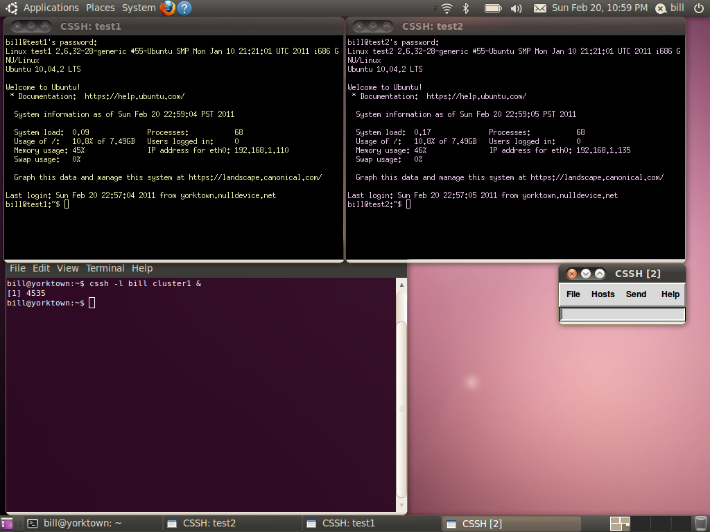
  1. it's hard to understand if actionning a button will affect the whole window, the current session, or the active terminal.
  2. space is wasted by terminal decoration
  3. it's sometimes hard to distinguish between sessions
  4. input sync is a really basic feature, but it is quite hidden
  5. bookmarks is a really powerful feature, yet it is somewhat messy and hard to use
  6. some features (like cluster shell support) would be really nice to have, but would not fit well

Screenshot:

screenshot

Proposal

Hopefully the following changes would make Tilix more convenient to use:

  1. clearly separate things and refine buttons placement
  2. avoid duplication and show the name of the active active terminal only
  3. use colors in addition to layout and session name
  4. make input sync obvious by adding an input bar
  5. split bookmarks into meaningful components: inventories, folders, and commands

That would look like this:

proposal

RFC

Thanks for reading. Now, feel free to comment!

FFY00 commented 5 years ago

I think removing the split terminal specific menus would be nice but adding an input bar is awful. That would kill a lot of shell functionality. The Inventories things seems kind of unpractical and really just like bloat as you can just ssh whatever.

gnunn1 commented 5 years ago

First thank you very much for putting together these mockups and I really appreciate it. There are some really cool ideas in there and some stuff I'm not too sure about. Give me a few days to review and think then I'll respond with some detailed comments to further discussion.

gnunn1 commented 5 years ago

Thanks again for putting this together, here are my thoughts on it:

  1. I quite like the idea of the "floating" controls for the terminal window in the upper right, I'm not sure how feasible this is to implement though. This would likely be done as an overlay and I'm not sure if the overlay would interfere with the lines of the cover it covers. By interfere I mean prevent things like clicking links or selecting text. I'll definitely play around with this though.

  2. If the transparent bar works, I like the idea of the blue/grey dot as a way to show focus. It's much cleaner then what I'm doing with dimming or as some others have suggested putting a border around the terminal. Great idea.

  3. Your idea about inventories somewhat mirrors my thinking that I had in issue in #1085 that I called Assistants. The idea is to encapsulate the various accessory functionality like bookmarks, passwords, process monitoring, etc in a separate pane. I was thinking of something that was always visible whereas you are doing fold-out pane which is actually easier to implement in many ways.

Does combining all of these things into a sidebar make sense to you and if so thoughts on how to represent it from a UI perspective?

  1. When you mention inventory and users loading existing inventories, are you referring to this as per the Ansible concept of inventories or something else? i.e. Where are these inventories being maintained that tilix should load if tilix is not doing it?

  2. I like the UI for the inventories and the way you drill into categories instead of a treeview which is what I think the image with "Production", "staging" and "hpc" is showing but how do you go navigate back up the heirarchy again?

  3. The idea of the input bar at the bottom is not technically feasible, for various technical reasons you have to edit in the terminal itself, it cannot be done outside. Synchronized input works not just for commands at the prompt but with vi, emacs, etc and I want to keep it that way.

  4. I'm not keen on adding a bottom bar in general, I don't think separating functionality into top and bottom panes makes sense from a UI perspective. Maybe I could see it working it is as something that pops up when the mouse hovers near the bottom edge but that has it's own set of issues in terms of discoverability.

Thanks again for taking the time to do this, while I may not agree with everything you presented I do think there is a lot there to get me excited about in terms of trying some new things. Have a look at my comments and let me know what you think, I'd love to continue the discussion.

gnunn1 commented 5 years ago

So I took a few minutes and quickly hacked out the floating controls as per the screenshots below. The good news is that I can get the overlay positioned in a way where it doesn't interfere with clicking or selecting text except for exactly where the controls are positioned.

The bad news is that while it looks wonderful in a relatively clean terminal, it becomes problematic in a non-clean terminal as per the second screenshot. Thoughts?

screenshot from 2018-10-06 12-58-39

screenshot from 2018-10-06 12-58-54

mjourdan commented 5 years ago

Thank you for your comment!

I think removing the split terminal specific menus would be nice but adding an input bar is awful. That would kill a lot of shell functionality.

Input bar would not replace the traditionnal per-terminal input, it would be used for pushing commands across separate terminals (which would allow to bookmark commands, etc).

The Inventories things seems kind of unpractical and really just like bloat as you can just ssh whatever.

Well, when you are dealing with hundreds or thousands of hosts is separated environments, with different naming conventions, simply opening a single ssh is not so straight.

However, the two features above are best used combined altogether to solve #1465. They allowto open several ssh connections at once by picking up a list of hosts to connect to. Then send the same commands to all.

Though I am not sure how technically feasible it is to display the actual input in the bar: as far as I remember cssh input bar always stays desperately empty. That would mean the recent/bookmarks stuff could not work like represented on the mockups.

mjourdan commented 5 years ago

By interfere I mean prevent things like clicking links or selecting text. I'll definitely play around with this though.

  1. Using cli, Just scroll up a bit more and overlay should never be a problem… except for the very first line of the terminal. This may become annoying with text editors and consoles, though.

  2. Thanks!

Your idea about inventories somewhat mirrors my thinking that I had in issue in #1085 that I called Assistants

  1. I wasn't aware of issue #1085, this is really the same kind of stuff indeed!

Does combining all of these things into a sidebar make sense to you and if so thoughts on how to represent it from a UI perspective?

Not sure about all these things. Probably they should be discussed separately. For instance, passwords. Could you describe concrete use cases? I think it would be nice to integrate with the password manager with the desktop password manager, like Seahorse (which is about to get a new design) or Passbook (a new 3rd party app), don't you?

  1. Yeah, I had Ansible in mind but actually that could be anything that lists hosts. You are right, for Terminix users who do not already use that specific kind of inventory, the UI should probably allow to maintain such a thing. On the backend side, there is plenty of already existing stuff: Ansible or Cluster Shell use static files, whereas VMware, Kubernetes, or AWX (Ansible Tower) have their own set of API. My point here is there already exists several ways to represent lists of hosts, there is probably one format which could be reused by Terminix. Which one? Probably the simplest, or the most widely used, I don't know. Have you any thought on this?

  2. I fixed the mockups. Good catch!

  3. For that matter, see above my reply to FFY00.

  4. I won't argue since it seems the input bar just can't work.

Thanks again for taking the time to do this, while I may not agree with everything you presented I do think there is a lot there to get me excited about in terms of trying some new things. Have a look at my comments and let me know what you think, I'd love to continue the discussion.

Thank you for welcoming this proposal and discussing it. Actually thee subjects you raised pushes me to consider things I never thought about, so it's really interesting. I would be glad to push the effort further!

mjourdan commented 5 years ago

The bad news is that while it looks wonderful in a relatively clean terminal, it becomes problematic in a non-clean terminal as per the second screenshot. Thoughts?

I updated the mockups (look at the bottom) with a hypothetical solution for that. Tell me what you think.

FFY00 commented 5 years ago

@mjourdan commented on Oct 7, 2018, 2:54 PM GMT+1:

Input bar would not replace the traditionnal per-terminal input, it would be used for pushing commands across separate terminals (which would allow to bookmark commands, etc).

When doing this, we are killing interactive support. For an real example, please try something like the fish shell.

You can try it in a browser here: https://rootnroll.com/d/fish-shell/

gnunn1 commented 5 years ago

Just an FYI, I'm swamped at work for the next couple of weeks so I won't be able to look at this greatly for a little bit.

mjourdan commented 5 years ago

When doing this, we are killing interactive support. For an real example, please try something like the fish shell.

Sorry, I can't see how interactive support would not be affected by input sync, and would be when using an input bar?

Anyway, thanks for Fish, I was aware of it but never gave it a try, until your post : )

Just an FYI, I'm swamped at work for the next couple of weeks so I won't be able to look at this greatly for a little bit.

Ok!

For convenience, I moved overlay experiments here.

FFY00 commented 5 years ago

@mjourdan commented on Oct 15, 2018, 5:34 PM GMT+1:

Sorry, I can't see how interactive support would not be affected by input sync, and would be when using an input bar?

Anyway, thanks for Fish, I was aware of it but never gave it a try, until your post : )

Well, it comes to the way of implementing it. If you emulate the last shell line then it wouldn't kill support, but this includes emulating the colors and updates too. @gnunn1 might have a better insight on this but I don't believe it's really easy to implement something like that.

mygithubthrowaway commented 5 years ago

in my opinion the last things to revamp for making tilix the best terminal emulator ever (TM) is more ui on bookmarks, some ideas:

Thanks btw for all your work @gnunn1!

mjourdan commented 5 years ago

Hey there, I made some more mockups to experiment with assistants / bookmarks. Comments are welcome!

brokenpip3 commented 5 years ago

Hey there, I made some more mockups to experiment with assistants / bookmarks. Comments are welcome!

I love this mockups

stuaxo commented 5 years ago

I didn't even know there were bookmarks.

The bookmark-ish/naviation thing I'd find super useful, (but no idea how the UX would work) is some awareness of where different commands output starts and ends -

The user, runs a few commands, each of which output a lot of log information.

You want to be able to:

At the moment, both are tricky (especially with a trackpad), and get more tricky when there are multiple commands with lots of output.

While I realise I should redirect these sorts of things to logs, it's not always what you do in the heat of the moment.

Tilix gets some special output in PS1, so finding the boundary between commands might be possible.

mjourdan commented 5 years ago

Some more mockups.

bookmarks-experiments

Any thought, @gnunn1 ?

Lecrapouille commented 5 years ago

Firstly, I would thanks Tilix which changed my life since I discovered it recently :) I did not like Terminator, in the way that Tilix is more robust (and Tilix code is easy to read :+1: ). Secondly, thanks @mjourdan for your good knowledges in UX that is something I do not have, so it always nice to read this kind of review and learn from this.

But I'm not a huge fan about your icons in the corner (blue dot, the arrow ...). I think you can simply remove them (or move them into the Popover when your right click with the mouse). I'm a Emacs user and I customized my emacs to remove all GUI stuffs, buttons to use the whole windows size, ... I configured it to activate (get the focus) the current buffer when the mouse entered the window. The bottom bar changes of color (grey -> purple) so I know witch buffer is active. See my screen-shot

emacs

With Gtk+ you use the enter/leave focus events. I think with Gtk+ you can add a color on borders of widgets (the whole terminal). Another solution is to change the background color of the terminal (lighter vs. darker).

I know some people does not like mouse auto-focus but you can show the terminal focus when you click on it. Anyway a good Emacs user will never use its mouse ;) it'll just add keyboard shortcuts :)

So I took a few minutes and quickly hacked out the floating controls as per the screenshots below. The good news is that I can get the overlay positioned in a way where it doesn't interfere with clicking or selecting text except for exactly where the controls are positioned.

The bad news is that while it looks wonderful in a relatively clean terminal, it becomes problematic in a non-clean terminal as per the second screenshot. Thoughts?

screenshot from 2018-10-06 12-58-39

screenshot from 2018-10-06 12-58-54

mjourdan commented 5 years ago

@Lecrapouille , using darker colors for unactive terminals could indeed improve readability, I think! Regarding the buttons you dislike, they are kept for discoverability, while allowing us to remove the terminal bar. I don't see how your suggestion would work outside of emacs? Borders don't work so well it seems.

mjourdan commented 5 years ago

As seen earlier in this issue, sessions are not always easy to distinguish. So, here is an experiment for a nicer overview of what you are doing in tilix:

activity-overview

Comments are welcome (even if I don't always reply really fast)…

mjourdan commented 5 years ago

@gnunn1, do you think the mockup above could solve or at least mitigate issue #1627?