 phw
commented
5 years ago
phw
commented
5 years ago Regarding translations you can help updating them at https://hosted.weblate.org/projects/tilix/translations/
Although I don't think we should translate orange with gelb and purple with magenta etc. If the colors really should be named differently I think the English source text should be updated first.
 egmontkob
 fbruetting
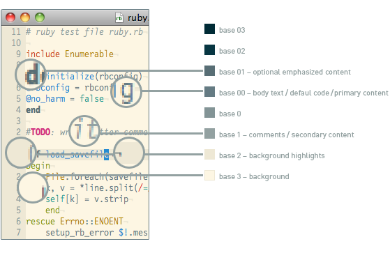
 gnunn1
In the solarized palette, most intensivated colors are diverted from their intended use and instead carry gray tones. It’s no wonder that this leads to issues. One case for example arises in the Julia language, as the Julia prompt uses green/yellew/red colors according to the respective mode. Of those colors, only the red one has a matching intensivated tone, which leads to gray and indistinguishable prompts / modes in the other two cases.
The hack version would be to just deactivate the “show bold text in intensivated colors” option, so that the regular colors get used, instead of the intensivated ones (which in fact are shades of gray).
Maybe a better solution would be to really split the Solarized Dark and Solarized Light palettes in two palettes, as the Dark variant just uses the two black and the two bright gray tones, whereas the Light variant just uses the two white and the two dark gray tones. Then the four colors green, yellow, blue and cyan could be duplicated, so that the palette can really work like it should.
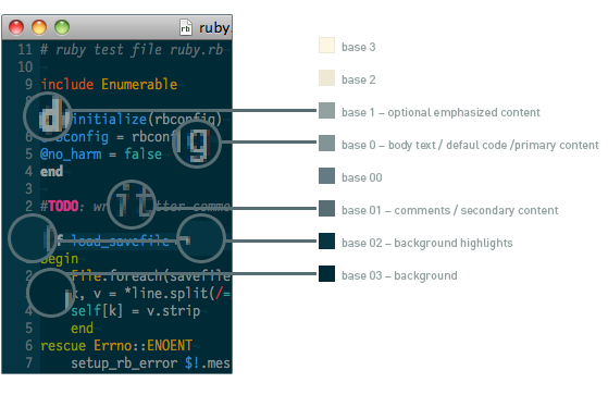
By the way: Another thing I recognized, is that in the german translation, the color terms “Orange” / “Lila” / “Türkis” / “Grau” (english: orange/purple/turqoise/gray) are falsly translated and should be “Gelb” / “Magenta” / “Zyan” / “Weiß” (english: yellow / magenta / cyan / white) instead. [0]
[0] https://opensource-usability.blogspot.com/2018/11/why-linux-console-has-sixteen-colors.html