 gopherbot
commented
7 years ago
gopherbot
commented
7 years ago Change https://golang.org/cl/69130 mentions this issue: godoc: add alt attr to gopher on main package index
Open jimmyfrasche opened 7 years ago
gopherbot
commented
7 years ago Change https://golang.org/cl/69130 mentions this issue: godoc: add alt attr to gopher on main package index
gopherbot
commented
7 years ago Change https://golang.org/cl/69150 mentions this issue: godoc: better distinguish links and link state
gopherbot
commented
7 years ago Change https://golang.org/cl/69190 mentions this issue: godoc: add label and button to search bar
gopherbot
commented
7 years ago Change https://golang.org/cl/69210 mentions this issue: godoc: accessible permalinks
gopherbot
commented
7 years ago Change https://golang.org/cl/69171 mentions this issue: godoc: avoid skipping heading level in package docs
 jimmyfrasche
commented
7 years ago
jimmyfrasche
commented
7 years ago I created a wiki page for anyone who wants to help out or to make sure that tools they create are as accessible as possible: https://github.com/golang/go/wiki/WebAccessibilityResourcesAndTips
 ghost
commented
7 years ago
ghost
commented
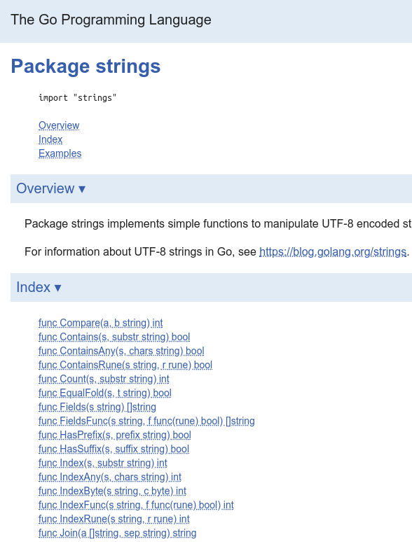
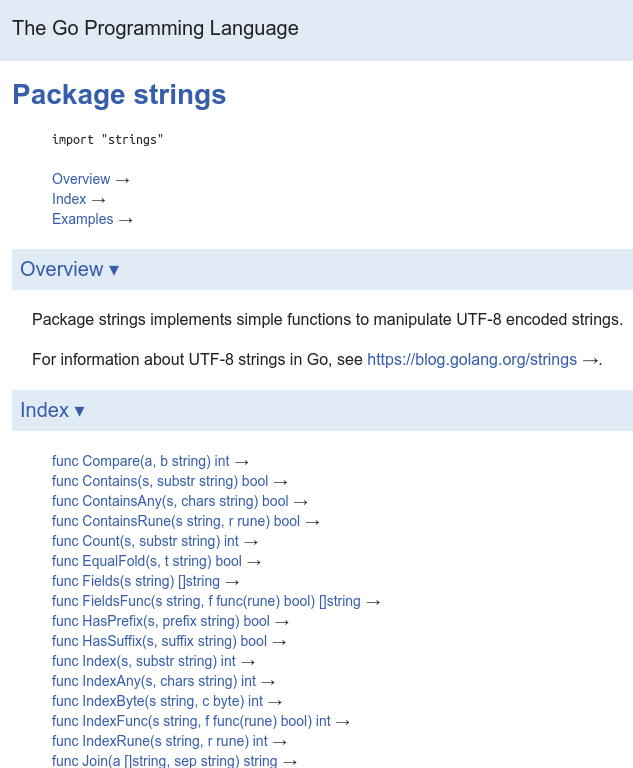
7 years ago @jimmyfrasche IMO the underline effects in CL 69150 makes the docs look messy, especially in the package table of contents. I'm curious if anyone else feels that way.

jimmyfrasche
commented
7 years ago @bontibon The purpose is to distinguish between clickable and not clickable elements. That means having to distinguishing them by both shape and color. This helps users who have trouble seeing certain colors, a monochrome display, and new users who haven't acclimated to the fact that you can click "func Count(s, substr string) int" but not "Package strings" despite them both being the same blue.
 dsnet
commented
7 years ago
dsnet
commented
7 years ago I find the underlines fairly hard to read. Perhaps we should keep the underline, but make it an opacity of 30% or something.
 griesemer
commented
7 years ago
griesemer
commented
7 years ago cc: @rsc
I strongly agree with @bontibon: This new look is quite ugly in my mind. When we started on godoc, we made the deliberate decision to not have the underlines. Also, all the section titles now have a paragraph symbol at the end (see e.g. https://tip.golang.org/doc/). Overall, the graphic quality of golang.org has deteriorated significantly here.
I am all for accessibility, but surely the answer is not to make golang.org less accessible for the majority of people. I'm taking part of the blame here since I gave the go-ahead signal but then didn't really look at the changes.
Going forward, I suggest:
Significant visual changes to godoc really need some vetting before they are committed. There's a lot of fine-tuning that went into godoc in the first place; let's not undermine that work.
Let's revert the underbar change. It's really bad, graphically (also no faint underbars please).
Instead, make it possible to enable underbars if desired. Perhaps there's a link to a web-page version with accessibility features enabled. I suspect it may require as little as a different .css.
In summary, let's provide accessibility without compromising the vast majority of users.
Thanks.
 paranoiacblack
commented
7 years ago
paranoiacblack
commented
7 years ago I'd like to note that as a colorblind person with mild deutranopia and tritanopia, I find this much harder to read overall, despite the anchor tags standing out. In general, I'm not really a fan of using text-decoration as a color blindness accessibility signal. If you really want to use text-decoration, though, it'd probably be better to settle on subtle dotted lines with a clear line-height between the anchor tag and the underlined text.
Are there any other approaches being considered here? If the goal is to distinguish links by not only color alone, a different font (like a fixed width font that stands out on a coding page) might be better suited.
jimmyfrasche
commented
7 years ago I'm going to respond out of order but try to hit everything. Please let me know if I missed anything.
In the future, I will post in this thread with screenshots whenever I make a CL that changes visuals in any way so everyone knows that something unhappy is afoot. Other than these and a small contrast tweak here or there, there should only be one other as far as I can tell, though: visible hover/focus states for buttons and button-themed links. Regardless, I'll look forward to more thorough reviews.
@griesemer The ever-present pilcrows (¶) are because if they're not always there's never a way to get to them to without using a mouse. In the first patch set, they were pushed further to the right and de-emphasized to counteract them always being visible. Even if that had made it, it looks like it wouldn't have meshed well with underlines and would require its own formatting. But for that matter they don't work with the toggled sections either. Maybe that feature needs more of a holistic re-think—that was certainly the minimal patch.
we made the deliberate decision to not have the underlines
I don't have any vision or motor deficiencies that would make a lack of underlines on links troublesome for me. Generally, I think no underlines looks better, but there are more considerations to balance than just aesthetics.
I'm not a fan of how it works on godoc. The headers and links being the same color, especially when all or part of a header is a link, means I have to guess whether something might be clickable and check by hovering over the link.
I've been using Go a long time and by now I've roughly memorized everything that is and is not a link so it only shows up as sometimes clicking a header and realizing that it's not a link. It's as small as an inconvenience can get, but it's still irksome when run across.
If I did have a motor deficiency and were new to Go, it could take actual effort and strain to position the mouse to check (which I would have to do until the keyboard accessibility is 100%). If I had total color blindness on top of that, I'd have to do that for every word in every page. It would not be a welcoming experience to the language.
surely the answer is not to make golang.org less accessible for the majority of people
I agree that the change that ended up being pushed is less than ideal. I think that the readability could be improved (see below) without as great an aesthetic impact.
Instead, make it possible to enable underbars if desired. Perhaps there's a link to a web-page version with accessibility features enabled. I suspect it may require as little as a different .css.
A css file with for the visual issues would be quite small. The mechanism to enable that stylesheet would likely not be as small. And such a mechanism would of course itself have to be both accessible and easily discoverable or it would be of little use to those who need it. Like with any configuration option, it would require changes to be tested both with the accessible stylesheet enabled and disabled, except few will, so when there are any changes that need additional handling in the accessible stylesheet it will tend to lag behind the main stylesheet.
A style that is readable and acceptable to everyone would be simpler and better for everyone.
@dsnet The original CL for the underlines in fact had the underline color at 50% opacity to counteract the harsher interactions, particularly with the pkg-index:

Here's a variant with the text color at .3 opacity:

Here's a dotted line as @paranoiacblack suggests. It may work better in conjunction with one of the above, this one is just the same color as the link:
Unfortunately the only way to adjust the underline's position to the text is to fake it with it a border or box-shadow. That has a lot of edge cases and requires a bit of code to cover everything, but here's a very rough sketch using border. It does have its virtues and might work better with a transparent border and it would need some more spacing, as noted:

Just to round out the options in case it gives anyone ideas, another tact is to attach an icon of some sort as a signifier, akin to the ▹/▾ used for collapsible sections:
I'm not a designer by any means so if anyone has better ideas I'd love to hear them.
dsnet
commented
7 years ago The ever-present pilcrows (¶) are because if they're not always there's never a way to get to them to without using a mouse.
If that's the rationale, we should use CSS and/or JS to detect mobile and display it permanently only in that situation. Given that Go is mostly developed on desktops or laptops with full browsers, it seems sensible to prioritize making sure things looks nice on that platform first.
jimmyfrasche
commented
7 years ago @dsnet it has nothing to do with touch (though that benefits as well) it's about people who can't use a mouse or find it difficult and all of the devices to aid accessibility that work by synthetic keyevent.
griesemer
commented
7 years ago Again, I am all for accessibility but we should do it right and not compromise one experience for a slightly improved experience for others. The result will not be satisfying for anybody.
A css file with for the visual issues would be quite small. The mechanism to enable that stylesheet would likely not be as small. And such a mechanism would of course itself have to be both accessible and easily discoverable or it would be of little use to those who need it.
I don't see why this mechanism is complicated. We serve the html which is generated via templates. It can't be too hard to replace the .css reference to a different one; perhaps based on a cookie.
jimmyfrasche
commented
7 years ago Sorry if I was unclear. I meant not just the mechanism to include the alternate stylesheet, but the mechanism in the user interface of the site allowing one to enable the alternate stylesheet.
There are probably other configuration options that would eventually get exposed: maybe being able to set the default GOOS/GOARCH in addition to a per-package UI, as requested in #22178 . Not very useful when running a local godoc but I'm sure it could be handy for someone using tip.golang.org. Since it's a general settings page, it would probably suffice to have a gear icon in the navigation bar that goes to the settings page.
If it turns into a grab bag, it won't be immediately apparent that you need to go there to turn on visual accessibility settings—few sites offer such choices, even in config so it's not something one learns to expect. It would be discoverable though and certainly better than nothing.
If it stays focused on accessibility settings, a generic gear icon wouldn't be wrong but it would be sort of deceiving—everyone would click it to see what fun config parameters can be messed with. To make it clear that it is solely for accessibility settings, it should be so labeled. But having something named "accessibility settings" would take up quite a bit of real estate in the navigation menu, so it's going to get pushed down somewhere else. The label would be more appropriate but the overall discoverability would be worse since it would itself be harder to find. One compromise would be to put in the navigation bar but slightly out of the way:

Another compromise would be to more selective about where to include visual indication and by having an appropriate variety of stylings based on context. Things like the package index could be considered sufficiently self-evidently navigation to be exempted. Links in headers could have their own appropriate style and links in general text areas another.
 andybons
commented
6 years ago
andybons
commented
6 years ago We are looking to roll master to golang.org, so I’m going to revert the changes to the underlines and permalinks since those seem the most contentious.
@jimmyfrasche please don’t interpret this as being unappreciative or dismissive of the work you’re doing, because we are very happy you’re doing it and this is very important work. Feel free to open another set of CLs (revert the reverts if you like) so that we can better discuss the design decisions with the relevant people.
gopherbot
commented
6 years ago Change https://golang.org/cl/73151 mentions this issue: Revert "godoc: better distinguish links and link state"
 agnivade
commented
6 years ago
agnivade
commented
6 years ago I just ran a google lighthouse test on the godoc page and we have a 97% score on accessibility.
<html> element does not have a [lang] attribute.I believe setting the lang attribute to "en" should fix it according to this site https://dequeuniversity.com/rules/axe/2.2/html-lang-valid. @jimmyfrasche - Any reason you have set the missing lang on html tag (difficult) item to difficult level ?
jimmyfrasche
commented
6 years ago Lighthouse is the least useful a11y analyzer I've ever seen. I would recommend only using it if you need to triage major issues on an extremely inaccessible site, since that seems to be all it is concerned with.
The SiteImprove chrome extension is the best one I've found (though it sometimes nags about signing up for their newsletter or somesuch, but that can be skipped).
Even so, these are all static analyzers and, as such, while quite helpful, they have occasional false positives and many false negatives. Also, the criteria they're evaluating (WCAG) are necessarily a bit vague. The real test is if you can use the site exactly as well regardless of assistive technology or any temporary or permanent loss of ability.
That is obviously quite hard to evaluate. In practice a good proxy for this is to:
It can be quite hard to get all of those 100% so the goal is to get them as close as is possible within reason.
I marked the lang tag as hard because while the language of the document itself is en, the language of a given's documentation need not be.
agnivade
commented
6 years ago Thanks. But isn't the lang attribute supposed to contain the language of the document ? Or are you saying that there are translations of godoc, in which case the lang attribute needs to be dynamically set or sth ?
jimmyfrasche
commented
6 years ago Godoc can display arbitrary user packages. The site will be in en but the documentation for a given package might be de or ja or anything else. I am unsure if there would be side effects from not also marking those correctly. To even attempt to mark them correctly would require some kind of program to analyze the docs and guess the language or an out of band way to specify the BCP 47 tag of a package.
agnivade
commented
6 years ago Got it. Thanks for the clarification.
This is a meta issue for improving the accessibility of godoc.
If you discover an issue not in the above list, please report it here so that it can be addressed.
If you want to help out and aren't sure where to start or just want to make sure that tools you create are as accessible possible, see (or update!) WebAccessibilityResourcesAndTips on the wiki.