golang / go

The Go programming language
https://go.dev
BSD 3-Clause "New" or "Revised" License
123.93k stars 17.66k forks source link

x/pkgsite: Accessibility Color Contrast Problems #51480

Open feketegy opened 2 years ago

feketegy commented 2 years ago

Would it be possible to change the color contrast on the pkg.go.dev website so people with color blindness or other eye deficiencies could enjoy and use the website better?

I made a test with the a11y.com tool to see the contrast between various colors on the website and the colors highlighted in the screenshot were problematic, these colors are mainly used in links, titles, and code backgrounds.

Screenshot

image

What did you do?

  1. Go to: https://color.a11y.com/Contrast/
  2. Test a pkg.go.dev internal page, I tested: https://pkg.go.dev/encoding/json
beoran commented 2 years ago

In stead of relying on a tool which only simulates color blindness, you should ask people who have color blindness, like myself. Since the go website uses white as the background color, and black or blue as the foreground, the contrast is sufficient for me. Unlike, say the python docs which use green or yellow backgrounds... 😛

Of course, color blindness is very personal, so I would like to hear the opinion of a few other color blind people. But I can tell you that most tools like a11y are unhelpful since they do not and cannot describe what people like me actually see. For me the Go website is fine.

feketegy commented 2 years ago

@beoran Is there a tool that you would suggest that comes close to what you're experiencing and what the tool tells you?

I asked a couple of people with color impairments and they told me that the a11y is good.

beoran commented 2 years ago

@feketegy, That is the problem, I haven't found any particular tool that is correct for me, and I tried a dozen on so. As I said color blindness is very personal. I but the Go website is fine for me.

I think it would be best to try to ask the opinions of several color blind people before making any changes. If you make changes based on just a tool in stead of people, you risk making it worse for some people as well.

jamalc commented 2 years ago

Thanks for this feedback. Ensuring pkg.go.dev is accessible for all users is a top priority and we always take contrast into consideration when choosing colors to use on the site. Are there specific elements you can point to on this page that you find problematic? It's difficult to pick out exactly where the the issues are using the text alone.

feketegy commented 2 years ago

My test was done on a package doc page.

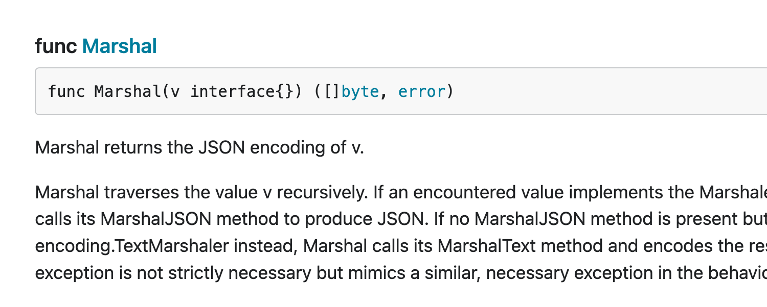
The main issues are the blue links don't have enough contrast:

image

Also, the code examples grey background against the text don't have enough contrast:

image
beoran commented 2 years ago

Personally don't see too much problems here, but if we really must increase the contrast a selectable high conrast theme could be the solution. The code examples could be white on black as in a terminal. The links could be underlined so they stand out better no matter what the color.

gopherbot commented 2 years ago

Timed out in state WaitingForInfo. Closing.

(I am just a bot, though. Please speak up if this is a mistake or you have the requested information.)

luctalatinian commented 6 months ago

Note that all of the dark theme's contrast ratios are within WCAG boundaries. As far as I can tell though the only way you can select the theme used is through OS-level display settings (e.g. the "Appearance" settings tab in macOS).

The light theme's colors are very close, I submitted https://go-review.googlesource.com/c/pkgsite/+/584175 to pull everything within prescribed ratios.

An interactive way to toggle the theme used is probably the ideal long-term solution.

bkaws commented 5 months ago

Hello, any updates on the submitted PR that fixes the color contrast accessibility issue?

bkaws commented 3 months ago

@jamalc still looking for an update on the PR we submitted to fix the color contrast issue for light mode based on the WCAG 2.0 standards. The issue was flagged during an accessibility audit and we are still looking for a resolution. If you are not going to accept the PR that fixes the issue, can you let us know so we can share with the auditor? Thank you.

bkaws commented 3 months ago

@dmitshur @mvdan hello, could you folks please let us know whether you'll accept the PR we opened for the pkg.go.dev documentation pages to be WCAG 2.2 color contrast compliant? If you suggest a different approach, could you please let us know and we can revise the PR? I'm sure you appreciate that addressing accessibility issues for our customers is a top priority and we have not had any communication about this issue or the PR opened from the maintainers since 5/8. Thank you.

Edit: cc: @hyangah who reopened this issue and @jba, @findleyr who reviewed another PR of ours for another accessibility fix.