Closed wpdarren closed 2 years ago
I've made a start on the IB, addressing the y-axis label inconsistency between zero-data and gathering data states.
However, the issue of the axis labels being truncated is a bit tricky to determine a solution for. As such I have a couple of questions, for @wpdarren and @felixarntz respectively.
Before tackling the y-axis side of things, I would like to mention that I've not actually been able to reproduce the x-axis label truncation.
@wpdarren, I'm not sure if something could have changed since this was raised, I've tried with Chrome 99.0.4844.74 and Safari 15.3 on MacOS 12.2.1, and Chrome 99.0.4844.74 on Ubuntu 21.10, running develop
(currently at commit d1ebb0f15c2e0e74c308a032e535ad7f1e9c63ce). Could you please check again to confirm it does still happen, and let me know what you're testing it on?
As for the y-axis labels:
Reducing the vAxis
maximum value from 2500
to 100
(see the first part of the IB) actually mitigates the truncation problem to a large degree. For example, viewing UserCountGraph
in Storybook at the "Small mobile" viewport, 320px, only the topmost label is truncated. At 330px the label is no longer truncated.
In order to prevent truncation at this narrow viewport, I have identified a couple of approaches. However, they are not perfect, as the result is a bit inconsistent with the broader graph usage.
It should be noted that the truncation itself is a function of the Google graph renderer, which does some calculation to determine if the text will fit and truncates if not. In other words it's not a CSS ellipses which might allow us to override the style.
Reduce label font size. The default is 12px. Bumping down to 11px is an easy way to fit more label text. We potentially could do this at a given breakpoint, and only for the zero/gathering data state. However, 11px is a bit on the small side, and this would also introduce a bit of inconsistency if we're only reducing the font size in a handful of scenarios.
set( chartOptions, 'vAxis.textStyle.fontSize', 11 );
Flip the vAxis.textPosition
property to in
, thus displaying the labels inside the graph. This works well but again adds some inconsistency compared to the broader graph usage (unless we flipped it for all graphs, but then the axis labels are liable to display over the graph lines).
set( chartOptions, 'vAxis.textPosition', 'in' );
Tweak the chartArea
settings to provide more space for the labels. This provides a bit more control but I think would probably be difficult to manage given the responsive and varied nature of the charts.
chartOptions.chartArea = { left: 0, width: '90%', height: '90%' };
See https://developers.google.com/chart/interactive/docs/gallery/linechart?hl=en#configuration-options for more info on the chart options.
@felixarntz, could I get your input on the above? Could it be the case that we don't even need to worry about the truncation if it's only occurring in the ~320px viewport range? Otherwise, what are your thoughts on the suggested solutions?
Thanks for taking a look!
cc @aaemnnosttv
@techanvil
Reducing the
vAxis
maximum value from2500
to100
That makes sense to me. However, since the 100
is still getting truncated at the smaller viewport, why don't we make that maximum even lower for the "gathering data" state? There won't be any date, so technically the maximum could be as little as 1. How about using something like 10
or 20
?
If the above fixes the y-axis truncation, then we should be good with that. Otherwise, I'd be leaning towards reducing the chart area size as needed, which is something we've done before when similar truncation problems were occurring. Let's not change the font size or make the labels inset though, that would be a more drastic design change we should avoid.
Hey @felixarntz, thanks for taking a look.
That makes sense to me. However, since the
100
is still getting truncated at the smaller viewport, why don't we make that maximum even lower for the "gathering data" state? There won't be any date, so technically the maximum could be as little as 1. How about using something like10
or20
?
That did occur to me too, but (sadly) I realised that in some cases we are using 100
because the data point is represented as a percentage so keeping 0-100
for the y-axis makes those graphs look more consistent with no data...
With that in mind, shall we proceed in the direction of tweaking the chart area?
@techanvil Ah, good point. In that case I agree tweaking the chart area makes most sense.
@techanvil the 2nd point on my comment related to x-axis. I am wondering if its because I am testing on a 13" MacBook Pro? I am using the latest version of Chrome and have created a screencast. It's still an issue on mobile and desktop.
Hi @wpdarren, thanks for sharing your clip, can see it plain as day there. However I can't explain why I am not seeing it here. I've tried on a 13" MacBook Pro, and have recorded a similar clip to yours to demonstrate:
Does anything stand out to you that could explain the difference we're seeing? Maybe we'll need to ask someone else with a similar Mac to try it on theirs...
@techanvil this is an odd one! I see that the (...) appears at 1206 and smaller pixels. I look to have the same Chrome version, but the MacOS is different but surely that can't be the reason? Are you using the 'gathering' option on the tester plugin, or, is it a new site that is in gathering state with no forcing in the testing plugin? These are the only two things I can think of.
Hey @wpdarren, thanks for pointing out the MacOS version. This does appear to make the difference! Having upgraded to Monterey I can also see the ellipses. FWIW I was not using the "gathering" option on the Tester plugin, in fact hadn't realised it was there, so that's another useful piece of knowledge shared.
Fortunately I have now managed to figure out a fix for the x-axis cutoff, and have updated the IB accordingly. Cheers!
Instead, generate a sequence of ticks from
startDate
toendDate
. The ticks should beDate
instances. This should override anything inchartOptions.hAxis.ticks
.
- This ensures a
discrete
sequence and allowshAxis.allowContainerBoundaryTextCutoff
to work in its defaultfalse
state - see developers.google.com/chart/interactive/docs/gallery/linechart?hl=en.
@techanvil according to the docs, hAxis.ticks
is only supported for a continuous axis.
Also, it says "For a discrete axis, set the data column type to string
" in contrast to the suggested Date
type. From what I've seen this is the only factor that determines the axis type.
I'm guessing you've probably tested this so it seems something is not consistent here 😄 Thoughts?
@techanvil according to the docs,
hAxis.ticks
is only supported for a continuous axis.Also, it says "For a discrete axis, set the data column type to
string
" in contrast to the suggestedDate
type. From what I've seen this is the only factor that determines the axis type.I'm guessing you've probably tested this so it seems something is not consistent here smile Thoughts?
Hi @aaemnnosttv, thanks for pointing this out. I've totally managed to misread the docs here :facepalm:, but as you've guessed I have tested this out and it's a legitimate fix, in my opinion, as it fixes the truncation and is in line with other instances of the graph using real data where hAxis.ticks
is populated with Date
objects.
With that in mind I'm going to remove the erroneous point about being a discrete
axis from the IB and leave the implementation as it is. Hopefully that sounds OK to you! :)
Thanks @techanvil !
IB ✅
Hi @aaemnnosttv, further on the above discussion about the hAxis
truncation, unfortunately during implementation I have discovered that the "fix" of setting the hAxis.ticks
does not in fact work as desired in all cases.
Having generated the ticks, I noticed that the labels can still be truncated, for example as seen here on the Analytics All Traffic widget:
I spent a bit more time trying to find a fix. I tried generating a discrete
axis for the graph, using the string
datatype with the axis labels then coming from the data set. Unfortunately though, I still found the label would truncate, as seen here for example, on the Search Funnel widget:
In the end I took a step back and revisited the original Bug Description, which specifically mentions the Search Funnel widget as being the problematic chart for the x-axis truncation. Revisiting the chart options for this widget, I noticed the chartArea
was set to width: 100%
but with a left
value of 60
. Being full width but with a left offset seems conceptually a bit off so I tried reducing the width and found that 90%
ensures the truncation no longer occurs at any viewport width, in my testing. The same fix is applicable to the SiteStats, AnalyticsStats, SearchConsoleStats and Stats components which also use the width: 100%
/left: 60
values and display the same truncation.
The problem with setting the width to 90%
is the amount of empty space it introduces at wider viewports. It's ok at a mid-range one, for example:
And narrower too:
But a wider viewport leads to a more significant area of empty space, to the right of the graph:
By way of comparison, here's the above graph at the current chartArea.width
of 100%
:
Unfortunately I found that values over 90%
were a bit unpredictable, even at wider viewports. For example here's the same graph width a width of 95%
at a 1600px
wide viewport, note the truncated label:
I'm not convinced that the empty space introduced here would be a good tradeoff for the label truncation, but at the same time, have spent quite a lot of time trying to figure out a fix here, finding it quite problematic due to the relative lack of control we have over the chart rendering process.
A more robust fix might entail a significant amount of engineering effort in order to attain a higher degree of control over the chart rendering.
Could you please let me know if you think this approach of reducing the width to 90%
is viable in your eyes?
If not, I would propose that we remove the hAxis
truncation fix as a requirement to this ticket, in order to get the vAxis
work over the line, and then consider our options as regard the hAxis
.
cc @felixarntz
Thanks for the detailed report @techanvil!
Regarding the chartArea
, how does it work with default values for left
and width
? It looks like the default is "auto" for both, I'd be curious how this functions with labels that would otherwise get truncated. Also, if the text truncation is done via CSS, the chart engine may not be able to compensate.
Overall, I think having an hAxis
label's text truncated is less critical than the yAxis
, we shouldn't probably change the chart too much just for a label or two on the boundaries, especially when this is a native feature of the library. Of course we should avoid that within reason but I think we're approaching the threshold for reasonable effort to control this (assuming we've exhausted possibilities for doing this via configuration).
A more extreme solution (that I'm not particularly advocating for) would be to use a kind of container component that provided alternate chart properties for the area based on the rendered size of the chart on the page. That way we could use a more optimal percentage for the width based on the size. Again, this sounds like overkill for something which is not highly critical IMO.
Could you please let me know if you think this approach of reducing the width to
90%
is viable in your eyes?If not, I would propose that we remove the
hAxis
truncation fix as a requirement to this ticket, in order to get thevAxis
work over the line, and then consider our options as regard thehAxis
.
I'd prefer to revise the ACs rather than reducing the size of the chart but I'd prefer to get @felixarntz 's thoughts before we go forward with that. Again, it would be good to be sure that there is no other solution via configuration that has not been explored as well.
Hey @aaemnnosttv, regarding chartArea
and its left
and width
properties, when left to the default (or explicitly set to 'auto'
), the result is a narrower, centred view, e.g.:
Also, just ascertaining that left: 60
is valid, I tried setting left: 0
and the result is the vertical axis is not displayed (this is with the default/auto width, but the same occurs at other widths):
To your question about the text truncation being done by CSS, I can confirm that it's not a CSS truncation and the text is apparently being truncated by the google chart visualization library, as evident looking at the ellipsis here:
The "label-unclutter measures" are briefly mentioned on the line chart docs in the description of the hAxis.minTextSpacing
property, although I've not been able to find any detail about them.
hAxis.minTextSpacing: ... and in this case one of the label-unclutter measures will be applied (e.g, truncating the labels or dropping some of them).
At this point, although it's certainly possible I have missed something, I do feel that I've considered all of the relevant available options listed on the line chart docs.
I would generally agree with your points about the hAxis
truncation being somewhat less critical than the vAxis
and it's probably not worth changing things too much to accommodate the occasional truncated label, especially, as you have mentioned, given its a native feature of the charting library.
I'd prefer to revise the ACs rather than reducing the size of the chart but I'd prefer to get @felixarntz 's thoughts before we go forward with that. Again, it would be good to be sure that there is no other solution via configuration that has not been explored as well.
As you've mentioned, it would be useful to get Felix's view on this one. @felixarntz, please could you take a look at this and see what you think - should we drop the hAxis
truncation as a requirement for this ticket, or if you feel it's something we should still pursue here?
@techanvil @aaemnnosttv I agree the hAxis
truncation is not as critical as the vAxis
one, but I'd prefer if we found a solution that kept both not truncated. This same problem has been raised before (probably more than a year ago at this point), and back then we fixed in somehow and then apparently it got re-introduced elsewhere. So a more "holistic" solution here would be great.
First of all, your screenshots of the 90%
width fix in https://github.com/google/site-kit-wp/issues/4944#issuecomment-1085947125 (even on larger viewports) don't look that bad to me. I'd love to see that in a PR to try so we could also double-check with UX what they think, but at first glance this may be a good enough solution from my perspective.
With that said, I'm curious, what exactly is the 60
in the "left" value? Is it 60px? Is the problem that we somehow add 60px on the left but don't account for it in the width? Can we possibly use something like calc(100% - 60px)
? Is it that 90%
width simply works because that plus the 60 is never too wide? I see above we can't just set "left" to 0 since then it removes the vertical axis, but I'm curious how these two values really relate.
Hey @felixarntz, I have created a PR for this issue, including the 90%
width fix: #5040. Are you going to liaise with UX on this one, or would you like me to follow up with Sebastian, or possibly Mariya?
Regarding the 60
in the left
value: It is indeed 60px
. The problem does appear to be that we're offsetting the graph by 60px
on the left, but the width: 100%
results in the graph right-hand side being pushed all the way to the edge of the container, and the chart label rendering routine then clips the label.
Unfortunately the value types for chartArea
are restricted to simple numbers (which map to pixels), or percentages. From the line chart docs:
chartArea: An object with members to configure the placement and size of the chart area (where the chart itself is drawn, excluding axis and legends). Two formats are supported: a number, or a number followed by %. A simple number is a value in pixels; a number followed by % is a percentage. Example: chartArea:{left:20,top:0,width:'50%',height:'75%'}
So, we are not able to use a CSS calc
function, or similar approach. It should be noted that even when using a percentage it appears the chart code uses that to calculate a specific pixel value to render the chart SVG.
For example, when specifying left: 60
/ width: 90%
, this rect
element is rendered, with 60
mapping directly to x="60"
, but the 90%
is calculated to width="1115"
(this value is updated when the container is resized).
@techanvil This looks reasonably well to me, we can potentially check with UX. Thanks also for the follow-up research on possible values. With that said though, why don't we then use a percentage value for left
instead? Does it have to be 60
? Could we maybe try different combinations of percentages for left
and width
to see what works well? For example something between left: 5%, width: 95%
and left: 10%, width: 90%
.
Maybe we can find a percentage value that works well on larger and smaller screens. In any case, it seems that mixing absolute and percentage values here may be the underlying problem we should fix.
Hi @felixarntz, thanks for the suggestion here - it's a good point to consider, but having looked into it, I don't think we'll achieve better results using a combination of percentages.
However: Looking into this in more depth, I have unfortunately discovered that my suggestion of left: 60, width: 90%
still results in label truncation in some cases. ~I suspect that a workable fix is to render with different chartArea.width
values depending on the breakpoint.~ I'll go into that toward the end of this comment.
Update: I have discovered what appears to be an undocumented property of chartArea
. It looks like simply specifying chartArea.right: 20
works and prevents the label truncation. chartArea.right
is not mentioned in the docs but is working in my local testing.
I've updated my PR #5040 with this fix if anyone wants to take a look. Although it's arguably a little risky using what appears to be an undocumented property, I think we should be OK to go ahead with this, given we have VRT coverage of the related components that would alert us if anything were to change. Interested to know what you think.
The hAxis
label truncation seems to be occurring when the chart renderer wants to draw a label beyond the bounds of the chartArea
, but there isn't room between the chart area and the edge of the chart itself. Bear in mind the "chart area" is defined as "where the chart itself is drawn, excluding axis and legends".
To illustrate, here's a chart where you can see the label extends beyond the chart area. The horizontal lines of the chart indicate the chart area, and I have coloured the chart container green to show the edge of the chart (green = beyond the chart bounds).
This chart is using left: 60, width: 90%
for the chartArea
.
Increasing chartArea.width
to 95%
, the amount of space between the chart area and edge of the chart is reduced to the point where the label can't fit and is truncated:
Increasing chartArea.width
to 100%
, the chart area extends fully to the edge of the chart. It's hard to see at first glance but the label is still truncated, to a single .
.
Now, if we were to change to a combination of percentages where they add up to 100%
, we'll still end up in the same situation. For example, this is the chart with left: 5%, width: 95%
. The label is truncated exactly the same, to a single .
.
Evidently, the label truncation is a product of the available width between the chart area and the edge of the chart, regardless of how this available width is determined. Furthermore, specifying a fixed value for left
works better than a percentage, as the vAxis
labels take up a consistent amount of space regardless of the viewport or container width.
To illustrate the problem with using a percentage for left
: At a narrow viewport of 450px
, in order for the vAxis
to display fully, the minimum percentage for left
is 15%
.
Note I'm using 1,000,000
as the max value as this is the max viewable at 60px
without truncating. I have set chartArea.width
to be 80%
to allow 5%
space on the right hand side, to avoid hAxis
truncation, as above.
However at the arbitrarily wide viewport of 1650px
, the chartArea.left
value of 15%
is clearly too wide:
Unfortunately, it seems apparent there's no single combination of percentages that would work well across the board.
Arguably we could render different percentages for left
depending on the breakpoint but again, seeing as the label width is fixed and predictable, it seems we'd be better off sticking with a fixed value, e.g. 60px
.
As mentioned at the start of this comment, having dug into things more, I have found some scenarios where the proposed left: 60, width: 90%
still results in label truncation. For example:
Selecting "Last 90 days" at 320px
viewport:
Selecting "Last 14 days" at 820px
viewport:
Based on the analysis above it seems we should ensure that sufficient space is left between the chart area and the right-hand side of the chart. ~In order to do so, we could render the chart using different chartArea.width
values depending on the breakpoint.~
Taking some quick measurements I can see that about ~14-15px
of space is needed to prevent truncation. Allowing a margin for error, we could aim for a minimum of ~20px
space at all breakpoints.
Update I have found what appears to be an undocumented property of chartArea
, and as mentioned at the top, specifying chartArea.right: 20
is giving me good results in my local testing.
cc @aaemnnosttv
Thanks @techanvil ! Looks like chartArea.right
is quite useful here! I think it's fine to use as it seems odd that the chart would really allow for one and not the other (even if undocumented) – it's probably just a mistake that it isn't documented.
As for the value, I found that there were still some places where a date label was being truncated with right: 20
(see here in Storybook with a viewport width from ~700-950), although 25
seemed to do the trick across the board.
Let's not worry too much about finding the exact perfect value but I think if we can find something close to this which avoids truncating the labels in all viewports we should be good to go 👍
Thanks @techanvil ! Looks like
chartArea.right
is quite useful here! I think it's fine to use as it seems odd that the chart would really allow for one and not the other (even if undocumented) – it's probably just a mistake that it isn't documented.As for the value, I found that there were still some places where a date label was being truncated with
right: 20
(see here in Storybook with a viewport width from ~700-950), although25
seemed to do the trick across the board.Let's not worry too much about finding the exact perfect value but I think if we can find something close to this which avoids truncating the labels in all viewports we should be good to go +1
Thanks @aaemnnosttv, and good catch about the truncation at right: 20
! 25px
looks like a pretty safe bet and at @felixarntz' suggestion I've gone with that value.
Felix also raised a couple of good questions about the UserCountGraph
component, in response I've suggested that we change the chartArea
for this to use non-percentage values, and have pushed the proposed changes in case anyone wants to try it out on this PR.
@techanvil The latest PR implementation in #5040 looks great to me!
Thanks @felixarntz! I have updated the VRT images, so this should now be good to go!
Verified:
Setup Site Kit with Analytics connected and enable the unifiedDashboard
feature flag.
Disable the unifiedDashboard
feature flag
On the Search Console page and neither the x or y-axis labels are truncated on the Overview widget.
On the Analytics page and neither the x or y-axis labels are truncated on the Audience overview widget.
Tested on a site with data, and all of the graphs display correctly.
Note: I completed QA on main and unified dashboard with desktop and small screen sizes (mobile - iOS and Android mobiles) for all widgets with graphs. This includes gathering, zero and actual data.
Bug Description
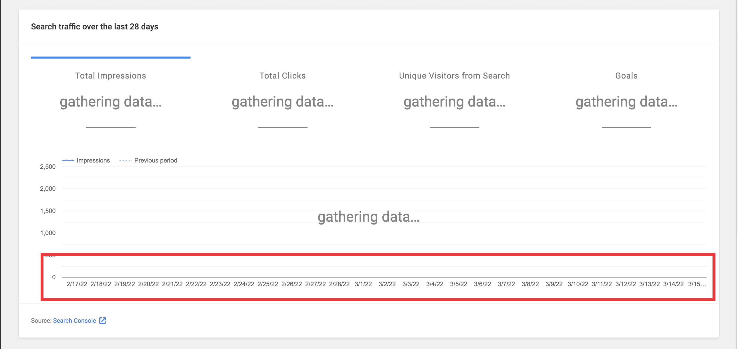
While testing #4697 I noticed a few minor UX/UI issues on mobile with the graphs on the main and entity dashboards.
Both of these issues only occur when the site is at
gathering...
state.2...
I could recreate this on all small screen sizes. What's interesting is that the values are in the thousands for gathering data but hundreds for zero data. So, this is why I could not recreate these issues with zero data. See screenshots below.Screenshots
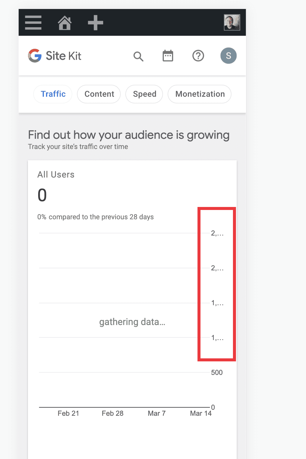
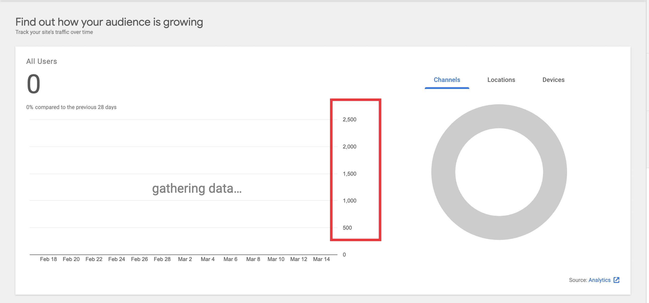
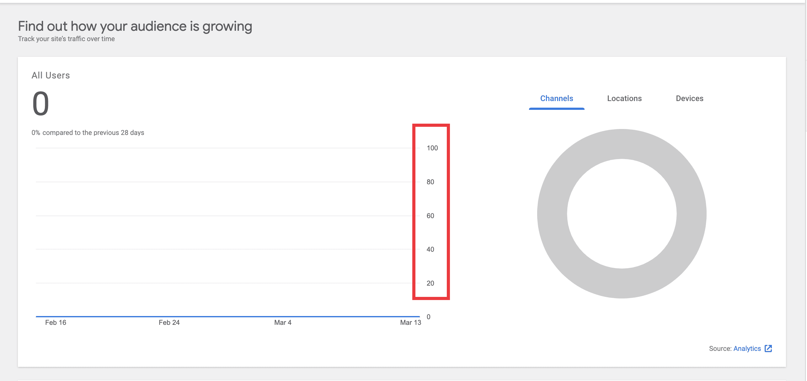
![image](https://user-images.githubusercontent.com/73545194/158361195-20947c4c-62dd-483f-99d9-75d86be9a27b.png) ![image](https://user-images.githubusercontent.com/73545194/158360232-061059f9-75f9-4c9e-afb6-02d5b43d15e2.png) ![image](https://user-images.githubusercontent.com/73545194/158360270-2be7d960-6639-403f-a60e-98c6b8621dc5.png)Screenshots
![image](https://user-images.githubusercontent.com/73545194/158361276-714ab0a5-f58b-4746-9fca-f00a44aa11a8.png) ![image](https://user-images.githubusercontent.com/73545194/158361423-a679a11a-247e-4e1d-a24f-3918ae87f319.png)Do not alter or remove anything below. The following sections will be managed by moderators only.
Acceptance criteria
Implementation Brief
Ensure y-axis label consistency between zero-state and gathering data views
vaxis
inGoogleChart
, it should be camel-cased, i.e.vAxis
. https://github.com/google/site-kit-wp/blob/d1ebb0f15c2e0e74c308a032e535ad7f1e9c63ce/assets/js/components/GoogleChart.js#L204-L207vAxis
maximum value from2500
to100
. https://github.com/google/site-kit-wp/blob/d1ebb0f15c2e0e74c308a032e535ad7f1e9c63ce/assets/js/components/GoogleChart.js#L208100
(see the IB for #4696). It was updated to2500
with the intent of matching the Figma mock of the Search Funnel widget (see screenshot in #4696). However, this value of2500
is at odds with the zero-data value which is just1
. Additionally, theGoogleChart
component is general purpose and the value100
is more in keeping with the broader usage of it, as evident when examining the zero-datavAxis
maximum values for the relevant components (those which render aLineChart
with thegatheringData
prop, at the time of writing:UserCountGraph
,SiteStats
,AnalyticsStats
,SearchConsoleStats
andStats
).Prevent y-axis label truncation
vAxis
maximum value from2500
to100
(see above) mitigates the truncation problem to a large degree. Having investigated the relevant chart-rendering components listed above, it appears that only one small tweak is necessary to prevent the top-most value inUserCountGraph
from being truncated at a very narrow viewport, as highlighted here:chartArea.width
from90%
to89%
will prevent this truncation. https://github.com/google/site-kit-wp/blob/52dc809d41a8f33f9c8d42218b4c3f68f538a2e0/assets/js/modules/analytics/components/dashboard/DashboardAllTrafficWidget/UserCountGraph.js#L236Prevent x-axis label truncation
delete chartOptions.hAxis.ticks
. https://github.com/google/site-kit-wp/blob/c7cd510d192d177737e42a63508022fd6bf35a64/assets/js/components/GoogleChart.js#L212 https://github.com/google/site-kit-wp/blob/c7cd510d192d177737e42a63508022fd6bf35a64/assets/js/components/GoogleChart.js#L216startDate
toendDate
. The ticks should beDate
instances. This should override anything inchartOptions.hAxis.ticks
.Test Coverage
QA Brief
During testing, either use accounts which are in "gathering data" and "zero data" states, or use the Tester plugin to force these states.
unifiedDashboard
feature flag.unifiedDashboard
feature flag, navigate to the Search Console page and verify the same for the the Overview widget.Changelog entry