 Tomasz-W
commented
5 years ago
Tomasz-W
commented
5 years ago #d7e5ac for heath (with #d1e0b4 for scrub) proposal:


Open matthijsmelissen opened 10 years ago
Tomasz-W
commented
5 years ago #d7e5ac for heath (with #d1e0b4 for scrub) proposal:
 jeisenbe
commented
5 years ago
jeisenbe
commented
5 years ago Sorry I haven't responded; for some reason this thread was sent to spam in my email.
I've tried a regular dash pattern for heath as @Tomasz-W suggested, but it looks too man-made to me; it's basically the same pattern as vineyard with a browner background color, which suggests some sort of agricultural area IMO. Here heath and scrub have the same background and pattern color:


It would work a little better with a random pattern, but I would still reserve this kind of pattern for grass/meadow
jeisenbe
commented
5 years ago Re: " proposed colour is too intensive/ too dark - as generally it turns out that 'the darker the green fill is, the higher plants it includes', proposed heath share breaks it imo" ... #d7e5ac for heath (with #d1e0b4 for scrub) proposal:
In this case I would suggest changing scrub to ceddb0, just 1 or 2% darker than d1e0b4 but this make it a little more distinct from heath, and I think it also makes it a tiny bit easier to see the intermittent streams. But we may also need to change the grass color; it's a little close to this heath color:
Tests with #d7e5ac for heath with denser bushier pattern, and #ceddb0 for scrub:
Azores, same places as above tests (http://www.openstreetmap.org/#map=15/38.5627/-28.6741):


Test areas:


The big thing I notice is that this new heath color is a little similar to grass, but its looks good with the new scrub color. Making grass lighter might work, if we want to tackle that!
I agree that we need to check the pattern at the same time, and adding a pattern will make it much easier to understand that this is heath.
@Tomasz-W the pattern generator can use any small icon for input, so if you find the example patterns unsatisfactory, it would be great if you could make a new svg (probably 8x8 pixels or less) that would look good for heath.
 Adamant36
commented
5 years ago
Adamant36
commented
5 years ago I agree about the pattern. It looks to man made. As far as the new colors, I prefer the older ones.
Scrub was fine darker and I don't feel like grass needs a change. Unless there's actually a good reason to. Otherwise, its easy for a change to one thing to justify a change to another one, etc etc. Id note to that heath/scrub is a "natural" tag. Whereas grass is a "landuse" one. Therefore, they will inherently have different tones and "clash" slightly. As they should. Because grass is mainly used around other landuse colors, that it has to have some visual "parity" to. Not in the middle of a bunch of natural features.
jeisenbe
commented
5 years ago Re: "I prefer the older one", Which colors do you mean, @Adamant36 ?
Do you mean these colors (ceddb0 scrub and dde5a9 heath): https://github.com/gravitystorm/openstreetmap-carto/issues/780#issuecomment-440568617
Or d1e0b4 scrub and d5dca1 heath: https://github.com/gravitystorm/openstreetmap-carto/issues/780#issuecomment-440524240
I think the heath pattern in the most recent tests was a little too dark. Here is a new pattern that is closer to the background color (c0cc96 instead of b5c498), and I've also made the pattern less dense, so it matches better with scrub. (Also, if we make the heath pattern more dense, mappers may start tagging areas of scrub as natural=heath where the bushes are close together, but this is incorrect.)
Heath #d7e5ac and scrub #ceddb0:


Adamant36
commented
5 years ago d1e0b4 scrub and d5dca1 heath. I think. I'm starting to lose track since you keep changing multiple things things in the same test. I.E "can I see test of scrub at d1e0b4 around different things?", "Sure here's a test scrub at #ceddb0 darkened by %15 and a heath at c0cc96 with a new pattern even though know one commented on what they thought about the last one." etc etc.
As it is, I think d1e0b4 is good for scrub and I like the bushy pattern for heath compared for the lines. As far as the heath color goes, I'm not really sure at this point. Since you know my opinion and I can't keep up anymore I think I'm going to dodge out of this one for a while until you and @Tomasz-W figure out the details. I have faith in you guys to figure it out ;)
jeisenbe
commented
5 years ago Here we can compare the different versions:
Before (current master): darkest

Bushy b8c187 on d5dca1: close to current color (scrub d1e0b4)

Bushy c0c98e on dde5a9, slightly lighter (scrub d1e0b4)

Newest pattern with heath d7e5ac (Tomasz-W's suggestion; slightly lighter and greenr) with scrub ceddb0:

Re: "grass"; recall that the same color is used for pastures, meadows, landuse=grass and natural=grassland, as well as village_green and common, and it's used as the background color for garden. It's common to find heath and scrub next to meadow, pasture or natural=grassland; the colors should look good next to each other.
jeisenbe
commented
5 years ago Comparison of the different versions of heath vs grass, forest and residential: http://www.openstreetmap.org/#map=5/54.0578/-6.1949 coastal Northern Ireland
Before (current master): darkest
Bushy b8c187 on d5dca1: close to current color; @Adamant36 prefers this one, he thinks.
Bushy c0c98e on dde5a9, slightly lighter
Newest pattern with heath d7e5ac; slightly lighter and greener - @Tomasz-W's new suggestion
Re: "grass"; recall that the same color is used for pastures, meadows, landuse=grass and natural=grassland, as well as village_green and common, and it's used as the background color for garden. It's common to find heath and scrub next to meadow, pasture or natural=grassland; the colors should look good next to each other.
Tomasz-W
commented
5 years ago @jeisenbe Pattern showed in https://github.com/gravitystorm/openstreetmap-carto/issues/780#issuecomment-440870962 is based on some other file than the one I provided in https://github.com/gravitystorm/openstreetmap-carto/issues/780#issuecomment-440558091, so please test the second one on:
#d1e0b4 (scrub colour)#d7e5ac#dde5a9#dce5ac (a little less saturated version of the #dde5a9)To have a simple and connected system, I would use this pattern also for meadows (on grass background) and grasslands (on a #e4efca from https://github.com/gravitystorm/openstreetmap-carto/issues/3411#issuecomment-424900037)
jeisenbe
commented
5 years ago I disagree with the use of a regular pattern for heath (or grassland for that matter), and I do not think we should use the same pattern for different types of vegetation. On Thu, Nov 22, 2018 at 4:56 PM Tomasz Wójcik notifications@github.com wrote:
@jeisenbe https://github.com/jeisenbe Pattern showed in #780 (comment) https://github.com/gravitystorm/openstreetmap-carto/issues/780#issuecomment-440870962 is based on some other file than the one I provided in #780 (comment) https://github.com/gravitystorm/openstreetmap-carto/issues/780#issuecomment-440558091, so please test the second one on:
d1e0b4 (scrub colour)
d7e5ac
dde5a9
dce5ac (a little less saturated version of the #dde5a9)
To have a simple and connected system, I would use this pattern also for meadows (on grass background) and grasslands (on a #e4efca from #3411 (comment) https://github.com/gravitystorm/openstreetmap-carto/issues/3411#issuecomment-424900037 )
— You are receiving this because you were mentioned. Reply to this email directly, view it on GitHub https://github.com/gravitystorm/openstreetmap-carto/issues/780#issuecomment-440943178, or mute the thread https://github.com/notifications/unsubscribe-auth/AoxshFT40DJaYNh-xTTDTECsA4J0lwQuks5uxliwgaJpZM4CRmJO .
Adamant36
commented
5 years ago @jeisenbe, you don't think the three different patterns clash/look off/to busy when next to each other due to not being aligned etc (for instance, in this picture)? Also, what do you consider the reason is for having different colors and patterns in the first place is?

Tomasz-W
commented
5 years ago @jeisenbe Pattern which I provided above is irregular (you took some another one for test, propably by mistake), so again: please test https://github.com/gravitystorm/openstreetmap-carto/issues/780#issuecomment-440558091 on a colours proposed in https://github.com/gravitystorm/openstreetmap-carto/issues/780#issuecomment-440943178.
jeisenbe
commented
5 years ago Re: Three different patterns.
@Adamant36, that example was made up for testing. However, there certainly are areas with multiple landcover patterns next to each other, even now. The patterns are needed because we render too many types of landcover for them to be understandable otherwise, and the pattern is random because a regular pattern looks unnatural.
For example, this area in Wales has marsh, woods and scrub, which all have random patterns:

jeisenbe
commented
5 years ago Sorry, @Tomasz-W, I had remembered a regular pattern suggested for meadow in another issue, and for some reason I thought that was what you were suggesting here. I see that it is similar but random.
Mapnik will not let us adjust the color of a png, as far as I know, so I would have to create a new png for testing with each of the 4 background colors you suggested; generally I have been darkening the background color about 10% to get the pattern color.
That's why I asked for a png that already had the right color, eg c0c98e for testing with d7e5ac, or b5c498 for d1e0b4, etc. I don't have photoshop or other good image editing software.
I've been creating patterns at http://www.imagico.de/map/jsdotpattern.php - you can make a random pattern similar to that by using the dash, shrinking it by 50%, and then rotating 90 degrees after exporting and converting to png.
Here's a couple examples with a similar pattern (color #c0c98e) on heath (#d7e5ac):


Still makes me think of some type of cropland
Tomasz-W
commented
5 years ago @jeisenbe Thanks, but there is still something wrong - as this is rotated wetland pattern, it should has the same symbol-density level, but somehow it hasn't. Can you investigate it and make pattern denser? I still would like to rate its effect on colours from https://github.com/gravitystorm/openstreetmap-carto/issues/780#issuecomment-440943178.
jeisenbe
commented
5 years ago You are correct, it wasn’t the same pattern. As I mentioned, I don’t have photoshop or other image editing software, so I generated a new pattern at the link. But I think it gives some idea of what it would look like.
I think shorter dashes would look better, for grassland, but I don’t think it will work for heath. On Thu, Nov 22, 2018 at 11:30 PM Tomasz Wójcik notifications@github.com wrote:
@jeisenbe https://github.com/jeisenbe Thanks, but there is still something wrong - as this is rotated wetland pattern, it should has the same symbol-density density level, but somehow it hasn't. Can you investigate it and make pattern denser? I still would like to rate its effect on colours from #780 (comment) https://github.com/gravitystorm/openstreetmap-carto/issues/780#issuecomment-440943178 .
— You are receiving this because you were mentioned. Reply to this email directly, view it on GitHub https://github.com/gravitystorm/openstreetmap-carto/issues/780#issuecomment-441047332, or mute the thread https://github.com/notifications/unsubscribe-auth/AoxshFa4cCt3o5OO-5mt2bKhk4GgBGlDks5uxrUMgaJpZM4CRmJO .
Adamant36
commented
5 years ago d7e5ac isn't going to work as a heath color because its to light and blends in with the other green. So heath needs to be darker.
 I kind of like heath at scrub (d1e0b4) darkened by 2% or 5%.
2%
I kind of like heath at scrub (d1e0b4) darkened by 2% or 5%.
2%
 5%
5%
 2.5%
2.5%

jeisenbe
commented
5 years ago Great testing location! I like seeing residential, farmland, grass, vineyards, heath, scrub, and forest in one place. Could you share the link to this place?
What colors are these? I'm guessing that d1e0b4 darkened by 5% is something like c3d2a5?
The scrub color should be darker than heath; consider that woodland is one of the darkest landcovers currently, and farmland and grass are light. So higher vegetation is darker.
We could try using c3d2a5 for scrub and d1e0b4 for heath, then. But there colors are fairly similar to each other:
 The scrub and heath are distinct when they are right next to each other and have a pattern (above)
But without the pattern, they are hard to distinguish at low-mid zoom (z13): (below)
The scrub and heath are distinct when they are right next to each other and have a pattern (above)
But without the pattern, they are hard to distinguish at low-mid zoom (z13): (below)
 Could you tell that this was a patch of scrub next to forest in the last image? Can you tell if the small areas at the edge of the image (at top left and top right) are scrub or heath without a pattern?

EDITED: add test areas next to grass, and with streams:


jeisenbe
commented
5 years ago Here are the same areas with c8d7ab (3% darker) for scrub and d1e0b4 for heath. Now the scrub is more distinct from the forest, but the scrub and heath are very similar without a pattern.
 I can't easily distinguish heath and scrub at zoom 13:
 But now the scrub and wood are different enough:

Next to grass:

So if we are going in this direction, I would suggest making heath a slightly more yellow shade than d1e0b4. This will also help keep bogs looking right. Tomasz-W suggested dce5ac above, but this is also a little too close to grass color. If we make d1e0b4 more yellow we get d9deb0, so I'll try that for heath.
Here's d9deb0 for heath (d1e0b4 shifted toward yellow), and c8d7ab for scrub (3% darker d1e0b4):


Here is another area, with meadow or grass next to the scrub and heath, plus some streams:


(I've also edited the previous comment to add this test area, in case you are reading on email https://github.com/gravitystorm/openstreetmap-carto/issues/780#issuecomment-441138956)
jeisenbe
commented
5 years ago OK, @Tomasz-W, here is one of your requests. I didn't manage to get the two patterns to match the same density, but I've added a random vertical dash pattern for both grassland and heath.
The grassland pattern is #b3d097 (on the current grass color background, cdebb0) The heath dash pattern #c0c98e is with a background color of #dde5a9 for heath. Scrub background is #d1e0b4:
Here's an area in Wales with grassland next to heath, with some forest, scrub and wetland nearby. The similar patterns make the two areas look more alike, which is a problem:
 Heath with scrub and forest:
 Next to meadow, scrub and woods (I did not put a pattern on meadow)
 z13; no patterns, just background colors: (except wood, which still gets a pattern at this level)


Tomasz-W
commented
5 years ago I think it should be one medium-dense pattern on a different backgrounds, but generally I like an effect, because it's a good way to suggest a diversified structure of a heath, It's also a simplest way to make a difference between lowest-level grass (no-pattern), higher heath/ grassland/ meadow (dashes pattern on different backgrounds) and scrub/ forest (icon-based patterns).
jeisenbe
commented
5 years ago Re: pattern with short vertical lines.
I agree that this pattern doesn’t work well. I would prefer more widely spaced icons that look like shorter bushes.
Re: color of scrub. As I mentioned above, it starts looking similar to woodland/forest, especially on z13 and lower, if the scrub color is too dark.
One option would be to make heath a bit lighter so that the scrub looks good, and also lighten grass so that heath is not too similar.
Current grass/meadow is much darker than farmland, so we can lighten it without problems as long as we change camp sites (these look almost the same as grass already).
Is it worth opening up that can of worms? On Fri, Nov 23, 2018 at 5:29 PM Adamant36 notifications@github.com wrote:
I still think its a tad to light. I like the examples where heath was the scrub color and scrub was heath darkened by 5% or whatever. Also, the pattern doesn't look to bad, but there's to many marks. Which makes it to busy and stand out to much. I think it would look better with less marks that are just randomized more. Otherwise, the pattern is going to be to busy compared to all the others. Even orchards aren't that busy.
— You are receiving this because you were mentioned. Reply to this email directly, view it on GitHub https://github.com/gravitystorm/openstreetmap-carto/issues/780#issuecomment-441178878, or mute the thread https://github.com/notifications/unsubscribe-auth/AoxshNX9zVkNbbAx0gkWJRzwB2yNvnaaks5ux7HjgaJpZM4CRmJO .
jeisenbe
commented
5 years ago Tomasz Wójcik wrote:
I like an effect of pattern abov, ... , It's also a simplest way to make a difference between lowest-level grass (no-pattern), higher heath/ grassland/ meadow (dashes pattern on different backgrounds) ...
While natural=grassland may grow high in areas of regular rainfall like northern Europe, grasslands are very common in semiarid areas like the western USA, Australia, northern Africa, Central Asia etc, and there the grass is quite short. Most natural grasslands are gazed by wild (or domestic) animals, eg Bison and Elk in the USA, which also keeps the grass short for much of the year.
Adamant36
commented
5 years ago Re: color of scrub. As I mentioned above, it starts looking similar to woodland/forest, especially on z13 and lower, if the scrub color is too dark.
I don't agree with that. The olive color (#d1e0b4) doesn't look anything like woodland/forest. As far as changing grass/meadow. Grass is for managed grass, like lawns. Which is naturally a lot darker. So its fine the color it is. Meadow could be lightened closer to farmland though. As I've suggested more then once already.
Tomasz-W
commented
5 years ago After some Photoshop tests, I like an idea of #d1e0b4 for heath and 3% darken #d1e0b4 for scrub :) Patterns are another thing.
jeisenbe
commented
5 years ago Remember that landuse=meadow is also approved to be used for pasture; in fact there are many areas where most of the places tagged meadow are grazed full-time as pasture.
Eg all of the areas tagged landuse=meadow in my hometown in Northern California are pasture, most are irrigated in the summer, and grazed by cattle or horses most of the year, so the grass is green and short. On Fri, Nov 23, 2018 at 6:15 PM Adamant36 notifications@github.com wrote:
Re: color of scrub. As I mentioned above, it starts looking similar to woodland/forest, especially on z13 and lower, if the scrub color is too dark.
I don't agree with that. The olive color (#d1e0b4) doesn't look anything like woodland/forest. As far as changing grass/meadow. Grass is for managed grass, like lawns. Which is naturally a lot darker. So its fine the color it is. Meadow could be lightened closer to farmland though. As I've suggested more then once already.
— You are receiving this because you were mentioned. Reply to this email directly, view it on GitHub https://github.com/gravitystorm/openstreetmap-carto/issues/780#issuecomment-441187969, or mute the thread https://github.com/notifications/unsubscribe-auth/AoxshKAhkrJ7iyLVPpv9-BPVJlOxoaE1ks5ux7yxgaJpZM4CRmJO .
jeisenbe
commented
5 years ago After some Photoshop tests, I like an idea of
#d1e0b4for heath and 3% darken#d1e0b4for scrub
Do you mean c8d7ab for scrub, like in the first few photos in this comment: https://github.com/gravitystorm/openstreetmap-carto/issues/780#issuecomment-441157955
I think this color will work well for scrub, but I'll try some tests with intermittent streams on the appropriate thread. Let's try to get that settled first, unless we want to do grass/heath/scrub all in one PR.
Adamant36
commented
5 years ago in the code it would just be @heath: #d1e0b4;
Then @scrub: darken(@heath, 3%);
The hex value doesn't really matter when its done that way.
I think we can do scrub/heath in their own PR since they go together and then deal with grass separately on its own. Although, I think its fine with the current color (unless you mean grassland/meadows. Those could be changed, but it should still be in a different PR then scrub/heath).
jeisenbe
commented
5 years ago It’s better to have independent colors for separate features when possible, especially since the patterns are png files and we have to generate it with the right colors. On Fri, Nov 23, 2018 at 7:42 PM Adamant36 notifications@github.com wrote:
in the code it would just be @heath https://github.com/heath: #d1e0b4;
Then @scrub https://github.com/scrub: darken(@heath https://github.com/heath, 3%);
The hex value doesn't really matter when its done that way.
I think we can do scrub/heath in their own PR since they go together and then deal with grass separately on its own. Although, I think its fine with the current color (unless you mean grassland/meadows. Those could be changed, but it should still be in a different PR then scrub/heath).
jeisenbe
commented
5 years ago Re: Patterns The Ordnance Survey is one of the examples of maps that shows a pattern for heath. I find the legend a little confusing, but one of these patterns is used for heath on the current maps (I believe the one on top; the others are bracken and rough grass?):

The old OS maps included this legend. The resolution of this image is poor, but you can see "brushwood" (scrub) in the upper middle, and "Furze" in the lower middle for a rounder pattern. Furze is the same as gorse, or broom; a type of heath.

Perhaps we can try a symbol for heath that is similar to one of these.
Here are some examples of heath from outside of Europe:
http://www.anbg.gov.au/photo/vegetation/heathlands.html
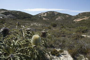
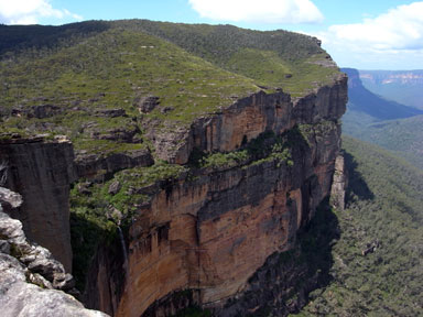

Diagrams of Australian heath structure:
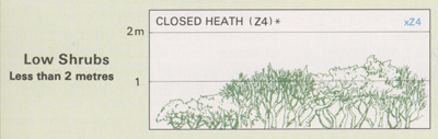
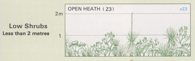
Compare to Australian grasslands, the "Brunette Downs" from the Wikipedia Grasslands page:

South African Heath:

Alpine/Montane heath

European examples for reference, from Wikipedia Heath page:
Heath dominated by yellow flowering Broom aka Gorse aka Furze in England:
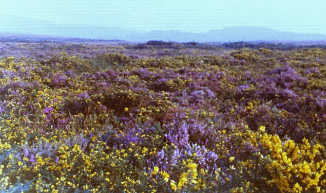
Purple heather in Germany:

jeisenbe
commented
5 years ago (Deleted duplicate)
Tomasz-W
commented
5 years ago @jeisenbe Can you make a test rendering of #d1e0b4 with a vertical version of a pattern from https://github.com/gravitystorm/openstreetmap-carto/issues/3143#issuecomment-441346233?
jeisenbe
commented
5 years ago Re "Can you make a test rendering of #d1e0b4 with a vertical version of a pattern from #3143?"
I believe d1e0b4 is too close to c8d7ab (it's only 3% lighter, and otherwise identical).
Here is a comparison of Snowdonia National Park in Wales, from z10 to z16, with the new scrub color (#c8d7ab) as the only change, or with the new scrub color (#c8d7ab) and with #d1e0b4 for heath. I've also shown a third test with #d1e0b4 for scrub and #d9deb0 for heath.
The color #d9deb0 has the same lightness and chroma as #d1e0b4, but is less green (hue is 113, instead of 122), so it looks more similar to the earlier test colors of heath, and not too similar to the new scrub color. It also looks less similar to grass, because grass is also more green (hue 128)
z16 Scrub c8d7ab

z16 Heath d1e0b4, scrub c8d7ab

z16 Heath d9deb0, scrub c8d7ab

z14 Scrub c8d7ab

z14 Heath d1e0b4, scrub c8d7ab

z14 Heath d9deb0, scrub c8d7ab

z12 Scrub c8d7ab

z12 Heath d1e0b4, scrub c8d7ab

z12 Heath d9deb0, scrub c8d7ab

z10 Scrub c8d7ab

z10 Heath d1e0b4, scrub c8d7ab

z10 Heath d9deb0, scrub c8d7ab

 turnsole80
commented
5 years ago
turnsole80
commented
5 years ago There's an argument to be made that there should be a heath=* tag. It would like for different heath types and fix the natural=fell issue from previous requests. I have no idea how or where to propose this. Nor do I have the means at the moment to be honest, but please consider it as an option
jeisenbe
commented
5 years ago @Chris, if a new tag is needed, please discuss this on the Tagging mailing list or make a proposal page on the openstreetmap.org wiki.
On Sun, Nov 25, 2018 at 1:06 PM Chris notifications@github.com wrote:
There's an argument to be made that there should be a heath=* tag. It would like for different heath types and fix the natural=fell issue from previous requests. I have no idea how or where to propose this. Nor do I have the means at the moment to be honest, but please consider it as an option
— You are receiving this because you were mentioned. Reply to this email directly, view it on GitHub https://github.com/gravitystorm/openstreetmap-carto/issues/780#issuecomment-441413751, or mute the thread https://github.com/notifications/unsubscribe-auth/AoxshKAeUdG0kIg-wPK80iGvEeO4cJjdks5uyhdLgaJpZM4CRmJO .
Tomasz-W
commented
5 years ago Propably my last proposition, otherwise I'll end in mantal hospital ^^
#d0e3b6+ 10% vertical dash pattern (some less dense vertical pattern might be also good) for heath + #c8d6ab for scrub


jeisenbe
commented
5 years ago The lightness is only 2% different and hue is very close; the main difference is chroma or saturation, but this doesn’t show up well on most screens.
Adamant36
commented
5 years ago To blueish tinted/camo looking. We should just go with #d1e0b4 and scrub 3% darken it. Since both looked good and only Jeisenbe didnt want to go with it. Otherwise its never going to get changed. There's no such thing as perfect.
jeisenbe
commented
5 years ago What is your objection to using #d9deb0 for heath, as I’ve tested above? On Sun, Nov 25, 2018 at 7:32 PM Adamant36 notifications@github.com wrote:
To blueish tinted/camo looking. We should just go with #d1e0b4 and scrub 3% darken it. Since both looked good and only Jeisenbe didnt want to go with it.
— You are receiving this because you were mentioned. Reply to this email directly, view it on GitHub https://github.com/gravitystorm/openstreetmap-carto/issues/780#issuecomment-441430363, or mute the thread https://github.com/notifications/unsubscribe-auth/AoxshJlDvAuG2R6PtsrZXBWiTdUevljbks5uynHDgaJpZM4CRmJO .
Adamant36
commented
5 years ago Whats your objection to using #d1e0b4 for heath as me and Tomasz-W said? Usually we go with a democratic system to decide things. It means you not get your way sometimes, but that's the trade off of doing things fairly and listening to other people.
You should do a cut and paste side by side of both of them or like the square colored boxes thing. Its hard to compare them otherwise.
Adamant36
commented
5 years ago Also, if we went with your color then it wouldnt be such a stright path to a scrub color that we know would work with streams would it? Or would we still with the heath darkened color?
jeisenbe
commented
5 years ago My objection to #d1e0b4 was stated in my previous comment:
"d1e0b4 is too close to c8d7ab (it's only 3% lighter, and otherwise identical)."
No other two landcover colors are this close. Even leisure, which somewhat overlaps with park, is 5% lighter than the park color, and @Tomasz-W previously said that he thinks this is too similar.
As the test images above show (See https://github.com/gravitystorm/openstreetmap-carto/issues/780#issuecomment-441412852), Heath #d1e0b4 looks too similar to scrub #c8d7ab, especially it low zoom levels, eg z13, z12 and z10.
z16 Heath d1e0b4, scrub c8d7ab - too similar, and heath is too green
z12 Heath d1e0b4
z16 Heath d9deb0, scrub c8d7ab my new suggestion
z12 Heath d9deb0
Another problem, which I forgot to mention, is that bog uses the heath color. Bogs are quite different from marshes; they are made from low-growing mosses which form peat, while marshes have grasses and similar plants. So they use the brownish heath color as a background to distinguish them from marshes, which have the green grass background color.
If we make heath too green, it will not be easy to distinguish bogs from marshes.
For both of these reasons, I believe it would be better to give heath a color with a hue more on the yellow side of green, for example #d9deb0 as I tested in the previous comment.
BTW, @Adamant36, could you give me the link to the location you tested in previously in this comment: https://github.com/gravitystorm/openstreetmap-carto/issues/780#issuecomment-441060481 It looks like a great place for testing!
jeisenbe
commented
5 years ago Here's a better example of the problem with #d1e0b4. At z13 zoom level the landcover colors are the same as at higher zoom levels, but there are no patterns shown.
Goodwick, Wales, z13 with heath d1e0b4:
Can you easily tell scrub from heath with #d1e0b4?

How about now? Heath #d9deb0

z14 to compare http://www.openstreetmap.org/#map=14/52.0101/-4.9899
heath #d1e0b4

heath #d9deb0

Here is an area of bog (on the left side) near marshes (Right, upper and middle) http://www.openstreetmap.org/#map=7/52.81443/-4.01972
Current heath rendering (with new scrub):

Can you tell the marshes from the bog with #d1e0b4 for heath and bog?

With #d9deb0 for bog and heath, it is easier to see the difference.

I also see that with #d9deb0 for heath is easier to distinguish heath from grass.
jeisenbe
commented
5 years ago Re: "You should do a cut and paste side by side of both of them or like the square colored boxes thing"
Here's the two colors, with grass on the left and the new scrub color on the right. (The page background is set to land-color; #f2efe9 - light gray)
d1e0b4 (middle)

d9deb0 (middle)

(The color picker is showing the Lch values, but I actually entered the hex codes directly)
Adamant36
commented
5 years ago Hhmmm I guess that all makes sense. 3% isnt that much of difference and it probably should be more. The bog thing, I dont know. Is the colors of bogs and heath the same in real life? If not, maybe they should a seperate color.
If we arent going with d1e0b4 for heath, is there a reason we couldnt use it for the scrub color as it was originally entended? I only said it would work for heath because of it having a second color that we could switch it out with. Now that we arent using it for heath though, id prefer it be the scrub color. It was the better of the two. Although its not that big of a deal, as both colors resolve the stream issue. Which is why we are here. I think....
What are you using to tweak with the colors? Is that an app or a website?
I'll try and find the location from my example. I know it was in the New York area. I want say around Scranton. There isnt much heath tagging around there. So it should be easy enough to find in OverPass Turbo. I think its a good place because of the lake. Whatever new color for heath is picked it should be tested against a large body of water. Since theres a tendecy for colors to washout the blue for some reason.
jeisenbe
commented
5 years ago This is the link to the color gradient page. Use the dropdown menu to change "Colour selection mode" to "show all", and then you can enter hex values or RGB. You can also set the "Page background colour:" to #f2efe9 (the untagged land color)
jeisenbe
commented
5 years ago I believe that this issue has been partially addressed by the changed scrub color. The old scrub color was a bluer shade of green, which contrasted particularly strongly with heath.
@imagico used slightly different colors for vegetation areas on his branch, recently. I was considering making a PR, but the difference is slight, especially for grass (only 1% lighter) and scrub (a couple percent more chroma and a little shift in hue, on the alt-colors branch).
Health is the only color that is significantly different on alt-colors; it was changed from #d6d99f LCH(85,30,110) to #dae2ac LCH(88,28,114) - still a small change, though the difference in lightness is visible (and probably is why grass was changed to be 1 point lighter):

These changes would make the different types of vegetation slightly closer together in color, compared to the current colors; heath is shifted to be a little closer to scrub, which is more similar to forest/wood. But perhaps the reduced contrast is still enough?
A number of renderings are shown on this page: http://blog.imagico.de/more-on-vegetation-rendering-in-openstreetmap-maps/
 kocio-pl
commented
5 years ago
kocio-pl
commented
5 years ago Looks reasonable to me. I would just tune the wood color to be lighter or just a bit more yellow, because woods tend to make "heavy" areas on the map (large and dark at the same time).
kocio-pl
commented
5 years ago I have discussed forest color in https://github.com/gravitystorm/openstreetmap-carto/issues/3513#issuecomment-456731561.
The following issue has been moved over from trac:
Nyah. I think that current heath color is inharmonious. I propose to replace the color on #ddebbb (see the bottom picture).