 Adamant36
commented
5 years ago
Adamant36
commented
5 years ago @Hufkratzer, I think we could render a horse racing icon sports centers that have the sport=horse_racing tag. I don't don't recommend it on on tracks though due to the current issues we have with icons positions not rendering well if the area is round etc. Otherwise, it will render it will render in the middle or some other weird spot. If I remember correctly it was an issue on the Maptnik side that was supposedly fixed, but I've still been seeing it around sometimes. Its been a while though.
 Hufkratzer
 HolgerJeromin
 Tomasz-W baseball
 Maki basketball
 Tomasz-W basketball
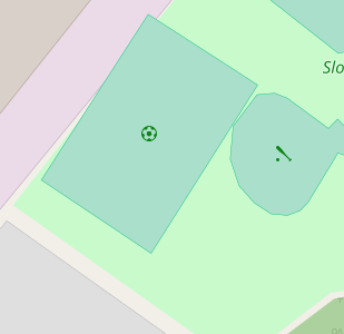
 Maki soccer
 Tomasz-W soccer
 Maki tennis
 Tomasz-W tennis
 Personally, I'm leaning more toward Tomasz-W's icons because they aren't mostly solid black. So they don't stand out as much.
  Tomasz-W
 meased
 geostonemarten
 kocio-pl
 boothym
 ? This is from
  IgorEliezer
 imagico
 pqhf5kd
 jeisenbe
 jidanni

 sekerob
 BertMule
Currently all sport fields are shown in the same style. It is very difficult to distinguish the different sports. Furthermore there are good sport icon sets out there: http://wiki.openstreetmap.org/wiki/Category:Sport_icon Comparing the different olympic pictograms http://www.nytimes.com/interactive/2010/02/24/sports/olympics/pictograms-interactive.html I suggest to take the icon sets of Olympic games 1972 (munich) http://olympic-museum.de/pictograms/Picto1972.htm adopted to the constraints of 16px
See also https://trac.openstreetmap.org/ticket/3159.