 mathiasbynens
commented
12 years ago
mathiasbynens
commented
12 years ago Demo that’s supposed to show the performance difference: http://lab.pgdn.us/hidden-text-performance/
Closed davidmurdoch closed 12 years ago
mathiasbynens
commented
12 years ago Demo that’s supposed to show the performance difference: http://lab.pgdn.us/hidden-text-performance/
 scottkellum
commented
12 years ago
scottkellum
commented
12 years ago Happy to see the FIR method being updated.
@necolas also pointed out the NIR method here: http://nicolasgallagher.com/css-image-replacement-with-pseudo-elements/ Lack of support for IE7 and below might be a deal breaker though, it is for me in most situations anyway.
 necolas
commented
12 years ago
necolas
commented
12 years ago Other than first gen iPads, what other browser/OS combos experience noticeable perf benefits from this?
 davidmurdoch
commented
12 years ago
davidmurdoch
commented
12 years ago @scottkellum, the method I posted should be IE5.5+ compatible, I believe. According to MDN IE has supported white-space: nowrap since version 5.5, overflow: hidden since version 4.0, and text-indent since 3.0.
Disregard if you were just referring to @necolas' version.
scottkellum
commented
12 years ago You can identify the performance hit with a CSS profiler. It will not be visible in the frame rate as the demo is running on a single page.
Here are the numbers: http://yfrog.com/kgqzwp
Small but it adds up with each redraw, new element, and animation.
davidmurdoch
commented
12 years ago @necolas I just tested on Android 2.2 running in a Huawei M835/Comet (One of the worst Android-based phones of 2010) and the demo Mathias posted doesn't stutter at all.
necolas
commented
12 years ago Whatever that profiler data is showing, the difference is 0.007ms - extremely small even if you scale that up hundreds of times. Actual framerate/scrolling/rendering/etc degradation would be a concern.
 paullewis
commented
12 years ago
paullewis
commented
12 years ago @necolas I've just tested it on iPad 2 and iPhone 4S, neither of which stuttered. So far the only claimed benefit seems to be the iPad 1 as far as I can tell.
 paulirish
commented
12 years ago
paulirish
commented
12 years ago So I just switched the order of the two testcases in this file and rerun the CSS selector profiler and it's indicating the inverse results:
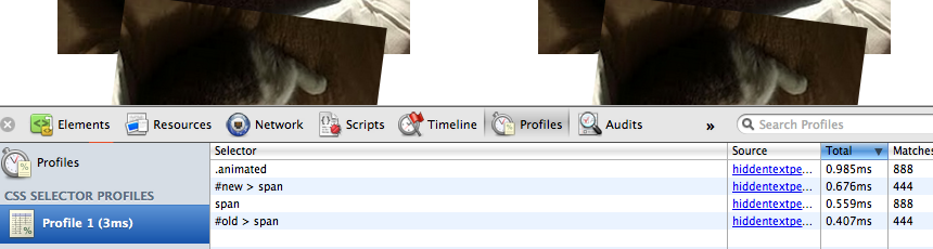
test page: http://dl.dropbox.com/u/39519/temp/hiddentextperf.html
So your evidence of an improvement isn't too trustworthy, but I'm not 100% concerned because the CSS Selector profiler merely matches at selector matching, not style recalculations and reflow.
Measuring that is different, but let me see if i can wire up a more appropriate test page for it.
scottkellum
commented
12 years ago Thanks @paulirish. This is just a little something I wiped up trying to speed up animations on complex pages. I have noticed performance increases in animations but an having trouble applying quantitative data to them.
What steered me away from FIR: http://techblog.netflix.com/2012/01/webkit-in-your-living-room.html
Honestly, the FIR method is tried and true. I am not saying my method is perfect but it works well for me. Other people seem to like it and I am flattered.
necolas
commented
12 years ago What steered me away from FIR...
What does the video say that convinced you?
paulirish
commented
12 years ago Certainly, but if this is the new best technique then it should, in fact, be the best. I'd be happy to see that it is, but 1) i don't want to see people regress the perf of their sites but wrongly implementing this change and 2) i want to see people prioritize performance issues well.
scott, come by #html5 on freenode -- we're banging this out now.
paulirish
commented
12 years ago Also Seeley's presentation is awesome. +++ it
paulirish
commented
12 years ago So I think the most optimal way to measure this cost is a test page with some large number (like 1000) of elements with .ir applied to them. Then in Chrome/Safari open the Dev Tools and Timeline panel. Record, refresh, and look at the Style Recalc, Layout and Paint actions. Those are where we'd see a change.
And hypothetically there is a significant difference ( >20ms diff for layout/paint would be "large", even though these numbers are small)
We don't have this sort of instrumentation on iPad so you'd have to use some +new Date() measurements from <head> to window.onload and hope to see a difference (or benchmark.js), but you're capturing a lot more browser lifecycle so it may be too messy to get hard data.
scottkellum
commented
12 years ago @necolas Finally, found where he talks about text-indent: http://youtu.be/xuMWhto62Eo?t=35m15s
 jonathantneal
commented
12 years ago
jonathantneal
commented
12 years ago What about this? https://gist.github.com/1954805
.ir
{
    direction: ltr;
    font: 0/0 serif;
    overflow: hidden;
    text-indent: 100%;
    white-space: nowrap;
}

.ir *
{
    clip: rect(0 0 0 0);
    position: absolute;
}
I've set the direction (because h5bp does), but that might not be necessary; it depends on how right-to-left text impacts text-indent: 100%. The font is compressed to decrease the size of the "invisible box"; one of the main suspects of performance. The overflow, text-indent, and white-space (as mentioned by others) hide the text. The descendants of .ir get the usual hidden-but-screen-readable treatment.
Also, would it be useful to use the bookmarklet at http://andy.edinborough.org/CSS-Stress-Testing-and-Performance-Profiling to test and quantify the performance of these different methods ( like the ones seen at http://lab.pgdn.us/hidden-text-performance/ )?
Here's a potential test page at http://jsfiddle.net/CpewT/3/show/
necolas
commented
12 years ago If the text is going to be crushed out of existence, like we did when working on that IE-expression-powered clearfix, then you don't need white-space: nowrap...might not even need the text-indent either (haven't tested in all browsers).
.ir {
    font: 0/0 serif;
    overflow: hidden;
    text-shadow: none;
}
However, there might be a reason why crushing the text in IR methods isn't used already - such as it being hidden on screenreaders. Worth checking that it doesn't cause any additional accessibility problems.
scottkellum
commented
12 years ago Might not even need overflow:hidden as the text is already gone.
.ir {
    font: 0/0 serif;
    text-shadow: none;
}
Also, direction: ltr is not as important as text-align: left. It doesn’t really matter what direction the text is flowing as long as it is left aligned. Again, not needed as the text is gone :)
jonathantneal
commented
12 years ago Older Safari browsers could not crush text out of existence. Font size 0 would render as font size 6 or 8. However, in a Safari 4+ or Safari 5+ world, I'm not sure if that is still the case.
I was shrinking the font size to reduce the size of the invisible box that was reportedly being drawn off screen on the iPad and adding a substantial and noticeable performance hit.
If font size does the trick all by itself in 2012, well, awesome.
 chriseppstein
commented
12 years ago
chriseppstein
commented
12 years ago @jonathantneal In older safaris, will color: transparent be respected?
chriseppstein
commented
12 years ago I would also point out that we can use @media screen to avoid issues with readers.
necolas
commented
12 years ago I just tested in Safari 4 - the text is very small but not crushed down into an invisible pixel. You still get a line of tiny text. Setting color: transparent did hide it though.
Safari 5, like modern browsers, only needs the font and text-shadow styles.
.ir {
    font: 0/0 serif;
    text-shadow: none;
    color: transparent;
}
I would also point out that we can use
@media screento avoid issues with readers.
Really? Given the amount of time spent debating the use of display:none and its effects on accessibility, I would find it really surprising if this claim were correct.
chriseppstein
commented
12 years ago @necolas tested - that works on IE6-9 and all the way back to FF3 and Opera 10
chriseppstein
commented
12 years ago Re: @media screen My claim is a theoretical one, but would not expect display:none to have any correspondance to a media query in terms of behavior. display none means "remove from the document" -- it's not a visual property.
necolas
commented
12 years ago What I meant was that if styles in @media screen were hidden from screenreaders, that fact would have been exploited by now to shield screenreaders from styles that might negatively impact the experience for users of that tech.
As an aside: display affects the formatting structure; so "remove from the document" doesn't seem like an accurate characterisation, especially since that makes it sound like the DOM is affected. It's just that screenreaders take some CSS into account when deciding how to present the document.
scottkellum
commented
12 years ago Screen readers can be used/are included in most modern browsers. Just because something is on screen doesn’t mean it won’t also be read by a screen reader.
chriseppstein
commented
12 years ago @necolas right. but to the point, is there no way to use @media queries to target screen readers in a production-quality way? that would be severely disappointing if it were true.
necolas
commented
12 years ago @chriseppstein I don't think so :(
There's this stuff - http://www.w3.org/TR/CSS21/aural.html - but afaik, it has pretty much zero support in existing screenreaders. Was looking at using speak to prevent the reading of chars inserted as generated content and used by icon fonts, but no screenreaders supported speak. Maybe one day.
jonathantneal
commented
12 years ago For the record, Safari 4 was released before Internet Explorer 8, and Safari 5 has been on the market since June of 2010.
Related: Are there statistics we trust to provide us the latest browser usage trends? How can I find out which versions of Opera, Chrome, Firefox, IE, and Safari are supported by the manufacturer? A combination of those sets of information would be very useful when evaluating the pros and cons of these css image replacement methods.
necolas
commented
12 years ago @jonathantneal http://gs.statcounter.com/#browser_version-ww-monthly-201112-201202
Safari 4 died ages ago. The fix for it is more of a technical novelty than a necessity.
jonathantneal
commented
12 years ago Well, looks like font: 0/0 will work. For the record (if it even came up), I don't want anything named after me. :P
http://jsfiddle.net/355CP/show/ is working well for me in IE7-10, Opera 11.61, Chrome 17.0, Firefox 10.0, and Safari 5.1.2.
scottkellum
commented
12 years ago Settling on this then? Looks good to me.
.ir {
    font: 0/0 serif;
    text-shadow: none;
    color: transparent;
}
Merging into H5BP might be a little weird. There are a lot of properties in the current version that might cause issues with people upgrading to this. I’m not a H5BP user though, not sure how you roll these things out :P
necolas
commented
12 years ago @scottkellum Yeah I think so! This technique works and seems pretty robust. We don't encourage people to upgrade live sites so it shouldn't be an issue for H5BP users.
I'll merge this in over the weekend. I've actually been using the font hack part of this technique for nearly a year when making icon components...but didn't think anything of it. It's already in this early version of the H5BP UI toolkit - https://github.com/h5bp/h5bp-ui/blob/alpha/scss/_icons.scss - but I should probably use the shorthand that I used to help remove IE6/7 whitespace in this expression-powered clearfix experiment that Jon and I worked on: https://gist.github.com/935783/
As an aside: The reason I had to use it for icon components was because of a weird IE7 layout bug that seems to occur when text-indent is used, inner text is used for screenreader love, the icon is inline-block, and it's nested within another element (I seem to remember it happening in combo with my button components). The suffering never ends.
chriseppstein
commented
12 years ago Talking to a coworker: we are curious whether this will have negative SEO impacts compared to the negative text-indent approach. From what I could discern, one should expect that this text will not be indexed and if used on a lot of text, one might expect to be flagged as a spammer.
necolas
commented
12 years ago All these techniques appear to work with VoiceOver. Text is not hidden from the screenreader.
necolas
commented
12 years ago I came across an early version of the text-crushing approach (2003) - http://www.maxdesign.com.au/articles/headings-as-images/
 brendanfalkowski
commented
12 years ago
brendanfalkowski
commented
12 years ago The new image replacement technique is bugging when the element has display:inline-block. See: http://jsfiddle.net/brendanf/SGPqc/2/
jonathantneal
commented
12 years ago They look the same to me in that fiddle, @brendanf . What browser and could you include a screenshot?
brendanfalkowski
commented
12 years ago Tested in latest Mac versions of Chrome/Safari/Firefox/Opera. Screenshot: http://cl.ly/FYVx
Notes in the 'Info' panel. Example 2 has odd ghost-padding.
 cust0dian-old
commented
12 years ago
cust0dian-old
commented
12 years ago Same with Windows in Chrome 18 (latest); Firefox 10, 11 (latest); Opera 11.62 (latest); IE 8.
 dpogue
commented
12 years ago
dpogue
commented
12 years ago This is fixed (at least in Chrome 19-dev on Linux) if you set a vertical-align on foo. Doesn't seem to matter what the value is, as long as it's set (I've tried top, middle, and bottom).
EDIT: Just tested, and vertical-align: baseline causes the extra padding to appear.
You can also fix it by setting a line-height on ir, but it's unlikely all your replacements need to be the same height.
cust0dian-old
commented
12 years ago Setting vertical-align on ir fixes this (latest Chrome, Firefox, Opera; IE8; Windows), but what is the cause? Padding is 15px, is text flown out of the foo?
necolas
commented
12 years ago There is no padding; it's because the font: 0/0 a means the ir-ed element's baseline is at the top of its box, so the default vertical alignment (baseline) results in it lining the top of the box with the baseline of its parent's line-box. Setting it to middle seems the best option.
FYI, the old IR techniques break in IE6/7 when used on inline-block.
brendanfalkowski
commented
12 years ago I updated the JSFiddle with more test cases, and the vertical-align:middle fix:
http://jsfiddle.net/brendanf/SGPqc/4/
Also confirmed in IE8 + IE9. Not relevant to IE7 and below since inline-block isn't supported.
Patched proposal:
.ir {
    color:transparent;
    font:0/0 a;
    text-shadow:none;
    vertical-align:middle;
}
Note: I removed border:0 and background-color:transparent which where added in this commit: https://github.com/imaginationac/html5-boilerplate/commit/aa0396eae757c9e03dda4e463fb0d4db5a5f82d7
Zeroing border doesn't affect the behavior, but implies styling (for form inputs). I think this goes too far. Adding the ir technique shouldn't require extra specificity in rules to override its style. It's simpler for authors to extend styles as needed when ir is chained than making border:0 an absolute. Extend is better than override.
Same argument for background-color:transparent. It's one extra thing to override.
necolas
commented
12 years ago IE7 is relevant. The inline-block works on inline by-default elements, and there is a hack to have it work on block by-default elements.
jonathantneal
commented
12 years ago In regards to vertical-align, I'm not sure that we're discussing a bug that needs to be fixed, but rather we're discovering the default behavior of vertical-align.
http://css-tricks.com/what-is-vertical-align/
The default value of vertical-align (if you declare nothing), is baseline. Images will line up with the text at the baseline of the text. Note that descenders on letters dip below the baseline. Images don't line up with the lowest point of the descenders, that isn't the baseline.
In regards to IE6/7 and inline-block, the solution is simple:
display: inline-block; /* inline-block is half-supported in IE7, unsupported in IE6 */
*display: inline; /*  asterisked CSS is only used in IE6/7, and inline is supported */
*zoom: 1; /* zoom causes inline to behave like inline-block */@necoloas: Ah, yes. Forgot about that.
Added a test case (Ex. 6) using span set to inline-block for IE7:
http://jsfiddle.net/brendanf/SGPqc/7/
Setting vertical-align:middle creates 1px offset at the top in IE7. This doesn't happen with top, bottom, or baseline (which causes the larger offset in every other browser).
Setting vertical-align:top (or bottom) seem the most bullet-proof.
@jonathantneal: Wasn't trying to solve IE6/7 behavior, but the updated ir technique breaks on any element having inline-block in sub-modern browsers and up. Setting vertical-align fixes that behavior. I think helper classes should have the smallest footprint to solve the issue.
necolas
commented
12 years ago In regards to vertical-align, I'm not sure that we're discussing a bug that needs to be fixed, but rather we're discovering the default behavior of vertical-align.
Yeah, it's the default behaviour of baseline...but the outcome isn't desired, so it's probably worth using middle instead.
brendanfalkowski
commented
12 years ago Yeah, it's the default behaviour of baseline...but the outcome isn't desired, so it's probably worth using middle instead.
Note: middle breaks in IE7 though (1px offset). Screenshot: http://cl.ly/FZyU
Setting top or bottom works best cross-browser as far as I've tested.
jonathantneal
commented
12 years ago @brendanf with small graphics, especially icons, vertical-align: middle is often preferred because it vertically centers an image with a line of text.
However, for larger images, vertical-align: top is often preferred because it vertically stacks itself to the top like other (block) layout elements.
Here is an example of a large image vertically aligned 8 different ways. http://jsfiddle.net/mUQLz/
This article claims that -9999px (or -999em in our case) has noticeable performance issues when running animations on the iPad 1.
The new CSS would be something like:
Also, H5BP has some non-obvious tweaks in the existing
.irclass that would need to be evaluated if this new method were to be implemented.