Open michaje opened 2 years ago
I would also like to state that the new design update is disgustingly bad. Please either revert it or give users an option to change back to the old style.
The buttons and colors are glaringly distracting / noisy and the icon art styles look very outdated compared to the previous iteration.
give users an option to change back to the old style.
Here: https://noscript.net/getit#devel
And the icon art styles look very outdated compared to the previous iteration.
Well, that's ironic, since the new branding has been designed by UX experts specializing in UI for software tools, while "the previous iteration" has been hand-made by myself 16 years ago 😅
The design did kinda go backwards by about 10 years, that is ironic
Well, design is always going to be a matter of personal opinion. But upgrading to the development build and switching to the old design fixed my problem. If you intend to keep this feature in the next stable release, consider this issue solved :) (I like it this way, but I guess some people might still prefer the new style but with small icons so I'll leave it open for now as a low priority feature request)
Thank you @hackademix !
I have just spent a while finding my way here to see if there was something wrong with my Firefox as noscript looks like utter garbage now. Like, it's ugly beyond my comprehension, and in the dark theme just looks blerghh, even though it matches the dark theme now.... I suppose it is mostly because it's a change, but yes, I really do not like it.
I've just updated to dev version and it still looks funny in dark mode and it will take me a while to get used to the new toolbar icon, but i suppose that is "progress". Can't really complain too much about stellar software. But I do think that major visual "linkers", that is, the symbol i use to interact with noscript should maybe change more slowly, or have warning. When you have 10+ addons enabled, it now really gets lost in the icons and takes me a while to find sometimes, especially because I had no warning it was changing.
Also, to revert to the blue colours (I didn't even know that was what I was missing), in addition to:
"11.4.1rc1 x Support for reverting to the "Vintage Blue" style
(NoScript Options/Appearance)"
You also have to tick "high contrast" and only then "Vintage blue" is enabled" then you can tick that, and untick high contrast as that also adds lots of clutter, but then the vintage blue tick box disappears, but it is still enabled. That probably needs some tweaking.
Thank you for hurting me. New design piece of shit. 💩💩💩
Thank you for hurting me. New design piece of shit. hankeyhankeyhankey
No need to be rude about it. I also strongly dislike the new design, but I recognise it as an attempt by Giorgio to improve a great addon he has been providing us with for so long.
He immediately offered an option to revert in the upcoming release, so no need to be an ass about it.
Thank you for hurting me. New design piece of shit. 💩💩💩
Yes, this is a non-constructive comment not worthy of noscript. It is arguably the most essential browser addon available and phenomenal software, but perhaps this change could have been tested first with a small group to see how UX changes are received. I mean,every time Firefox changes something people scream and cry about it, so there's precedence. Overall, I am happy now that I can roll it back.
Thank you for providing the option to go back to the previous icon set. However the weird grey gradient is still there.
Maybe some changes in userChrome.css will take care of that.
So I tested this with a few sites. Of all the options (light+new, light+old, dark+new, dark+old), the old icons with light theme has vastly better contrast against the page. The new icons/colors have inherently low contrast and it's really hard to see what's active and chosen, but they also blend in with the page's elements so on dark pages it's even harder to use.
The new icons have the eyes on all of them and are slanted, which is a negative. It means they don't stand out from the program's icon. The old icons clearly separate buttons from logo.
Dark+New
is black on black. Black background with black icons and black highlight. Completely unusable, especially on dark sites.
Light+New
is ok, but everything is bigger which is a downside. But I wouldn't riot if this was forced through.
Dark+Old
is similarly ok. The fact that the icons and highlights are not black helps with contrast, and the icons are dissimilar to anything sites use so they stand out even on dark sites.
Light+Old
is what we're used to, but I actually find it's objectively the better option. It's legible on all sites and backgrounds, and it doesn't take up too much space. The whole popup clearly stands out from the site in both colors and iconography.
So you may say the old theme was hand-made 16 years ago, but it's vastly more legible in a wider range of contexts. The first time I opened the popup after the dark+new theme was added, I legitimately couldn't tell where the site ended and the popup started, because it was just a dark popup with dark icons on a dark site. So it looks to me like the UX expert only tested for 1 use-case.
I will not comment on my opinion of the design, lest I upset the developer who is doing this graciously on [their] own time.
However...the new UI is broken in terms of good UI design. The deactivated icons have the same brightness, size and color intensity as the activated icons, making it almost impossible to tell the difference between the two unless you look for the text status - this is exactly opposite good UI design.
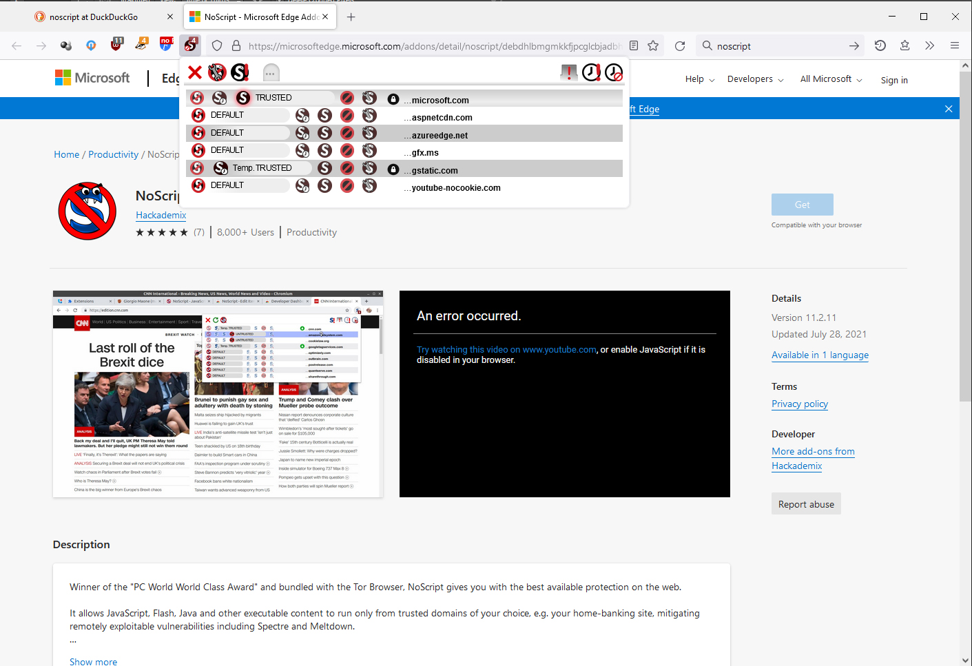
This is how the new NS looks on my desktop
What is the optical difference in the icons of TRUSTED, Temp TRUSTED, and DEFAULT? Pretty much, none. The only optical difference is the text. Only TRUSTED has a red glow around the icon to actually notify you it is activated (and a small glow at that); the rest of the icons have no distinction as to their state, either activated or not.
On my (admittedly old version of) Android Firefox, this is what it looks like
High Contrast is a disaster
with UI elements overlapping and cut off, text overlapping, and still the same UI icon problems (no differentiation between activated or deactivated).
The old design was superior in terms of usability.
With the recent design update, the popup and especially it's icons have become very large, about twice as big as before on my computer. On my resolution icons are 8mm/32px while icons in the toolbar are 4mm/16px. See attached screenshot for clarification.
Especially on pages with lots of different external javascript sources this makes the popup block a big portion of the screen. I'm not sure if this is intended behaviour or a bug on my system, but I personally find it very annoying.
If this is intended behaviour, please offer a setting that makes it possible to make the icons smaller.
Edit: I just saw this is also the case in the screenshot on the official website, so I assume it acutally is intended behaviour. So please see this as a feature request instead of a (possible) bug report.