 MasFlam
commented
3 years ago
MasFlam
commented
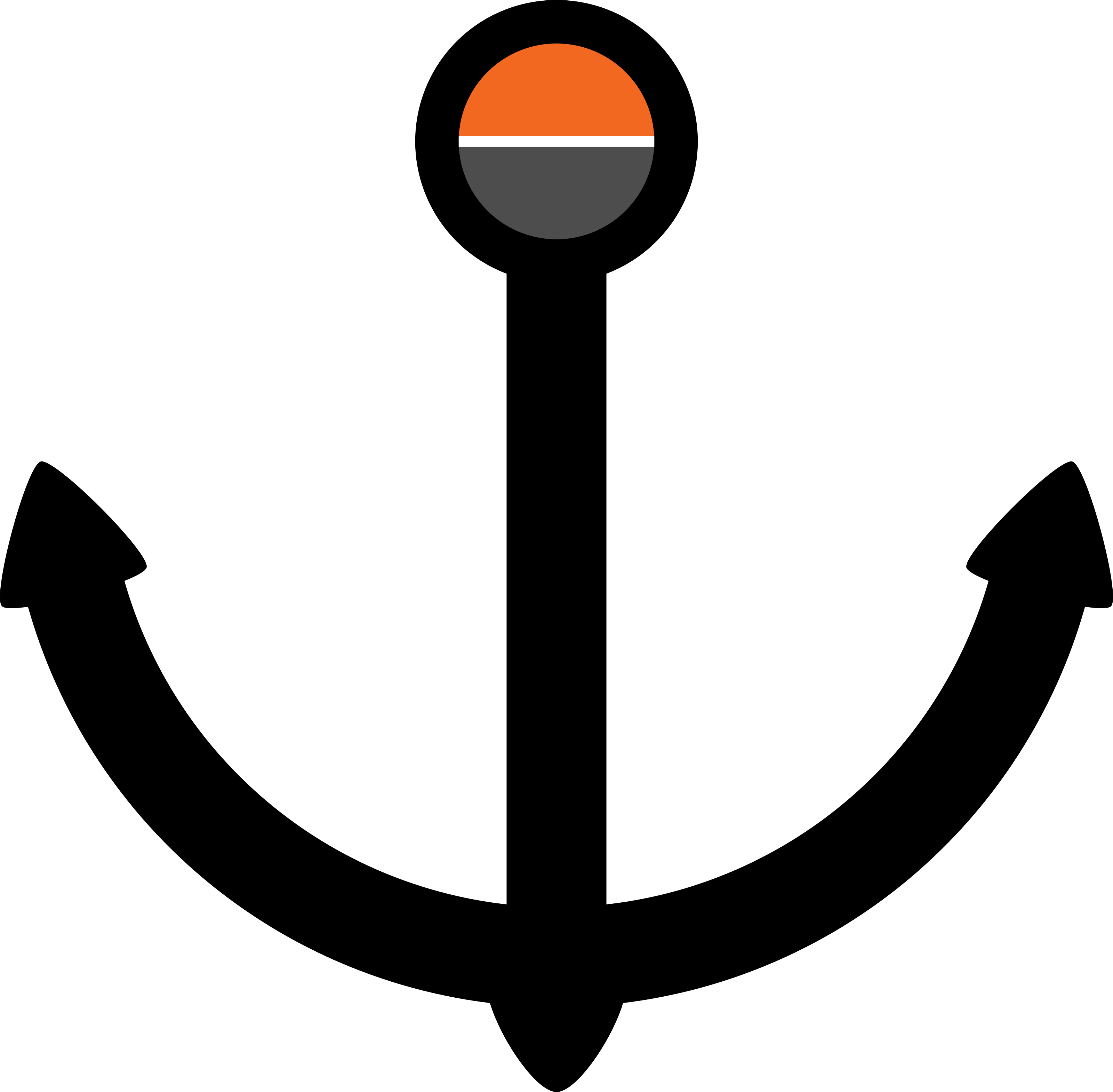
3 years ago Hey, I made this logo for Haveno, available as svg here.
![]() Let me know what you think about it and what can be improved :) (I share this under CC0)
Let me know what you think about it and what can be improved :) (I share this under CC0)
Closed erciccione closed 3 years ago
MasFlam
commented
3 years ago Hey, I made this logo for Haveno, available as svg here.
![]() Let me know what you think about it and what can be improved :) (I share this under CC0)
Let me know what you think about it and what can be improved :) (I share this under CC0)
 erciccione
commented
3 years ago
erciccione
commented
3 years ago Thanks for submitting this @MasFlam!, but it's important to not include the Monero logo in our logo as it could give the feeling of being Endorsed by Monero :)
MasFlam
commented
3 years ago Ah, I for some reason figured the opposite. I'll remove it and add some other detail then
 anhdres
commented
3 years ago
anhdres
commented
3 years ago I make this proposals:


Basically I tried to make it a sibling to monero, that's why I choose an angle for the H that made it more "M" which is also a good perspective to make it shape like a harbour. I took inspiration from old harbour markets and its imagery.
There are several options to explore there and iterate. I hope it helps.
MasFlam
commented
3 years ago I like the first one you sent the most, way better than whatever I could come have come up with. The colors (at lest the arches) don't match the ones in monero's logo though.
anhdres
commented
3 years ago The colors (at lest the arches) don't match the ones in monero's logo though.
That's intentional. They're a bit more contrasty than the originals to keep the associations but not making it look like a Monero official project. They could be even more different IMO.
A subtle nod I like is that the columns supporting the harbour have three legs shaped like an M, like Monero as a foundations of it all.
 fischdecasio
commented
3 years ago
fischdecasio
commented
3 years ago My final design for the logo. Primarily I drew inspiration from the existing Monero logo, basing it instead of an M on an H for Haveno and trying to keep its minimalist simple style. Furthermore it represents a swap, with the left and right area symbolizing a Bitcoin and Monero block respectively, which are connected through a thicker line. Regarding the Haveno/harbor theme it could also be seen as two ship containers sitting at a dock, with the sea in the background. The colors follow the Monero pattern, with the bottom color staying the same, the left being Bitcoin's, the one on the right representing Monero's and the top one being an alteration of the complementary color to Monero's orange.

 tejstead
commented
3 years ago
tejstead
commented
3 years ago @fischdecasio I really like this logo, it really integrates the Monero aesthetic while also communicating that it's a different, unaffiliated project.
 Gitdownwiththefunkysound
commented
3 years ago
Gitdownwiththefunkysound
commented
3 years ago @fischdecasio Excellent Logo. I need a logo for a project i'm doing. It's a website called FuZion. based on fusion the process of atoms bonding to produce energy. In this case the atoms represent the users of the website. i need something representing this fusion process with a lowercase letter f. or something with the word fuzion, and also a logo using the seperate letters in the word fuzion to represent a Breaking Bad style logo based on the periodic table of elements. If you want to fab me something up we could discuss pricing first. And i would gladly give you a deposit, thanks.
fischdecasio
commented
3 years ago @fischdecasio Excellent Logo. I need a logo for a project i'm doing. It's a website called FuZion. based on fusion the process of atoms bonding to produce energy. In this case the atoms represent the users of the website. i need something representing this fusion process with a lowercase letter f. or something with the word fuzion, and also a logo using the seperate letters in the word fuzion to represent a Breaking Bad style logo based on the periodic table of elements. If you want to fab me something up we could discuss pricing first. And i would gladly give you a deposit, thanks.
I'm afraid I might not be able to do this, but I can certainly give it a try without you having to pay me anything first. You can write me on Element, user name is the same as here.
 LukeAldevindo
commented
3 years ago
LukeAldevindo
commented
3 years ago Here's a logo idea that I put together. The lighthouse gives the feeling of a harbor, with the orange Monero wave at the bottom to indicate that Monero is the foundation of this DEX. Also, the stars could be thought of as decentralized nodes.
Feedback appreciated.

 newsyp
commented
3 years ago
newsyp
commented
3 years ago Here's a logo idea that I put together. The lighthouse gives the feeling of a harbor, with the orange Monero wave at the bottom to indicate that Monero is the foundation of this DEX. Also, the stars could be thought of as decentralized nodes.
Feedback appreciated.
I like the nodes up in the sky like stars. It's clever how you thought about that. Have you tried seeing what it would look like if all the nodes had lines connecting them like in a network?
 subreme
commented
3 years ago
subreme
commented
3 years ago ErCiccione already said that he'd prefer not to use the Monero logo on the Haveno Server, but while I like the idea behind fischdecasio's logo proposal I find the "H" he used to look a little weird, so I might as well leave my original proposal here.
I'll see if I can come up with a better alternative (especially if you guys like the idea of combining the Monero orange with its complementary blue color, as fischdecasio suggested). Maybe we could completely replace the orange with blue, spinning off the Monero logo similarly to how Bitcoin Cash modified the Bitcoin logo?
It could still be pretty cool if someone managed to design a logo containing something similar to a container ship, kind of like the Docker logo, we'll see...

 niyid
commented
3 years ago
niyid
commented
3 years ago Best design I have seen. Simple. Effective (tells a connection).
On Tue, Apr 13, 2021, 10:51 Subreme @.***> wrote:
ErCiccione already said that he'd prefer not to use the Monero logo on the Haveno Server https://matrix.to/#/!cSwJDzxRuWndmFUZTd:haveno.network/$tGOUaeBlWJKQsqQ-2knPbSX5xBD4umdyB5FCJa6oCoY, but while I like the idea behind fischdecasio's logo proposal I find the "H" he used to look a little weird, so I might as well leave my original proposal https://matrix.to/#/!cSwJDzxRuWndmFUZTd:haveno.network/$7mbxhEW6zRVNF16S6nf1q9IXYbOEpf1Qncua3EmwNHw here.
I'll see if I can come up with a better alternative (especially if you guys like the idea of combining the Monero orange with its complementary blue color, as fischdecasio suggested). Maybe we could completely replace the orange with blue, spinning off the Monero logo similarly to how Bitcoin Cash modified the Bitcoin logo?
It could still be pretty cool if someone managed to design a logo containing something similar to a container ship, kind of like the Docker logo https://matrix.to/#/!cSwJDzxRuWndmFUZTd:haveno.network/$pNhRtWXJXiMs0g4bUHrjwh3dVRSry5PMLeEBhfXPdNE, we'll see... [image: image] https://user-images.githubusercontent.com/71085002/114533633-62913e00-9c4e-11eb-892a-7b148dbe0efd.png
— You are receiving this because you are subscribed to this thread. Reply to this email directly, view it on GitHub https://github.com/haveno-dex/haveno-meta/issues/1#issuecomment-818607215, or unsubscribe https://github.com/notifications/unsubscribe-auth/AE2MWR7BNO7XP3EZNKJDUODTIQHY7ANCNFSM4XSCD72A .
newsyp
commented
3 years ago For this logo, after having learned the meaning behind the name Haveno; port. I researched images of ports to draw inspiration from and found that, in a majority of the images I would see there where large crane like structures I assume to be for lifting boats and cargo. I incorporated these structures into the logo in the shape of the wedge's you see lifting what appear to be coins. I like to imagine the two cranes in the logo to be 2 peers preparing to exchange their coins in a trade and the front crane is getting its coin from out the water while the other crane waits.
These are two versions for this logo that I’ve put together after having received some feedback in the dev chat and from looking here at all your ideas.
A more simplified look to the left and a more artistic look to the right.

newsyp
commented
3 years ago Here are some closer looks at the design
With title:

Simplified:

Artistic:

anhdres
commented
3 years ago A new idea based on the docker thing someone mentioned. I still like the "harbor"idea more, since it's the place where the trading takes place, but this container ship with negative H in there is probably clearer and works better in small sizes:


The profiles are of course containers which make them modular and square, we could add some extra detail but I think it's too much.
anhdres
commented
3 years ago Last exploration, based on the idea of a safe haven, tax haven, whatever haven: a destination to be sheltered. So island themed, with a start marking the capital or main city, defined coastline, elevation, and adjacent waters. Extra point because the star and te top of the H make a little house negative space shape.

These would also work well in icon sizes. This next one I like better because of the stronger red color, but changed the star pointing the city for a dot because it was too viva la revolución. Also simplified shape of the island. It could be even more simplified I guess, if desired.

and accompanying full logo:

LukeAldevindo
commented
3 years ago Here's a logo idea that I put together. The lighthouse gives the feeling of a harbor, with the orange Monero wave at the bottom to indicate that Monero is the foundation of this DEX. Also, the stars could be thought of as decentralized nodes. Feedback appreciated.
I like the nodes up in the sky like stars. It's clever how you thought about that. Have you tried seeing what it would look like if all the nodes had lines connecting them like in a network?
I tried that but couldn't seem to get it to look quite right. I'll give it another shot.
newsyp
commented
3 years ago Here's a logo idea that I put together. The lighthouse gives the feeling of a harbor, with the orange Monero wave at the bottom to indicate that Monero is the foundation of this DEX. Also, the stars could be thought of as decentralized nodes. Feedback appreciated.
I like the nodes up in the sky like stars. It's clever how you thought about that. Have you tried seeing what it would look like if all the nodes had lines connecting them like in a network?
I tried that but couldn't seem to get it to look quite right. I'll give it another shot.
Yea I tried something similar with mines but it didn't look right neither.
LukeAldevindo
commented
3 years ago I like the nodes up in the sky like stars. It's clever how you thought about that. Have you tried seeing what it would look like if all the nodes had lines connecting them like in a network?
I tried that but couldn't seem to get it to look quite right. I'll give it another shot.
Yea I tried something similar with mines but it didn't look right neither.
Okay, what do you think of this? I also made the top section of the lighthouse a bit less rounded.

newsyp
commented
3 years ago I like the nodes up in the sky like stars. It's clever how you thought about that. Have you tried seeing what it would look like if all the nodes had lines connecting them like in a network?
I tried that but couldn't seem to get it to look quite right. I'll give it another shot.
Yea I tried something similar with mines but it didn't look right neither.
Okay, what do you think of this? I also made the top section of the lighthouse a bit less rounded.
I think you figured out a smart way to incorporate this idea using the dotted lines to connect the nodes, but looking at it and comparing the two I think the original looks best.
erciccione
commented
3 years ago Two nice proposals from twitter and reddit:
anhdres
commented
3 years ago wallpaper based on the logo:

anhdres
commented
3 years ago Zip file with the 3 versions of the logo in SVG, PNG with alpha, and JPG
erciccione
commented
3 years ago This issue is resolved. I will upload logos and meeting logs on this repo.
Thanks everybody :)


The present logo is a stock image. We need something unique for Haveno.