 mradamcox
commented
1 week ago
mradamcox
commented
1 week ago This is now implemented, but here are the old color scales, just in case we need to revert for some reason:
economic hardship:
old: [[175, 240, 91], [226, 183, 47], [255, 120, 71], [254, 75, 131], [191, 60, 175], [110, 64, 170]]

new: [[254,235,226], [252,197,192], [250,159,181], [247,104,161], [197,27,138], [122,1,119]]
air quality variables:
old -- Satellite-Derived Particulate Matter (PM2.5): [[68, 1, 84],[70, 50, 127],[54, 92, 141],[39, 127, 142],[31, 161, 135],[74, 194, 109],[159, 218, 58],[253, 231, 37]]
old -- Observed Particulate Matter (PM2.5): [[70, 50, 127],[54, 92, 141],[39, 127, 142],[31, 161, 135],[74, 194, 109],[159, 218, 58]]
old -- Modeled Nitrogen Dioxide (NO2): [[68, 1, 84],[70, 50, 127],[54, 92, 141],[39, 127, 142],[31, 161, 135],[74, 194, 109],[159, 218, 58],[253, 231, 37]]
old -- Modeled Ozone (O3): [[68, 1, 84],[70, 50, 127],[54, 92, 141],[39, 127, 142],[31, 161, 135],[74, 194, 109],[159, 218, 58],[253, 231, 37]]
old -- Modeled Particulate Matter (PM2.5): [[68, 1, 84],[70, 50, 127],[54, 92, 141],[39, 127, 142],[31, 161, 135],[74, 194, 109],[159, 218, 58],[253, 231, 37]]

new: [[237,248,251], [191,211,230], [158,188,218], [140,150,198], [136,86,167], [129,15,124]]
Makosak
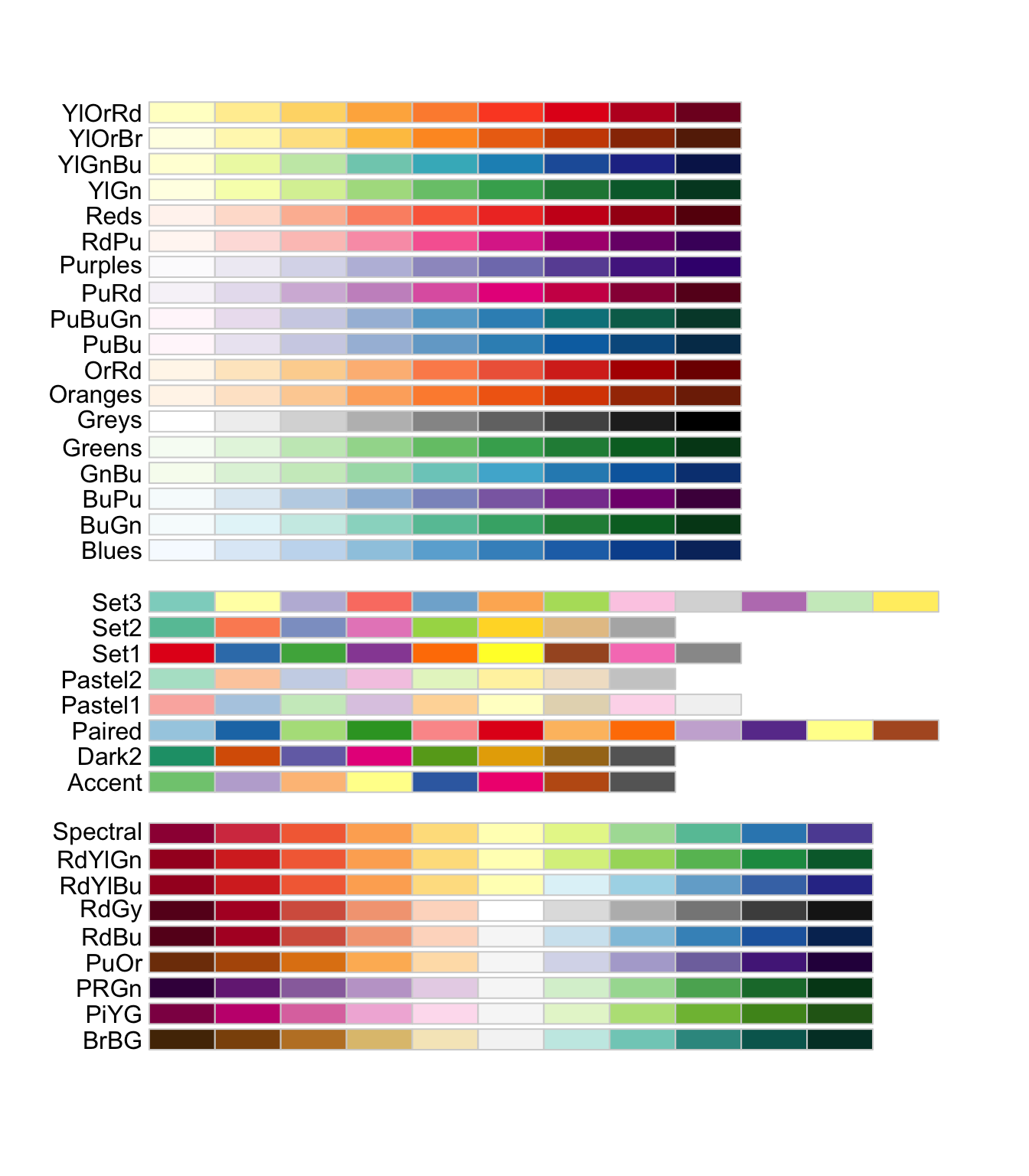
Issue At our events in June, some of the community members who interacted with the air quality and economic hardship maps had trouble interpreting what colors represented high values vs. low values. For example, for the air quality maps, the darkest purple could be interpreted as the worst air quality while the lighter yellow could be interpreted as the best.
Recommendation We recommend this color palette for economic hardship:
feebe2
fcc5c0
fa9fb5
f768a1
c51b8a
7a0177
And this color palette for all of the air quality variables:
edf8fb
bfd3e6
9ebcda
8c96c6
8856a7
810f7c
Rationale Both of these palettes are colorblind friendly and are sequential which will help with the interpretation issues the current color palettes have.