Team's Response
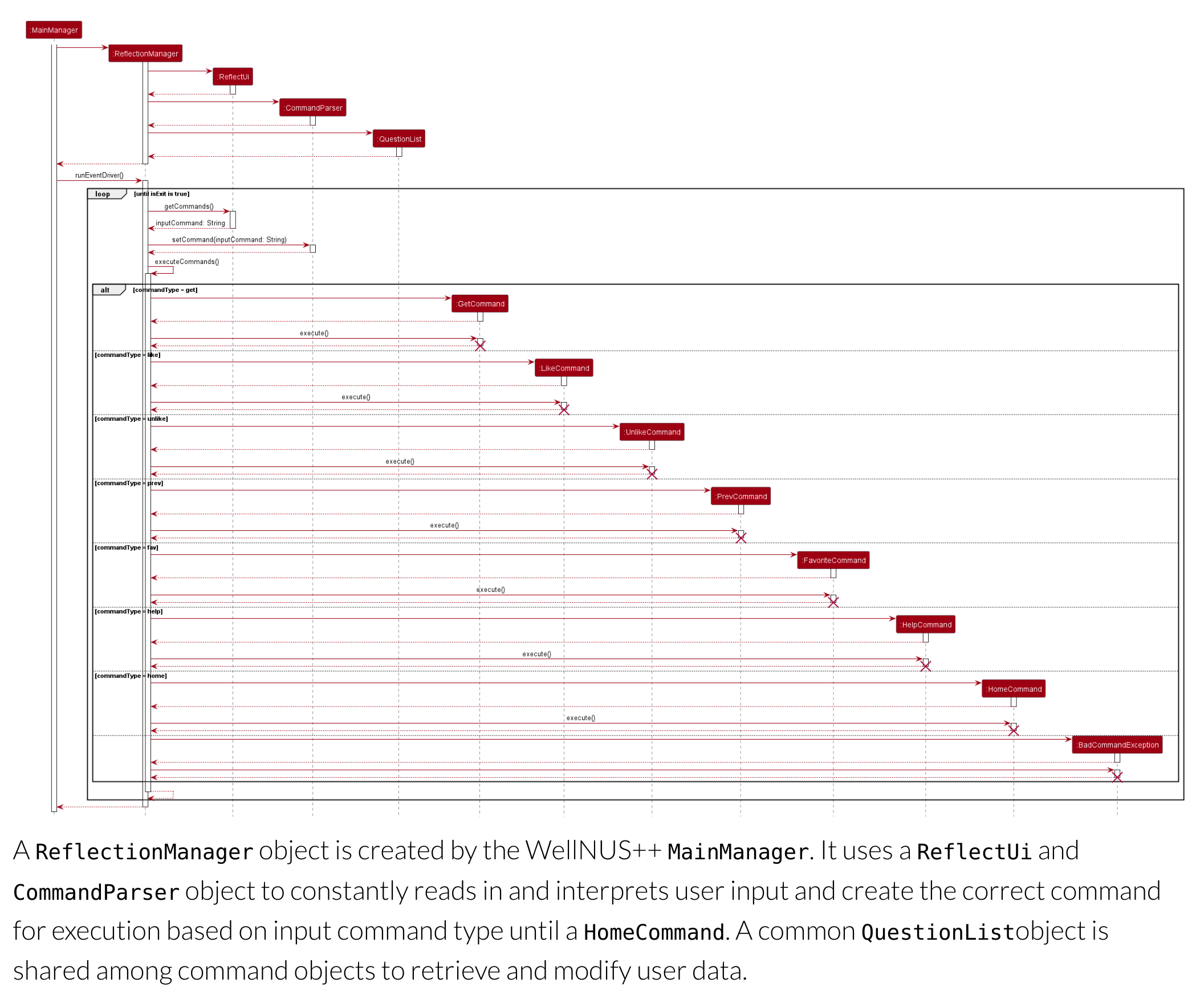
We agree that the sequence diagram is a bit small. However, users can zoom in and read the sequence diagram clearly, hence, it is purely a cosmetic issue and severity should be VeryLow.
The 'Original' Bug
[The team marked this bug as a duplicate of the following bug]
Self Relection Implementation sequence diagram hard to read
Note from the teaching team: This bug was reported during the Part II (Evaluating Documents) stage of the PE. You may reject this bug if it is not related to the quality of documentation.
Size of sequence diagram makes it unreadable. I would suggest breaking it into parts using reference frames.
[original: nus-cs2113-AY2223S2/pe-interim#723] [original labels: severity.VeryLow type.DocumentationBug]
Their Response to the 'Original' Bug
[This is the team's response to the above 'original' bug]
We agree that the sequence diagram is a bit small. However, it's just a cosmetic issue as users can still zoom in to read the sequence diagram clearly. Hence, we accept that it's just a verylow documentation error.
Items for the Tester to Verify
:question: Issue duplicate status
Team chose to mark this issue as a duplicate of another issue (as explained in the Team's response above)
- [ ] I disagree
Reason for disagreement: [replace this with your explanation]
## :question: Issue severity Team chose [`severity.VeryLow`] Originally [`severity.Low`] - [ ] I disagree **Reason for disagreement:** [replace this with your explanation]

It is almost impossible to read the sequence diagram given. The words are too small.
I think it is better to just demonstrate 1 application of the object.