 probonopd
commented
3 years ago
probonopd
commented
3 years ago Most likely these are placeholder icons.
Yes. Improved versions are highly welcome.
Open velissarious opened 3 years ago
probonopd
commented
3 years ago Most likely these are placeholder icons.
Yes. Improved versions are highly welcome.
 velissarious
commented
3 years ago
velissarious
commented
3 years ago Most likely these are placeholder icons.
Yes. Improved versions are highly welcome.
Can you state the technical specifications for icons (File format, sizes for each one etc)?
I read the "Icons" chapter again form the 1992 version of the Machintosh Human Interface Guidelines, it states a number of interesting guidelines which I believe are not followed in any UNIX-like MacOS and some guidelines are not followed even in the old ones.
For example:
The desktop interface is based on an office metaphor using a desktop as the primary workspace. You want to build on this basis and diverge from it as little as possible.
But the icon for the floppy and drive is like this in early mac systems:

 A better choice according to this guideline would be the one for floppies in Atari TOS:
 But without the drive letter on the icons as there is this guideline:
Avoid using text in your icons whenever possible. Text in icons can be confusing, and it's not localizable to other regions, languages, or countries.

HelloSystem is currently using the office metaphor.
Also, don't use inside jokes or pictures that represent code names for your icons.
What is this ?

We should prefer something like:

Icons like the Filer icon should be avoided.
On the Macintosh screen the light source always comes from the upper-left corner of the screen.
Take a look at the different perspectives:
Mac
 ->
->
 ->
->
 (macOS 9)
 (but also macOS 9, different perspective :/ )

Amiga
->
 ->
->
 ->
->

There is a similar evolution for Windows and OS/2, flat scheumorphic to 2.5D perspective to more detailed and then a switch to flat and abstract.
What about shadows ?
Colors
This entire set of 34 colors was chosen to be subtle. Subdued colors avoid a "circus" effect on the screen. If you use too many of the same types of colors, people can't discern what is important as easily.
Which is the color palette to be used in HelloSystem ?
Most icons in home computers looked simple and if modernized (technologically) I believe they would look more like haiku's icons than modern macOS X icons (or even 10.5 era icons). For example (I do not think we could use these): https://www.deviantart.com/marcello-c/art/Classic-Mac-Style-Folders-for-OS-X-624900831 https://www.deviantart.com/marcello-c/art/Classic-Mac-Style-Drives-for-OS-X-625109975
I took most snippets from the pictures of this site: http://toastytech.com/guis/magdesk.html (maybe we could have a color set inspired by this Commodore Magic Desk? A nod to one of the most popular home computers)

Is there a list of icons for the HelloSystem in order of use?
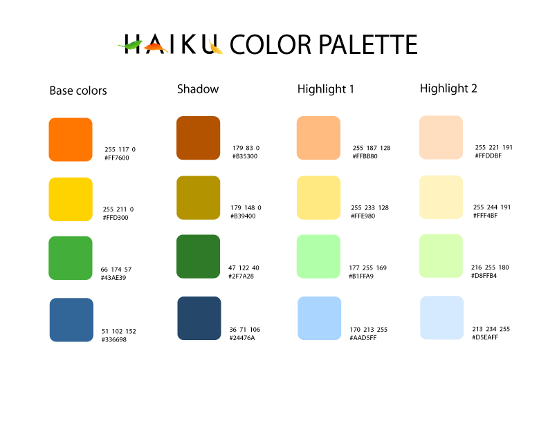
I was thinking that Haiku icons could be used if the license was suitable. They also follow the guideline to use a fixed set of colors for system icons. They use a different set than 1992 Apple. These are the icon guidelines of haiku https://www.haiku-os.org/development/icon-guidelines extremely similar, basically the same principles to the 1992 Apple guidelines. In fact if the license is compatible and desirable I suggest to convert the Haiku icons change the palette (to avoid confusion) and create new icons like the one for the file manager (drawer) and license them with BSD and share back. The colors used by haiku is https://www.haiku-os.org/files/downloads/2007-03-20_haiku-color-palette.png
I found these from a discontinued Linux distro that aimed to be BeOS-like http://www.zevenos.com/download/themes (no information on license :( )
OS/2 Wrap 4 icons also looked similar, different palette https://www.os2world.com/wiki/index.php/OS/2_Warp_4:_New_Workplace_Shell HelloSystem would be following in the same type of style.
 natrist
commented
3 years ago
natrist
commented
3 years ago I agree with some of the statements but I think strictly following guidelines from a 30 year old OS as to what represents an intuitive GUI is mental retardation, unless what you are aiming for is to accurately recreate an OS from that era.
Tristan Cormier
From: Dimitrios Stefanos Velissariou notifications@github.com Sent: Sunday, March 7, 2021 12:04:41 PM To: helloSystem/hello hello@noreply.github.com Cc: Subscribed subscribed@noreply.github.com Subject: Re: [helloSystem/hello] all icons should have a black outline (some icons are not suitable) (#143)
Most likely these are placeholder icons.
Yes. Improved versions are highly welcome.
Can you state the technical specifications for icons (File format, sizes for each one etc)?
I read the "Icons" chapter again form the 1992 version of the Machintosh Human Interface Guidelines, it states a number of interesting guidelines which I believe are not followed in any UNIX-like MacOS and some guidelines are not followed even in the old ones.
For example:
The desktop interface is based on an office metaphor using a desktop as the primary workspace. You want to build on this basis and diverge from it as little as possible.
But the icon for the floppy and drive is like this in early mac systems: [image]https://user-images.githubusercontent.com/23398764/110237121-507afc00-7f3a-11eb-85b0-bbc0b28b1fb8.png [image]https://user-images.githubusercontent.com/23398764/110237140-6a1c4380-7f3a-11eb-8451-41f0643f0958.png A better choice according to this guideline would be the one for floppies in Atari TOS: [image]https://user-images.githubusercontent.com/23398764/110237164-8cae5c80-7f3a-11eb-8df0-a0b892f822ad.png But without the drive letter on the icons as there is this guideline:
Avoid using text in your icons whenever possible. Text in icons can be confusing, and it's not localizable to other regions, languages, or countries.
HelloSystem is currently using the office metaphor.
Also, don't use inside jokes or pictures that represent code names for your icons.
What is this ? [image]https://user-images.githubusercontent.com/23398764/110237802-43f8a280-7f3e-11eb-9d77-674ef177745a.png
We should prefer something like: [image]https://user-images.githubusercontent.com/23398764/110237865-9e91fe80-7f3e-11eb-9202-31a2f98105a8.png
Icons like the Filer icon should be avoided.
On the Macintosh screen the light source always comes from the upper-left corner of the screen.
Take a look at the different perspectives: Mac [image]https://user-images.githubusercontent.com/23398764/110238152-3d6b2a80-7f40-11eb-9fba-b7e020196a9c.png -> [image]https://user-images.githubusercontent.com/23398764/110238162-4d830a00-7f40-11eb-8703-d9c2760490ff.png -> [image]https://user-images.githubusercontent.com/23398764/110238174-596ecc00-7f40-11eb-84fc-d0a28fc3b631.png (macOS 9) [image]https://user-images.githubusercontent.com/23398764/110238456-05fd7d80-7f42-11eb-9d6c-d3d32f7a2f37.png (but also macOS 9, different perspective :/ ) [image]https://user-images.githubusercontent.com/23398764/110238726-7e187300-7f43-11eb-89b9-2a639798c695.png
Amiga [image]https://user-images.githubusercontent.com/23398764/110238060-9f776000-7f3f-11eb-9236-a3c74aaa5154.png -> [image]https://user-images.githubusercontent.com/23398764/110238133-1876b780-7f40-11eb-87ea-d126c46da4e4.png -> [image]https://user-images.githubusercontent.com/23398764/110238140-24627980-7f40-11eb-9458-3606dd79d329.png -> [image]https://user-images.githubusercontent.com/23398764/110238429-de0e1a00-7f41-11eb-9423-fdf71c279e9f.png
There is a similar evolution for Windows and OS/2, flat scheumorphic to 2.5D perspective to more detailed and then a switch to flat and abstract.
What about shadows ?
Colors
This entire set of 34 colors was chosen to be subtle. Subdued colors avoid a "circus" effect on the screen. If you use too many of the same types of colors, people can't discern what is important as easily.
Which is the color palette to be used in HelloSystem ?
Most icons in home computers looked simple and if modernized (technologically) I believe they would look more like haiku's icons than modern macOS X icons (or even 10.5 era icons). For example (I do not think we could use these): https://www.deviantart.com/marcello-c/art/Classic-Mac-Style-Folders-for-OS-X-624900831 https://www.deviantart.com/marcello-c/art/Classic-Mac-Style-Drives-for-OS-X-625109975
I took most snippets from the pictures of this site: http://toastytech.com/guis/magdesk.html (maybe we could have a color set inspired by this Commodore Magic Desk? A nod to one of the most popular home computers)
Is there a list of icons for the HelloSystem in order of use?
I was thinking that Haiku icons could be used if the license was suitable. They also follow the guideline to use a fixed set of colors for system icons. They use a different set than 1992 Apple. These are the icon guidelines of haiku https://www.haiku-os.org/development/icon-guidelines extremely similar, basically the same principles to the 1992 Apple guidelines. In fact if the license is compatible and desirable I suggest to convert the Haiku icons change the palette (to avoid confusion) and create new icons like the one for the file manager (drawer) and license them with BSD and share back. The colors used by haiku is https://www.haiku-os.org/files/downloads/2007-03-20_haiku-color-palette.png
I found these from a discontinued Linux distro that aimed to be BeOS-like http://www.zevenos.com/download/themes (no information on license :( )
OS/2 Wrap 4 icons also looked similar, different palette https://www.os2world.com/wiki/index.php/OS/2_Warp_4:_New_Workplace_Shell HelloSystem would be following in the same type of style.
— You are receiving this because you are subscribed to this thread. Reply to this email directly, view it on GitHubhttps://github.com/helloSystem/hello/issues/143#issuecomment-792311756, or unsubscribehttps://github.com/notifications/unsubscribe-auth/AAXNN4KZDSVEVRUTOQTTXXDTCOW2TANCNFSM4YJ5VBJA.
probonopd
commented
3 years ago Thanks for considering the early Machintosh Human Interface Guidelines. Indeed in helloSystem we want to follow key concepts described there, especially as far as they contribute to being "welcoming" to switchers from the Mac. But this does not necessarily mean that we have to follow every recommendation to the letter. Especially in areas in which technical constraints and/or usage patterns have significantly changed over the last decades we may want to re-interpret the guidelines rather liberally.
A better choice according to this guideline would be the one for floppies in Atari TOS
Let's keep in mind that our objective is that a switcher from the Mac should feel "at home" on helloSystem quickly; so using an icon that shows a filing cabinet to represent a floppy disk would be unexpected and confusing. Also, at the time of Atari, the concept of a storage medium probably was so new to users that they wanted to choose an abstraction from a typical (analog) 80s desktop. Today, storage media (e.g., SD cards) are part of our (analog) desktops today, so we do not need to represent storage media with icons other than storage media.
Similarly, a "folder" is a concept every longtime Mac user is very familiar with, so the icon for a folder should show, well, a folder (and not a drawer).
What is this ?
I agree that the Finder icon in the Dock of Mac OS X is a bad choice for several reasons:
So in helloSystem we are using a "home folder" icon, because the home folder is opened when you click it.
What perspective should they have? Which is the color palette to be used in helloSystem ?
Good point; I think Classic Mac and Mac OS X were not really consistent in this regard (neither within one OS version nor across versions). The elementary icon set which we are currently using for most icons are using a "frontal" persepctive for most icons and this seems plain and useful to me, loosely reminds me of the System 7 icons while still being distinctly different. Unless we decide to switch to another icon set or someone volunteers to make completely custom icons I think we should follow the elementary recommendations (e.g., regarding perspective and color palette) for consistency: https://elementary.io/docs/human-interface-guidelines#iconography
I like the "Classic-Mac-Style-Folders-for-OS-X" examples you posted but I fear the work of creating a whole icon set from scratch. Maybe we might want to make some characteristic changes to some of the elementary icons to incorporate some of the System 7 (frontal perspective) Classic look?
In case we really go for a fully custom icon set, I would like something more skeuomorphic; like many third-party icons that were made during the time of Mac OS X 10.4-10.9 but without applying Aqua-like glossy effects to materials that are not glossy in nature. A good example is the icon we are currently using for the Hardwre Probe utility (also the big version when the utility is opened). We should also check what the Macintosh Human Interface Guidelines from that timeframe said about icons.
We should never interfere with the icons of well-known applications as their branding should be consistent across all platforms and may even be version-specific (e.g., the Firefox icon has evolved quite a bit over time).
What about the "computer" icon?
It needs to go away entirely. Instead of the "Computer" icon, the contents of what is currently inside the "Computer" icon need to go on the desktop. We already have a ticket for this: https://github.com/helloSystem/Filer/issues/9
Is there a list of icons for the HelloSystem in order of use?
Not 100% sure what you mean by this but so far most of our icons have come from http://archive.ubuntu.com/ubuntu/pool/universe/x/xubuntu-artwork/xubuntu-icon-theme_16.04.2_all.deb
Haiku
To me Haiku icons "feel" like BeOS icons, whereas we want helloSystem icons to "feel" Mac-like without being a clone of existing Mac icons.
OS/2
These feel like "pixel art" to me and look very dated to me.
Possibly one way to achieve this would be to combine some general concepts from System 7, Mac OS 8-9, and mainly MacOS X ~10.4 iconography but freely re-interpret them. Since doing en entire new icon set is a major undertaking, we should only start if someone really steps up to put serious time and effort into this. Whatever we decide to do, we should avoid to make the system look like a "80s museum", even though we apply some of the 80s concepts (possibly with moderate 00s skeuomorphism). I know that this may sound a bit vague, but I can't describe it any better. What we definitely should avoid is the "every icon is a rounded square") iOS look and feel (or anything that really was designed for touch use).
I think strictly following guidelines from a 30 year old OS as to what represents an intuitive GUI is mental retardation, unless what you are aiming for is to accurately recreate an OS from that era.
Agree. I think it is good to keep in mind proven concepts that stood the test of time but freely re-interpret them given today's requirements and constraints.
probonopd
commented
3 years ago Unfortunately the license of these is not suitable for inclusion in helloSystem, and the shapes are a little too reminiscent of their inspiration source:

Source: https://freeware.iconfactory.com/preview/agap, by @dlanham
 louies0623
commented
3 years ago
louies0623
commented
3 years ago If it is, a shadow will be automatically generated on the icon, so that there is no need to modify the image separately. https://doc.qt.io/qt-5/qml-qtgraphicaleffects-dropshadow.html
probonopd
commented
3 years ago @louies0623 Filer is currently not using Qml but Qt Widgets.
louies0623
commented
3 years ago Forget QML, you should be able to automatically add shadows to icons, right?
probonopd
commented
3 years ago Probably yes, using https://doc.qt.io/qt-5/qgraphicsdropshadoweffect.html:
QGraphicsDropShadowEffect *effect = new QGraphicsDropShadowEffect;
effect->setBlurRadius(3);
effect->setXOffset(3);
effect->setYOffset(3);
effect->setColor(Qt::black);
object->setGraphicsEffect(effect);
But it's unclear how to actually apply this here:
louies0623
commented
3 years ago You can do it. And I found that if possible, the text shadow below the icon is also synchronized with the shadow of the icon, so that there will be a uniform shadow. Secondly, there is a "Select shadow color" option in Filer that can also be removed, because this feature is rarely used by people, and it can also reduce ISO usage if removed.
probonopd
commented
3 years ago You can do it.
How?
In the Human Interface Guidelines it is stated that the icons should have a black outline. Here is an example of an icon which is difficult to see because of the lack of the black outline.
Take a look at "Figure 8-21 Icons with a black outline" vs "Figure 8-22 Icons without a black outline".
In a youtube video by Gardiner Bryant he noticed that the mouse icon is a cursor. https://youtu.be/MomHU2tP8fU?t=605
Most likely these are placeholder icons.