Closed b-g closed 1 year ago
This is to gather a few links.
Currently we use https://github.com/hfg-gmuend/openmoji/blob/master/font/README.md basically SVGinOT Color Font Builder a 3-4 year old and stale project. The resulting Colorfont seem just partly to support the standard. They just work in Firefox :(
Other links:
To simplify the discussion: Which format should we support? Right now, there are four: PNG based: Google's CBDT/CBLC tables and Apple's SBIX table Vector based: Microsoft's overlapped glyphs (COLR/CPAL tables) and Mozilla and Adobe’s SVG (SVG table)
These formats are supported as follows at the time (source: https://pixelambacht.nl/2014/multicolor-fonts/):


Checking with https://pixelambacht.nl/chromacheck/ there also seems to be supported SBIX in Chrome.
My opinion: there's no way around SVG because it's much more powerful than COLR. I guess, sooner or later all browsers will support SVG Color Fonts.
Our situation:

From left to right: Chrome, Firefox, Safari (I'm on Mac, so no quick check for Edge, ...)
Safari should support SVG Color Fonts. So, that's a bug.
Hi @bohnacker, many thanks for putting this together. I'm agnostic and happy to support a single standard e.g. SVG properly ... just it should be 100%. Currently our colorfont is just rendered in Firefox, but should also usable in Safari, Adobe CC, Sketch, Affinity ... which is not the case. Also @dnlutz is strongly in favor of SVG ... Hence I think SVG is the best bet, however I couldn't find a good tooling for it back at the beginning of 2019. Also note: Google Noto Emoji tooling is PNG based.
I don't know what joypixels (emojione) is doing, but their color font seems to display nicely in browsers and qt apps (including konsole) on Arch linux with the repo package, which fetches joypixels-android.ttf.
The b/w font looks damaged as well for me in LaTeX:

Hi @bohnacker, https://www.glyphrstudio.com/online/ a free online font editor might be interesting in terms of debugging the black font. (But also no colorfont support currently https://github.com/glyphr-studio/Glyphr-Studio-1/issues/270)
Related font issue from #96:
Not sure how valid this is but using the black openmoji font and vscode, it shows ones we support as a single character and others as multiple characters
However we do have a pirate flag emoji so maybe this is also an issue with the font that we haven't realised?

I checked a few things with our color and black fonts and compared it with the fonts "EmojiOne Color" and "Twitter Color Emoji". I chose those because they are not from a vendor of operating systems (Apple, Windows, Google). EmojiOne is an Opentype font while the one from Twitter is Truetype. Ours is Truetype too.
It appears that our fonts are not that bad in general, but there are quite some things to improve.
The following screenshot is made in InDesign on Mac and it seems to handle the Openmoji Color font perfectly. Openmoji Black has some problems. The conversion from SVG to Truetype glyphs ignores stroke-linecap="round" and stroke-linejoin="round" (most obvious on the smiley and the TM-sign). Also, overlapping paths are not converted well (hand, soccer ball, santa claus).

For the black font I see two possible solutions:
I found another problem with our fonts in InDesign. Ligatures sometimes are split into parts when text gets wrapped. It happend with the hand and the horse but not with the dark santa claus and the flags. I'll try to find out why.

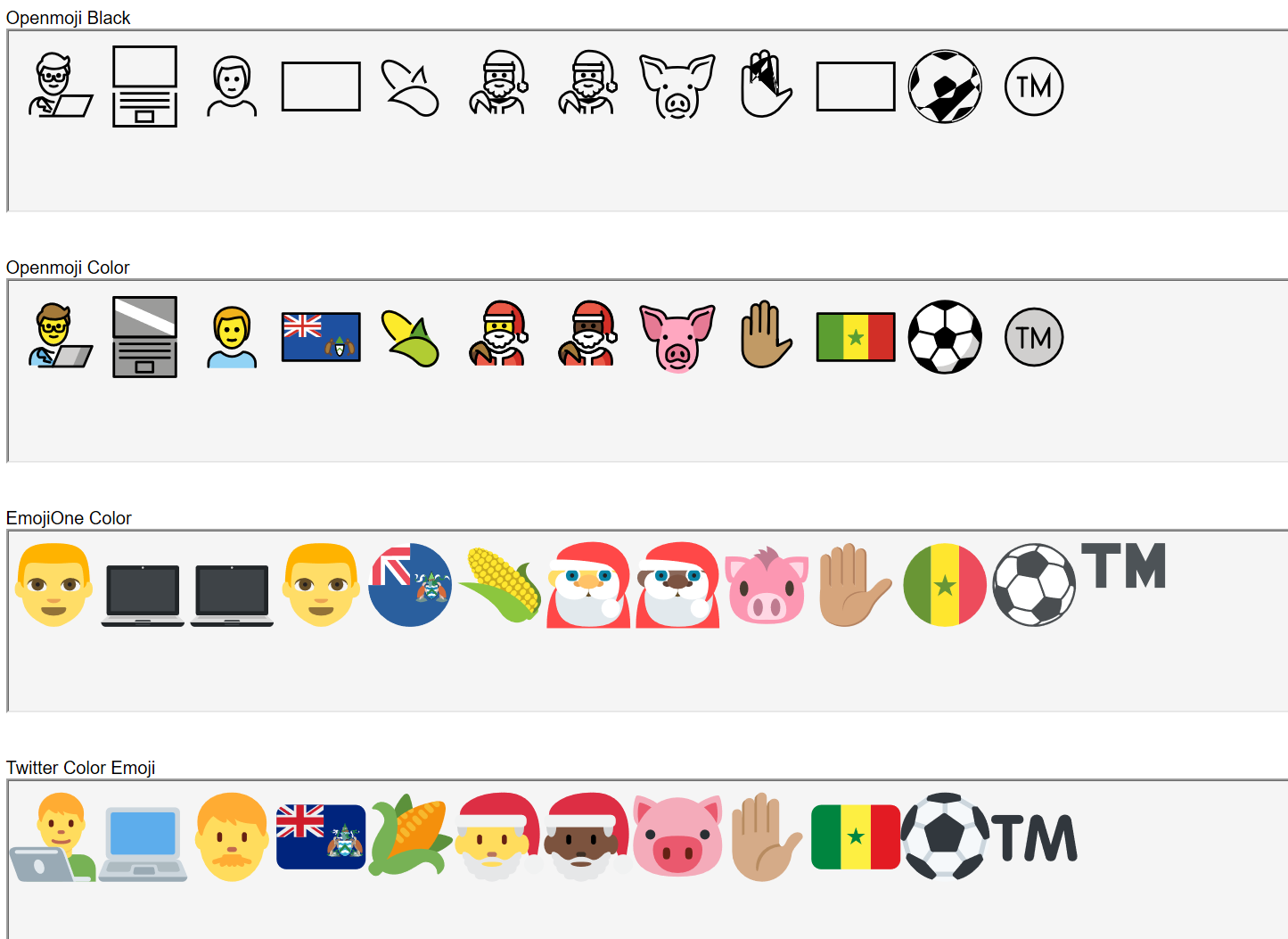
Comparision of the behaviour in browsers:
Firefox (Mac and Windows): Some problems with our color font shows up. Some strokes are not scaled correctly. I'm mot complete sure why. Maybe it's because there are elements on the color layer that have both a fill color and a stroke color. Or it has something to do with transforms that are still in some emojis. Edit: Quite sure it's the first guess... the hand with yellow skin is displayed correctly, all others not because they get a stroke color while building.

Safari (Mac): Only EmojiOne works (maybe because it's Opentype):
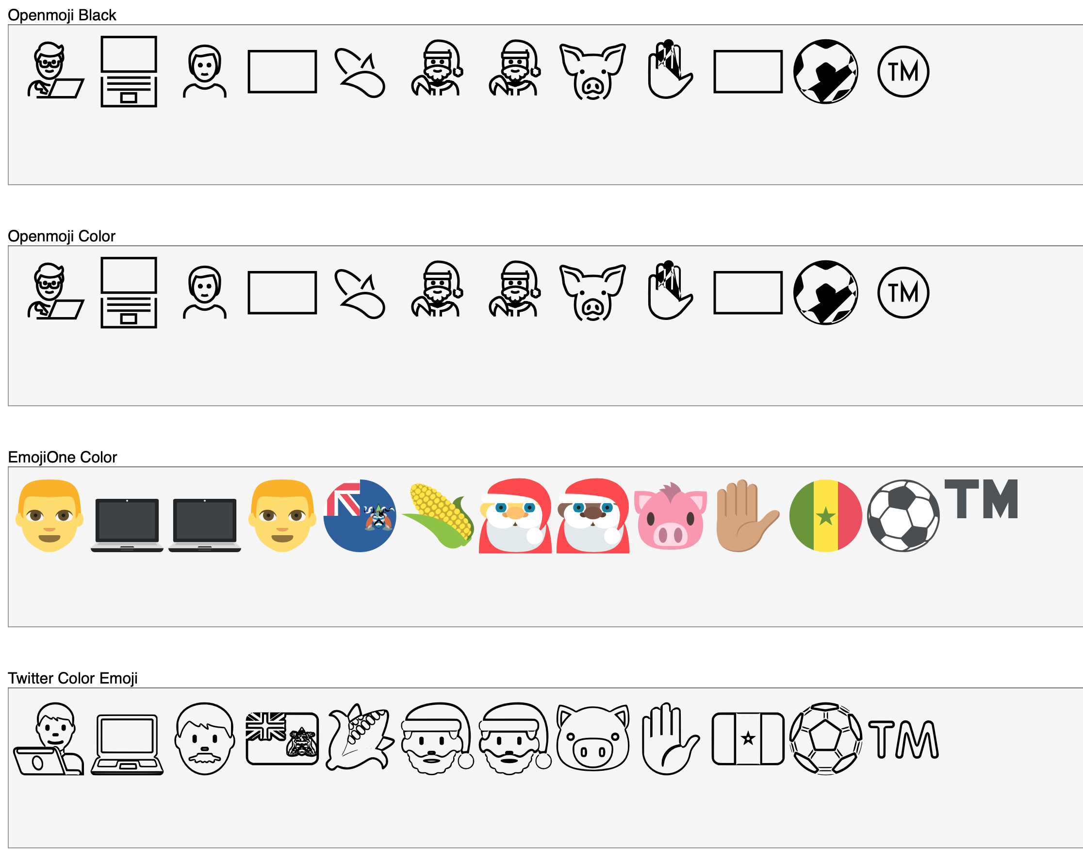
Edge (Windows):
Handles our color emojis perfectly.
Maybe we could use some other libraries like this to convert all strokes in the black SVGs to areas before creating the truetype glyphs: https://www.npmjs.com/package/js-clipper
It seems to support all we need (stroke-linecap="round" and stroke-linejoin="round"). The fact that it is not developed further on is not a problem in my opinion because it has no dependencies.
Or has anybody good experiences with other libraries for path operations?
Hi @bohnacker! A belated happy new year + many thanks for the investigation! That sounds a lot more promising than I've anticipated! Yay! A few comments/thoughts:
OpenMoji Black
OpenMoji Color
Hi @b-g, some answers to your questions and suggestions:
I would vote to introduce a dedicated build process which converts all problematic strokes to shapes ... but not to alter the src svg files
Yes, I think so too. That's the only approach that makes sense.
Instead of js-clipper I would rather bet on paper.js (in node.js) with the paperjs-offset plugin. (See also the discussion on Parametrized stroke outlining / expanding / offsetting with paper.js)
I also agree. I had a look at js-clipper and found that it converts all curves to polygons. The result will be glyphs that will look bad when scaling them up a lot. Still we have to check if paperjs is doing everything correctly.
Would we have to convert every stroke or just the ones with stroke-linecap="round" and stroke-linejoin="round" attributes?
Best would be to convert every stroke beforehand because scfbuild (or whereever this is done) has also problems with paths that are crossing itself (see hand and soccer ball in the above examples). In the end (as a glyph) everything will be areas.
Q: Is the issue with svgs which have both a fill color and a stroke color a Firefox bug only? If so ... should we simply ignore it?
As far as I've seen, it's a Firefox only bug. Maybe we could ignore it and hope for a bug fix on the Firefox side.
Q: Should we ditch current color font generator or stick with it? I can offer to improve the generator "scfbuild" to support properly generating the two fonts without the current hustle ... but this makes only sense if the scfbuild is worth the invest. (I guess it won't be possible to generate a colorfont in opentype flavor with scfbuild, or?)
I think we could stick with scfbuild. In general it is doing a good job as far as I've seen. I don't know if it is possible to switch to opentype using scfbuild. I think the truetype glyph creation is done with the fontforge library which should also be capable of generating opentype glyphs. But there might still be a lot more things to change...
Note this image is 5 years out of date (it's from 2014):

COLR works fine in Chrome now
@mikemaccana Thanks for the heads up! :)
@bohnacker Many thanks + agree! Should I go ahead and improve scfbuild with a dedicated --black-only flag so that we can streamline the font build process, or is this too earlier and currently not helpful?
PS is there a webpage we can see openmoji rendered in COLR format, as a webfont?
@b-g: If you want you can streamline the font building but it's not urgent from my side. I'll start testing paperjs stroke conversion and exploring the other bugs.
@mikemaccana: We haven't build the font in COLR format (and I'm quite sure that we can't do that in the near future). We concentrate on debugging the SVG color font.
via @carlinmack
The OpenMoji colour font kinda works! You can easily test this by
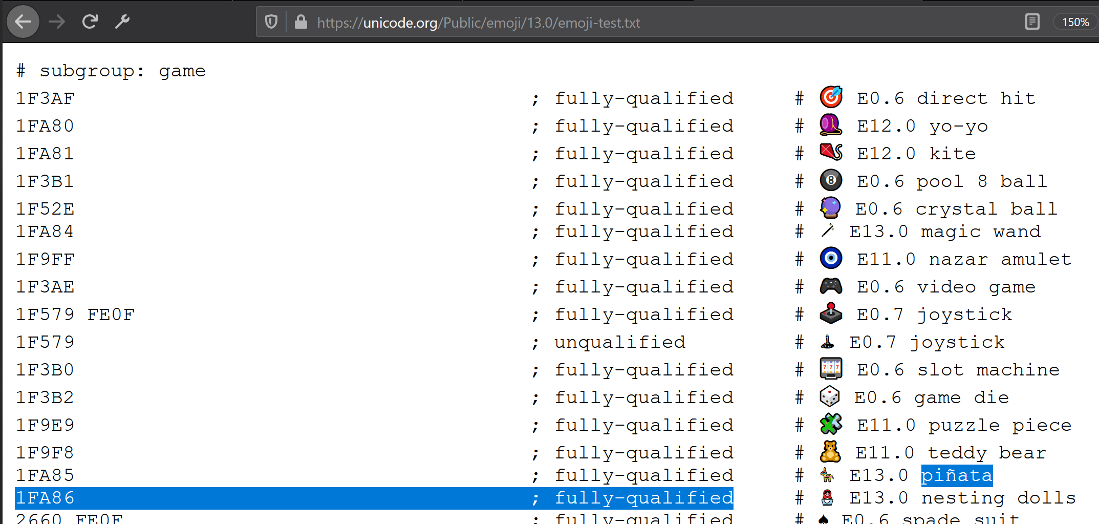
Note that Pinata is rendered in OpenMoji now. Yay!
@dnlutz But it also shows that the size of the glyphs is way too small! We should tweak the size in https://github.com/hfg-gmuend/openmoji/blob/master/font/scfbuild-color.yml#L8. What size would you suggest?
I would suggest to scale the OpenMoji by factor 1.3 The Y-position is perfect in relation to the baseline.

Looks good!
We should highlight where the baseline is in openmoji-template.svg
Done. Scaled up by 1.3.
Scale 1 / Scale 1

Scale 1.3 / Scale 1

Scale 1.3 / Scale 1.3

cc @dnlutz
Tip top / thank you! These emoji sizes now work much better within "normal" text fonts.
Ligatures sometimes are split into parts when text gets wrapped. It happend with the hand and the horse but not with the dark santa claus and the flags. I'll try to find out why.
@bohnacker the people at GitLab also noticed this! https://about.gitlab.com/blog/2018/05/30/journey-in-native-unicode-emoji/
@mikemaccana you can view how the the emojis look as a font on this website https://hfg-gmuend.github.io/openmoji/ by selecting Font in the top bar. There are some bugs in the font but it's pretty good
I see that Google have started work on a new tool, nanoemoji, to build colour fonts in a variety of formats. Not all formats are currently implemented, and it doesn't seem to be production quality yet, but I think it's worth keeping an eye on.
Thanks @mavit! This is a good pointer! Would you have time to give it spin? ;) Our color font generator seems not the best bet in the long run ... We are keen to have better and more fonts to render OpenMojis on more platforms.
Status update for nanoemoji. It worked for building COLR TTFs when I first tried it, but by the time I got around to containerising the build it had broken because of googlefonts/picosvg#65.
Hi @mavit! Many thanks for keeping us posted! Building color fonts via nanoemoji would be mega! Fingers crossed that the bug is soon resolved!
googlefonts/picosvg#65 has been closed. Just played around with nanoemoji 0.4.1 and openmoji 13.0 and got it to work in chrome and firefox:
linux chromium openmoji-color-cff2_colr_0.otf:

While nanoemoji can generate colr v1 fonts these don't seem to be supported by browsers yet.
Here are the fonts I generated if you want to avoid having to build them yourselves:
While nanoemoji can generate colr v1 fonts these don't seem to be supported by browsers yet.
It depends on your OS. They mostly work fine on Linux, but not on MacOS. I don't think we've heard either way about Windows, yet.
I'm testing the new font form the zip file above. I really like the simplicity of the design of openmoji and I'm glad that I can use it form applications which just use freetype2, but this rendered font is incredibly small, compared to the other emoji fonts. I can barely see what's depicted in a normal text (12-14pt) on my 1080p display of my laptop. The font looks really great when I set it to be more than 20pt. Edit: Also I've noticed some emojis are missing in yweb (webkit2gtk).
I'm testing the new font form the zip file above ... but this rendered font is incredibly small
See #260.
via @carlinmack
The OpenMoji colour font kinda works! You can easily test this by
- install the OpenMoji colorfont
- go to https://unicode.org/Public/emoji/13.0/emoji-test.txt on (Firefox developer edition)
My Firefox browser shows everything with colors but unfortunately, I can't get colorful emojis on Brave (Chromium spin-off).
I think a change to the way fonts are compiled would be nice. Nanoemoji would be a good candidate. There is an older version by @Voultapher that loads the colourful emojis in Brave and is compiled with nanoemoji. (I don't know python so I can't compile a version for my use)
see #260 for the saga of using nanoemoji instead :)
Here's an oddity I found. The line height of the font is too high when viewed in some browsers, namely Chrome or Safari on MacOS.
See this example screenshot:
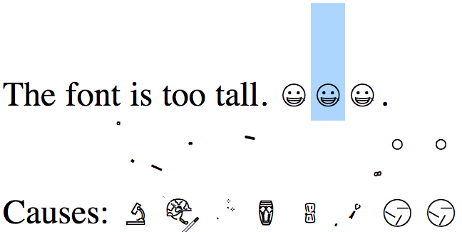
This is caused by certain glyphs having elements placed far outside where they should be. The commonality between the broken glyphs is that in their SVG source, they have an element which is rotated around a point other than the origin. When certain browsers display these glyphs, they rotate those pieces around (0,0) instead of the point they are supposed to rotate them around. If the transform attribute is set using a matrix or a rotation about the origin, these browsers display the resulting glyphs fine.
I found that when using FontForge to build a vanilla ttf version of the font, the same glyphs were misrendered in the same way. So I suspect the ultimate source of the error lies in FontForge's SVG importation function.
I am working on an implementation of the black font using FontForge's import tools.
I'd like some feedback on a couple minor implementation details:
All of the regional flags look the same in outline form. They are each just a blank rectangle. Would it would be sensible to exclude regional flag characters from the black ttf?

There are some characters which are present in Unicode in both emoji and non-emoji forms, distinguished by a variation selector FE0F. Should both codepoints be encoded into the font?
@RobertWinslow Many thanks for the thoughts! Super! Please gives a day to ponder on the questions and to double check once more the quality of the generated glyphs of OpenMoji-MonoChrome.ttf. Stay tuned.
Dear @RobertWinslow thank you for your work on the fonts! The overall curve quality looks really good (as good as it can get with our mixed quality source svgs ; )
However, the fonts are really a tough topic and I have discovered a some issues when checking the files in InDesign:
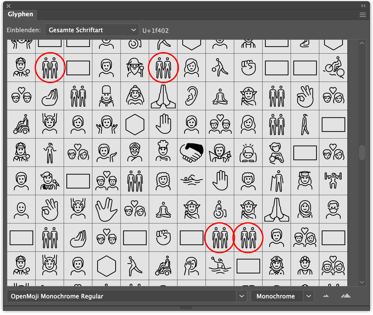 Duplicates: Some glyphs appear multiple times in an untraceable order.
 Fillings: Some characters have areas completely filled with black.
Do you think these issues could be resolved by code? We try to avoid manual interventions during the font built process – the effort can quickly become unmanageable ; )
At the moment the width of the glyph equals the bounding box of the paths, all emoji should get a uniform with.
I hope I have not discouraged you and I don't know if all this is feasible – but the fonts are definitely a tough job (since the start of OpenMoji in 2018).
Many Greetings
Daniel
@dnlutz
Duplicates: Some glyphs appear multiple times in an untraceable order.
I suspect this is related to the way I'm handling skin-tone variations. I'm planning to try another way of handling those, though I have no clue whether it will resolve this particular issue. Alternatively, the issue might lay in how TrueType handles ligatures. OpenType handles ligatures more gracefully, so switching from ttf to otf might resolve it.
I had considered leaving skin-tone variants out of the font (it's a monochrome font, after all), but this would cause problems for glyphs with mixed skin tones, as the skin-tone codepoint occurs in the middle of the ligature.
Fillings: Some characters have areas completely filled with black. Do you think these issues could be resolved by code?
Unfortunately, I'm not sure whether they can be. There used to be very many more of these errors, and I was able to resolve most of them by cleaning up the source files. That was the impetus behind this pull request. A lot of the remaining fill errors are bespoke to individual glyphs rather than systemic issues.
For example, I've spent a while looking at the leg of that orangutan: 🦧. The issue there is that the path for the leg loops back around and self-intersects without actually being closed with a z command. This causes FontForge to 'helpfully' interpret it as a solid shape before the expandStroke method has a chance to be called.
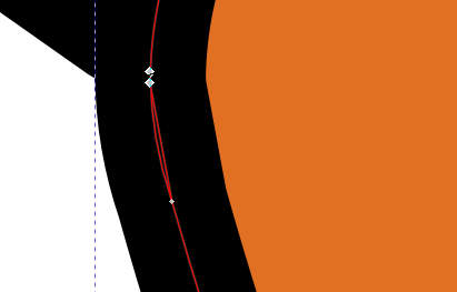
A very very similar, but not quite identical, problem plagues the handshake 🤝 glyph. And now looking at the gear ⚙2699, its source also has one of these 'pseudo-closed' paths.
The 🦧 glyph in the font could be corrected by:
z command, or 'splitting' the path by inserting an m 0 0 command in between two other commands.All that said, some of those filled glyphs aren't actually mis-rendering. I recognize 'keyboard' E1D1 and ◭ 25ED. That's just the 'line-supplement' layer being drawn.
At the moment the width of the glyph equals the bounding box of the paths, all emoji should get a uniform with.
Okay. That's an easy change.
I hope I have not discouraged you and I don't know if all this is feasible – but the fonts are definitely a tough job
Haha, if I were that easily discouraged, I wouldn't have gotten this far along. Thanks for the feedback. Like you say, it's a tough project.
@dnlutz
Could you take a look at this new version of the font, to see if the duplicate glyph issue has been resolved? I changed the method I used to handle the skintone variants.
Re: Giving the glyphs a uniform width. If the glyphs are scaled up by a factor of 1.3, should the width also be set 30% bigger than normal? If yes, then the font ends up unusually wide. If no, some glyphs are so wide that either they will overflow their bounding box or they will need to be scaled back down a bit. See the eye (👁️ 1F441) for an example of a very wide vector source. In the script I used to generate the font file, I included multiple parameters to adjust the width of glyphs. I'm just not sure what they should be set to.
dear @RobertWinslow there seem to be less duplicates now. but there are still some, for example "People Holding Hands" exists several times. also the fill bugs are still there:

metrics / scaling: it would be ideal when all the glyphs retained the 72 px bounding box from the source svgs (emoji + bounding box should be scaled in the same ratio). i hope this makes sense. many greetings daniel
Minor update on the above mentioned duplicate-glyph issue. I thought I had fixed skintone variants showing up as duplicate glyphs. But actually, I had just accidentally removed many of the skintone variants. Further testing has fixed the latter issue, but I suspect the issue of "duplicate" glyphs might not be solvable. (They aren't actually duplicates, just identical.)
The only color format I know of which is cross-browser compatible is COLR(v0). Chromium(and Chromium-based browsers) do support COLRv1 since chrome 98.
Is it possible for users to change the colors in COLRv1 fonts?
Okay … I just spotted this article: https://css-tricks.com/colrv1-and-css-font-palette-web-typography/ Maybe we should go all in with COLRv1 and dump all other font formats?
Maybe we should go all in with COLRv1 and dump all other font formats?
That would certainly simplify things if we can, but I thought COLR wasn't supported by Adobe Illustrator? Is that still true, and, if so, is it a showstopper?
@dnlutz
I've made another pass at improving the Black font. I've uploaded two versions of the font: TwoVersionsOfOpenMojiBlackFont.zip
This zip contains two files: called OpenMoji-Black.ttf and OpenMoji-Black_sansSkintoneAndFlags.ttf. The latter excludes two sets of glyphs:
Skintone Variants: In a monochrome font, skintone variants appear identical to the base glyph. In OpenMoji-Black.ttf, I implemented the skintone variants as a pointer to their base glyph, as defined in the skintone_base_hexcode of openmoji.csv. This reduces file size and ensures proper rendering, but may be the cause of the strange 'duplicates' you identified previously.

Country Flags: The country flags, with few exceptions, are depicted as identical black rectangles in the Black version of OpenMoji. With the recent addition of regional indicator letters, a monochrome font might be more useable if the country flags are excluded. If this is done, then the flags will be rendered as pairs of regional indicator letters

I've set up a build script for the font so neither of these exclusions are implemented, but can be toggled on by changing a pair of global variables near the beginning of the file.
Thank you @RobertWinslow !
The paths look pretty neat now! There are still some black fillings, but i'm pretty sure that it's not the fault of your algorithms but our source svgs ; )

The two versions have pretty much the same file size. I would go for the Google Noto way: OpenMoji-Black_sansSkintoneAndFlags.ttf
– Regional indicators for the flags – No skintone indication
What do you think?
And could you please include an empy space sign (U+0020)? … and a hyphen would be neat (U+002D ; )
@dnlutz If a hyphen is added, which of the following styles would be preferred?


Or would it be better to duplicate the heavy minus sign?

thank you! for the sake of consistency i would vote for the duplicated heavy minus sign.
The OpenMoji colorfont is currently just a proof of concept and only works in Firefox.
We hope to improve this to proper colorfont in the near future (or at least in the long run). Sorry + stay tuned and follow this thread for updates!