 hteumeuleu
commented
8 years ago
hteumeuleu
commented
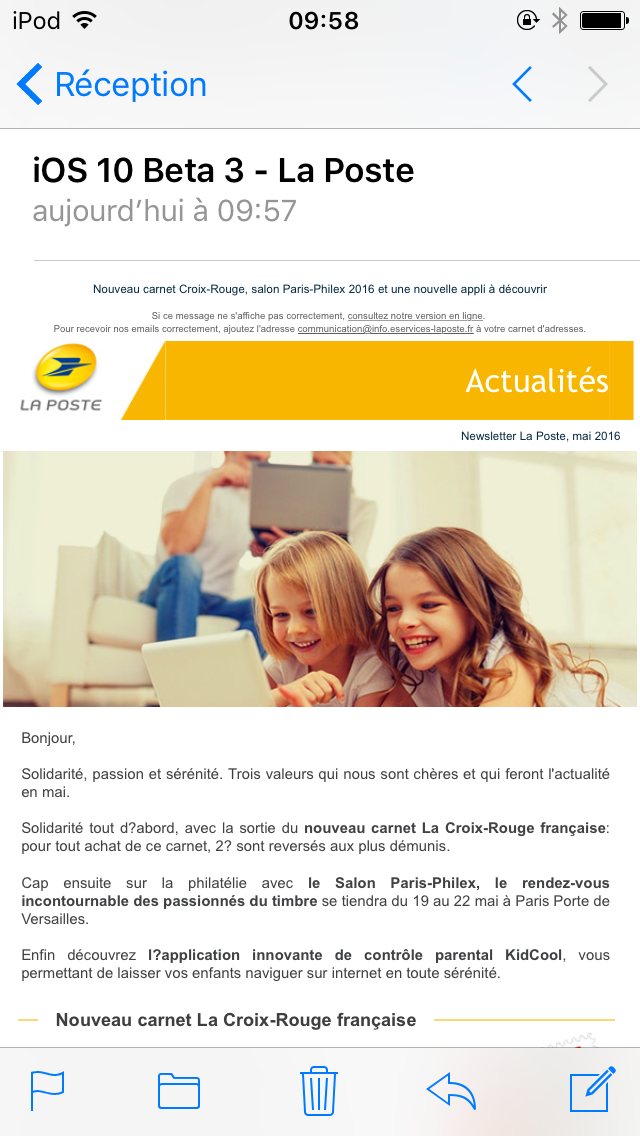
8 years ago This email from Orchestre National de Lille doesn't auto-scale on iOS 10. Here are two screenshots (iOS 9 on the left, iOS 10 on the right).


Fix :
In the HTML received, there is a main <table> and two <p> outside of it. If we insert the two <p> in new rows of the main <table> (and thus have only one table for the whole email), iOS 10 auto-scale the email correctly. Here is a screenshot of this email fixed for iOS 10 :


 ericlepetit


 revelt


 buzzert
 therealglazou
 gpalz
gpalz
 marett
 erickao08
 bigfatweb


 justinbiddle
 arborcrowd
 charitysf
 Jo-anneW
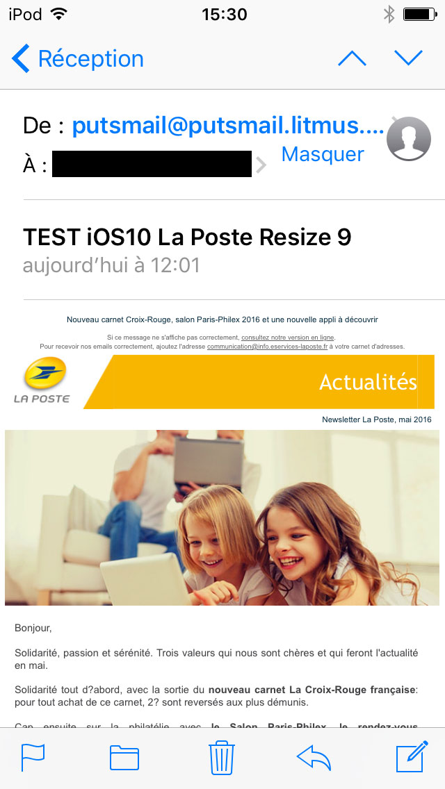
In the first beta of iOS 10, Apple Mail has a new mechanism that doesn't always auto-scale non responsive emails. This results in huge emails that needs to be scrolled horizontally and vertically, and what I think is a poorer experience. But this mechanism doesn't seem consistent. Sometimes, non responsive emails will auto-scale. And other times, they won't. The aim of this issue is to list examples of emails that don't auto-scale, and try to find fixes and understand what causes the non auto-scale in iOS 10.
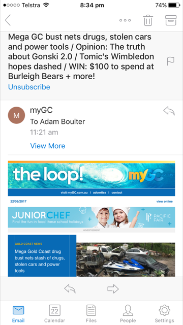
Here are two examples reported on Twitter by Alex Williams and Eric Lepetit.