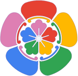
I personally like the current logo very much. For me it has just more personality and stands out of all the flat and corporate like logos. Also it is just super easy to explain to my parents that they have to open the app with the "flower" icon. It is silly but it just works :)

I am enjoying a lot using immich, and I just worked on a concept for a new logo design. If you like it, I can send you all the files as PSD and other formats (SVG, PNG, JPG, WEBP)...
The design I chose is inspired on a variation of the shape commonly used in many Gallery apps. I made this choice as the logo would be familiar to any person at a glance; You see this logo and you think of a gallery. Also, the shapes resemble petals from a flower or leaves (or even a butterfly); it is in honor of nature and the thousands of photos we take of it.
The colored logo has the most common colors in nature: green (plants and trees), blue (oceans and sky), yellow (sunlight) and red (dirt, rocks, sunset sky...)
The typography is pixelated to refer to the digital image, since it is a software to backup digital images.
Feel free to say no if you don't like it. I just made it because I enjoy doing this things and I thought that the current logo is a bit too much for my taste as I like simple things. Also you can share any variation ideas or anything that you feel it could improve the design. Here you can see the concepts:
App logo concept:
Banner concept:
Logo variations:
Platform
Mobile App