Open lidel opened 5 years ago
Some cool mockups from https://github.com/ipfs-shipyard/ipfs-webui/pull/1062#issuecomment-508318007 (Peers screen):
@lidel We can pull the colors from the theme.json in
ipfs-css
, but we can't generate the icons in CSS.Here's what it looks like with the theme colors:
I'm wondering if maybe it'd look better with a different style of identicon though. Here's a different type of identicon:
@JustMaier Thank you for prototyping this!
I like first one better right now, but given the IPFS logo is a hexagon, going with hexagons may create better visualization overall. See the original idea by @gozala.
How are you creating those identicons? How fungible is the library? Perhaps we need to create our own generator?
I'm using these two libraries to create the identicons:
I certainly like the look of the second one when the identicon is larger, but at the size we're using it in the table, it's just harder to tell the differences between the more complex icons.
I'm not exactly sure what you mean by fungible in this context, but I assume you mean something along the lines of, can we use these libraries without issues. I believe so, the first has no license, but is small enough that most likely that means they have no issue sharing it. The second is an Apache license. We could try to make our own, we'd just need to find someone in the community with experience doing it or interest in trying.
I really like the design idea that @Gozala had, but I worry that at the size used in the table, it'll have the same issue that the hex one above has as well, the details are too small so they start to look really similar.
Thanks! Hashicon playground at https://etcdevteam.github.io/hashicon/examples/ is pretty good:
What I meant by fungible library is that we could tweak hashicon aspect ratio to produce symmetric hexagons (matching IPFS logo). I stretched them in Gimp to see how that would look like:
I suspect having ~11% taller identicons will look better, especially at smaller sizes.
Wow this is so cool to see happening!
I was planning to port this really cool library form scheme to do it https://github.com/DarrenN/identikon/blob/master/README.md
My thoughts was slight variation of qbert.rkt would be a great fit
I like the look of the qbert identicon, but I think the uniformity of the hashicons might look better in the majority of places that we end up using the identicons.
@lidel did you already edit the library to produce those taller hexs?
I like the look of the qbert identicon, but I think the uniformity of the hashicons might look better in the majority of places that we end up using the identicons.
That’s what I meant by slight modification - clip by the hex to give it more uniform look, similar to libp2p logo
That'd be cool. Are you comfortable converting the qbert identicon to js? I haven't seen the language they are using before so it'd definitely be an uphill battle for me.
Neat idea. I agree that it seems like this might help users visually scan and mentally group peers.
If we do add the icons, the 2D pixelated versions strike me as way more iconic, scannable, and accessible. The 3D designs rely on color, which makes them difficult for many/impossible for some to distinguish. Red/Green is the most common form (both of my sons have it 😕) …
(The app is already non-compliant btw — headers are too light of a green. It's on my radar.)
I'd consider reducing the size of the icons, and run them in gray so they don't compromise the color palette (provided they are still scannable, we should test.)
Just to keep the conversation/progress rolling, could we implement the github like identicons for now with the expectation that they can/will be upgraded to something more "IPFS"-ish later? I think that they provide enough value as is to justify their existence without having to be perfect out of the gate.
That'd be cool. Are you comfortable converting the qbert identicon to js? I haven't seen the language they are using before so it'd definitely be an uphill battle for me.
I do love scheme, so I'm inclined to say absolutely, with a caveat that it's not high on my current priority list and unless it involves porting ton of dependencies along.
Just to keep the conversation/progress rolling, could we implement the github like identicons for now with the expectation that they can/will be upgraded to something more "IPFS"-ish later? I think that they provide enough value as is to justify their existence without having to be perfect out of the gate.
Yes please! I did not intend to derail or stall this by my remarks. I think any identicon is better than none.
Relevant, for future reference, sigils from Urbit: https://urbit.org/blog/creating-sigils/
While https://github.com/ipfs-shipyard/ipfs-webui/pull/1069 introduced generic identicons on Peers screen, we do not show it on Status, nor use IPFS-specific graphics (see discussion and examples above).
I also had this idea of reusing identicons for comparing CIDs in GUIs, when full CID takes too much space, but we want to avoid risk of spoofing:
Reopening to keep discussion and ideas going (cc @jessicaschilling @rafaelramalho19)
Example of use in UI: when you move/copy files in Files and file already exists, displaying both hashes with identicons would help user to faster evaluate if the file that is about to be overriden is the same, or different
I think identicons work if you do see them side by side. However I don't think they do all that well in the contexts where you see one identicon and have to compare with one from your memory. That is to claim that seeing a link in an email that points to dafy...
instead of bafy...
could be hard to spot even with identicons. I have no evidence to support this claim, other than when I see a comment from github accounts with identicon avatar, I can't really remember if I've had interaction with that user before, but reading a github handle seems to work.
My suspicion is that information density on indention is fairly high, and generated icons are still too abstract (maybe with an exception of urbit ?) I wonder if color + last 4-characters could be a better signal for that kind of recall. Or alternatively multiple colors (kind of like flags) + 4 digits
Agree with @Gozala's notes above ... and also am reluctant to repeat identicon-style identification (even if it's visually different between uses) as a shorthand for two different things. (In other words, I'd like to know that every time I see something that looks like an identicon, I'm looking at a unit of information corresponding to a Peer ID.)
Thinking about situations in which the question is "is thing A
the same as thing B
" (which is actually a different question from the Peer ID one above, in which we're trying to identify rather than compare):
bafy
that's kind of useless.)There is a blog post on how to visualize SHA2-256 hashes, which could also provide some ideas/pointers: https://francoisbest.com/posts/2021/hashvatars. They look like this:
PerCID (https://percid.va.gg) by @rvagg is server-side generated, but fun and worth honorary mention here:
This is a placeholder issue to ensure this fun idea suggested by @Gozala does not get lost:
Click to expand copy of https://twitter.com/gozala/status/1083066763661570048
[![Essentially what I want is identicon for each IPFS node based on it's ID more or less how roboticon does it but with a different visual representation](https://user-images.githubusercontent.com/157609/51170982-ffb66e00-18af-11e9-8bf1-c1c2b15dd146.png)](https://twitter.com/gozala/status/1083066763661570048)If such thing exists, we could display it on the status page to make it feel more personal and help to identify node at a glance:
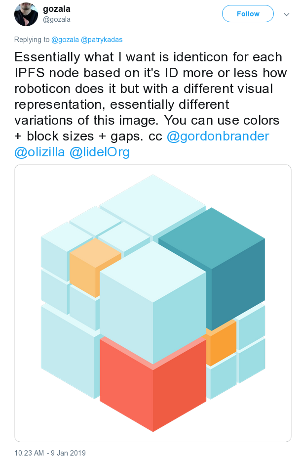
ps. if someone decides to pick this up and create the "ipfs-identicon" library that generates unique SVG for PeerID (or CID/multihash), some cool resources are in the twitter thread.