 certik
commented
7 years ago
certik
commented
7 years ago As a start, here are the ones for Czech:
Á É Í Ó Ú Ů Ý Č Ď Ě Ň Ř Š Ť Ž á é í ó ú ů ý č ď ě ň ř š ť ž
Open HughP opened 9 years ago
certik
commented
7 years ago As a start, here are the ones for Czech:
Á É Í Ó Ú Ů Ý Č Ď Ě Ň Ř Š Ť Ž á é í ó ú ů ý č ď ě ň ř š ť ž
 pelson
commented
6 years ago
pelson
commented
6 years ago As a start, here are the ones for Czech: Á É Í Ó Ú Ů Ý Č Ď Ě Ň Ř Š Ť Ž á é í ó ú ů ý č ď ě ň ř š ť ž
@certik It may be possible to manufacture these glyphs from what we already have. It would involve a bit of programatic hack and slice of the glyphs coming out of https://github.com/ipython/xkcd-font/blob/master/xkcd-script/samples/handwriting.png, but it is conceivable to do a good-enough job of it.
No such luck for the IPA characters though...
 thaliaarchi
commented
5 years ago
thaliaarchi
commented
5 years ago I frequently view XKCD comics using XKCD Open Source which uses this font. Unfortunately, of the German diacritics, this font only supports Ü. This means that sights like "ERKLäREN" are common where ä is in a fallback font. Could Ä/ä, Ö/ö, Ü/ü, and ẞ/ß be added to this font? In 1647 Diacritics, there are several diacritics that could be the source for these additions: résümȩ̊́́́̆.́́́
 fuhrmanator
commented
4 years ago
fuhrmanator
commented
4 years ago I was using this font for handwritten-looking diagrams for my courses in French, when I realized the accented characters were standing out like boring type... XKCD or OCD?

 HughP
commented
3 years ago
HughP
commented
3 years ago I found another missing character I use all the time today; and now I must write "sans em-dash".
 dummy-index
commented
3 years ago
dummy-index
commented
3 years ago I add accented letters (includes cedilla, ogonek, caron, breve), en-dash, em-dash, degree, minus (longer than hyphen-minus), multiply, long s, etc., and kernings. https://github.com/dummy-index/xkcd-font/tree/brushup/xkcd-script/font
HughP
commented
3 years ago @dummy-index do you have a total list of characters? when you added accented letters did you add these accents as combining diacritics or as composite character/pre-composed characters?
dummy-index
commented
3 years ago @HughP
as combining diacritics or as composite character/pre-composed characters?
Both. precomposition runs based on the Unicode Character Database. Like a 1647: Diacritics
a total list of characters
import os
import fontforge
base = '../font/'
ttf = os.path.join(base, 'xkcd-script.ttf')
font = fontforge.open(ttf)
glyph_iter = font.__iter__()
for glyphname in glyph_iter:
    if font.__contains__(glyphname):
        glyph = font.__getitem__(glyphname)
        if glyph.unicode >= 0:
            print(hex(glyph.unicode))
font.close()@dummy-index I was looking at the font metadata, and it says "Version 1.0" But is this still accurate?
dummy-index
commented
3 years ago @HughP I'm thinking, but want to change the version number system to such as 1.000 . (my immediate goal is Ver. 1.100, and release candidates are 1.090, 1.091, ...)
HughP
commented
3 years ago Well I definitely recommend semantic versioning https://semver.org/ BUT in this case, IF I understand the creative work you released, I think it is a fork of the original. In that case it needs to indicate that.... Something like this: https://dylanbeattie.net/2017/01/26/semantic-versioning-with-powershell_26.html But I have never done this before, but I am interested in this notation for other professional projects I am involved with.
dummy-index
commented
3 years ago Mmm... What is the public API of this font? Which do you think the "Version 1.0" of master corresponds to, 1.0.0 or 0.1.0? Or set the version number of the generator script? Certainly I should add some string to the version, because I'm an outsider of ipyhon project.
HughP
commented
3 years ago fuhrmanator
commented
3 years ago In semantic versioning, major revisions are "breaking" changes. I could think of that as a document using this font would look differently after a major revision.
Adding new characters that weren't previously supported would be a minor revision.
Fixing a character that displayed improperly would be a patch.
dummy-index
commented
3 years ago I don't intend to establish another project. At first, there were some reason to hesitate PR-ing. (#34 #36) Now I has been able to build the font file in same way as pelson. I'll PR after some more things.
I think my most "breaking" change is the kerning. (Although it's no effect for apps not supporting 'kern,' Microsoft says "This feature should be active by default" hence it should be treated as breaking change.) my kernings are bit too condensed for small-point text.
HughP
commented
3 years ago FYI: something to think about. I converted the font to wott2 for internet use and found two issues which could use some "tweaking"...

Job Well done on the creation of non-breaking hypen, and of the grave and acute diacritics. Those all work for me.
Note: Macron below, U+0331 ◌̱ COMBINING MACRON BELOW, is a combining diacritical mark that is used in various orthographies. It is not to be confused with U+0320 ◌̠ COMBINING MINUS SIGN BELOW, U+0332 ◌̲ COMBINING LOW LINE and U+005F _ LOW LINE.
 jorgesumle
commented
1 year ago
jorgesumle
commented
1 year ago I could add Esperanto letters (Ĉ, Ĝ, Ĥ, Ĵ, Ŝ, Ŭ, ĉ, ĝ, ĥ, ĵ, ŝ, ŭ) using Fontforge. Here is the result:
I don't know how to contribute this, so if this addition interests you, I ask you to guide me on how to contribute.
HughP
commented
1 year ago Would these then be Precomposed Characters, or diacritics? In IPA contexts diacritics are very useful.
https://en.wikipedia.org/wiki/Precomposed_character
On Wed, Sep 6, 2023 at 5:23 AM Jorge Maldonado Ventura < @.***> wrote:
I could add Esperanto letters (Ĉ, Ĝ, Ĥ, Ĵ, Ŝ, Ŭ, ĉ, ĝ, ĥ, ĵ, ŝ, ŭ) using Fontforge http://designwithfontforge.com/en-US/Diacritics_and_Accents.html. Here is the result:
[image: robota-estonteco] https://user-images.githubusercontent.com/14212780/265976039-ec858854-4fb0-46b4-a69d-5035e7fc660a.png
I don't know how to contribute this, so if this addition interests you, I ask you to guide me on how to contribute.
— Reply to this email directly, view it on GitHub https://github.com/ipython/xkcd-font/issues/11#issuecomment-1708073092, or unsubscribe https://github.com/notifications/unsubscribe-auth/AAAJ2JU3UVWXEDAXCQ4OJTDXZBFI3ANCNFSM4A7K66PA . You are receiving this because you were mentioned.Message ID: @.***>
jorgesumle
commented
1 year ago I did it adding individual diacritics, and then combining them with letters to create the Unicode characters I needed (see the linked guide).
 story645
commented
10 months ago
story645
commented
10 months ago I don't intend to establish another project. At first, there were some reason to hesitate PR-ing. (#34 #36) Now I has been able to build the font file in same way as pelson. I'll PR after some more things.
Any chance you'd PR it now? It'd be really helpful to get it in for https://github.com/matplotlib/matplotlib/pull/27299 / https://github.com/matplotlib/matplotlib/pull/26854
dummy-index
commented
10 months ago Oh, thank you for your concern. There are a few things to do...
 Carreau
commented
10 months ago
Carreau
commented
10 months ago Some notes as I was recently asked personally what was the state of this repository.
I don't think many of the committers in this repository really all know what they are doing with fonts, and we likely all had notification off.
Personally I have no clue how to build a font file, how to add a character. Though if some of you want know how to do that, and have a nice way to be able to review the changes, I would be happy to merge it.
Among other I guess a demo page (like https://monaspace.githubnext.com/), would be nice.
I guess a really nice first step would be for someone that understand how this repo work to help fill the .github/CONTRIBUTING.md that appear to be empty. (even if it's just sending a PR that say "we know this file is empty please help us completing it", or better dig through history to see why it's empty.
Thanks,
 rgbkrk
commented
10 months ago
rgbkrk
commented
10 months ago Though if some of you want know how to do that, and have a nice way to be able to review the changes, I would be happy to merge it.
Same. I sometimes come over to the repo to get the font but it's all greek to me.
pelson
commented
10 months ago FWIW, I keep an eye here from time-to-time too. I dream of finding the time to extend the with the desired characters, but the reality is that I am not going to be able to invest enough effort to do it well. FWIW I think the steps I would take to achieve it:
This will require some upfront maintenance:
Whilst I don't have the capacity to do these things, I would be happy to support somebody who is motivated to give it a go.
 Tim-the-gitter
commented
3 weeks ago
Tim-the-gitter
commented
3 weeks ago No coding experience here, but I have a feeling this will help.
Tim-the-gitter
commented
3 weeks ago No coding experience here, but I have a feeling this will help.
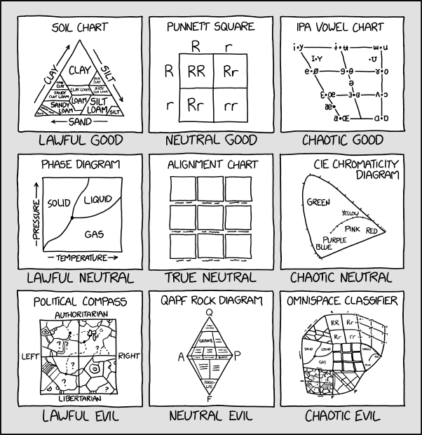
BTW, actual comic
rgbkrk
commented
3 weeks ago Well I'll be. After all this time.
@randallmunroe and others (@kolbylyn @rgbkrk ), I was reading the discussion on #9 and... Sooo I thought I'd ask, is it beyond all geekery sensibleness to ask for IPA characters to be added to the font? I mean we're not all astronomy and math students who read xkcd.... ;-) If we can start with some hand writing samples again, I'll look at reaching out to some font developers and adding the glyphs to the font proper... but I'd need the original hand writing samples. I guess much like what was asked for and provided in #9.