Team's Response
Thank you for your report. However, our team rejects this report because we feel that this issue does not hinder the reader in any way. They are still able to view how the sample data looks like as intended.
Items for the Tester to Verify
:question: Issue response
Team chose [response.Rejected]
- [x] I disagree
Reason for disagreement: Agreed that users can infer where the boundary between the screenshots and the main text descriptions is.
However, it can potentially be confusing, and at least as much as typos (which are also considered bugs of VeryLow severity even though the meaning can be inferred).
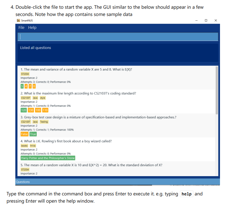
Where to find: UG Page 4
Issue: Since there is no border used for the image, and the title bar used is white, the screenshot provided blends into the background, in particular the title bar, along with the icons in the top right blend in with the background, which is potentially confusing.
Actual: