Team's Response
This is not a bug, as there are no errors here. Author of issue is also "Not sure". This is merely a suggestion.
Items for the Tester to Verify
:question: Issue response
Team chose [response.Rejected]
- [ ] I disagree
Reason for disagreement: [replace this with your explanation]
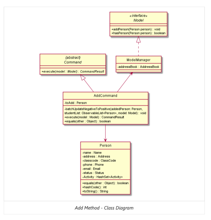
The following class-diagram found in the section "Adding a Person Feature" has a different style than the one in other parts of the Developer Guide,
Comments
Not sure if there is a standard styling to follow as part of CS2103/CS2103T, but ideally should stick to a consistent style for all class diagrams; ie if all classes belonging to the Command component are coloured blue, and all classes belonging to the Model component are coloured red, this should be adhered to in all class-diagrams!
As this is quite cosmetic, I feel that the severity is "VeryLow"