Team's Response
Thank you for your bug report. We think this submitted issue encompasses two documentation bugs :
- That there are example screenshots only for the "happy path" scenario where arguments are accepted, but not for when arguments are supplied to non-accepted prefixes.
- That the volume of text detailing what is / is not accepted input is too large, hence hindering the user.
We believe issue 1 is less severe, due to reasoning below, and hence will address primarily issue 2. :
Issue 1 :
Given the guidelines on optionality of screenshots as below, issue 1. is less severe, as it is discussing optimisations to an optional addition, and is thus less severe of a bug.
Furthermore, as the screenshots are there to aid understanding, but they are not strictly required. We believe that adding screenshots for arguments not accepted will make the filter UG writeup even longer and hinder the readability.

Issue 2.
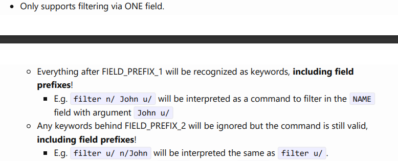
About the length of text, the relevant part about what is an accepted input is as below:


The other parts are just about the effect of filter, not with regards to what is and is/not an accepted input.
Lastly, we did not address what is not accepted input, in that we addressed only what is accepted. Implicitly, any input not stated as accepted is not accepted. The closest thing in the user guide to addressing non-accepted input is the clarification on how parsing works. This was a decision made to catch what the team deemed to be a common user error and easily-made misconception. The reasoning is that the behaviour of interpreting excess prefixes as extra input may not be immediately obvious, even though excess prefixes is a type of user error.
As we wished to inform the user of this behaviour, we posit that placing details of how (likely) common erroneous input is handled up-front rather than out of the way in another section enhances user value extracted out of the user guide.
Items for the Tester to Verify
:question: Issue response
Team chose [response.Rejected]
- [x] I disagree
Reason for disagreement: > the screenshots are there to aid understanding, but they are not strictly required
While they are not required, I firmly believe that in this case they should have been added as they hinder the reader in understanding your UG. As seen below, it is stated that not enough visuals is considered a UG bug and that is why I flagged it out as a bug.

That there are example screenshots only for the "happy path" scenario.
Mainly, I believe that screenshots for all your happy paths should have been added. You only provide example screenshots for one such path (you have two specified, with FIELD_PREFIX_1 and FIELD_PREFIX_2 but only provide one example for FIELD_PREFIX_1). As a developer & a user of your system, I believe that these screenshots need to be provided for easier reference & for clarity for your user, especially given that your filter documentation only bolds "including field prefixes" and would prove to be hard to read for users to read (personally, it was hard for me). My reasoning for this is that the feature would definitely be self explanatory if the field prefixes were easily understandable (e.g. if the prefix was marked/, I would immediately understand that this is referring to all marked contacts), but they are not, since the short-forms are used (i.e. 'm/', 'u/'), which does not come intuitively. Nothing wrong with this, but as a result, your documentation must be clearer for users.
If you chose not to provide an example screenshot, then alternatives should have been implemented, i.e. giving a warning to users when they use FIELD_PREFIX_2 with parameters, that it will be ignored, or in a note like what you did for the other commands as seen below:

Implicitly, any input not stated as accepted is not accepted.
While this may be true, there is no harm in adding commonly made mistakes to the end of the UG, as I suggested. This is relatively common practice for modern day applications. You state that this is implicitly stated, how clear would this to be to the user? They could think that your documentation made the mistake of missing out an option. However, I acknowledge that this is not required.
Example screenshots are given for prefixes with arguments accepted but not for prefixes without arguments accepted. There is also a lot of text to read specifying what is an accepted input and what is not. Better documentation would be to list accepted behaviour under the command, and for input that is rejected it should be shifted to an appendix or a summary.