 nus-pe-script
commented
9 months ago
nus-pe-script
commented
9 months ago Team's Response
We consider this a good-to-have, but not necessary for this module’s requirements.
We have already included examples and clear annotation, which we believe is sufficient for CS2103T’s requirements of a user guide. Your suggestion would be more relevant for CS2101’s grading scheme.
We also wanted to reduce the number of pictures in our user guide to improve readability, hence we did not include a before and after. We believe that our annotations sufficiently display the main effect of the commands. For future features that have a drastic change where annotations are not sufficient, we can consider your suggestion.
Items for the Tester to Verify
:question: Issue response
Team chose [response.Rejected]
- [x] I disagree
Reason for disagreement: Thanks for the clarification! I think for some of the pictures/screenshots, it's ok to leave it as it is currently (As they have annotations of what is being changed). However, for deleteperson, i think the current screenshot used is not sufficient to show the user what happens, as they cannot see what has happened in the contacts list (in the screenshot), and only see the message highlighted that a person was deleted. I would say an acceptable example would be the edittask in the screenshots above, as the changes are circled below and indicated in the task list, however the changes in deleteperson is not obvious to users in my opinion, and a before and after picture would be better to show off the feature.
For all the commands, I like that there are pictures to show the result of the command.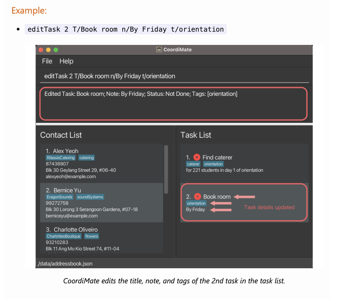
However, I think the effect of the command would be clearer if there were a comparison picture (eg a before and after), as it is not so clear as to what the change is. For instance, for the delete person command, it would help to see that before the command in the UG was used,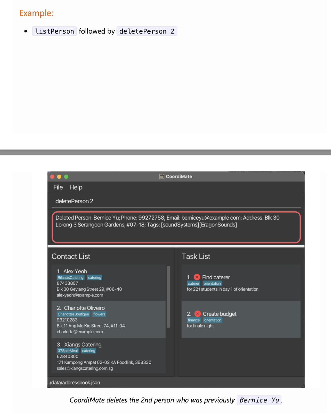
Bernice Yuwould still be there, and then after using it, she would not be in the list.