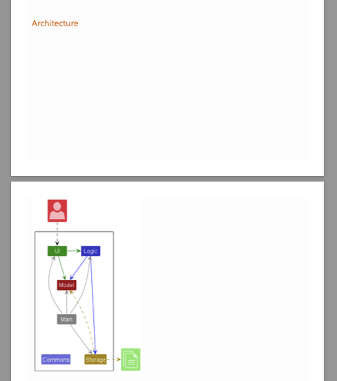
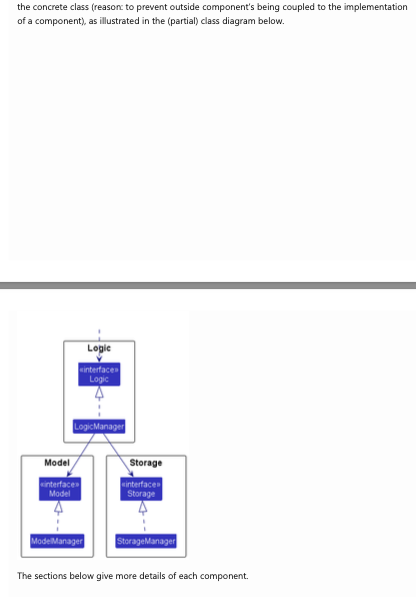
- In page 2 to 4 of the Developer Guide, there are two huge chunks of whitespace within the same section, making it hard to read as readers have to scroll all the way down to continue reading the same section
- The image below is already a zoomed out version. In the default view size, you cannot see both the "Architecture" header and the diagram at the same time
- It seems possible to resize the image to fit inside the whitespace (i.e. whitespace seems to be slightly smaller than the diagram)
- Minor inconvenience and likely to happen, but users can continue to use the product: medium severity

