 soc-pe-bot
commented
5 months ago
soc-pe-bot
commented
5 months ago Team's Response
No details provided by team.
The 'Original' Bug
[The team marked this bug as a duplicate of the following bug]
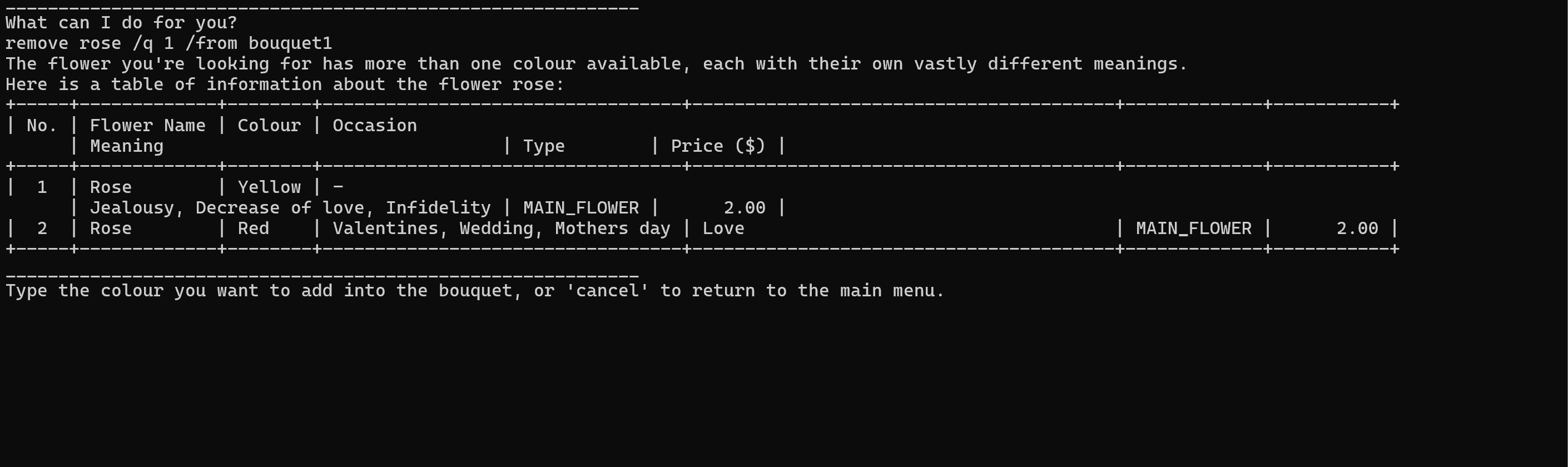
Table formatting is unreadable
Steps to reproduce: when i have a flower with more than 1 color in a bouquet and try to remove it, the table that shows afterwards has poor formatting, even after changing to full screen. see below:
The MAIN_FLOWER keyword here is confusing and I'm unsure what it does. Moreover, not sure how the rows
[original: nus-cs2113-AY2324S2/pe-interim#261] [original labels: severity.Low type.FunctionalityBug]
Their Response to the 'Original' Bug
[This is the team's response to the above 'original' bug]
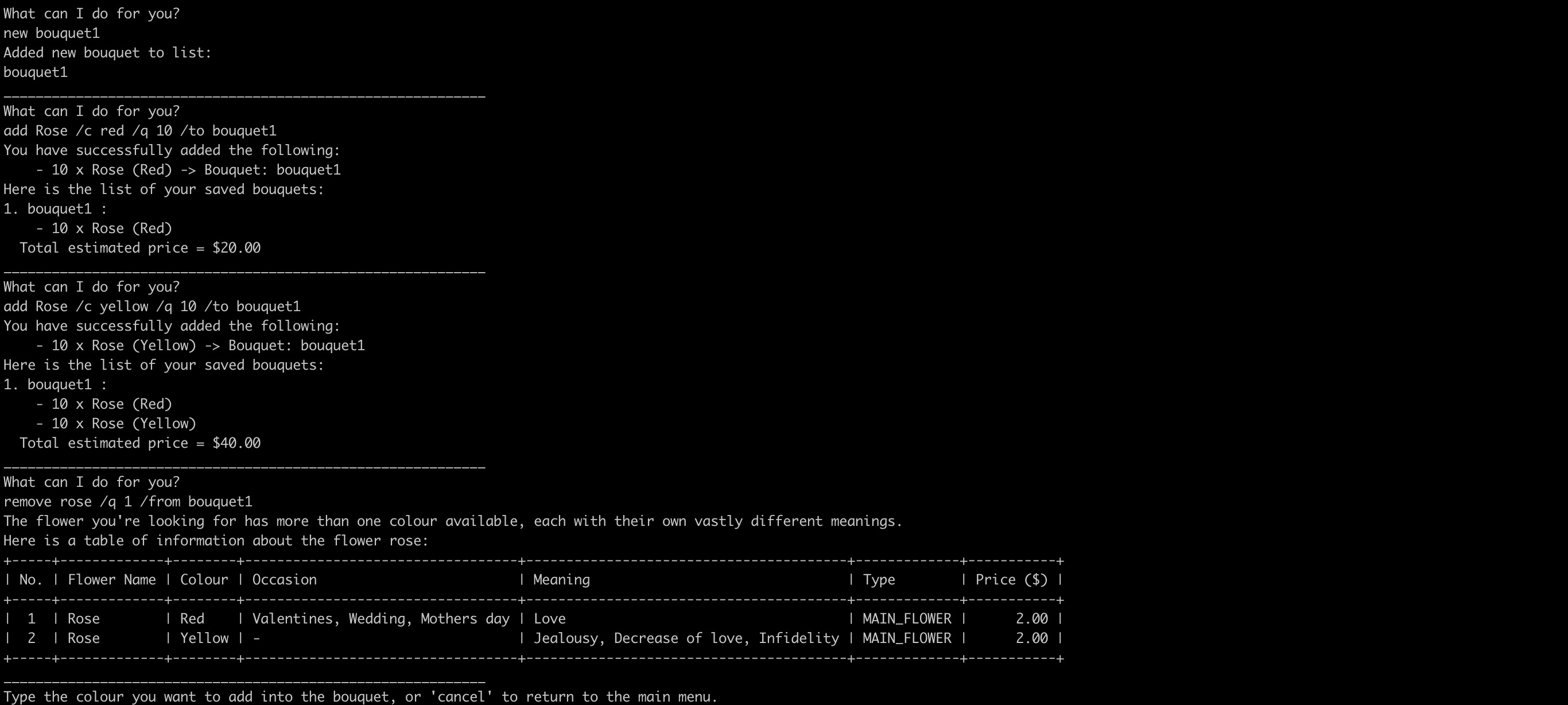
We have noted your concern and had taken the steps you have provided to reproduce this bug. However, under full screen mode, the table looks perfectly fine on our side (see below).
Secondly, under a non-full screen mode, users are advised to expand their terminal screen to fit the entirety of the line. Table or not table, the line will always break and the formatting will appear messy if the terminal is not expanded to an appropriate size.
We have attached a screen recording below to demonstrate 2 points. Firstly, we would like to show that expanding the tab to an appropriate size will result in the correct formatting of the table and secondly, that reducing the size of the tab will result in a messy format for not only the table, but for other texts as well, which is something that is bound to happen if users have reduced the tab size too small.
Furthermore, the issue of "The MAIN_FLOWER keyword here is confusing and I'm unsure what it does. Moreover, not sure how the rows" is a separate issue and does not align with the title of this bug report. However, to answer the question, users may input
flowersto see a list of different flowers, and typeinfo <flowerName>to further see if the flower is a MAIN_FLOWER or FILLER_FLOWER. Typeinfo Roseandinfo Freesiafor comparison.Items for the Tester to Verify
:question: Issue duplicate status
Team chose to mark this issue as a duplicate of another issue (as explained in the Team's response above)
- [x] I disagree
Reason for disagreement: help menu and flower information are different sections of code
## :question: Issue response Team chose [`response.Rejected`] - [x] I disagree **Reason for disagreement:**  As stated in your response, this should have been a factor for consideration when deciding on the length of your outputs, table or not. Poor formatting due to the lack of appropriate line breaks is a cosmetic (very low) issue. As with many other applications, Perhaps the table can be formatted such that the ASCII does not affect readability and the text can still be read line by line.
## :question: Issue type Team chose [`type.FunctionalityBug`] Originally [`type.FeatureFlaw`] - [ ] I disagree **Reason for disagreement:** [replace this with your explanation]
Actual result: When the terminal is not on full screen, the help menu layout does not look optimised in terms of separating the rows Expected result: The help menu should use appropriate line separators to ensure the the menu is always easy to read