 towerofnix
commented
7 years ago
towerofnix
commented
7 years ago So what I'm guesstimating is that Snap!'s color range is from 0-100 and doesn't loop, and Scratch's is wider (200?) and loops (even in the negative direction).
Closed ghost closed 5 years ago
towerofnix
commented
7 years ago So what I'm guesstimating is that Snap!'s color range is from 0-100 and doesn't loop, and Scratch's is wider (200?) and loops (even in the negative direction).
 jguille2
commented
7 years ago
jguille2
commented
7 years ago Yes, and the same with the shades. In Scratch, It alternates inc/dec (0[black]->100[white]-200[black again]) and loop this scale and Snap is just 0-100
But there are more differences (not only the scales) in the shade definition: in Scratch shade=100 is white, but not in Snap!.
I'm not sure if I must follow Scratch. I like current implementation... but we can add "saturation" control (set and changeBy) to the blocks. Then, using HSV, we find white, greyscales and all that you want.
Certainly, we have "RGB-HSV library" that allow users do whatever they want with colors...
Joan
jguille2
commented
7 years ago Then, we need a design decision ( @jmoenig ).
In addition to Scratch compatibility, if we use these two concepts (color and shade), maybe is better the Scratch way:
If you agree some of these changes, I can spend time implement them. In fact, morphic already has these methods (darker and lighter are "mixed" functions). Joan
 ghost
commented
7 years ago
ghost
commented
7 years ago The Snap! Help... for pen color matches the Scratch definition: range 0-200 -> red-violet The Snap! Help... for pen shade matches the Scratch definition: range 0-100 -> black-white Scratch documentation does not define what happens outside of the ranges. The Snap! implementation does not match its documentation for color range (Snap! implementation uses 0-100 -> red-violet). The Snap! implementation does not match its documentation for pen shade (for values 51-100). -- Tim
 brianharvey
commented
7 years ago
brianharvey
commented
7 years ago Good catch! I don't think Scratch compatibility is always the right thing, but in this case Scratch has it right. I hate having to achieve whiteness differently from how I can achieve blackness.
I don't feel so strongly about whether or not to cycle through shades. I guess it doesn't hurt. You can imagine some kid using it as a graphic effect like slow blinking. So I vote for Scratch compatibility here too.
@jguille2 Are you filing a PR for this?
jguille2
commented
7 years ago Hi @brianharvey,
I'm waiting for your decisions.
Then, if you want, I'll write down a proposal (behaviour and ranges) and I'll try to implement it.
Joan
brianharvey
commented
7 years ago Sure. Do it just like Scratch, I hereby decide. :)
I think p(Brian yelled at by Jens) is pretty low on this; if anything, it'd be about breaking old projects. It'd be nice to be able to ask questions like this about all the projects in the cloud, or at least all the shared ones.
 jmoenig
commented
7 years ago
jmoenig
commented
7 years ago wait! this issue may not be what it seems to you. At the heart of @timdoodle's report is the missing "wrapping" behavior. IMO that's only a very tiny fix since wrapping is basically already implemented, but his example is catching an edge case here. The other issue is whiteness, about which I'm not sure what I really want. In general I prefer predictability over feature-richness :-)
jguille2
commented
7 years ago Ok @jmoenig. This can wait, and the solution is not clear to me.
I write down the things I see and my opinon:
In my opinion, we have two alternatives:
Align Snap! to Scratch behaviour.
Alternative and different behaviour (quite compatible with current one)
-NOTE. I know I'm changing more things... but with a initial coloring = 100 past projects will run ok.
Thanks,
Joan
brianharvey
commented
7 years ago @jmoenig No, wrapping isn't the big issue. The big issue is black-to-white control. To users who aren't experts in color space, it's weird that you have to use V=0 for black, but V=100 and S=0 for white. We users want a single-knob shower control, in which 0-50 sets S=100 and controls V, but 51-100 sets V=100 and controls S (high to low). This is what Scratch does, and they're right.
@jguille2 Users who want to control H, S, V separately can use the library, and get the added benefit of industry-standard 0-255 instead of 0-100. The rest of us don't want colors that are both unsaturated and dark; they all look like mud. (Exception: what Scratch lacks is a COLOR value of white, which would allow SHADE to control greyscale. I think we should use COLOR=0 for that, and colors 1-100 for the H scale.)
P.S. The reason Scratch sets SHADE to 50 when you change COLOR is so that you don't get trapped in black, which happens to Snap! users all the time; we get complaints about it on Piazza a bunch. We should do that too.
P.P.S. "Brightness" (B) != "Value" (V). I read through the Wikipedia article on color spaces a while ago, and I understood it for a few seconds, and then it all dribbled out the hole in my head. Even HSB isn't quite exactly intuitive, but HSV is bonkers. Yes, it works great for professionals, but it's not for users. I think the numeric color controls we give users should be exactly the color space in the little rectangle you get by clicking in a color square in a primitive: "color" is the horizontal axis and "shade" is the vertical axis. If someone really wants a color not among those, use the RGB/HSV library.
jguille2
commented
7 years ago Yes, @brianharvey , and I quite agree with you.
But if you want "exactly the color space in the rectangle of the color primitive", then we must use HSL (see ColorPaletteMorph construction) where L is really "Lightness" and it goes from black to white (this calculator clearly shows this).
I said nothing about HSL because I thought "hsv" was a conscious decision (seeing morphic functions).
Then a third proposal would be to use L (lightness) for our shade concept. In one hand, it is the easier proposal (changing V for L values), but in the other hand, morphic objects has always rgb and hsv reporters.
I think we must choose only one system for everywhere. @jmoenig will tell us the key... Then colorPalette, basic blocks (color, shade), lib blocks (rgb, hs'x'), and morphic objects will be aligned and behavior would be entirely consistent.
Besides this, a "coloring" blocks to manage saturation (even only into colorLib) would be great... Maybe only a switch block (saturation = 1/saturation =0). Then users can work in grayscale in the same way they work with colors.
Continue...
brianharvey
commented
7 years ago I think we must choose only one system for everywhere.
Mais non! You are choosing the wrong side (☺) of my longest-running argument with Jens.
There is absolutely no reason whatever to expect that the user's view of some phenomenon should be tied to the implementor's view. Naturally the implementation should be based on what the underlying platform provides, which in the case of colors means RGB. But the fundamental principle of computer science is abstraction, which means that we provide users with a view that is sensible to users. It's the job of the implementor, not the user, to read Wikipedia and work out how to connect the user's view with the platform's view.
In particular, one of the design decisions that Scratch got absolutely right, imho, was to give users a two-dimensional color space, not a three-dimensional one. Yes, even at the cost of excluding the vast majority of displayable colors! For users who want all those colors, we provide a library with direct access to the underlying platform color space. The first lesson that a (software, web page, toaster oven) designer must learn is that less is more. (I say this humbly, not arrogantly -- I myself am often guilty of overengineering things.)
The only original thing I would propose (i.e., other than exactly following the Scratch rules) is to add a "gray" COLOR value, probably 0. This is equivalent to your saturation flag block, but without adding a dimension to the user's model. And this approach (making COLOR mean something slightly different from H) lends itself to possible generalization to other non-spectral colors; the first two that spring to mind are brown, which can of course be made as a kind of dark orange but not easily (exercise: make a light brown), and transparent, i.e., alpha=0. There was an old paint program on the Mac that gave you transparent paint as an option, and it was so much easier than trying to erase in Photoshop, because instead of an eraser tool, you could use transparent paint in any tool: floodfill, straight line, rounded rectangle, whatever. Modern software doesn't have transparent paint because programmers think users should have to know as much as they do about color spaces.
The only slight disadvantage of this proposal is that the "special" colors won't be perceptually close to numerically nearby colors. To mitigate this problem, I take back color=0 for gray. Instead, 0-100 are the Scratch colors, values >100 wrap, but we use -1 for gray, -2 for brown, -3 for tranparent. Values < -3 aren't allowed, or they wrap, I don't care. I'm betting that nobody wraps leftward anyway.
Ooh ooh, and in the RGB library we can have a block that lets power users define other negative color numbers as a function that maps shade values to RGB! So I could define a "burnt orange" color in which "lighter" shades are more yellow, "darker" shades more red, but all fully saturated. (This is in fact my favorite range of colors.) So, power users get all the control they want, and the rest of us get colors that behave the way we almost always want.
jguille2
commented
7 years ago Oh @brianharvey, but i'm still very much agree with you... I dont' see this wrong side...maybe is all caused by my poor English?
I only see different good solutions. And all that you have said is good... and I only tried to develop it (I said my third proposal). About this, the basics:
I've made an example, only to show all this. You'll see:
Like all we have said, wrapping and ranges is easier. But maybe first we must set what we want.
Thanks
Joan
brianharvey
commented
7 years ago Ah, yes, I see. Thanks for the project; that really helps! The only thing I don't understand about is why you think we need to use HSL "internally." As your code shows, eventually we have to get down to RGB. So whether we think of the computation you're doing as happening in Snap! (as in your project) or happening in Morphic (as I think you're suggesting) doesn't seem to me very important; the conversion still has to be done somewhere.
(And I still want transparent ink! ☺)
jguille2
commented
7 years ago Hi @brianharvey
About internally HSL.
About transparent ink... Only one question, is not "pen up" block a switch to "transparent ink"?
 bromagosa
commented
7 years ago
bromagosa
commented
7 years ago @jguille2, transparent ink means "eraser" ink. I'd think that, conceptually, this has to be a negative color, as you're "anti-coloring" stuff.
Brown as a negative color doesn't make much sense to me, I get that it's just a workaround but I think it's a bit confusing.
brianharvey
commented
7 years ago Actually, if I'm remembering correctly, Postscript gives you transparent ink. Yes, it should erase any existing pentrails where used.
I guess I have no position on how to implement it. That's between you and Jens (who has been remarkably quiet...). But now is a good time to be raising the idea of reworking the color implementation since color-as-object is on the horizon so there will be some code revision in any case.
@bromagosa Right, there's nothing inherently "negative" about brown (except maybe that mud has a negative connotation), but brown does have a unique position (I think) as a color that's perceptually as fundamental as the spectral ones, but isn't a spectral one. Is anything else like that? I mean, for example, pink is clearly a washed-out red; aqua is clearly a blue-green mix; but brown isn't visibly a shaded version of something else, even though I know intellectually that it's related to orange. (There are also special cases in which it's clear that something that isn't strictly a color phenomenon at all is involved, e.g., the metallic or dayglo paints. Metallic involves reflex reflection, right? And dayglo is some chemical that emits ultraviolet I think.)
(Is "Hue" a linear function of spectral frequency? I don't know why that never occurred to me to ask before.)
jmoenig
commented
7 years ago Jens (who has been remarkably quiet...)
Haha! That's because I'm working on OOP... :-)
jguille2
commented
7 years ago Hi @brianharvey,
I think a "transparent-ink" it's not a useful concept. Now I undestand (thanks @bromagosa) you want an eraser function... and it's more clear (erasing or painting, like in the editors).
This implementation is very easy. I've updated my previous example to show this.
I use "size concept" as an example. Negative sizes are erasing with this size value.
But we can thin other implementations, always relationing painting and erasing as alternatives:
brianharvey
commented
7 years ago Yes, I want PEN ERASE also (and PEN REVERSE, which XORs the current color with the color already at that pixel). But that doesn't let me FILL a region with transparent ink (which you do with the pen up, remember).
Anyway, a negative pen size is even more of a kludge than a negative color number! Transparency is part of the color, if you think RGBA, not part of the size.
jguille2
commented
7 years ago Hi @brianharvey Oh yes, the example only shows an implementation way for eraser, using globalCompositeOperation canvas property. Anyway, in this, size remains the sense of "size". It can be the size of the pen or the size of the rubber. The metaphor used (positive-pen /negative-rubber) is only a fast way to show it (I explained this, with two alternative proposals).
And I don't want to write philosofy... but I think your proposals are not about the color properties... are about implement other actions, no painting. Transparency is part of the color... but when I paint, I can only choose the transparency of the painting color. I like to consider this other functions (erasing, mixing, decoloring...) but these are actions, and we don't need to complicate color concept.
I try to summarize what we discussed to see if I have a line to work into this (I ask @jmoenig about this for criteria)
(*) No explicited to not confuse this thread
jguille2
commented
7 years ago Hi @jmoenig I guess you're busy with other things... and I don't want to be annoying ... but it's clear for me that we need some changes in our color system.
In addition to wrapping (not so important) and shade values (this is important, because current behaviour is not consistent with our docs [ shade = 100 is not white!], I've seen other problems showing big inconsistencies in our color system. We must arrange our core color functions (with hsl or not).
See this example.
 The problem is in the internal RGB conversion. Black is black... and it does not remember its hue
When you set the guidelines I can work in this.
Joan
jmoenig
commented
7 years ago @jguille2 don't worry, you're absolutely not annoying at all, I appreciate both your enthusiam and all your terrific contributions. You're also right that at this time I don't have my mind set on this subject, as I'm tied up in the next steps of OOP. But I'm willing to consider almost any suggestion, as long as it doesn't break any existing project and isn't (yet) about first-class colors :-)
brianharvey
commented
7 years ago Okay, since Jens is abstaining, I hereby declare that we have nothing against HSL, and that L rather than V is clearly the right thing for users. So, if you're going to do the work, you get to choose how the innards work (which I think mostly means how late in the game you convert to the RGB that the hardware needs). This despite the fact that Wikipedia thinks HSL and HSV are both perceptually terrible, and that people should use one of the more recently invented perceptual color spaces.
Actually, I bet that the actual display of pixels on the screen will be faster if colors are kept in RGB. So I would suggest that you keep both scales internally, making sure they stay consistent of course.
But Jens rightly specifies that existing projects shouldn't be broken. So I propose a 200-point scale for SHADE (which is Lightness) so that SHADE = 100 still means maximally colorful, SHADE = 0 still means black, but now SHADE = 200 means white. Unlike hue, it really doesn't make sense for this to wrap; I'd be happy if anything < 0 is black and anything > 200 is white.
About COLOR and wrapping: It seems clear to me that to avoid breaking existing projects, COLOR > 100 has to wrap around. But I'm not sure about color < 0; it seems to me that projects mostly just use CHANGE COLOR BY with a constant positive increment, so we can change the behavior of COLOR < 0 pretty safely. To avoid breaking projects I'm afraid we have to keep 0 as red, but I want -1 for grey, -2 for transparent, and -3 for brown, although I'm less adamant about brown than about the other two.
Is anyone other than me excited about the idea of user-defined negative colors?
Actually, if I could start over, I'd change the definition of hue so that all the rainbow colors get equal space (well, except for indigo maybe), so 0-16 are reds, 17-33 are oranges, 34-49 are yellows, 50-66 are greens, 67-83 are blues, and 84-99 are violets. In the current system, green gets way more space than it deserves, and orange way too little. My way would break projects only a little bit. But I get it that that's too hard to compute.
By the way, as support for my -3 for brown proposal, check out the ten colors in the official phone company 25-pair color code ([https://en.wikipedia.org/wiki/25-pair_color_code]): white, red, black, yellow, violet; blue, orange, green, brown, slate. ("Slate" really means grey, but they chose that name so that G would unambiguously mean green while S means slate/grey. The other ambiguity is dealt with by requiring BL for blue and BK for black. Don't ask me why they didn't call black "ebony.") This set of colors contains six rainbow colors, three greyscale colors, and brown. It really has a special place perceptually.
So, go ahead, write some code, make a PR.
jguille2
commented
7 years ago Thanks @brianharvey ,
I have already started working on this topic (in free time). I will report it when I have a consistent proposal.
I comment on your words...
which I think mostly means how late in the game you convert to the RGB that the hardware needs ... the actual display of pixels on the screen will be faster if colors are kept in RGB
I can implement HSL in the same way that RGB is now. We don't need to calculate RGB every time because javascript canvas properties (fillStyle, strokeStyle, shadowColor...) use css color values and we can use RGBA(r,g,b,a) or HSLA(h,s,l,a). We won't have speed problems. For example, our current colorPalette is made using hls function.
Of course, my proposal will consider backward compatibility.
I propose a 200-point scale for SHADE (which is Lightness) so that SHADE = 100 still means maximally colorful, SHADE = 0 still means black, but now SHADE = 200 means white.
I think NO! Schratch (and Snap docs too) run with a 0-100 scale. Then 0-Black, 50-colorful and 100-white. I agree with you that it does not make sense to wrap here (although Scratch does it). We can debate this later.
About COLOR and wrapping: It seems clear to me that to avoid breaking existing projects, COLOR > 100 has to wrap around.
And I agree with you... but here we have more problems to make a consistent proposal. Why? Scratch and our docs too stablish 0-200 scale. But our current behavior is 0-100!! What is the decision about hue scale ? (@jmoenig ?) Hue wraping is right for me (like Scratch)... and I say nothing about browns and other... I write about this later.
Joan
brianharvey
commented
7 years ago Oy. You're right about the documentation, but only because we stole the help screens from Scratch (1.4). But our actual practice is that SHADE 100 means colorful, not white. (By the way, by experiment, in Scratch it's not quite white; I can still see the pen trace against the white stage background.) I think the don't-break-existing-projects rule means we have to use the 200-value scale. @jmoenig please settle this; I don't have a strong opinion between being compatible with Scratch and being compatible with current Snap!.
The 200-point scale for COLOR is weird! What problem does it solve? Not enough integers 0-100? Again the issue is choosing between compatibility with Scratch and compatibility with ourselves. I'm happier with the latter, but I'll go along with whatever Jens decides. (By the way in this case the help file doesn't actually say that 200 is the largest color number; it just gives examples larger than 100. For all this documentation tells us, COLOR could wrap at 256 or something.)
jguille2
commented
7 years ago Hi Brian,
Excuse my insistence, but we need clear decisions on these concepts to implement a solution.
I am not (and I've never been) a Scratch user. But I understand Scratch compatibility is an strategic decision in our project (angles values, object names (sprites, costumes...), concept names (shade, color...). Sometimes these names are not the best (for example, I would prefer "lightness" than "shade" because larger values have lightness results, not longer shaded)... but I try to do the best (balanced between consistency and compatibility)
Then (@jmoenig and @brianharvey), you'll make the decisions.
I insist on the details:
Scratch is 0 (black) - 50 (full color) - 100 (white (almost white)) and is wrapping (for positive and negative values).
Current Snap! docs. We've seen are relating Scratch behaviour.
Current Snap! behaviour. This was the Big problem!!! Not a clear behaviour. Yes, now shade=100 is full color... but also every shade >100 is full color. We can't say our current range is 0-200, because is right for 0-100, but not for 100-200.
Decision needed: range and wrapping My personal opinion:
Scratch color (hue) is 0-200 (0 and 200 is red) and is wrapping (for positive and negative values).
Current Snap! help screens are relating Scratch behaviour. Brian, you can see this is clear ("There are 200 different colors" say "change pen color by" and color examples in "set pen color to %n" are in a 0-200 scales).
And yes, Current Snap behaviour is 0-100. Without any wrapping (values <0 and >100 are red).
Again, decision needed: range and wrapping. And here, I do not have an enough global vision to see the impact of this. We have to choose. One proposal would be:
Waiting your feedback. Thanks for your patience...
Joan
brianharvey
commented
7 years ago Thanks for your patience, too!
I agree we need a clear spec. Let me first try to clarify the relevant design criteria.
Current help screens. I don't think these deserve any weight at all; where they differ from current behavior, they should just be considered bugs. The history about help screens is that we started by importing the Scratch ones wholesale, and then I made new ones for the new blocks and for the few cases in which I was aware of a difference between us and Scratch for a block that exists in Scratch. In BYOB 3 our color blocks were the same as Scratch because we were using their code! Then Jens wrote the all-new-code Snap! 4, and introduced different behavior by (I guess) using HSV instead of HSL, and I didn't realize the behavior had changed so I didn't make new help screens. The help screens should, of course, reflect the actual behavior, and it's just a bug that they don't. So I am hereby excluding help screens from further consideration.
Scratch compatibility. This was a super important principle for us in the beginning, because at first we were hoping that Scratch itself would adopt our new capabilities. It's now clear that that isn't going to happen, and so the importance of Scratch compatibility has lowered. It's still somewhat important, not really (imho) because we want to be compatible with converted Scratch projects, but more because we want to be compatible with Scratch kids' expectations, so that it'll be as easy as possible for them to move across. But we have slowly been accepting incompatibilities when they are clearly the right thing pedagogically, starting with eliminating the "Make a list" button. And we haven't made it a priority to follow changes that Scratch makes, such as moving the hat blocks to a new color and palette. (We may end up doing that eventually, though, for the same reason they did: the Control palette is too long.)
Compatibility with existing Snap! projects. This is the one that Jens specified as a requirement. We could satisfy this, of course, by slowing down project loading by checking the version number in the project and converting color blocks so that, for example, we change SET COLOR TO (expression) to SET COLOR TO (2 * (expression)). But I think Jens meant to exclude that.
Doing the right thing. This is a less clear-cut criterion, but (especially when the other two are in conflict) an important one. All else being equal, we should do something sensible.
Here is how I think these line up for the two decisions we have to make.
COLOR values (not wrapping yet). Scratch compatibility: 1-200 (or 0-199, we have to decide which if we don't wrap in both directions). Snap! 4.0 compatibility: 1-100 (or 0-99). Right thing: 0-100, like the graphic effects. Sigh. But our current behavior is closer than Scratch, which is just weird about this.
So I am suggesting that we stay compatible with our own current behavior, as the least disruptive and most natural solution. It also makes Jens happy. In the comment below, I propose that for Snap! color numbers we ditch both compatibility and hue in favor of a human-intuitive and versatile selection of colors. This would very likely require converting old projects to avoid breaking them, but it's worth it!
SHADE. Scratch compatibility: 0-100 is black to white, with full color at 50. Snap! 4.0 compatibility: 0-100 is black to full color. Right thing: If I were designing this with no constraints, I'd go with -100 to 100 as the range, with 0 meaning full color. But in any case, black to white is clearly the right range of results.
My suggestion is none of these, so maybe I should just drop it. But it's the only solution that meets Jens's constraint of not breaking existing projects! If Jens will allow violating that constraint, then we should, I guess, do what Scratch does, as you are suggesting. If not, using a 0-200 range allows us to be 100% compatible with existing projects, while also giving us the black-to-white range of behaviors that we clearly want.
Wrapping. We are agreed that this is of secondary importance. For SHADE, there is no sensible meaning to inputs outside the 0-100 or 0-200 range, but wrapping doesn't hurt anything, so we might as well do what Scratch does. It's unlikely to break existing projects. For COLOR, it is vitally important to wrap in the positive direction, because lots of projects use CHANGE COLOR BY with a positive input in a FOREVER loop. But I think it's less important to wrap in the negative direction, and since we are already incompatible with Scratch color numbers, I want to grab this opportunity to expand the power of the SET COLOR block by introducing the concept of negative color numbers for things that aren't on the hue circle.
You keep saying that we can use other blocks to achieve the things I want. That's true, but I think it importantly misses the point. Greyscale colors are colors! When you go to the store and buy a box of crayons, some of the colors are greyscale. Users' intuitions are not going to expect to have to use a different block to get them. I would argue the same thing about brown, even though it's possible to get brown in two steps, by picking just the right orange and then shading it toward black just the right amount. Users shouldn't have to go through all that. My proposal for a transparent color is more of a stretch; the traditional way to provide this capability is with a PEN ERASE command. (And we should have that, too, even if we have a transparent color, because you want to be able to say PEN ERASE and then re-invoke the same custom block you used to draw your multicolored house or whatever, to erase it.) But I claim that once we free ourselves from the idea that COLOR has to mean precisely the hue circle, we might as well get as much benefit from that as we can.
It's fine with me if the Morphic part of the implementation is exactly about HSL. That's the right choice. But in the Snap! implementation of the COLOR block, we don't have to have color numbers match Morphic's hue numbers. If the COLOR block were named HUE, I can see why you'd be reluctant to use negative numbers in a special way. But it's not. We can use COLOR in a way that more closely matches human intuitions, rather than matching computer behavior. In fact, as I've said before, I would dearly love to have a nonlinear mapping from colors to hues, so we could have more yellow and orange, and less green. And, even more important, I'd offset the hues a little so that all the reds are on the left side of the color chooser, instead of having some reds on the left and some (in fact, more!) reds on the right. That doesn't match user's intuitions about the rainbow.
[Note: Here to the end is not part of my practical proposal; it's just what I wish we could do.]
Here's what I think the human-intuitive color wheel would look like, roughly:
This isn't perfect; the ranges are right (60° per rainbow color except indigo) but the center point of each range should be the canonical color and that's true only for red and green in this picture, because I made it piecewise linear instead of doing a proper curve fit.
Actually, if we had no constraints at all, I'd scale the color numbers so that 0=grey, 1=red, 2=orange, 3=brown, 4=yellow, 5=green, 6=blue, 7=violet, with wrapping and interpolation, so 5.5=aqua, 8=grey. Colors between 2.5 and 3.5 would interpolate in L as well as H. Colors between -0.5 and 0.5 are all the same, no interpolation. This way, CHANGE COLOR BY 1 would do something sensible.
brianharvey
commented
7 years ago No, wait! The more I think about it, the more I think we should take the opportunity to make a truly human-friendly color system, so that the average user should have the full range of human-friendly colors without ever having to use SHADE. So here's the proposal:
0 = black #000000 5 = grey #808080 10 = white #ffffff 15 = pink #ff1493 20 = red #ff0000 25 = red-orange #ff4500 30 = orange #ff8c00 35 = orange-brown #d2691e 40 = brown #8b4513 45 = goldenrod #daa520 50 = yellow #ffff00 55 = lime #00ff00 60 = green #008000 65 = spring green #00ff7f 70 = aqua #00ffff 75 = teal #008080 80 = blue #0000ff 85 = blue-violet #8a2be2 90 = violet #8000ff 95 = magenta #ff00ff
For values not divisible by five we interpolate.
Goals of this proposal:

SET SHADE interpolates between these colors and black for values below the midpoint (50 or 100, whichever Jens decides) and between these colors and white for values above the midpoint.
P.S. Our complete color library should also have a reporter X11 COLOR that takes an X11 color name as input, and reports the corresponding color. X11 color names
P.P.S. It's a non-goal of this proposal that the colors not divisible by 5 be especially useful. If I had more time and energy, though, I'd choose 100 of the X11 colors. And, yes, I realize that some of these colors are equal to shades of other colors. It's also a non-goal to be able to represent the maximum possible number of possible colors without going to the RGB/HSV/HSL library that we'll provide.
P.P.P.S. @jmoenig I want a setting to turn off anti-aliasing!!!!!!
P.P.P.P.S. This color wheel doesn't have transparent in it. I still want -1 to be transparent.
brianharvey
commented
7 years ago Oh, here, it works better if I draw it with a thicker pen:

jguille2
commented
7 years ago Oh Brian,
I understand many of your proposals ... but for me it's all very confusing.
I see your color wheel. I undestand your idea of the "box of crayons". But for me, this is talking about the color picker. And yes, we can change our Color-GrayPalette. My idea was to keep current colorPalette adding a column with a grayPalette in the colorPicker.
But params (color (hue), shade...) are good for programming (not for picking). We need this params to have a 'natural' sense (like 'light', 'coloring', 'the rainbow hue'...). Then, kids can program changing these 'natural' params of the colors (making darker, lighter, more coloring, changing colors...). In this sense, I think is better clear and separate (exclusive?) concepts. If I play with the light with a param (black-dark-full-lighter-white), I don't want to find white and black in the color 'hue'.
In my opinion, I need:
I've painted an example. Not thinking in a picker! Thinking in dinamical (and easy) transitions of colors.

Finally, continuing with the last proposal, I keep my opinions on the ranges of color and shade. We can change it later... or maybe this job does not pull forward (it would be not a problema :)) )
Joan
brianharvey
commented
7 years ago Sorry, I got all excited yesterday, as you can tell, and sort of spewed out my ideas as they popped into my head.
In 4.1, Color is going to be a first-class data type. There will be a series of reporters that report a color:

 and so on, probably those two as primitives and a color library with a zillion more, for everybody's favorite color space (CMYK, etc.). And one of them will be

The big central blinding insight I had yesterday is that once we provide the HSL color reporter, that frees us up to rethink "color numbers" entirely! For exploring color space, as you want to do, we have the HSL block (and selectors like HUE that take a color as input), in which the three dimensions are called by their proper names (and, by the way, values 0-255 just like for grownups). But not everyone wants to explore color space. A very, very, very common thing is that kids just want multicolor pictures and don't care about precisely which green they're seeing.
 For those kids, it's a problem that too many of the colors are green. It's a problem that none of the colors is black. (And once you select black with a color picker, you can't escape from black with color numbers.) If you're you, and you want to set the hue, you just do this:
 But if you're a kid, and you don't know a hue from a hole in the ground, you get a range of colors all of which are visibly different (if you stick with multiples of five), including black and white, in a single dimension.
I am just giddy with the freedom to pick color numbers without having to give myself a headache thinking about color spaces. This is how it was in the old days, when display hardware gave you a palette of 16 color numbers, and (in the very old days) they were burned into the hardware, or (a bit later) you could pick any 16 from the full RGB space.
As for the color picker, I'd prefer if the horizontal axis were color number as I've defined it, but it's not so important to me; the horizontal axis can be hue as long as I can have the color numbers I'm suggesting in the SET COLOR TO (number) block.
But, you know, none of this is super important, because I can write a library. The super important things are that SET SHADE can get you to white, as you rightly insist, and that you can escape from black without knowing about color space, for which the thing I insist on is that SET COLOR should always set the shade to full-color. To make you happy I can put off transparent ink. So, fine, write what makes you happy, as long as SET COLOR resets shade. You can even keep the current Scratch range of 200 colors.
I do want to convince you, though, that the SHADE range should be 0-200, so that we don't break existing projects. Make me happy. Make Jens happy. If COLOR and SHADE both have ranges 0-200 at least they'll be the same.
jguille2
commented
7 years ago Yes Brian! And really I'm very much agree with you.
My goal was always to arrange inconsistencies detected without changing (or almost) the current behavior. And I still think that my proposal reponds this way.
But if we could change everything, I would like to share my opinion:
Then color will not be hue (a param of the color). It will color itself.
As you have said, this have significant benefits: To scape from black/white (as you said) because shade is fixed... and more important, to scape from gray (because saturation is fixed). I say 'more important' because Snap init sprite is gray! And now, we can not change this gray with "set pen color to %n' block.
Then, if color is just color... before first class colors, we can implement four params to manage (and to program) actions into colors. It could be hue, lightness , coloring and transparency (or opacity). Yes, they are the same as H S L A... but the important is not the codification system... the important is the 'natural' sense of these concepts.
These four params could be implemented with only two blocks: 'set pen color %param to %n' and 'change pen color %param by %n', with the four params into the dropped list.
What is the way?
Do you want this significant change in 'color' blocks?
Two important notes:
That's all
brianharvey
commented
7 years ago Actually, since this will (probably) be a mid-school-year change, for the sake of BJC teachers we should avoid incompatible changes (despite what you say about shuffling the block names, it's not just breaking projects that's at issue, but also breaking script pictures in the curriculum) until summer.
So. I say you do this:
And that's all. We can then discuss at our leisure what the best thing should be. Just those changes could be pulled in a minor release, 4.0.whatever we're up to, without rocking the boat.
jmoenig
commented
7 years ago Okay, please hold it. Let me repeat the issues here:
1) pen colors currently only wrap if you use the change pen color by _ block, not if you keep track of the values elsewhere, e.g. in the x-position of a sprite, as shown in the original example.
2) pen colors are missing one dimension in Snap
the fix for 1) is a one-liner, if at all.
I've left 2) intentionally open and chose not to collapse everything into a single dimension, because I've always wanted to add the third color dimension later at some point. The idea is to fold the pen color and pen shade blocks into a single one with a drop-down menu for 'color', 'shade' and 'brightness' or so. This won't break any existing projects and give us all colors at one point.
In the meantime we have a library for rgb and hsv blocks for pen colors.
And no, there will be no first-class colors in 4.1 (yet). 4.1. will be about inheritance and polymorphism for sprites.
jguille2
commented
7 years ago Oh @jmoenig and @brianharvey, I'm a bit lost... Maybe I should give up
But the opened questions:
@brianharvey, for your request about pick a set of colors, now I see clear we must to do it in only one block. Current 'set pen color to %clr' block can be improved. We can change the Palette, but also, we can add the possibility to choose the color from a list... and then, the possibility to choose with a param (a number). I will think about this.
I wait the answers, and I hope we can close the discussion.
Joan
brianharvey
commented
7 years ago @jmoenig You start with "let me repeat the issues here" and then list two things that aren't the issues as seen by users. There are two of those:
The second of those can be worked around by users who understand color space, but that doesn't include kids who aren't expert programmers.
@jguille2 is suggesting a solution to the first problem, namely switching from HSV to HSL color space. I support this change, with the amendment that shade 100 be full color and 200 be white, so that projects depending on the existing Snap! behavior won't break.
I am suggesting a solution to the second problem, namely, changing the color should also reset the shade to 100 (full color). @jguille2 doesn't like that change because it would be incompatible with current behavior.
The problem is (sorry Jens) a piece of bad design in Scratch, which has the same misfeature. There are two blocks, both named SET COLOR TO, leading the user to think they do the same thing but with the input specified in two different ways, but really they're very different! One of them, the numeric one, only allows setting one color dimension; the other, the color picker, controls two dimensions -- or all three, I guess, if you click the eyedropper somewhere outside the actual color picker morph.
Yes, a user who reads both our documentation and the Wikipedia articles about color spaces can come to understand all this and work around it. But I think it's unreasonable to expect that of users, especially when we are using this misleading naming. If the numeric input block were called SET HUE TO, then it would be much easier for users to understand that they have to set both HUE and SHADE, in either order, to navigate around color space. But the name SET COLOR TO is making a promise that we don't meet.
In fact, /I/, not a totally naive user, always assumed that the Scratch color numbers covered all of (2-D) color space, so that you could choose ten hues at ten shades or something, and that it was just my own stupidity that made it so all I ever got was greens and occasionally reds. It's only been through this discussion that I came to understand how it actually works.
I know it's always extra hard to persuade you, Jens, that Scratch got something wrong. I do think that they got it mostly right! It's right that they only provide two color dimensions, as a simplification that doesn't really get in users' way (because in animations nobody ever wants unsaturated colors). It's right (and we're wrong) that SHADE is lightness (black to white), not black to full-color. But it's wrong to have two SET COLOR blocks, only one of which actually lets you set the complete 2-D color.
The fully correct solution would be SET HUE for users who want full 2-D color control, and SET COLOR (more importantly, CHANGE COLOR) that lets you wander through the entire space somehow. The details of the "somehow" obviously could be designed in many ways, but just to be concrete, I think a plausible design would be to have color numbers 0-999 in which the first two digits are the hue, and the last digit is (shade/20)+5. So, all color numbers ending in 0 (what you'd get from CHANGE COLOR BY 10) are full color. All color numbers ending in 5 are white, and all color numbers ending in 6 are black. That would make escape from black easy. Another good solution would be colors 0-99 in which the first digit is hue/10, so you'd have a smaller number of numbers, but still a good selection of hues and shades.
My more complicated solution above gives color numbers that aren't evenly distributed over 2-D color space, but instead includes ten greyscale values, doesn't have redundant white and black numbers, and tries for a generally useful selection of colors. But the main point is that renaming the existing SET COLOR block to SET HUE (even if, at first, just in our minds) makes it clear that we can, and should, introduce a new numeric SET COLOR block that's user-friendly instead of color-space-enthusiast friendly. We can change the labeling of existing numeric SET COLOR blocks to SET HUE in existing projects as we load them.
So, that's a proposal. If we rename the numeric SET COLOR block to SET HUE, then I would no longer want it to reset SHADE, thereby making @jguille2 happy. And I'd want to introduce a new SET COLOR block with some spread through 2-D color space. It doesn't matter so much exactly what the details are, as long as we document them. My complicated one, from a color-space point of view, is based on my belief that it's really only in greys, oranges (to get brown), and greens (to get both lime green and forest green) in which anyone other than a color hacker really wants lightness other than full-color. (Looking at it again, maybe I should find a way to include both royal blue and navy blue.) But, I can always write my own library for that, and let color numbers just be a hue digit and a shade digit, if you don't want a complicated mapping built in.
Actually, now I think of it, if we change the name of SET COLOR to SET HUE, we don't have to have a numeric SET COLOR block at all. It can be a library block, or a Tools block.
So, here's the minimal change proposal from the User Ombudsperson :-) :
Oh and I guess wrapping shade is okay too. I would then write SET/CHANGE COLOR Tools blocks, and I'll do it my way unless someone objects.
PS @jguille2 If you want to add SET SATURATION I'd just call it that. "Coloring" is too easy to confuse with "color," and "brightness" is too easy to confuse with "lightness."
brianharvey
commented
7 years ago New improved Brian's color wheel colors:


jguille2
commented
7 years ago I try to stop this endless dissertation and start working ... and we will discuss again over the results.
I think I am able to take your opinions and make something quite consensual.


I hope you like this. We can fine tune all at the end, working with something more concrete.
Joan
brianharvey
commented
7 years ago I like it, except that I would leave out the word "color" in the title of those blocks with the pulldowns, so it's just SET PEN HUE TO etc.
brianharvey
commented
7 years ago Oh! In fact, the HUE entry in the pulldown could be HUE (COLOR) so that color mavens will know what it really is from "hue" and Scratchers will know what it is from "color," while everyone will see that it's a different block. And it won't prevent SET COLOR later.
jguille2
commented
7 years ago Ok @brianharvey ,
We can tune these details at the end. My thoughts: if you want 'HUE (COLOR)' to be clearer tot Scratchers (and current Snapers (or snappers ?) too), maybe is better the firts option with the text 'color' in the block. Then 'color hue' (the default option) is clearly the old color and 'color shade' is the old 'shade' (I think also clear). And it's better for 'saturation'... because 'pen saturation' is not quite sense... but 'pen color saturation' is right. As I said, we can see this later.
Meanwhile... I ask you two questions.
Is there in English a better word for 'color saturation'?
Are you agree with 'opacity' param?. First, I thought 'transparency' was better (thinking about children). But after, I liked 'opacity' for two reasons.
Let's go on... Joan
brianharvey
commented
7 years ago As you say, we don't have to settle all the details now.
With regard to understandability with and without "color" in the title: You are thinking only about this block in isolation. Another part of the understandability issue is that in the long run, as soon as I have time to write the library there will be a SET PEN COLOR TO (number) block in the color library that isn't hue. So I want your block to be clearly separate from that. (Again, there are two kinds of users, those who want to navigate with full control around color space, and those who only want an easily distinguishable set of colors they can CHANGE through without thinking too hard. My feeling is that the former will figure out the blocks no matter what they're called, whereas the latter are the ones we have to worry about confusing.)
About "saturation": I'm happy with that word. If you want an alternative, all I can think of would be "colorfulness" or "vividness." But honestly, it's going to be hard enough for people to understand HSV vs. HSL if we use the official words they can look up. (And I guess that's especially an argument against "vividness," which might lead people to think it's the V of HSV.)
About opacity, yes, that's the right thing, I agree.
jguille2
commented
7 years ago Hi everybody ( ping @jmoenig and @brianharvey )
I already have some result. It's a first draft, but I think you can take a look to validate the way. Brian, I have not forgotten the subject of the "set color" block... but first, I want to get consensus on the basics. The goals are: full backward compatibility for current projects, a clear design (for new and old users) and a consistent system.
I need your feedback.

Joan
brianharvey
commented
7 years ago Looks great to me. Ship it!
brianharvey
commented
7 years ago Except I don't understand this:
- New palette with current HSL colors + grayScale + defined colors picker (no gradient, list of defined colors)
No gradient?
jguille2
commented
7 years ago Hi!
I would like to separate the discussion. I think "basic system" is close to finishing it (I've asked you about values accuracy) and I'll send the PR for this. And we'll continue to "pick" the best option for our "color setter".
Joan
brianharvey
commented
7 years ago About precision: It's not as if non-Snap! colors are infinite precision; it's a question of (100)^3 vs. (256)^3, right? So why not just take the user's value including decimal fraction if any, and convert it to the nearest 0-255 integer?
About blocks: I think the only primitive blocks we need are the set/change hue/shade/saturation/opacity (and corresponding reporter), and the set to color-picker. Everything else should be implementable in a library. I'm against cramming many representations into one primitive block, although this isn't a matter of high principle for me.
About color numbers: My proposal has 100 color numbers; the ones that aren't multiples of five are interpolated, so that color N+1 is always pretty close to color N.
jguille2
commented
7 years ago About precision: It's not as if non-Snap! colors are infinite precision; it's a question of (100)^3 vs. (256)^3, right? So why not just take the user's value including decimal fraction if any, and convert it to the nearest 0-255 integer?
I think no! It's just about float-point numbers! If I do nothing, all values will be ok, but calculus returns numbers like 99.9999999 or 0.00000001. I would like to store (and show) rounded numbers. I think the scale is chosen (0-100, 0-200) and I don't want to change this. The question is the decimal precision (if integers are enough... or tenths (+-0.1))
This is related with the use of 'change by' blocks. If we choose integers, use 'change pen color prop by 0.1' has no sense.
My vote is for integers. I think they offer us enough colors, and we scape decimals problems in JS.
Joan
brianharvey
commented
7 years ago Of course you're going to keep color-related values as integers internally. The question is whether integers 0-100 or 0-255. Or, I guess, 0-1000 if we decide on tenths as seen by users. I'm asking whether we can't let users give us any number at all, and immediately translate their number into a 0-255 number.
Although, I guess I don't really understand how HSL color space is translated to/from RGB. Is every RGB color representable in HSL? Is every HSL color representable in RGB? (I'm talking about how they do it in the real world, not how we'll do it in Snap!.) Do they use decimal fractional values for lightness, for example?
I was going to say, this is persuading me we should just expose 0-255 to users, but that doesn't really make sense for all the HSL dimensions, does it?
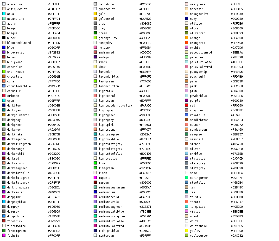
Could you maybe show me, for a dozen or so official X11 color names, the official RGB color and the closest match in your proposed integer HSL space? The actual colors, I mean, not the numbers. Including some orange and brown ones. If those tests come out okay, I guess you can have integer 0-100.
(Although, users should be able to specify RGB values and get the exact color they want, preferably.)
Oh, I dunno, I'll trust you on this, I guess. I hate computers.

The Color numbers and Shade numbers produce different results on Snap! and Scratch 2.0.
The following scripts demonstrate the differences (colors left, shades right):
Scratch Color Range:
Snap! Color Range:
Scratch Shade Range:
Snap! Shade Range: