jmshrv / finamp

A Jellyfin music client for mobile
Mozilla Public License 2.0
1.57k stars 110 forks source link

[Feature Request] Plans for a better UI? (Redesign Discussion) #220

Open JingAr87 opened 2 years ago

JingAr87 commented 2 years ago

Right now the UI is totally usable, but it looks certainly dated compared to other media streaming apps. Do you have any plans for a revamped UI?

jmshrv commented 
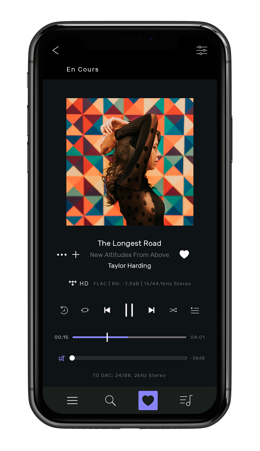
2 years ago

I would like to add some more colour to the UI, but I can't think of any specific bit that needs improving. Do you have any ideas? I'm not a UI person so I've been sticking to the Material guidelines 🙃

quite commented 2 years ago

What issue creator might mean is that the UI is not same as in some other app they are used to. I just found Finamp, and think that the UX might be slightly better for me, than some other apps. (Myself I'm most confortable with terminal and keyboard based programs, but i'm not comparing Finamp to my tools there of course). But perhaps issue creator only means the appearance of the UI? Not at all the functionality?

jaen commented 2 years ago

I've came across the app just now and want to try it for the offline playback capability. I've used Gelli so far (a fork of Phonograph) and while finamp's UI is not terrible, I think Gelli/Phonograph – while still quite minimal – are a wee bit neater.

Some colors go a long way to make it more readable and the "now playing" screen is considerably more slick – it infers a matching background colour from the album art (the audio notification also follows that colour, which is neat) and has a really nice quick playlist access, you can even swipe it up to easily navigate to past items. It also has an alternative layout for the landscape mode that works well (I think finamp doesn't). The navigation is also more fluid – for example when you're in the track list mode and you have that bar at bottom showing the current track, then swiping it up has a continuous fluid motion of it transforming into a full screen view (while finamp has a basic fade instead), making it a subjectively more smooth experience.

I'm not sure how much exactly should you ape Gelli/Phonograph, but I'd give them a spin and try navigating around (Gelli should be easier one to try, since it's also a Jellyfin client) and see how a very similar basic layout of the application feels much more polished due to just a few small differences and consistent attention to UX details. I feel like you don't have to reinvent the UI totally (it's already quite similar to Gelli/Phonograph, which I think works well), just invest a bit into polish. Also, the UI seems to lag quite a bit (and even sometimes crashes) when you're batch downloading stuff, I'd look into it (I queued some whole artists for ~5k downloads).

Hopefully it's an useful 2 cents.

jmshrv commented 2 years ago

Those are some really useful suggestions, thanks :)

About the animation when opening the player screen - I did try to implement a nice slide animation but it's quite a hard thing to implement. I want it to sort of be like an animation as well as a page transition, which means that I have to mess about with custom navigator stuff that I don't quite understand. It's possible, and when I was looking into it I tried understanding Sweyer's implementation (and even made an issue asking how it worked lol), but ended up not looking into it futher.

Another thing I'd like to add is an animation when opening the search bar, even a basic fade would help a lot. I need to refactor the main music screen because it's a mess so maybe I'll implement that if I ever get around to it.

As for the UI lagging when many items are downloading, this is a known issue and should be fixed when I implement a new downloader package (#213).

seniorm0ment commented 1 year ago

I'd like to see smoother more fluid animations. Also I've given my suggestions on UI in oast, but yeah I agree it could use a little tweaking. It feels a bit.. boxy and sharp imo. I know it's material, but maybe a bit more subtle roundness could be nice to match with the new Android style and iOS.

Chaphasilor commented 1 year ago

Hi there! I've recently started to work on a visual overhaul of the Now Playing view, and have been in touch with @jmshrv about this. Here's what I came up with so far:

image

It should look a lot more colorful and friendly, have a clear and easy-to-reach layout and contain all the info and functionality you need. While I've tried to incorporate requests from this issues as well as others (#211 @MarkWieczorek, #208 @nathancoooper), I've also tried to make it look somewhat unique.
Now I would like to now what you think! Please also look at the other examples below and tell me what you like, don't like, or if there's anything you're missing. I'll try to implement as much as I can, so that everyone is satisfied with the end result.

Some more examples (click to expand): ![image](https://user-images.githubusercontent.com/18015147/186044042-31c498e1-e6a8-4cf2-8a72-90e89bf14f45.png) ![image](https://user-images.githubusercontent.com/18015147/186044065-23573975-d13f-45d3-b9eb-39d4c9f4567e.png) ![image](https://user-images.githubusercontent.com/18015147/186044269-cf8a3408-3ddb-41c9-ab1b-7deb47151893.png) ![image](https://user-images.githubusercontent.com/18015147/186044086-588d64c5-abfa-4368-afcb-878702eea7b0.png) ![image](https://user-images.githubusercontent.com/18015147/186044101-b91f0086-622d-40d7-90f1-de73f9b933ac.png) ![image](https://user-images.githubusercontent.com/18015147/186044112-775006ad-5220-4a03-9a72-275a70939b95.png)
seniorm0ment commented 1 year ago

This is absolutely gorgeous, personally not a fan of the boxing around the buttons I feel it makes it look constricted whereas everything else has a nice floaty look. And I would probably prefer the buttons above the seekbar. Just personal preference though. Maybe instead of seperating the info with •, you can badge them (Look at how Poweramp does it). Would be more readable and fit with the theme.

But overall beautiful! Amazing work, can't wait to see in release.

MarkWieczorek commented 1 year ago

I think that these look good. The only thing that is missing for me is the year that the album was released. would it be possible to add this after the album name?

jmshrv commented 1 year ago

I've begun implementing this design in the redesign branch :)

Note that the code is a bit ugly, I'll tidy it up once I've got everything figured out

Chaphasilor commented 1 year ago

This is absolutely gorgeous, personally not a fan of the boxing around the buttons I feel it makes it look constricted whereas everything else has a nice floaty look.

Yeah I struggled a bit with this. Without the box the layout look a bit strange though. Will tinker a bit more :)

And I would probably prefer the buttons above the seekbar. Just personal preference though.

This will probably be toggleable in settings! ![image](https://user-images.githubusercontent.com/18015147/186522480-22a6581b-474d-493f-864a-4a232dec8075.png)

Maybe instead of seperating the info with •, you can badge them (Look at how Poweramp does it). Would be more readable and fit with the theme.

As of yet none of the text has background, and I feel like badges always imply being clickable. Maybe I could use an outline if that looks good, or just keep it like this.

Thanks for the feedback! <3

Chaphasilor commented 1 year ago

I think that these look good. The only thing that is missing for me is the year that the album was released. would it be possible to add this after the album name?

Yep, this will also be an option :) ![image](https://user-images.githubusercontent.com/18015147/186523066-5f95b057-11e2-4527-b159-4a6d22b08f4b.png)
nathancoooper commented 1 year ago

One small adjustment that I would make is that I would have the title, album, and artist test all centred as opposed to pressed against the left side. Just personal preference though.

seniorm0ment commented 1 year ago

I agree with centering

Chaphasilor commented 1 year ago

Center-aligned text will be available as an option, and may end up being the default. We'll see :)

MrPotatoBobx commented 1 year ago

Id like to pitch in my own ideas as well, with these (horribly drawn) drawings. Here is what id envision the album pages to look like: PXL_20220828_215351329~2

I think by default its already fine, but the improvements include:

Another thing I envision is the menu that pops up when long pressing a song

PXL_20220828_215546015~2

The pop up will take approximately half(or 75%) of the screen, and shows the album art and song name at the top, followed by the options(the order of which must be thought of).

I hope @Chaphasilor can actualize this so we'd have a clearer idea on how it'd look like

Chaphasilor commented 1 year ago

@MrPotatoBobx thanks for the mockups, they are great, honestly! It gives me additional input/ideas to go off of :)

I can already tell you we're in agreement about the rounded album cover with text to the right. Also, I assume you intended to keep the information shown next to the album the same, given that you've used the same icons? Or is there some piece of information that you (don't) want to have there?

I'm curious, what's the reason you would like to have the download button in this position and as a switch? Is it because this is how other apps (like Spotify) do it? And would you mind if the "Like" button were in the same spot, maybe on the opposite side?
I would like to keep related or similar controls/buttons grouped.

@jmshrv is it possible to get information about the "discs" through the jellyfin API? If yes, this would likely be another option that can be turned on in settings, but separation by disc would probably be off by default, given that I know no other (mobile) music player that shows albums like this.

I'll think about the song layout some more, not sure yet how much space there will be for icons. I always like to maximize the width of shown text whenever possible. Maybe, once things like #125 are implemented, we could simply have taller list items that can fit more information without making scrolling long lists impossible.

Regarding the song menu:
I'm actually in the process of designing this right now, specifically for the "three-dots" menu on the Now Playing screen. You can take a look at the current version down below. One thing I was trying to solve is how currently the menu always pops up in a different spot, depending on where you press. I'd also like to add a link to the artist, ideally one for each artist if there are more than one. Now my questions are:

  1. Would you prefer if the menu would not cover the whole screen?
  2. Is reachability (e.g. one-handed) usually an issue for you (or anyone else)?
  3. Do you have any frustrating experiences with menus in other apps?

Here's the mockup:

image

Keep the ideas, requests, criticism and drawings coming! 😁

nathancoooper commented 1 year ago

I think one-handed usability should definitely be kept in mind but, as long as you can swipe to close the menu with just one hand holding your phone then I see no problem with it covering the entire screen.

seniorm0ment commented 1 year ago

Would love to see two rows at the bottom of albums, and even playlists with "More from this artist" and "Similar to this artist"

I would prefer it to cover the entire screen, however I wouldn't be opposed to the idea of adding an option that shrinks it "One Handed Mode".

Also a reply about the badges for the audio quality. You could make them into buttons, that open up a box that displays highly detailed audio quality information. This would actually be very nice.

Also this may be a stretch, but it would be so nice to have an option for something to grab album information. I love learning about the albums stories, and artists sometimes. This is something a lot of streamers like Qobuz has.

Like Wikipedia for information, Genius has some info (also Lyrics!), Lastfm has some info. I'm not sure if there are any libre services, but maybe this is something that Jellyfin needs to implement not the app idk.

Chaphasilor commented 1 year ago

Would love to see two rows at the bottom of albums, and even playlists with "More from this artist" and "Similar to this artist"

"More from this artist" should be absolutely possible. Jellyfin also seems to provide a "More like this" category through the API for albums, so guess this can also be shown. Any preferences about the layout, or do you maybe have examples of music apps that do this well?

Also a reply about the badges for the audio quality. You could make them into buttons, that open up a box that displays highly detailed audio quality information. This would actually be very nice.

That's a very good suggestion! Maybe we could even go as far as being able to change transcoding settings right from there!

Also this may be a stretch, but it would be so nice to have an option for something to grab album information. I love learning about the albums stories, and artists sometimes.

Jellyfin provides that for artists only, not for albums, and even then only if the information is present on TheAudioDB. Whether or not we can integrate third-party meta-info fetchers is up to @jmshrv, not me. I'll try to add the description somewhere on the artist page once I get there, then it shouldn't be too hard to also add it to the album page if that is ever needed :)

MrPotatoBobx commented 1 year ago

I'm curious, what's the reason you would like to have the download button in this position and as a switch? Is it because this is how other apps (like Spotify) do it? And would you mind if the "Like" button were in the same spot, maybe on the opposite side? I would like to keep related or similar controls/buttons grouped.

I find that it ( as a switch) makes more sense. The album download status is either yes or no, and so the switch makes sense when you have two mutually exclusive options(i guess the same would also have to apply to the favorites button but i feel like a download button would be harder to convey the "undownload" option like the heart does) . As per the position, yes, mainly inspired by other apps, but also because having all that stuff at the top makes you forget that it ever exists, putting it near there always signals the option to download and favorite the album. And yea, its fine to group them together, it makes more sense.

Would you prefer if the menu would not cover the whole screen?

I would, because in that state you could exit by swiping down or tapping the part where it doesnt cover it, and also i wouldn't know how you'd animate the screen popping up.

I'll think about the song layout some more, not sure yet how much space there will be for icons. I always like to maximize the width of shown text whenever possible.

The icons don't have to be as big as drawn in the photo, or even clickable for that matter, they could be just status icons to see which songs are favorites/downloaded, finamp already does this for favorite songs.

Also, I assume you intended to keep the information shown next to the album the same, given that you've used the same icons?

At first it was yes, but then i thought the song number thing was pretty useless, and that this extra info should be shown in another page. so the first page is just the album name and artist name below it, and swiping to the second one shows the artist name(i thought this one redundant so it think it is better to actually just put song number instead) album time, and the release date.

Look here(ignore the back button, i assume you'd want to round it off like the player screen): image image

Also, for the existing mock up, it think the shuffle and repeating stuff is already found in the player screen so there isnt a need for it.

jmshrv commented 1 year ago

I think one-handed usability should definitely be kept in mind but, as long as you can swipe to close the menu with just one hand holding your phone then I see no problem with it covering the entire screen.

That menu could be implemented as a dialog, so pressing outside the menu would dismiss it.

Whether or not we can integrate third-party meta-info fetchers is up to @jmshrv, not me

Hmm, I'd have to leave API keys in the source code, which is a pretty big blocker. There are also concerns about interacting with non-free services. Maybe it would make sense as a Jellyfin plugin? That way everyone is in control of what services are used.

These are all great suggestions btw :)

Kaaybi commented 1 year ago

I will soon get to work onto Jellyfin-server code to allow the user to chose a rating mechanism (likes or 5-stars for instance), I would be interested to see what it would look like on this gorgeous UI revamp :)

Chaphasilor commented 1 year ago

I think one-handed usability should definitely be kept in mind but, as long as you can swipe to close the menu with just one hand holding your phone then I see no problem with it covering the entire screen.

That menu could be implemented as a dialog, so pressing outside the menu would dismiss it.

Well I'm really not concerned about closing the menu, but about being able to properly reach all actions with one hand. But maybe it's better to test that with a working prototype \^\^

Chaphasilor commented 1 year ago

I will soon get to work onto Jellyfin-server code to allow the user to chose a rating mechanism (likes or 5-stars for instance), I would be interested to see what it would look like on this gorgeous UI revamp :)

@Kaaybi I'm sure we can figure something out once that lands, but honestly before there is an actual implementation where it is clear what the "requirements" are and how the mechanism works, I don't think it's useful to design this. This could implicate pretty big changes to how the app in organized, so it might be necessary to adapt a lot of things to support this.
I'm not opposed to this in any way, I'd just like to do one thing at a time for now and not think too many steps ahead 😅

But if there's some sort of discussion about how this should end up working I'd be glad to read up on it and keep it in mind while designing the other things!

seniorm0ment commented 1 year ago

Thanks for the replies, I want to add that animations make the app. As long as they're not too slow, or over the top. Light and responsive. This is something imo Apple devs shine with. I find Geometric Weather to be an amazing example of an Android app that has quality animations that just feel right.

Pair this with the ability to do certain things such as swipe down om the album art on playback screen, to go back to the playlist or album menu.

Also I think I mentioned it in another issue, but I'd love to see near the codec type info, what it's playing back on. For example bluetooth - device name, USB-C dac, when casting is added then that device, to Wifi Sonos or Mopidy, to 3.5mm Headphones, etc.

Also the replaygain info, and decibel info is really nice to be able to see. Check out Audirvana

I point out Audirvana because there are currently no great libre audio solutions that compare to it's clients. The amount of information it provides, PAIRED with their beautiful apps is just amazing.

Third party meta-info fetches

Thinking more on it, it's probably best to just pull from whatever jellyfin can get. But if Jellyfin can pull info like lyrics, and genius info, etc through plugins then it can be relayed through to the app if it detects it and if not just hide those options or something. That way the app makes no connections to third party servers or connections, and is just relaying what jellyfin has.

ZarK commented 1 year ago

This here thread is amazing, and really inspiring to watch. I check it daily, and the effort, suggestions, designs and discussion here are all superb.

I don’t have the capacity to contribute at the moment, but if there is a way to patron some development, I’m up for it.

I finally found Finamp as my solution to Jellyfin music, and this new design will be fantastic. I can’t imagine it will take less than a year to complete, and it will be well worth the wait.

ae5960e8-a6fc-491f-b252-898ecf59af95 commented 1 year ago

Not much is needed to vastly improve the UI.

Please don't take the advice of those suggesting to use quirky fonts or to aim to achieve a clone of another app. Keeping the app as simple and light as possible while using the modern Android menu system as much as possible is the way to go, similar to the philosophy of Simple Mobile Tools. "Music" by Zion Huang does this well as an example of a very lightweight app which uses the modern standard Android 12 components.

If there's to be any major change to the UI I think your time is best spent using the latest Android material design for simplicity, lightness, speed, longevity, and visual appearance too.

Chaphasilor commented 1 year ago

@MrPotatoBobx sorry I didn't see your message. thanks for all the answers!

Chaphasilor commented 1 year ago

I want to add that animations make the app. As long as they're not too slow, or over the top. Light and responsive.

I'll try my best, but I don't have any experience with designing animations. Basic transitions are fine, but anything beyond that are, as of now, out of my league. If there's somebody here who has experience with this I'd love to collaborate, and if not I'll try my best to give it a shot myself once everything else is designed.

Also I think I mentioned it in another issue, but I'd love to see near the codec type info, what it's playing back on. For example bluetooth - device name, USB-C dac, when casting is added then that device, to Wifi Sonos or Mopidy, to 3.5mm Headphones, etc.

While that is a great suggestion and I'll try to fit it somewhere, implementing this probably won't be trivial. So I can't tell if it will ever see the light of day.

Also the replaygain info, and decibel info is really nice to be able to see.

These can be shown along with the sampling rate and streaming bitrate, no problem. That is, if finamp actually has that information. That's out of my control.

Chaphasilor commented 1 year ago
  • add a pure black theme
  • add the option to change the accent color
  • make opening and closing the player more responsive (like Gelli's)

I'll see if an AMOLED theme looks good, this probably shouldn't be too hard to add. It probably won't apply to the Now Playing screen though. Depending on how the redesign will handle the accent color, manually picking one shouldn't be a problem. Better gestures and transitions will be part of the redesign.

Please don't take the advice of those suggesting [...] to achieve a clone of another app. Keeping the app as simple and light as possible while using the modern Android menu system as much as possible is the way to go, [...] a very lightweight app which uses the modern standard Android 12 components.
If there's to be any major change to the UI I think your time is best spent using the latest Android material design for simplicity, lightness, speed, longevity, and visual appearance too.

Going with a Material You / Material Design 3 theme is not the goal, sorry. I discussed this with @jmshrv and even created a draft design in a similar style, but we decided against it. While I agree that it looks good, it actually would make it look like a clone of another app. Finamp should have a unique and well thought-out design.
However, you should take a look at "Symfonium" on Google Play, it is a paid app that does everything you want. :)

jmshrv commented 1 year ago

To add on to @Chaphasilor's comment, I'd rather not go with Material 3 as it would look very out of place on iOS (as does the current design). Also, I'm not a massive fan of Material 3 myself. If you want something that sticks closely to Material, I've heard good things about Symfonium.

MrPotatoBobx commented 1 year ago

Regarding the album header, your approach would be how it's done in Spotify, correct? I'm not sure I'm a fan of this, maybe I can put the year, track count and runtime as small badges, similar to how I did it above the progress bar on the Now Playing screen. This way there is no need to swipe to a second page, but the information doesn't take up too much space either. I'll play around with it.

yea, that makes total sense

also, pertaining to the UX, I'd like it for us to always have vision impaired people and other disabled folks in mind. for the most part the text is clear and the buttons are accessible and big, but i think the contrast of those orange icons are a bit low, here's a sample from WCAG contrast checker here image

just making the icons a bit more brighter usually hits most of the goals. Although there might be an issue in which a user is playing an album that contains a lighter color that might obscure both text and icons in the background blur. Another issue(in the current app as well) is that it does not take custom fonts set by the user(on android), now im not sure if this is a flutter issue, but some people with dyslexia might prefer to set custom fonts that aid in their reading, as of now, finamp only uses its own font. And another which i think wont be a problem but we must watch out for is using color as the only indication of information(commonly seen in error badges) this can be easily avoided by testing the app in grayscale mode and seeing how usable it is(it might be weird at first for someone who interacts with colors all the time)

I am not visually impaired in any way so i would not know every way in which they might find some designs inconvenient, if you are such person, please reach out here and let us know how we can make the design accessible to everyone! :)

Chaphasilor commented 1 year ago

I totally agree and will try my best to make sure the design stays accessible! If anyone notices that there is an accessibility issue, please let me know so I can fix it!

I also noticed I forgot to mention that the "accent color" (progress bar, icons, etc.) will be based on the album artwork, so it will be dynamic. We're currently in the process of figuring out how to reliably extract an accent color from the artwork that offers good contrast while still looking good. This won't be easy, but hopefully there is a way to do it.
Thanks for bringing up the WCAG contrast requirements, maybe we can use this to verify that the accent color has a high-enough contrast...
Either way, I'm trying to not have any text use the accent color, always either black or white, to prevent contrast issues with that.

nathancoooper commented 1 year ago

I can't wait for the dynamic accent colours! This will be my favourite update thus far.

jmshrv commented 1 year ago

A project has been made at https://github.com/users/jmshrv/projects/2 for tracking progress

Chaphasilor commented 1 year ago

Okay, it's been a while without new designs, so here you go:

I've updated the menu a bit more compact and more minimal:

This menu is for the Now Playing screen, for any other screen (e.g. songs list) it won't include the playback controls. The background will probably also look different:

The menus for albums and playlists will look similar, with slightly different options and info of course.

I've also started designing the album screen, but it's not finished yet.
I'm not sure if I should keep the redundant info in the title and the "card". Might look a bit weird.
I'm also not yet happy with the download toggle (the thing that says "Streaming") and like button, maybe I'll move them somewhere else or completely redesign them. If you have suggestions, let me know!
In general, what do you guys think about the card/layout? Is there anything missing or unclear? Can you tell what is clickable and what isn't?

Multiple discs will also be shown, but the concrete design for that will depend on everything else.

Edit: And yeah, all that brown-orange is the accent color, which depends on the colors of the album cover. So it will look a bit different for each album, or can be manually selected in the settings :)

seniorm0ment commented 1 year ago

Love it, imo the little badge behind Vicetone in last picture could be a little less rounded and more squared

riker09 commented 1 year ago

I want to add my two cents here. What I really miss is the ability to quickly scroll by alphabet. I've seen this in other apps, when you start scrolling on the side another scrollbar pops up that features all letters from the alphabet and highlights the current scroll Position (aka. the current letter). This allows for fast scrolling through large collections.

I hope you know what I have in mind. I'm typing in my mobile and cannot provide screenshots. 😅

[EDIT]

Seems like there is already a ticket for that: https://github.com/jmshrv/finamp/issues/125

Chaphasilor commented 1 year ago

@riker09 yes, this is definitely planned. I'll design this when I get to the long lists (songs, artists, etc.). I'd guess it's not needed for an album, right?

MrPotatoBobx commented 1 year ago

The new designs look nice, but i think the blurred backdrop should extend all the way to the download switch, and the download switch should be a part of the album stuff, not the song list, also the play and shuffle buttons seem small or weirdly spaces out(what do the arrows do?)

jmshrv commented 1 year ago

We could add lyric support to the player screen with this new plugin:

https://reddit.com/r/jellyfin/comments/x7mltw/looking_for_betatesters_jellylyrics_adds_lrc_file/

PauFCB commented 1 year ago

Hi, more ideas here😁 First, I’d like to see only 4 tabs on the bottom: My library, search, downloaded, settings. My library: (apple music/itunes style), with three sections on top: Artists, Albums, Playlists. And I’d love that the new artist section have a big posters and bio description like the Tidal app (sorry i can’t attach photo atm). And under this three sections on My Library only see the recent albums covers (played or recently added it doesn’t matter). A few more ideas:

seniorm0ment commented 1 year ago

The volume slider could be a volume button, that if tapped mutes sound, untapped enables it. If you hold it it opens a slider.

Chaphasilor commented 1 year ago

Love it, imo the little badge behind Vicetone in last picture could be a little less rounded and more squared

image

Like this? :)

Chaphasilor commented 1 year ago

i think the blurred backdrop should extend all the way to the download switch, and the download switch should be a part of the album stuff, not the song list

That's a nice suggestion! Let me play around with that...

also the play and shuffle buttons seem small or weirdly spaces out(what do the arrows do?)

The down arrow opens a dropdown that let's you change when the songs are played. Default is "now", but there's also "next" and "add to end of queue":

image

(I don't have a separate icon for "Play Next" yet, but there will be two different icons in the end)

Does that make sense? Would you prefer to have it done differently?
I did try to use dedicated buttons at first, but it's hard to fit them all on a smaller screen, and there are actually 6 options and not four (play/shuffle x now/next/queue).

nathancoooper commented 1 year ago

Maybe we should keep 'play now' and 'shuffle' where they are but then hide the 'play next' and 'add to queue' options behind the ellipsis menu.

Chaphasilor commented 1 year ago

Hi, more ideas here😁 First, I’d like to see only 4 tabs on the bottom: My library, search, downloaded, settings. My library: (apple music/itunes style), with three sections on top: Artists, Albums, Playlists.

Screenshots would be amazing if it's possible :)
Where would the songs be? You only mentioned artists, albums and playlists.

Is the "downloaded" tab something that you would be using a lot, or did you just include it because it's a major section of the app? Normally you don't have to go in there, just turn on offline mode, right? 🤔

  • Volume slider on screen

I'll see what I can do :)

  • Color adaptative song track slider

What do you mean? The "mini player" when you're using the app while a song is playing?

Chaphasilor commented 1 year ago

Maybe we should keep 'play now' and 'shuffle' where they are but then hide the 'play next' and 'add to queue' options behind the ellipsis menu.

So only a single menu, instead of one menu for each playback order (= two in total)?

nathancoooper commented 1 year ago

Yeah

PauFCB commented 1 year ago

Hi, more ideas here😁 First, I’d like to see only 4 tabs on the bottom: My library, search, downloaded, settings. My library: (apple music/itunes style), with three sections on top: Artists, Albums, Playlists.

Screenshots would be amazing if it's possible :) Where would the songs be? You only mentioned artists, albums and playlists.

Is the "downloaded" tab something that you would be using a lot, or did you just include it because it's a major section of the app? Normally you don't have to go in there, just turn on offline mode, right? 🤔

  • Volume slider on screen

I'll see what I can do :)

  • Color adaptative song track slider

What do you mean? The "mini player" when you're using the app while a song is playing? No, time left slider.

You are right, a stand alone Downloaded section it’s not necessari, just and icon that show you that if you are playing streaming or downloaded playlists.

First screenshot, something like that for the maim Library screen:

And this one for the Artist section, but with a Bio description: 10090072-5032-4D98-B278-B7F7BEE590BF

Just my two cents😁