 nus-se-bot
commented
1 year ago
nus-se-bot
commented
1 year ago Team's Response
This selection colouring of the client's cards is to help the user view which client they are currently at. This is especially helpful in the case where there is a long list of clients.
Items for the Tester to Verify
:question: Issue response
Team chose [response.Rejected]
- [x] I disagree
Reason for disagreement: It is good that you helped me understand your purpose of this feature now, but there was no indication that this was the case. The user guide did not explain this trait. It is especially confusing since the group had tabs for contacts and calendar.
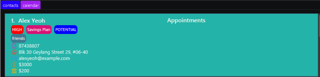
As a user, I might think that there might be certain effects if I clicked on the person card. For example, I thought by clicking a person card and then clicking Calendar would present me a calendar view of that particular person, not the appointments of the whole application’s database. Thus, since this was not specified at all it should still be considered a FeatureFlaw. Since it is merely cosmetic, it deserves its severity of veryLow.
When I click my mouse on one of the cards, it highlights but nothing happens in particular. This might confuse the user since they would expect a change in color to mean something.