 nxsdev
commented
3 weeks ago
nxsdev
commented
3 weeks ago I solved it.
I found that I can get the error status in FieldErrorContext.
I built the following component
field.tsx
"use client"

import React from 'react';
import { FieldErrorProps, Group, GroupProps, InputProps as RACInputProps, LabelProps, FieldError as RACFieldError, Input as RACInput, Label as RACLabel, Text, TextProps, composeRenderProps, FieldErrorContext } from "react-aria-components";

import { cn } from "@/lib/utils";

export function Label(props: LabelProps) {
  const validationResult = React.useContext(FieldErrorContext);
  return <RACLabel {...props} className={cn(
    'text-sm font-medium leading-none peer-disabled:cursor-not-allowed peer-disabled:opacity-70',
    validationResult.isInvalid && 'text-destructive',
    props.className,
  )} />;
}

export function Description(props: TextProps) {
  return <Text {...props} slot="description" className={cn('text-sm text-muted-foreground', props.className)} />;
}

export function FieldError(props: FieldErrorProps) {
  return <RACFieldError {...props} className={composeRenderProps(props.className, (className) => cn('text-sm font-medium text-destructive', className))} />
}

export function FieldGroup(props: GroupProps) {
  return <Group {...props} className={composeRenderProps(props.className, (className) => cn('flex items-center h-10 bg-background border border-input rounded-md overflow-hidden', className))} />;
}

export function Input(props: RACInputProps) {
  return <RACInput {...props} className={composeRenderProps(props.className, (className) => cn('flex h-10 w-full rounded-md border border-input bg-background px-3 py-2 text-sm ring-offset-background file:border-0 file:bg-transparent file:text-sm file:font-medium placeholder:text-muted-foreground focus-visible:outline-none focus-visible:ring-2 focus-visible:ring-ring focus-visible:ring-offset-2 disabled:cursor-not-allowed disabled:opacity-50', className))} />
}
text-field.tsx
"use client"

import React from 'react';
import {
  TextField as AriaTextField,
  TextFieldProps as AriaTextFieldProps,
  ValidationResult,
  composeRenderProps,
} from 'react-aria-components';
import { Description, FieldError, Input, Label } from '@/components/ui/field';

import { cn } from '@/lib/utils';

export interface TextFieldProps extends AriaTextFieldProps {
  label?: string;
  description?: string;
  placeholder?: string;
  errorMessage?: string | ((validation: ValidationResult) => string);
}

export function TextField(
  { label, description, placeholder, errorMessage, ...props }: TextFieldProps
) {
  return (
    <AriaTextField {...props} className={composeRenderProps(props.className, (className) => cn('flex flex-col gap-2', className))}>
      {label && <Label>{label}</Label>}
      <Input placeholder={placeholder} />
      {description && <Description>{description}</Description>}
      <FieldError>{errorMessage}</FieldError>
    </AriaTextField>
  );
}
form.tsx
"use client"

import React from 'react';
import { FormProps, Form as RACForm } from 'react-aria-components';
import { cn } from '@/lib/utils';

export function Form(props: FormProps) {
  return <RACForm {...props} className={cn('space-y-6', props.className)} />;
}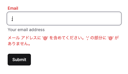
This makes it easy to construct a form very similar to shadcn.
export default function Home() {
  return (
    <Form className='w-96'>
      <TextField type="email" label="Email" placeholder="test@example.com" description="Your email address" isRequired />
      <Button type="submit">Submit</Button>
    </Form>
  );
}
https://react-spectrum.adobe.com/react-aria/forms.html#react-server-actions
Also, you can combine React server actions with Zod to form very easy forms.
The changes I have made would modify existing TextField Component and other components, so it would be nice if there is a way to successfully utilize Form in jolly-ui.
 jolbol1
First of all, thank you for creating this wonderful OSS! I am currently just starting to use jollyui.
Currently I am looking for a way to write a form similar to shadcn with good code.
Handling Zod validation and server actions with forms using jollyui and react-aria was easier than creating forms in shadcn.
However, I am struggling in some areas to build forms shadcn style.
For example, shadcn will have a destructive color for the label when there is a validation error.
This is the code for the server actions form built with jollyui + react-aria.
I was able to apply the color to the error message by writing the className directly in the FieldError component. However, I have been trying to figure out how to apply color to labels, but I am currently unable to come up with a good idea.
Has anyone built a form similar to shadcn's style with jollyui+react-aria? Also, since it is not very pretty to write the style directly, I thought many people would be pleased if there was a component to build the form.