Team's Response
Yes, thank you for pointing that out. However, we specifically design our error message to show what kind of input for email should be accepted. Therefore, the error message shouldn't be too short, else the user might still fail to produce correct input for the command. Regarding the hard to read, our result box allow user to scroll and the app is also resizable so the user can also enlarge the app size for more comfortable view. Indeed, we appreciate your input and will put this into consideration when developing further iteration to allow for more smooth viewing.

Items for the Tester to Verify
:question: Issue response
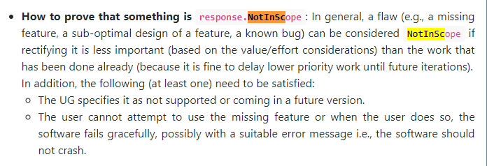
Team chose [response.NotInScope]
- [x] I disagree
Reason for disagreement: The error message could have been shortened to only point out what is wrong instead of listing all the requirements for an email. This severely lowers the user experience as the user would have to scroll a lot both horizontally and vertically just to read the email requirements only to realise a small error which can be easily rectified with an error message consisting of a few words.
The team also argued that rectifying this issue is less important. However, I feel that as email inputs are used across several commands, the chances of a mistake in the user input are high, and the user will often meet with a long wall of text that they have to scroll through just to find what is wrong with their input. Due to the high probability of a user facing this issue, the team should not put it on the back burner, and it is a feature flaw that requires an immediate fix.
Steps to reproduce:
edit 6 e/test@Expected Output:
A short error message to point out whats wrong instead of having to scroll a lot
Actual Output:
Emails should be of the format local-part@domain and adhere to the following constraints:
Screenshots: